
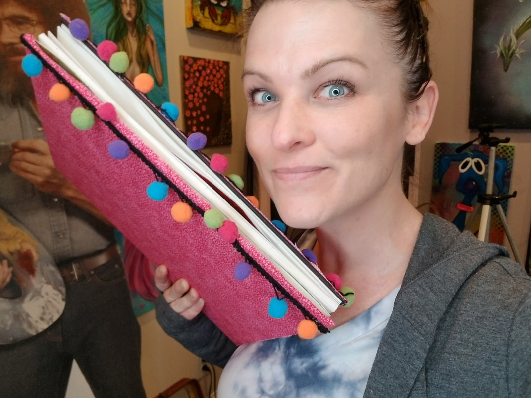
|
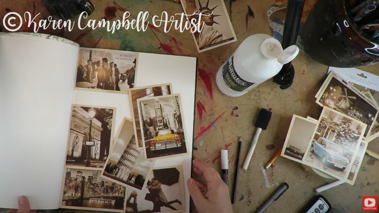
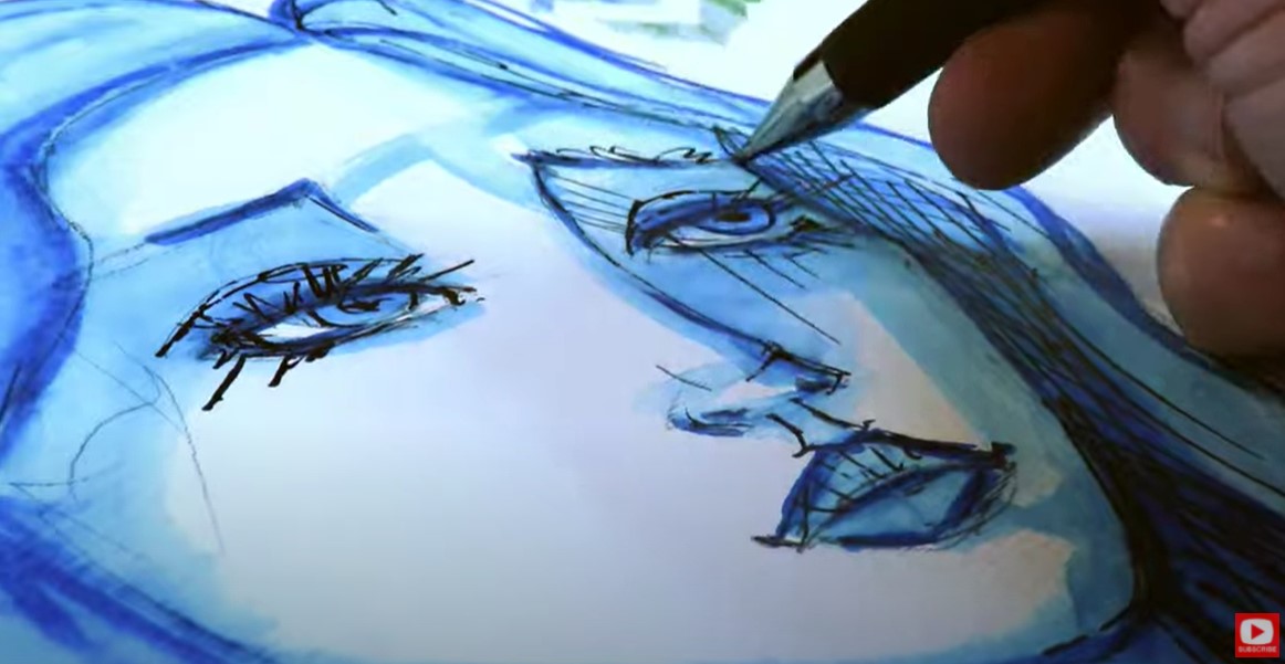
Picture this: you open your art journal, and instead of a silent page flip, you encounter that dreadful sticking sound. Sticky Art journal pages are a REAL problem, am I right?!
They're also SUPER normal, PREVENTABLE, and even fixable. In today's NEW YouTube video on my Mixed Media channel, I'm gonna show you FIVE ways to STOP THE STICK for good! 
*All product links are affiliate & for U.S. residents only.*
1When & HOW to Use Spray Sealers
Spray sealers have always been my go-to art supply to lock ALL the layers of a finished piece in place. These come in a wide variety of brands and price points to accommodate every level of artist from crafters to fine artists. I tend to reach for this acrylic spray sealer by Americana the most for my own projects.
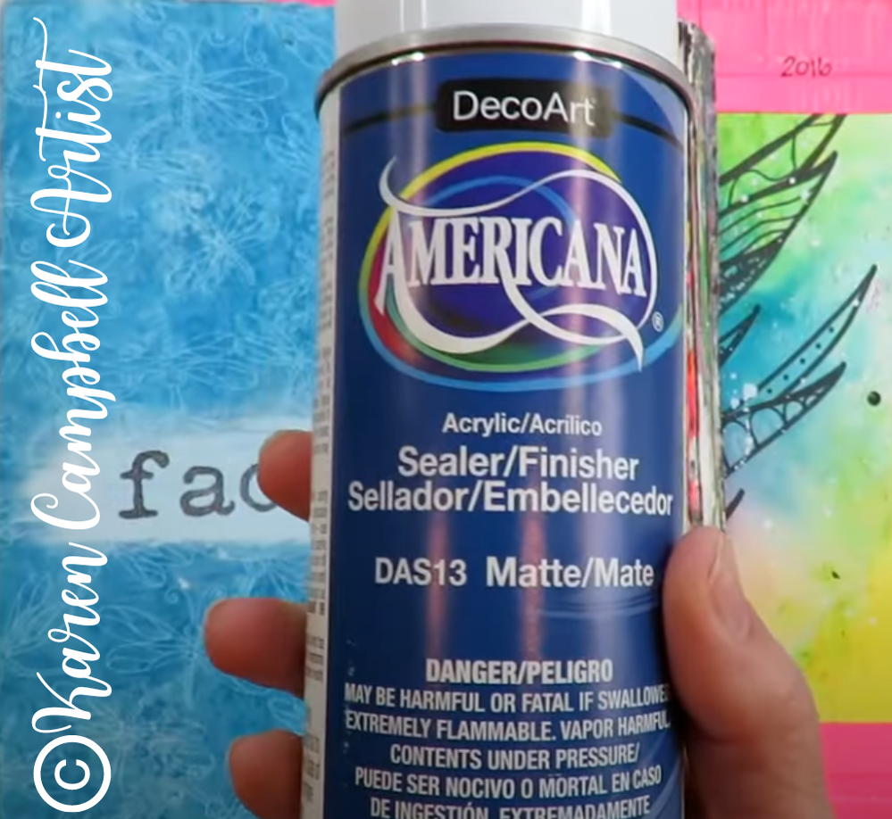
If you live outside of the U.S. and are trying to find a similar spray sealer, there are FOUR words you need to be looking for on your product labels: CLEAR, ACRYLIC, MATTE SEALER. That's it!
I feel a SPRAY SEALER is essential for mixed media artists because it won't re-activate all the layers in your piece.
This is HUGE for fans of watersoluble products like me!! Stabillo-all pencil or watercolor markers anyone?! 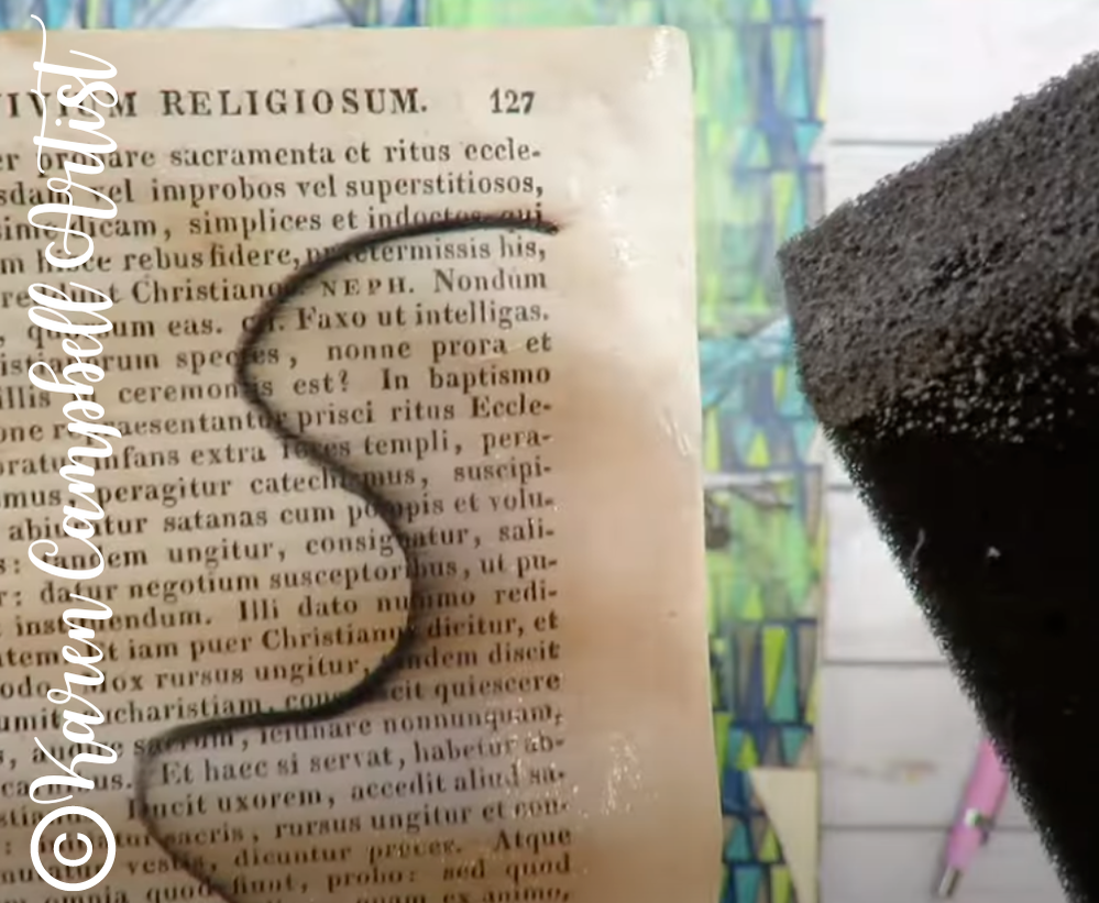
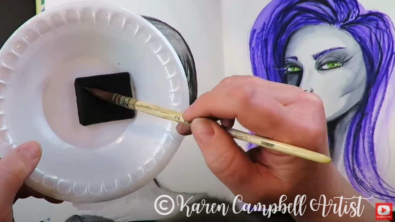
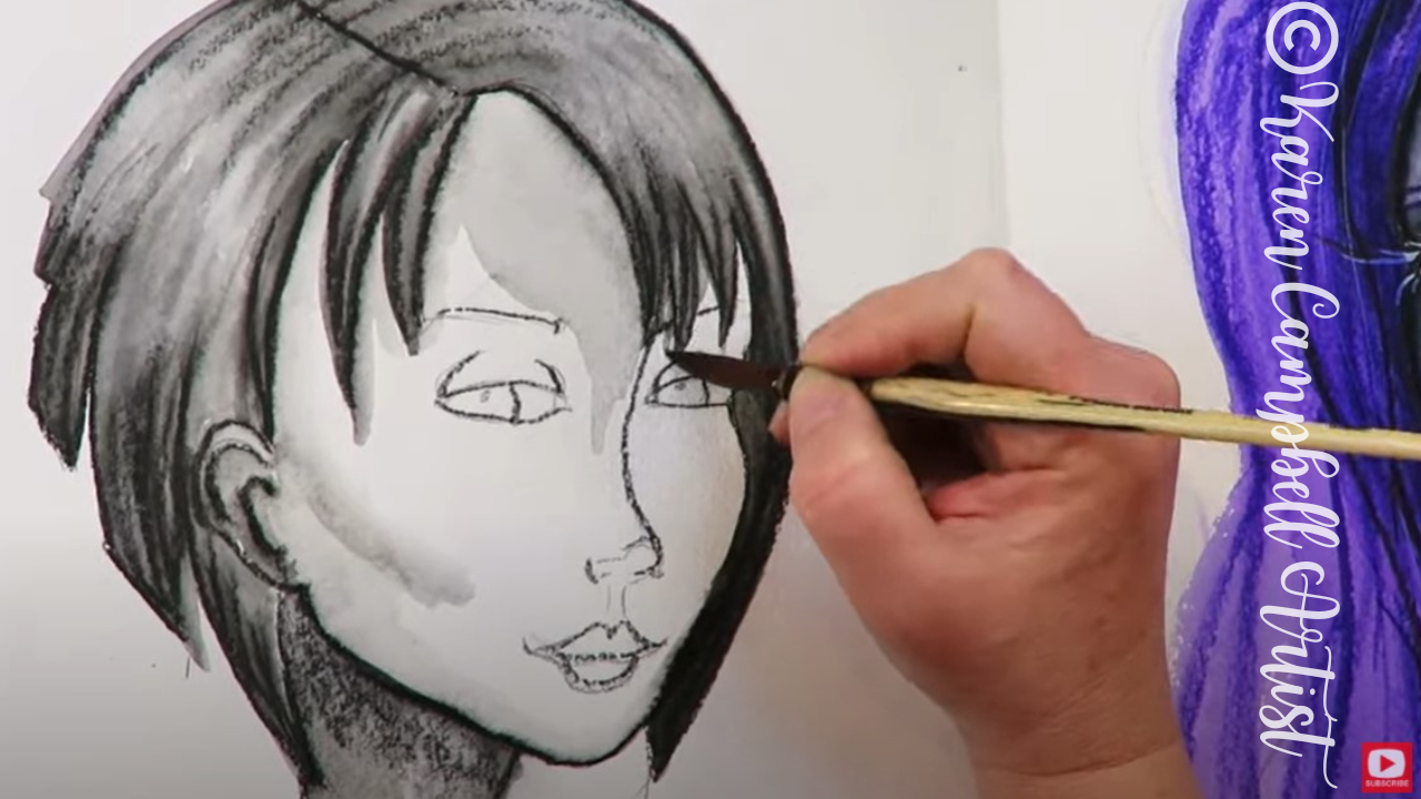
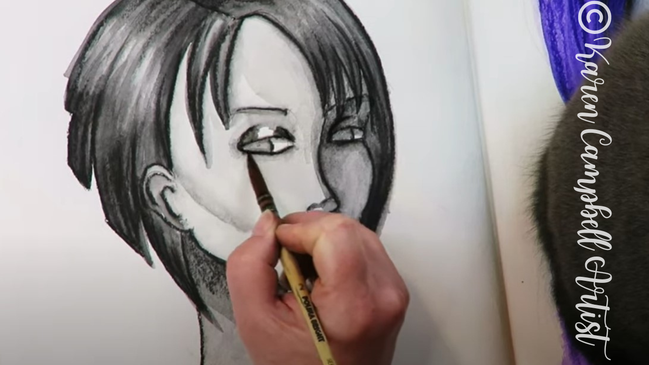
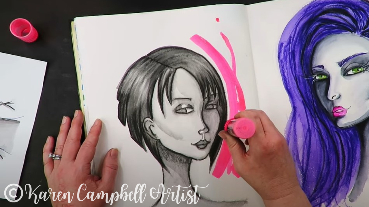
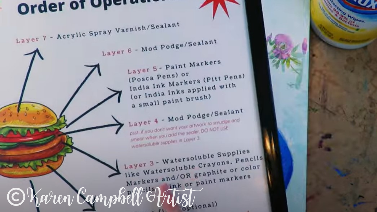
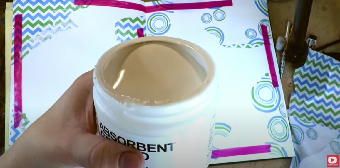
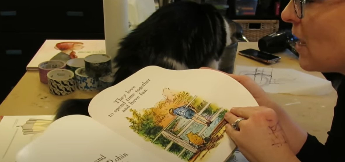
If I used a product with a brush applicator (like the mod podge used in the above demo), it would smear ALL my work and basically wreck my piece instead of saving it. A spray sealer allows us to lock in everything, prevent smears, and STOP THE STICK for your art journal pages!
2Wanna Decrease THE SHINE in Your Art Journal Pages?
Sometimes even when you've sprayed a matte sealer, pages can still look super shiny even when the product is dry. If this bugs you, try Dorland's Wax Medium.
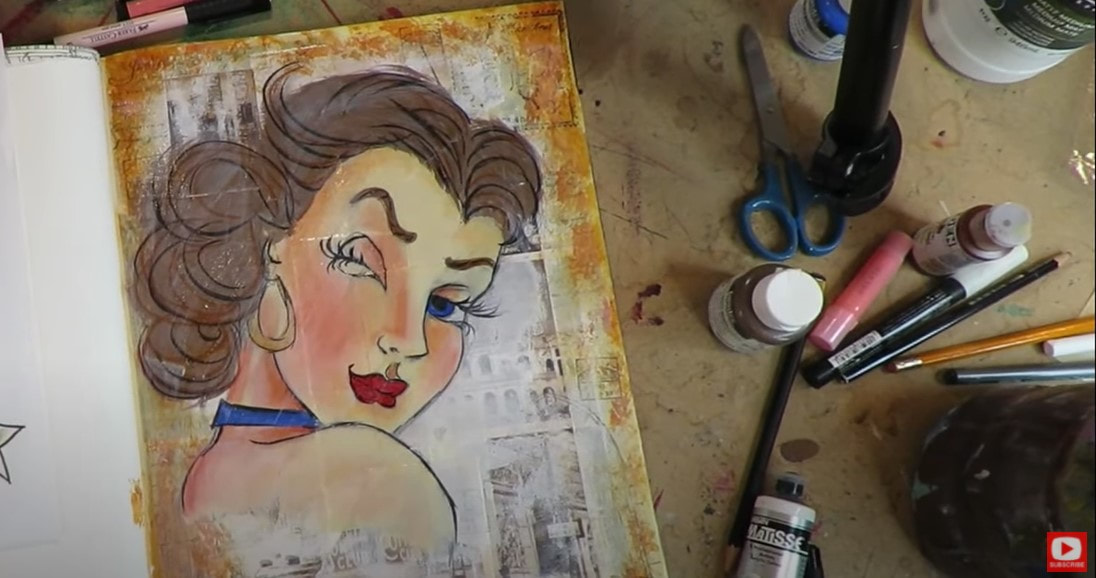
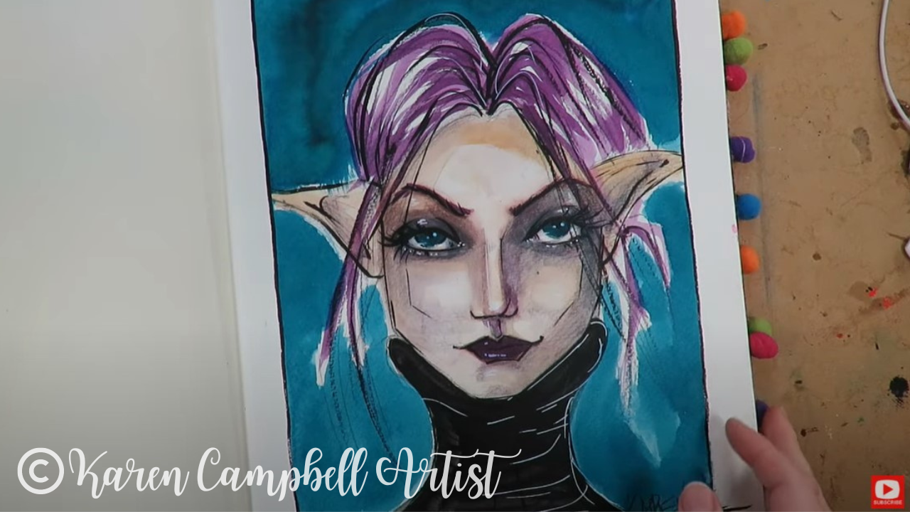
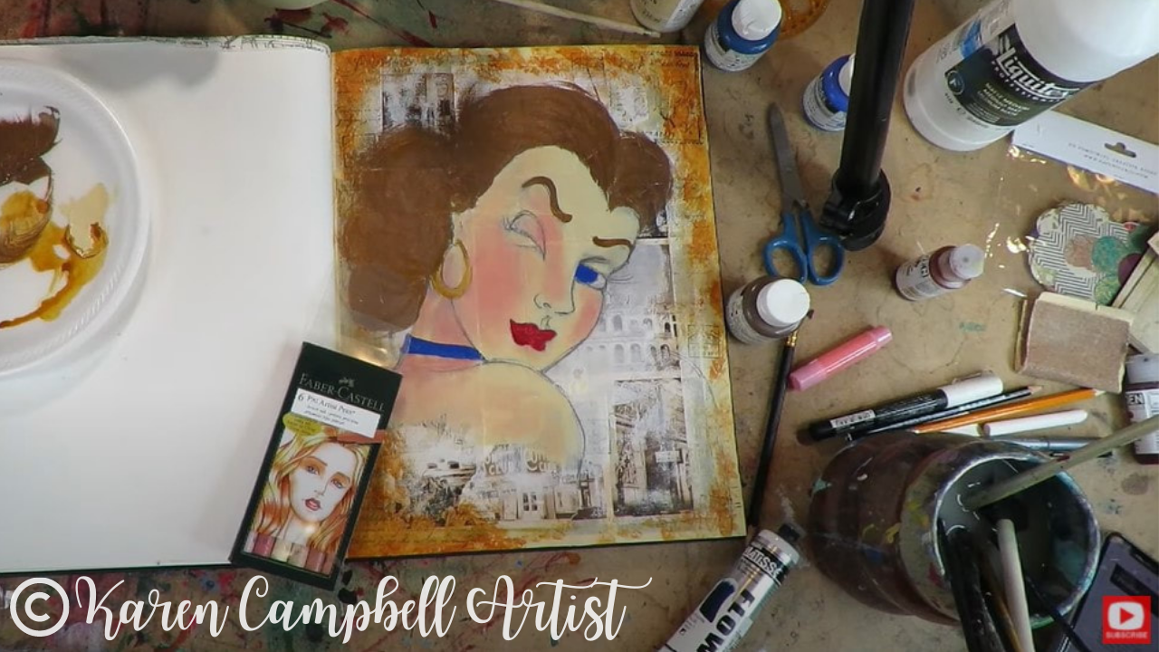
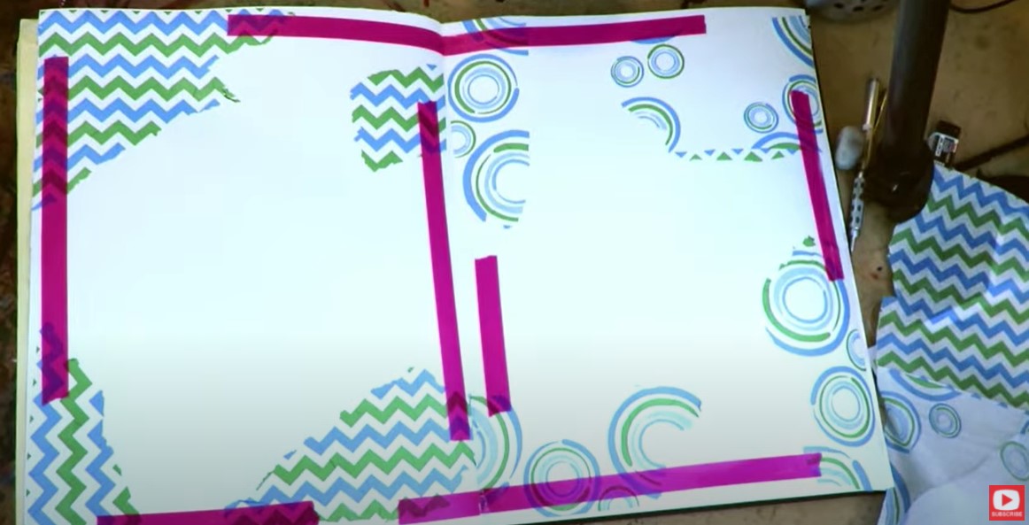
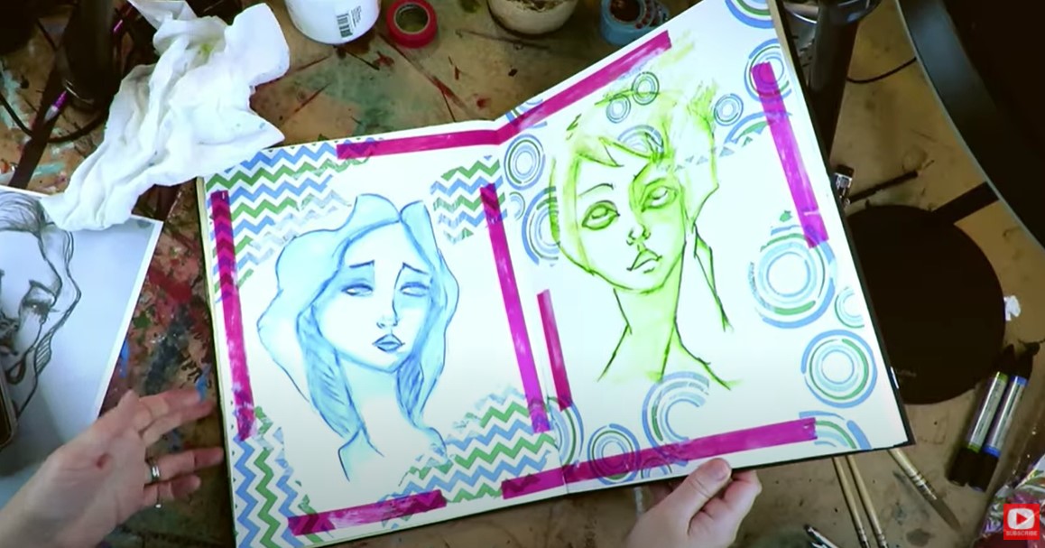
Dorland's is a cold wax, and you can simply apply it with an old dish towel right on top of a PRE-SEALED piece (super important - this wax doesn't replace the sealer, it goes on TOP of it). In the pic below you can see quite a sheen throughout my art journal spread. This is BEFORE I applied Dorland's Wax Medium. 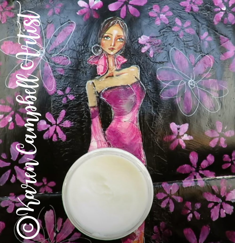
The next image shows a closeup of this piece AFTER using Dorland's. There's significantly less sheen, and it even smoothed some of the wrinkles from napkin collage or tissue paper collage in the background.

While I love the matte look I achieved with Dorland's wax medium, I don't love the way my pages FEEL since using it. The stickiness is definitely gone, but I guess I'm much more of a fan of how my pages feel if I've sealed with matte mod podge or Americana sealant.
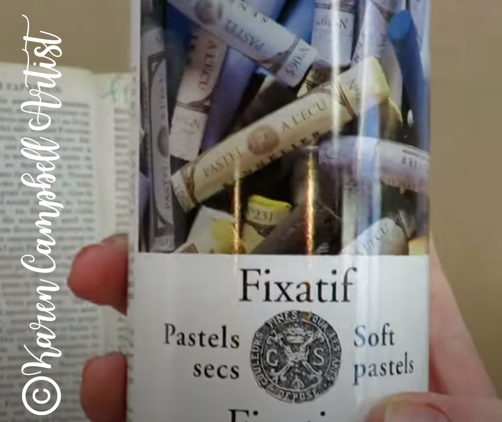
3When to Use a Fixative Spray in Mixed Media Art Projects
A fixative spray is something you want to reach for when you want to preserve what you've done, but keep working. It's about half as strong as a traditional sealer. A sealer is for when you KNOW you're DONE with a project and you want to lock everything in place for good.
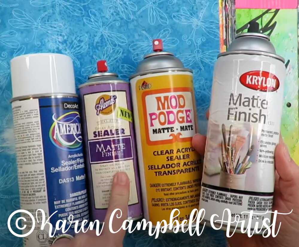
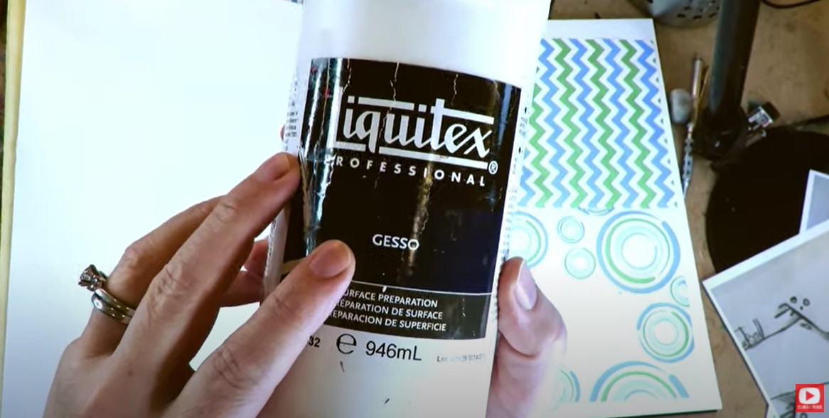
4Super Matte Mod Podge
I've always felt mod podge is an excellent sealer on its own. But even the matte version can occasionally leave more sheen on my art journal pages than I'd like.
I decided to test a new version of mod podge called SUPER MATTE Mod Podge, and found it to be a GREAT alternative to Dorland's Wax for just $10/bottle (vs. Dorland's $27, which I also don't love the feel of after it's been applied). My only issue with the super matte mod podge is if you used watersoluble mixed media art supplies to create your art journal pages. Whenever you try to apply a sealer with a brush on applicator, you run the risk of reactivating previous layers - which can sometimes look cool, and other times can ruin your work. Luckily Mod Podge DOES make spray sealers as well, in case these are something you're interested in trying! 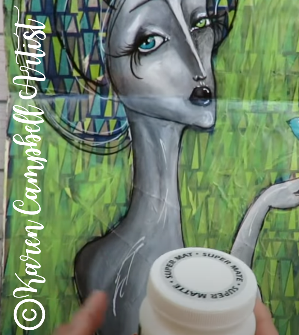
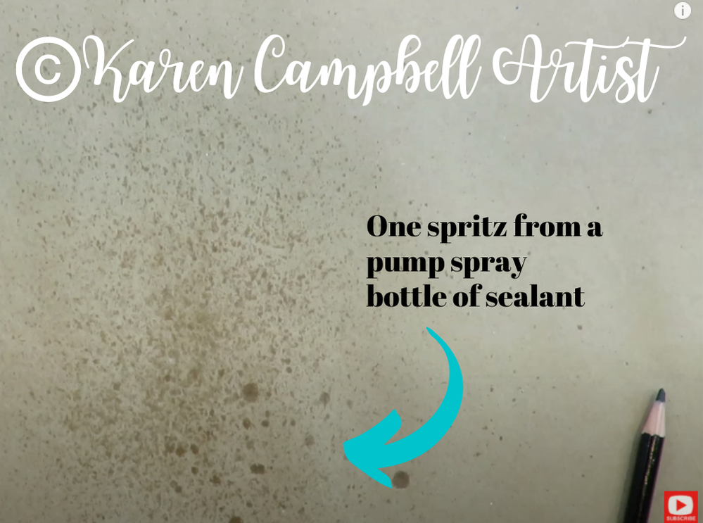
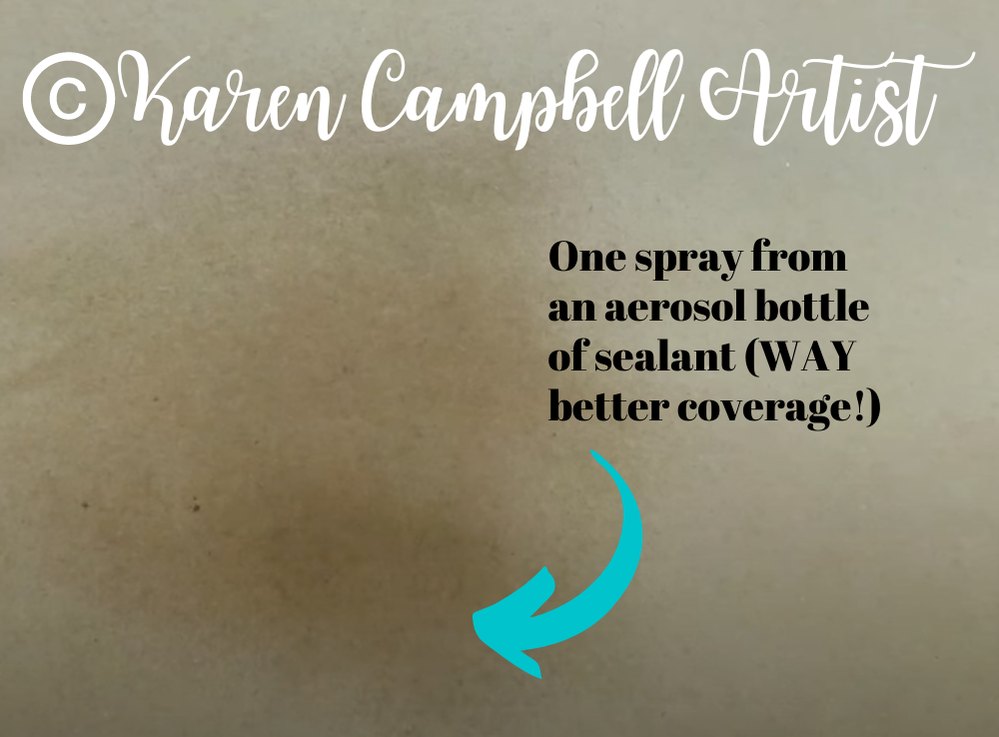
Aerosol Spray Sealer vs Pump Spray Sealer
Make sure you watch today's demo because I'll show you EXACTLY why I prefer an aerosol spray sealer to a pump spray sealer. As you can see below, a pump spray sealer offers VERY LITTLE coverage with just one spritz.
The photo below shows the coverage from one spray of the Americana aerosol sealer I typically reach for when sealing my projects. I know it's subtle here in the photo, but watch the video. It's kinda shocking how much MORE ground you can cover with an aerosol spray sealer vs a pump spray sealer.
5What if You're Sensitive to Aerosol Sprays?
|
Karen CampbellFounder of Awesome Art School. Mixed Media Artist. Author of 19 Instructional Art Books! 
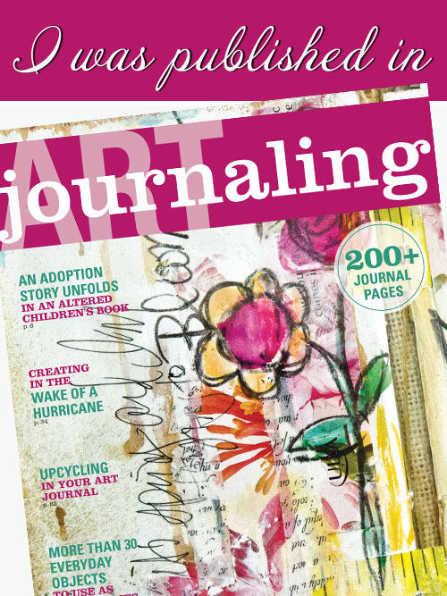
Whose work has appeared in...
 Archives
July 2024
Categories
All
|


 RSS Feed

"Karen is flipping hilarious and she's very real...I like the way she teaches in a way that really gives you confidence, whether you're a beginner or advanced there's always something new to learn!"
- Elizabeth W. |
What Fans Are SayingKaren, you are absolutely fabulous! You make me feel like I can draw anything. I have recently retired and finally have the time to do some of the art that I have loved since I was in school. I am really at the beginning of my art journey and I hope to learn as much as I can. Thank you for all you do. |
Contact ME |