|
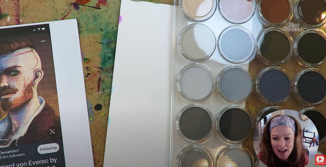
How have I NEVER tried pan pastels before in any of my mixed media portraits?! I KNOW!! I just purchased a pan pastel set of 80, and am super excited to PLAY with them for the FIRST TIME. Will my pan pastels portrait fail on yupo paper? Is layering pan pastels easy or hard? What art supplies "play nicely" with them? NO CLUE!
Today's mixed media art supply demo is all about letting go & discovering the answers on my own as I play. It is in this space of experimentation where we can truly be FREE as artists! If you're new to pan pastel art like me, need a little push to TRY something new, or curious if you should add some pan pastel colors to your own art supply stash - THIS VIDEO is FOR YOU!
I don't about you, but I like to dive in "blind" whenever I experiment with a new art supply! I think it's fun to not know how things are gonna work, how they'll react together, and figure it all out by myself first!
Then I love to dive into research LATER if things went wrong, because for me - my experience helps me to craft my knowledge. My hope for you with today's video is that you feel empowered to try anything and everything you want to all by yourself. You can learn SO much by doing this!! Before we continue, super quick announcement: All product links are Affiliate. I may earn a small commission if you choose to order through these links but by law there is never any additional cost to the consumer for doing so. I thank you for your support.
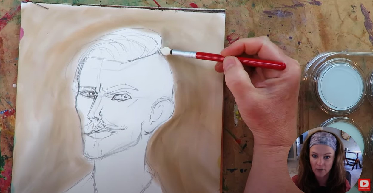
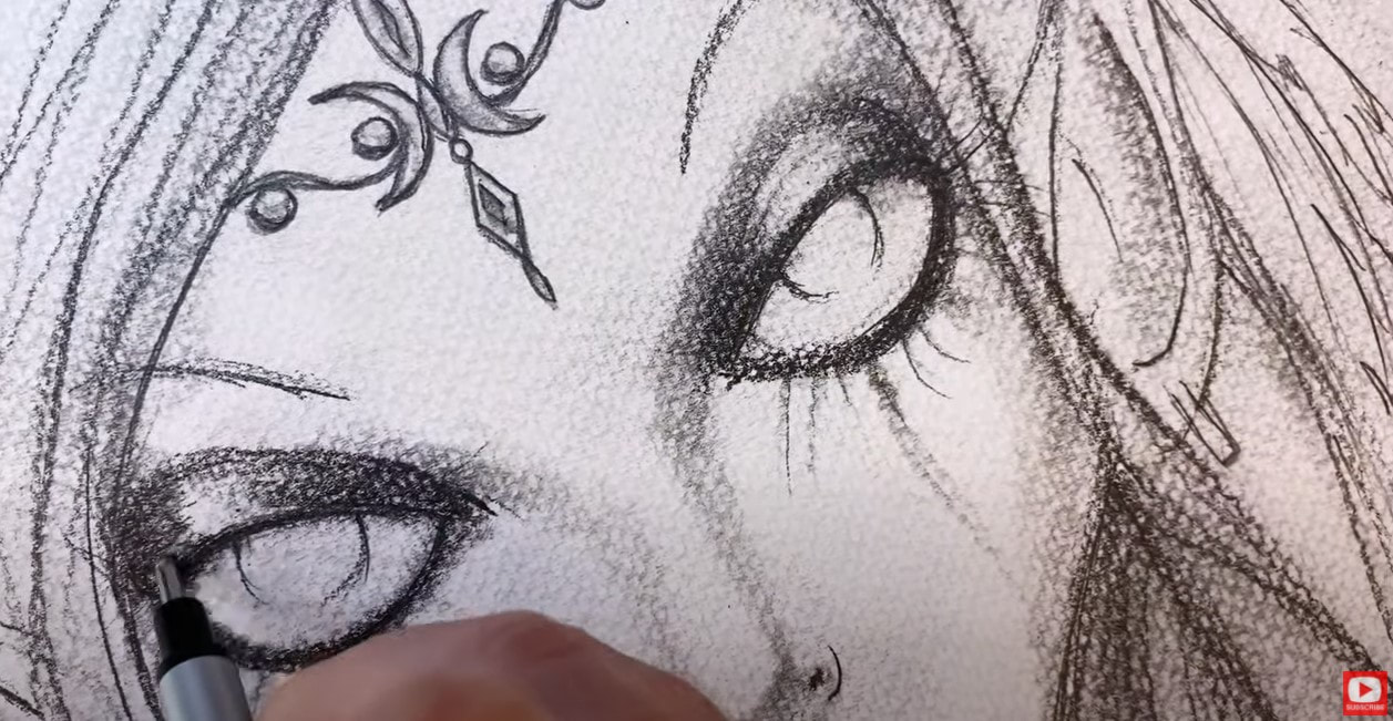
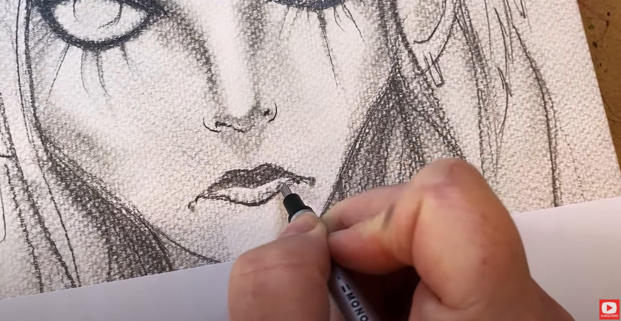
I found an awesome face shading reference photo on DeviantArt that inspired today's project. He's a side profile drawing in 3/4 view.
If you'd like to try drawing a 3/4 portrait, and need a little help, click the button below to download my FREE 3/4 view Face Drawing Guidelines! I'll email them right over to you.
The paper I'm using today is called Yupo paper. It's 100% non-pourous, and basically plastic! When you draw on it - you'll experience a really slippery sensation, like 80x slippier than bristol!
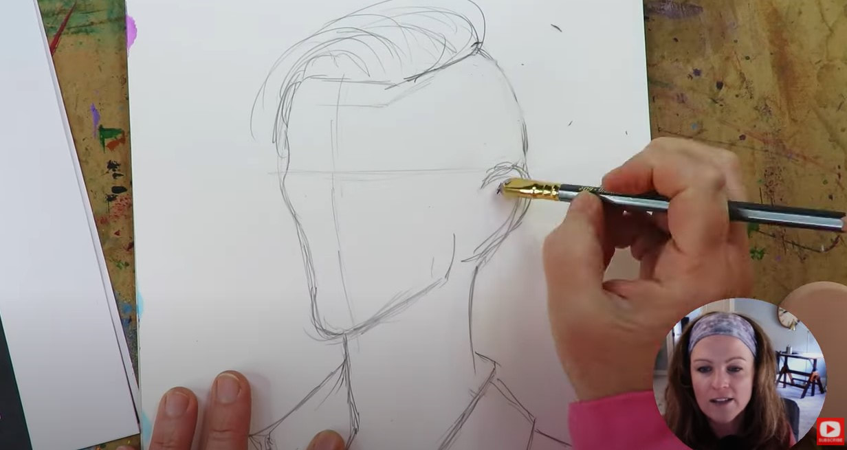
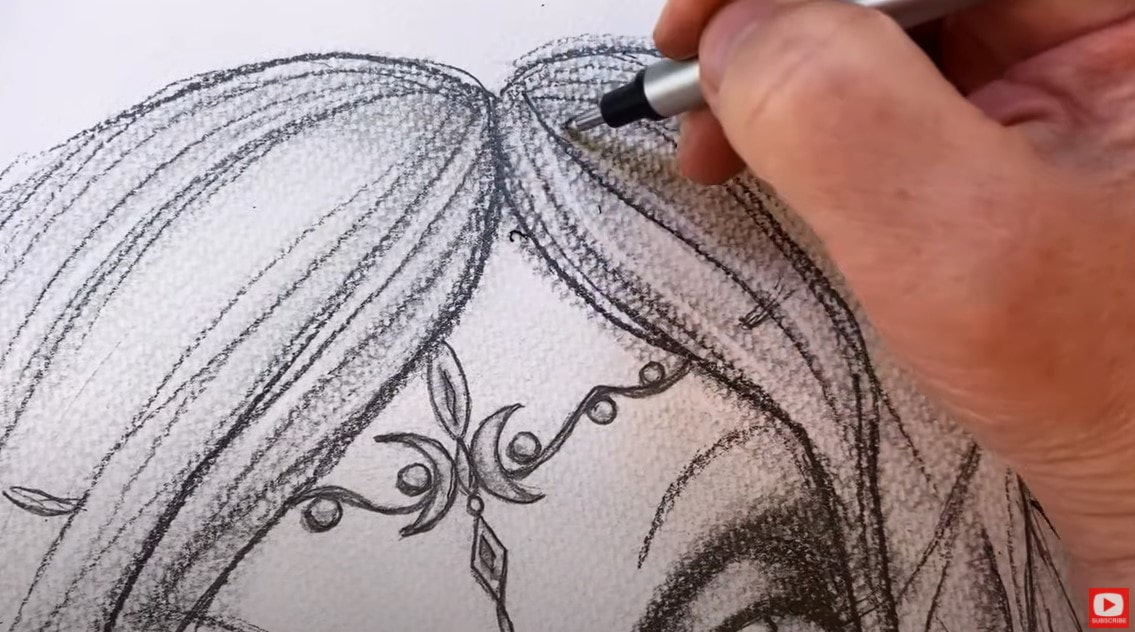
As you'll see in the video- it doesn't matter how many times I've drawn a face, I ALWAYS go back to basics and sketch in my face drawing guidelines first. This helps me ensure the face I'm drawing will come out with facical features that are proportionate. If you need help getting the proportions of the 3/4 portrait correct, CLICK HERE to download my free cheatsheet.
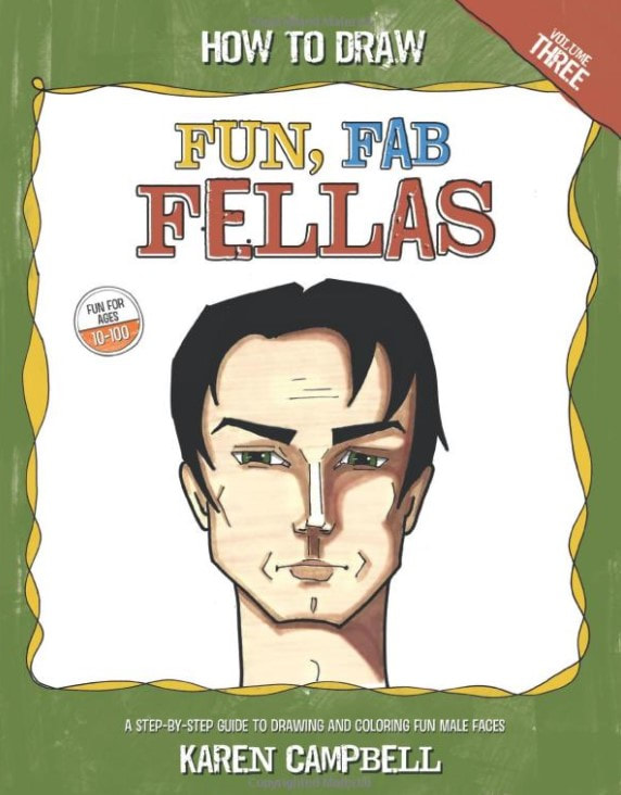
If you're interested in learning more about how to draw male faces check out my book - How to Draw Fun Fab Fellas. I don't draw guys nearly enough, honestly! And they're really fun because the angles in their faces are SO different from women.
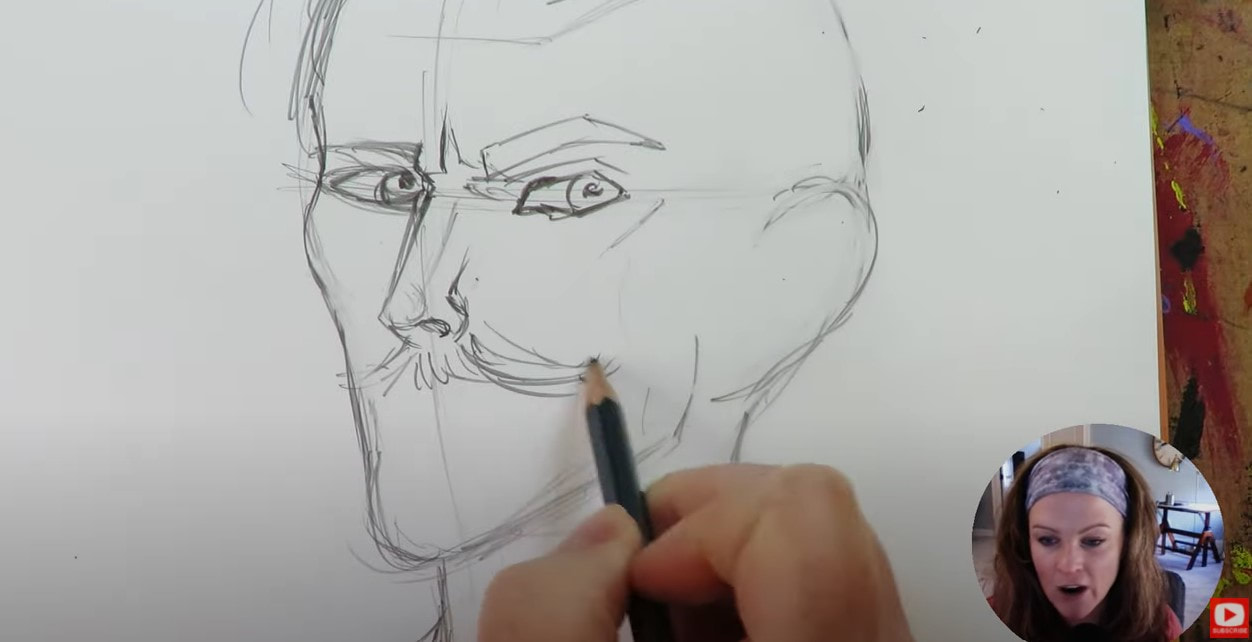
As I was drawing this particular guy, I really felt like he was turning into a young Van Gough!
Since I'm totally doing this project from the perspective of a pan pastels beginner... and also new to working on Yupo paper- I have no idea how my first layer of pan pastels is going to stick to the paper, because it literally has zero texture and feels like a skating rink.
If you don't have any pan pastel sets yet, I recommend trying the set of 20, or the skin tones set of 7. I used one of the pan pastel Sofft tools (they came with my pan pastels set of 80), to apply some color to the background, and it was seriously done in under a minute. If you need some applicators, try this little set of 12 mini sponges, and/or this set Craft Ink Blending Brushes.
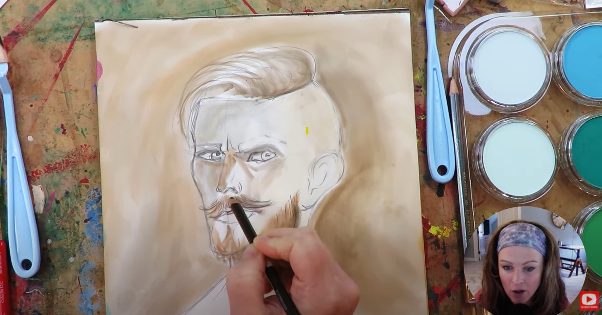
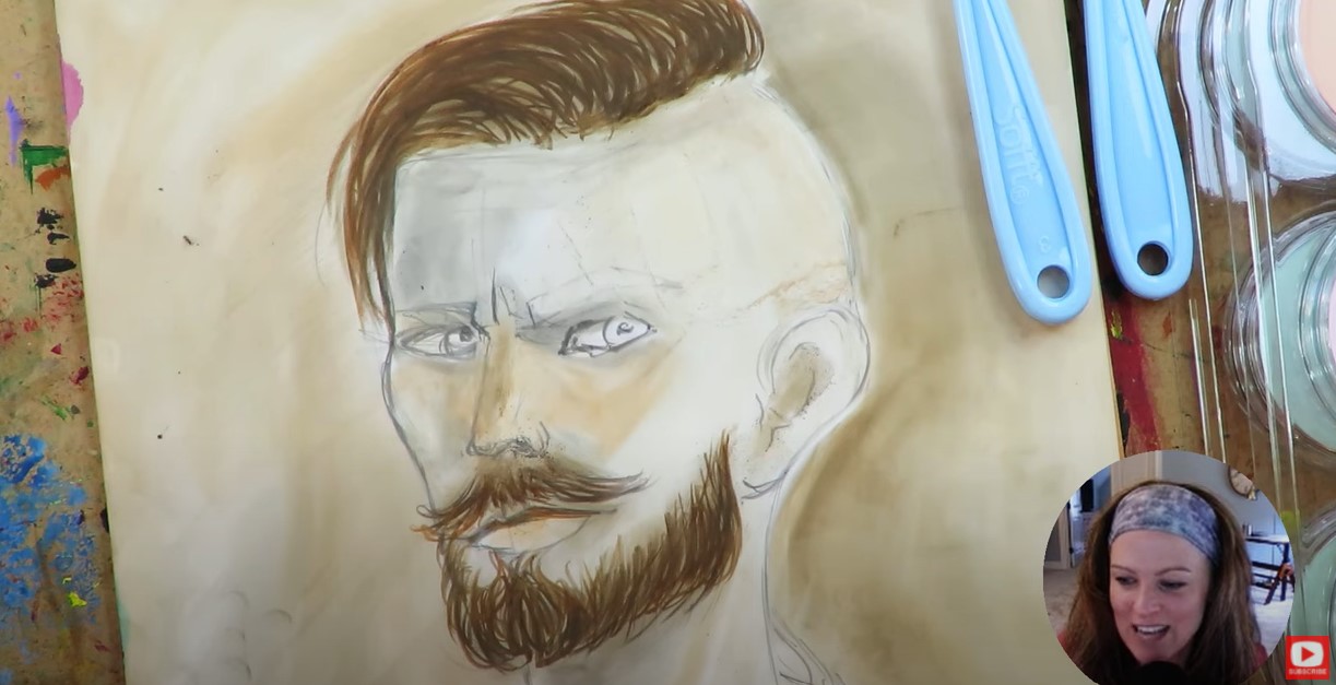
I experimented with trying combining my pan pastels and Prismacolor colored pencils, but wasn't patient enough to work with that for a long period of time. It was great for adding some detail in the beard (above), but I needed something bolder and faster to work with.
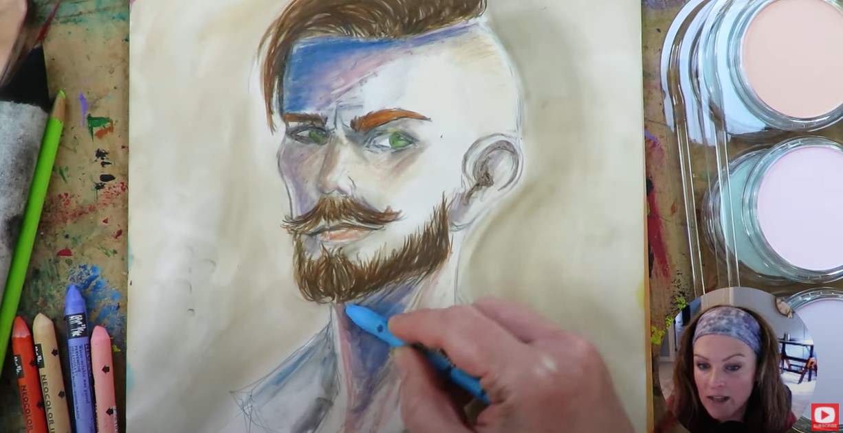
I discovered using my Neocolor IIs by Caran d'Ache really worked well and helped me to achieve the depth I was struggling to get out of the pan pastels alone.
I had heard pan pastels are eraseable, but they didn't erase well with my beloved vanish eraser. I also tried using the eraser on my Blackwing pencil, and had much better luck. I love chiseling highlights out of the face shading I do, so enjoyed playing with this fun pan pastels technique!
If you know me and my work at all, you know I'm a HUGE FAN of outlining. And you may know that as soon as I pull out my pentel pocket brush, the project is basically over! LOL. I hope you have fun with this demo, and enjoy working with pan pastels on your own as much as I did!
0 Comments
Today I'm trying 5 watercolor moon painting techniques out to see which ones create THE BEST lunar effects! Check out what happens when I test naturally granulating watercolor by Daniel Smith vs adding granulating medium. Plus- how does regular table salt compare with kosher salt watercolor painting? And- how does the texture of my favorite Fabriano watercolor paper change the effects when I paint on hot press vs cold press paper? Click over to today's video to find out!
Before we continue, super quick announcement: All product links are Affiliate. I may earn a small commission if you choose to order through these links but by law there is never any additional cost to the consumer for doing so. I thank you for your support.
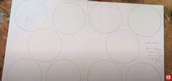
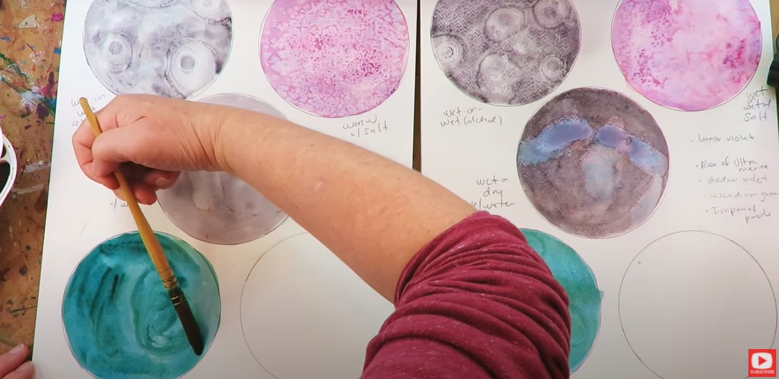
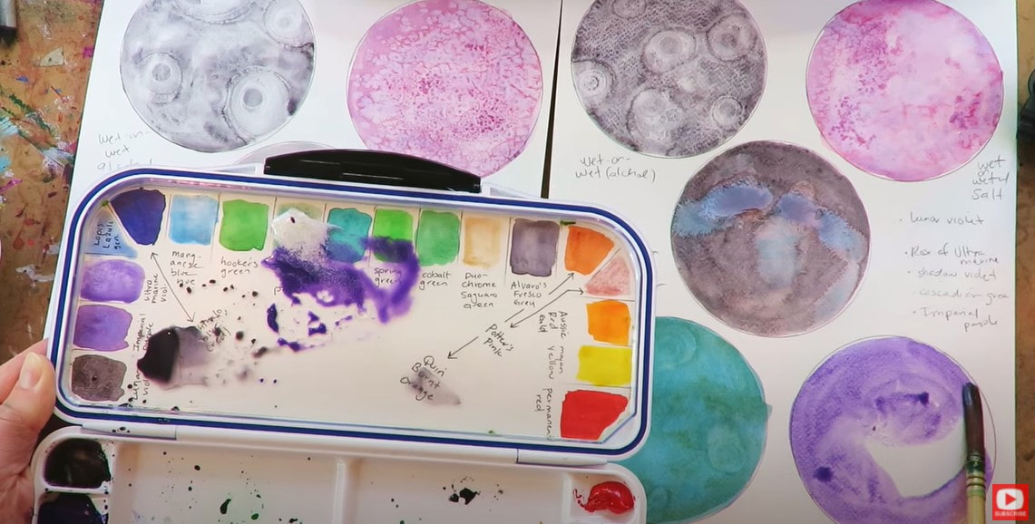
I've drawn 5 moon circles on each page of Fabriano watercolor paper. On the left, I've got 140# hot press (smooth) watercolor paper, and on the right- I have a sheet of 140# cold press (textured) watercolor paper.
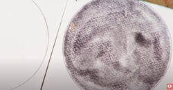
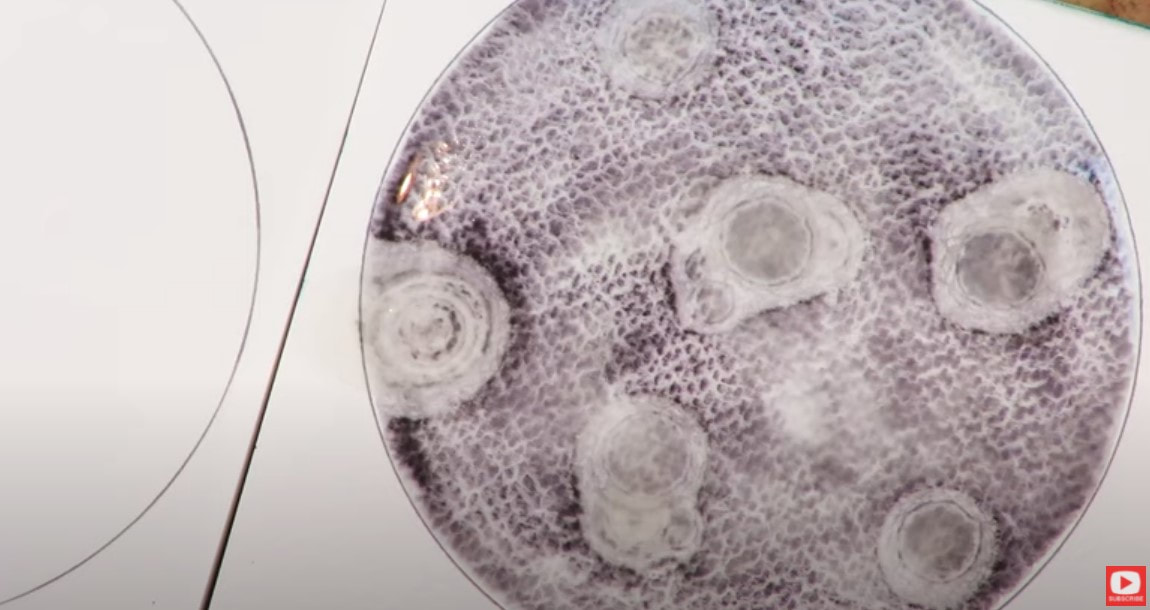
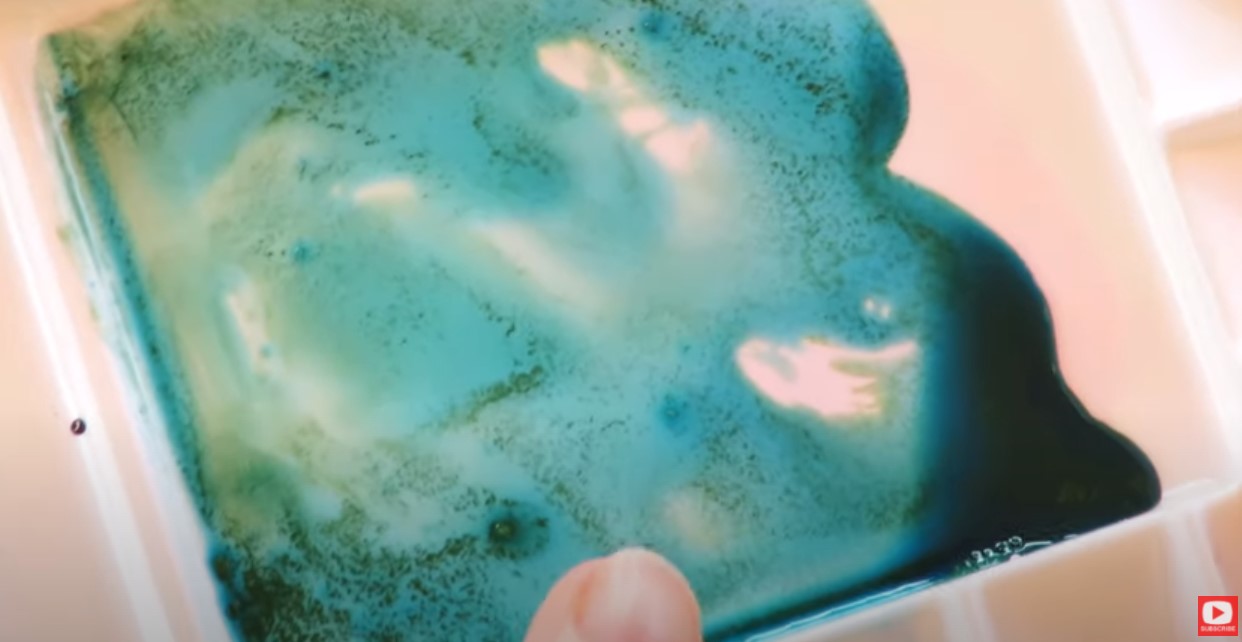
I love granulating watercolor (this means the color separates a bit and you can see tiny particles in it, like in the pic above). The first granulating shade I chose to work with is lunar violet by Daniel Smith.
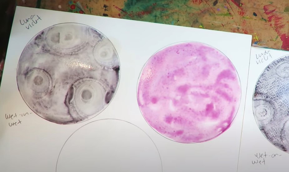
I coated this entire circle with plain water first, then applied the color.This technique is called wet on wet watercolor.
For fun I decided to add a few droplets of rubbing alcohol using a pipette to see if this would give me the look of moon craters. Above is how it looked on the textured, cold press watercolor paper.
As you can see, wherever the alcohol droplets were added, the watercolor dispersed. Click over to the video to see how the wet on wet watercolor technique looks on the hot press watercolor paper.
I tried the same alcohol watercolor technique to see how this looked on the hot press watercolor paper, and so far I'm loving how this looks.
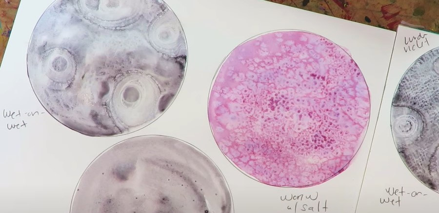
For the next "moon," I used the same wet on wet technique with rose of ultramarine by daniel smith. While it was still wet, I sprinkled some table salt over this one because salt watercolor painting can give you some gorgeous effects!
Isn't that beautiful?!
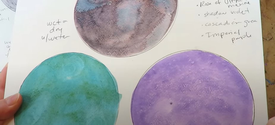
The next color I'm testing out is shadow violet. This time I used the wet on dry watercolor technique, and tried adding a few extra droplets of plain water to see what happened. At first I kinda hated how this looked- but after it dried, it started to look a bit more "planetary." For my fourth watercolor moon, I decided to use cascade green (also by Daniel Smith). I mixed this off to the side with about 50% granulating medium because I really want to see how this separates the colors of this gorgeous blue green.
I just love the way the colors immediately separate in my palette, but it doesn't transfer to the paper in the same way like I expected it to, so that's a little disappointing.
The final color I wanted to test out today is imperial purple (another granulating watercolor by Daniel Smith). It separates into pinks and purples and reminds me a lot of the effects I love getting from activating my elegant writer! It's so pretty (bottom right corner, below)!
For this one, I tried adding one more medium - an irridescent medium, and just becuase I love salt watercolor painting effects, tried sprinkling kosher salt on top.
Once dry, the irridescent medium doesn't do very much to create that shimmery look I was hoping for, so again - I'm feeling a little disappointed in this medium.
Today's test has definitely shown me that the mediums I tried aren't really worth it, and we're better off just getting a set of irridescent, metallic or granulating watercolors if these are effects we enjoy. Thanks for hanging out with me today! Make sure you click over to the video to see each technique in action and decide which one YOU like best!
The Tombow mono zero eraser is an ESSENTIAL drawing supply in my studio. If you've never used it before - the mono eraser is built like a mechanical pencil, but filled with a long, skinny eraser instead of graphite.
In today's drawing supply demo, I'll show you why the Tombow mono eraser is a MUST HAVE in my studio + the QUICK & EASY ways I use it to add dimension when I'm shading faces in graphite. If you're just learning how to draw faces, or curious about what the mono zero eraser can do for you - today's video is a MUST SEE!!
Before we continue, super quick announcement: All product links are Affiliate. I may earn a small commission if you choose to order through these links but by law there is never any additional cost to the consumer for doing so. I thank you for your support.
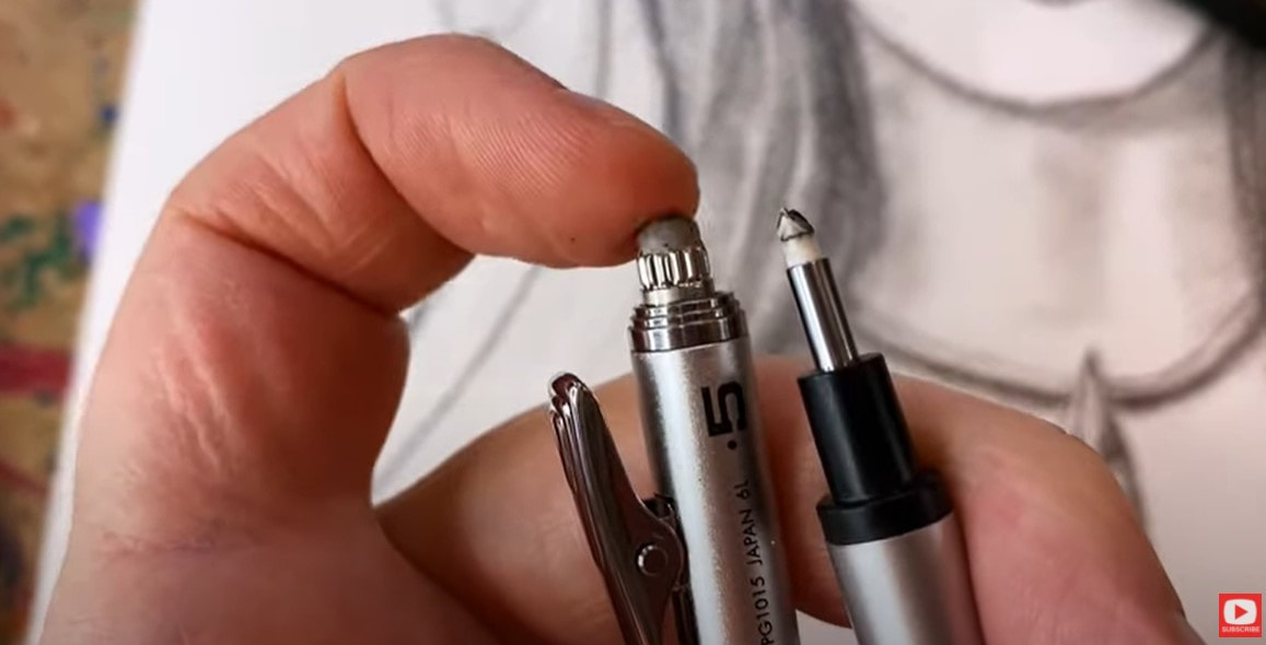
The mono eraser is one of my MOST FAVORITE drawing tools on the planet! As you can see, the mono eraser (right) is WAY smaller (less than half the size!) of the eraser on my pentel mechanical pencil.
The mono's tiny eraser nib enables me to chisel highlights into my drawings after I've already done some shading.
I've nearly finished a Fairy Witch graphite drawing project for The Celtic Collective, and just need to add in some highlights. I thought you might like to watch how I do this using the mono eraser. Interested in learning MORE about the Celtic Collective? Add your name to the waitlist here to be notified the next time we're open for enrollment!
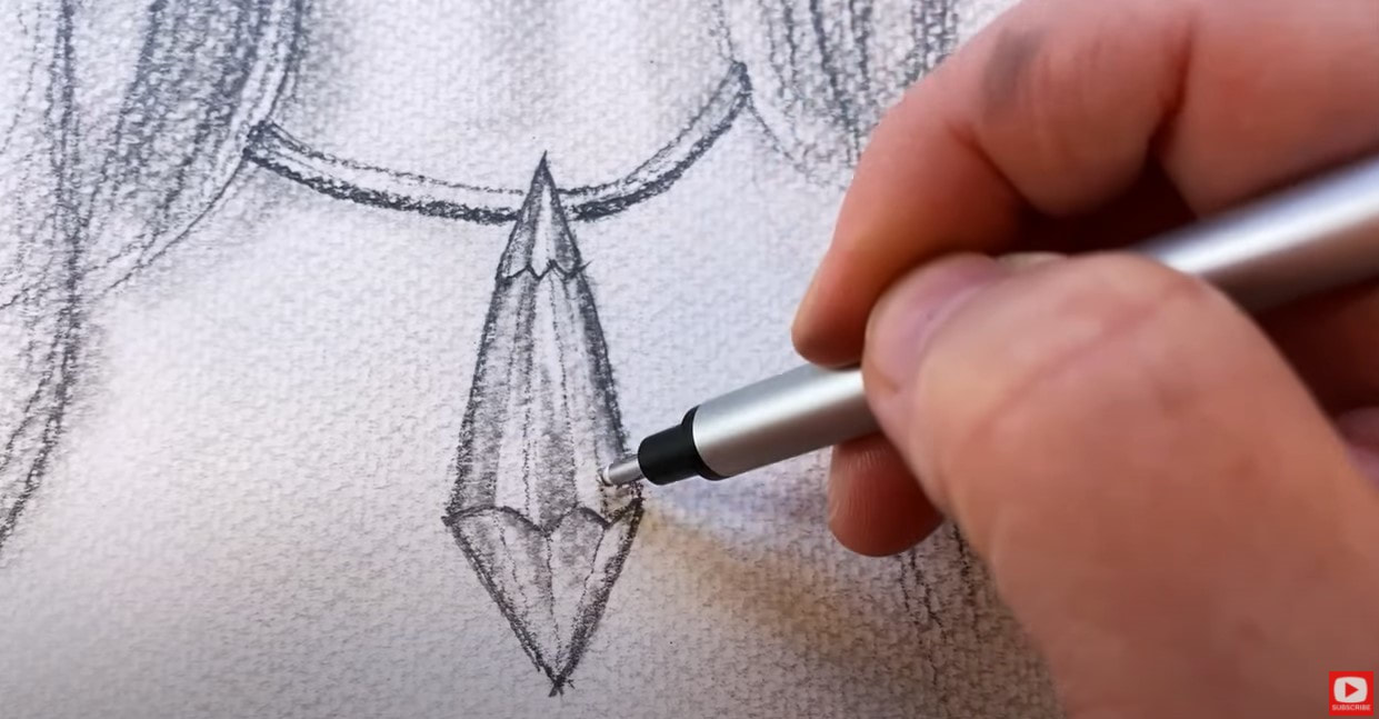
The crystal necklace around this girl's neck is definitely an area where I need to add some thin reflections. I use my mono eraser in a similar way to my drawing pencils and tend to just "draw in" highlights wherever I want them to go.
It's literally like sculpting - I carve the highlights OUT of previously shaded sections to remove some of the graphite and add dimension by revealing newly "drawn" white highlights.
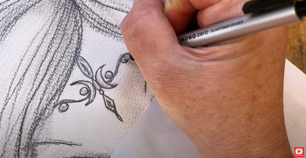
Another way I like to use the mono eraser is for cleaning up my edges. In the photo above, I ran the tiny eraser nib along the darker outlines of this piece of jewelry to remove sketchy lines, smudges, etc.
I LOVE adding drama to the center of the upper eyelids when I'm shading faces. My Tombow mono zero eraser is perfect for blending out highlights here to help the eye look more bulbous and realistic.
Do you love drawing and shading faces too? Or maybe you're just learning how to draw faces? You NEED my FREE whimsical face drawing guidelines. They're super easy to follow, and will help you draw proportional facial features every time. Simply click the button below to request your free guidelines cheatsheet, and I'll email it right over!
If you're just getting starting with learning how to draw faces, I've got a quick playlist of face drawing tutorials for you to practice with, that is perfect for beginners! It's FREE on YouTube, and is the perfect way for you to start playing with the whimsical face drawing guidelines.
If you know me and my work at all, you KNOW I'm not a huge fan of detail work. LOL! But the Tombow mono zero eraser has helped me add another layer of dimension to my work and I kinda love doing it!!
Whenever I'm drawing hairstyles in pencil, I also love using my mono zero eraser to create the illusion of individual strands of hair within my drawing. CLICK OVER to the video to see this technique in action.
Thanks for hanging out with me today! ❤️ CHECK OUT ALL my art books on AMAZON ❤️ MY FAVORITE ART SUPPLIES on AMAZON ❤️ MY BELOVED FACEBOOK GROUP ❤️ FOLLOW ME ON INSTAGRAM |
Karen CampbellFounder of Awesome Art School. Mixed Media Artist. Author of 19 Instructional Art Books! Whose work has appeared in...Archives
July 2024
Categories
All
|
|
"Karen is flipping hilarious and she's very real...I like the way she teaches in a way that really gives you confidence, whether you're a beginner or advanced there's always something new to learn!"
- Elizabeth W. |
What Fans Are SayingKaren, you are absolutely fabulous! You make me feel like I can draw anything. I have recently retired and finally have the time to do some of the art that I have loved since I was in school. I am really at the beginning of my art journey and I hope to learn as much as I can. Thank you for all you do. |
Contact ME |


 RSS Feed
