
|
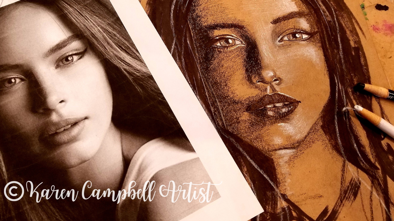
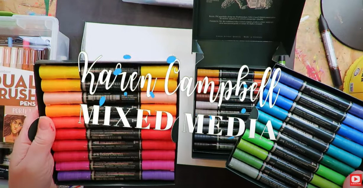
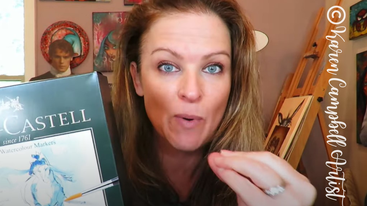
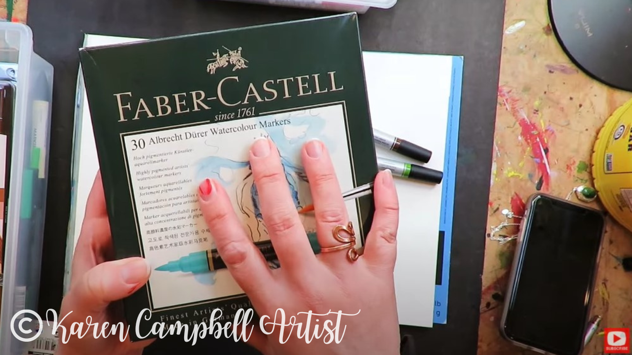
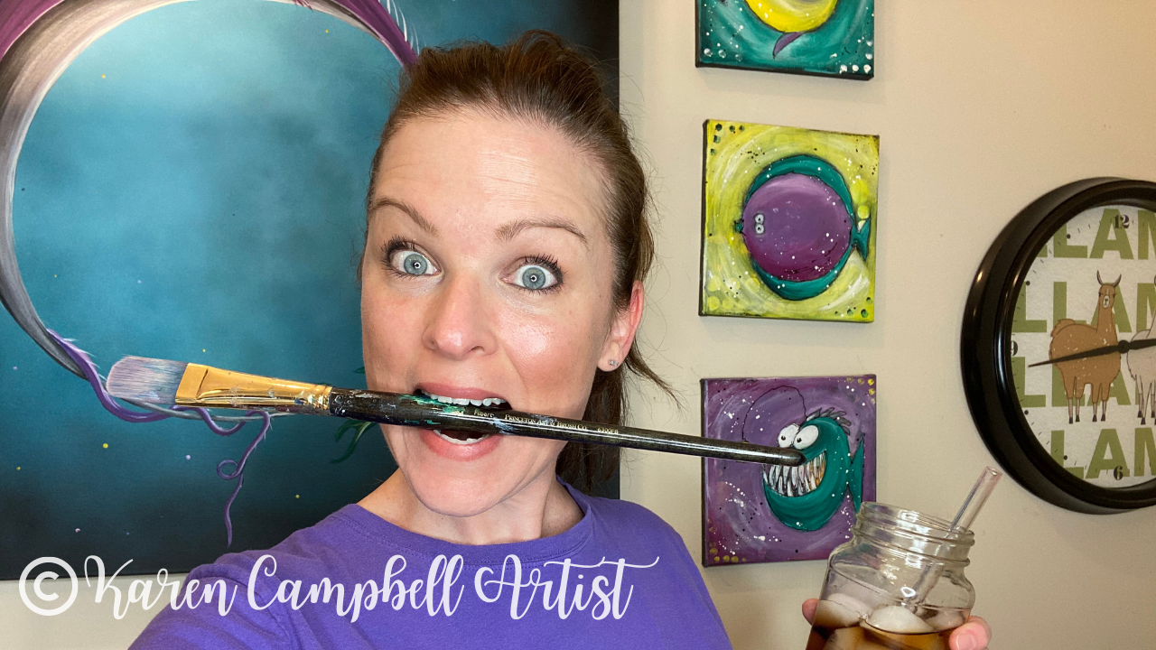
I am super excited about today’s video on my Mixed Media YouTube channel. If you’ve been following me for a while, you KNOW how much I adore my Pitt Pens by Faber-Castell, and am OBSESSED with their new dual tip re-design (watch that review here). Pitt pens have been my go-to for creating whimsical girl art on canvases and in my art journals for YEARS.
Their only downfall? PRICE. A set of 30 gorgeous Faber Castell Pitt Artist Pen Dual Markers will set ya back about $180. I KNOW.... I've never found an alternative until today. Join me on YouTube to see if Staetdler Pigment Arts Pens can be trusted to deliver dramatic results in YOUR Hamburger System projects!! 
*All product links are affiliate & for U.S. residents only.*
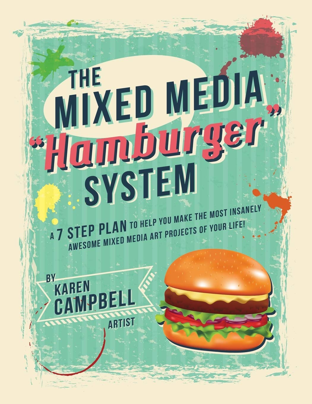
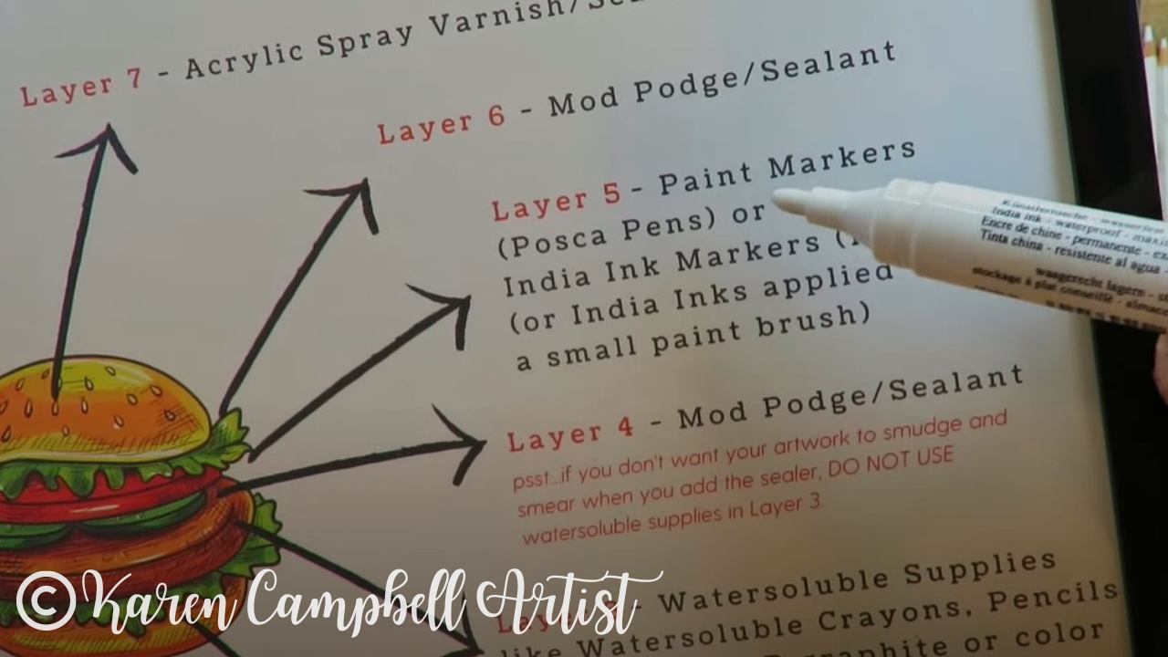
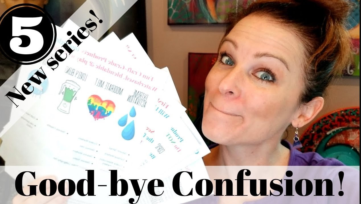
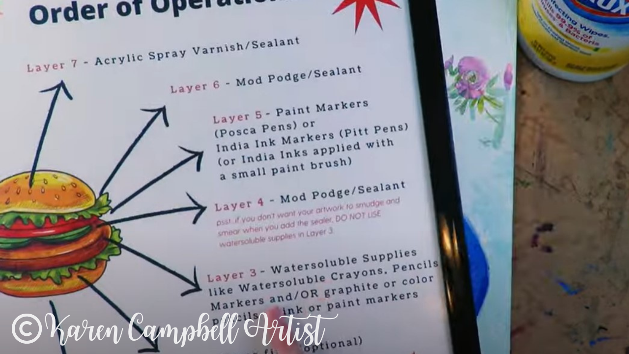
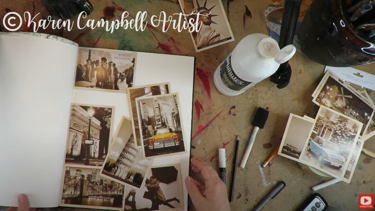
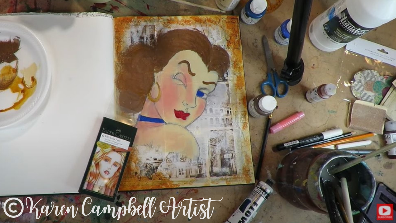
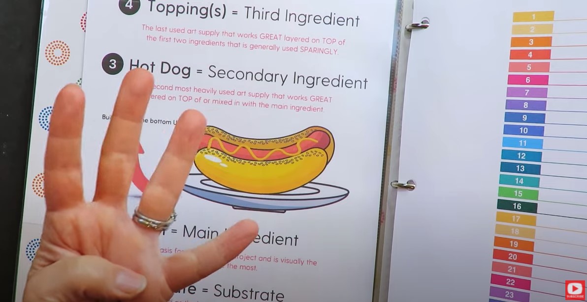
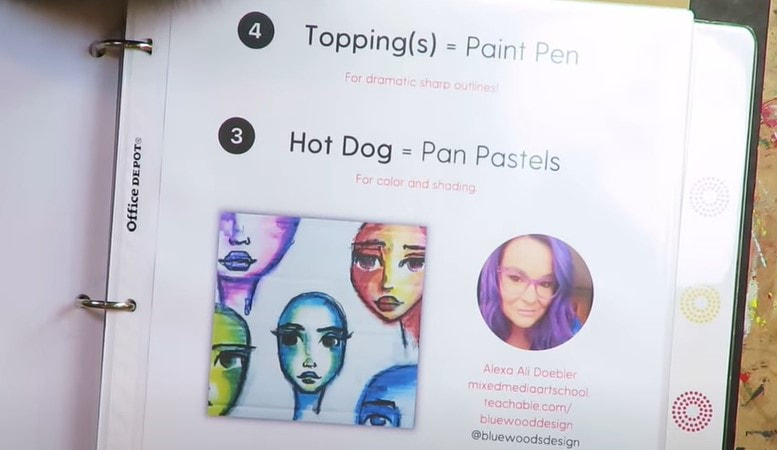
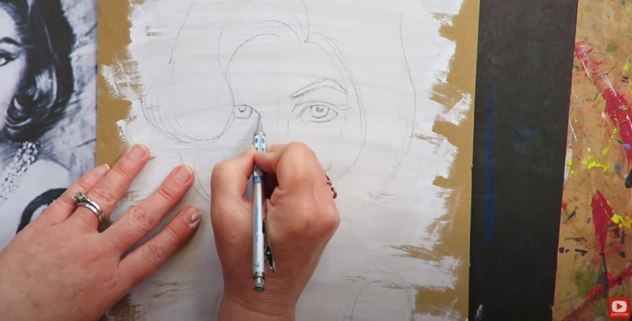
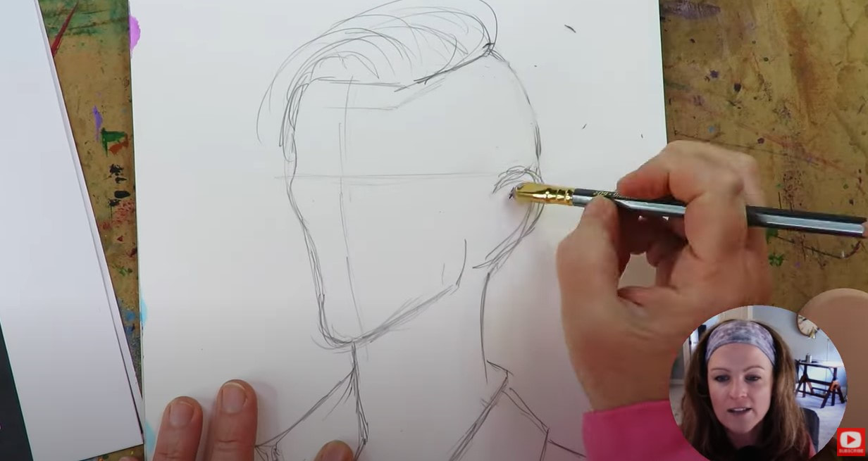
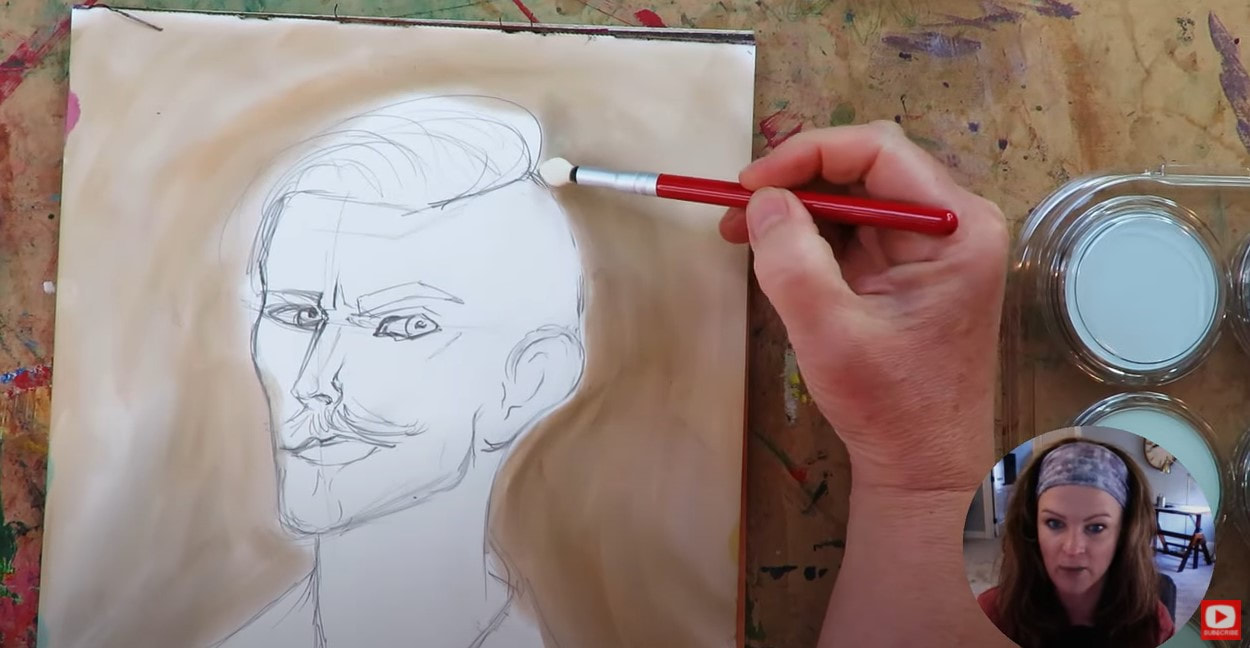
Not sure what the Hamburger System is? It's my tried-and-true mixed media layering process for achieving stellar results EVERY TIME I sit down to create whimsical girl art at my art table :)
CLICK HERE to grab a copy of my cheatsheet for your own art table!! 
When you're ready, check out this playlist to learn about each layer of the Hamburger System, and if you prefer, grab a copy of the full-color book on Amazon. It's such a helpful resource!!

Now back to today's video.
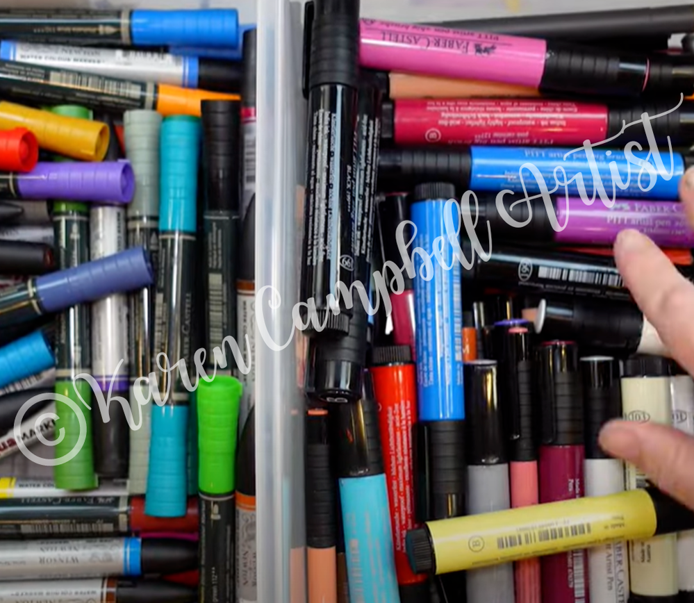
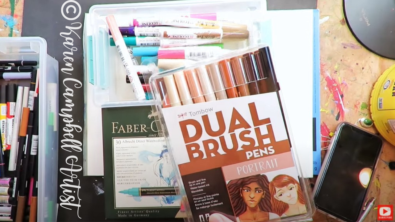
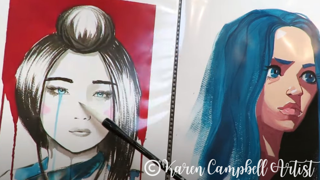
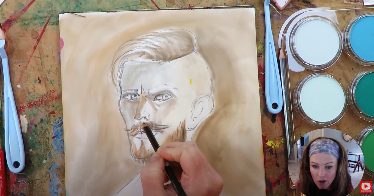
For years, Pitt Pens have been the only color PERMANENT pigment marker I could rely on. Today, we're diving into Staedtler Pigment Arts Brush Pens. I'll be unboxing and comparing them to my beloved Pitt Pens, focusing on price, quality, and usability. My big question is can pigment arts pens deliver STELLAR results in Hamburger System projects AND save my students money? 
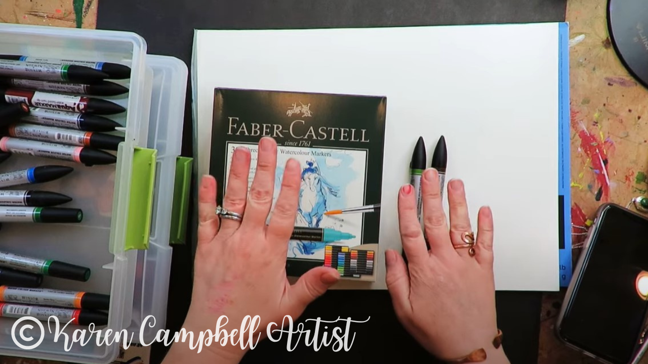
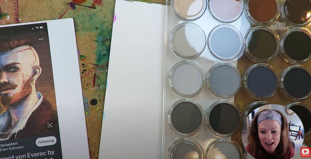
Right from the start, I know the pigment arts pens will save ya money. A set of 36 is available on Amazon for just over $50.
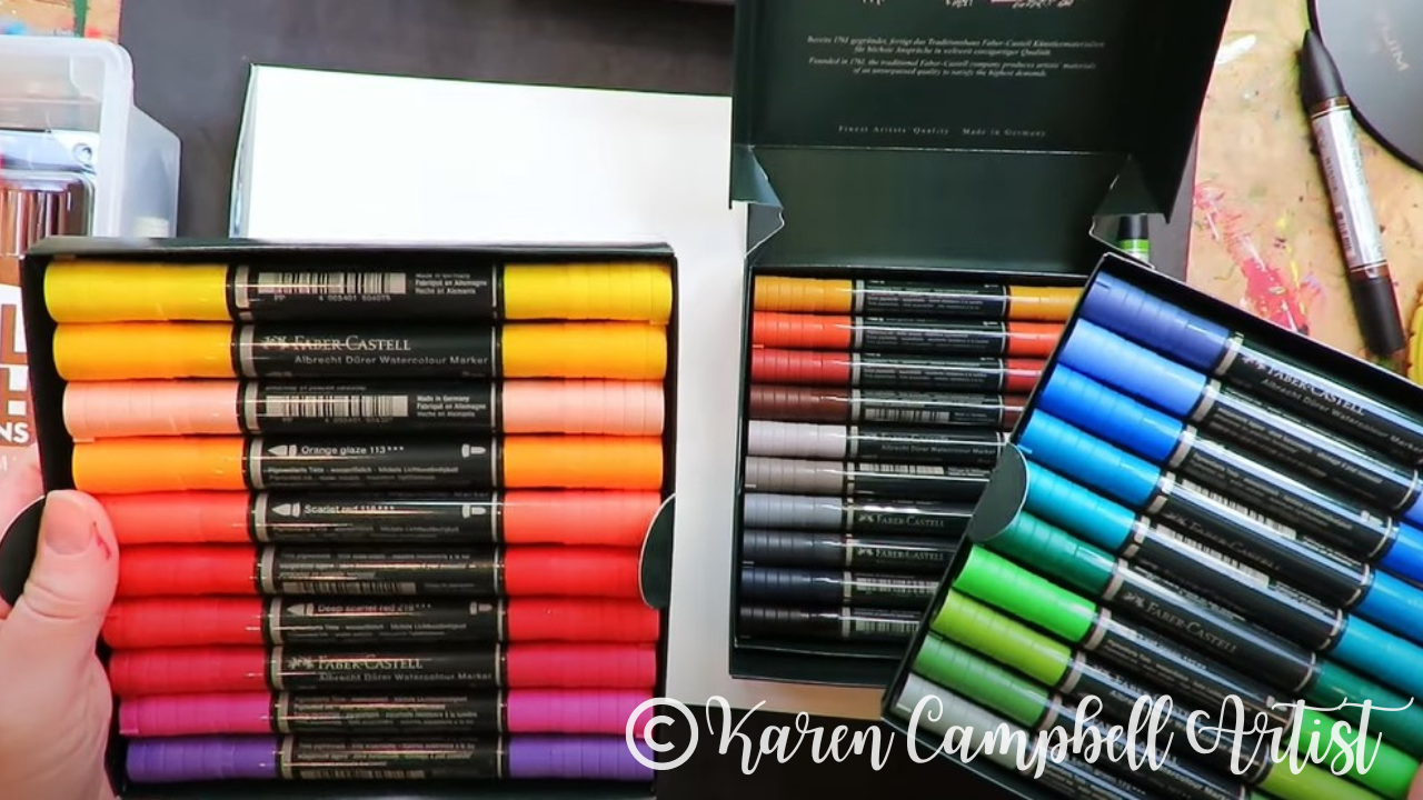
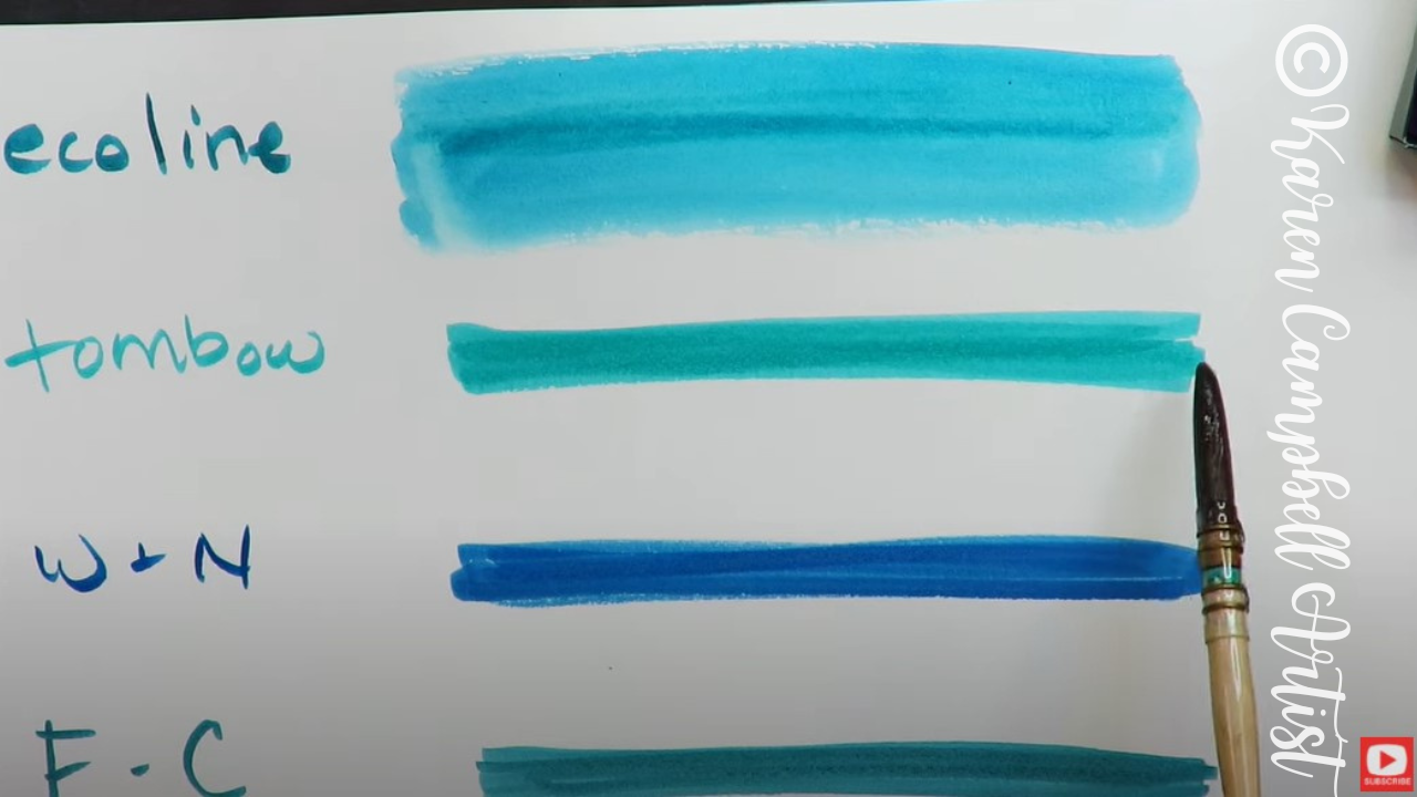
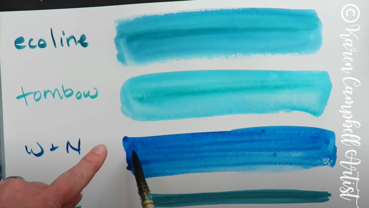
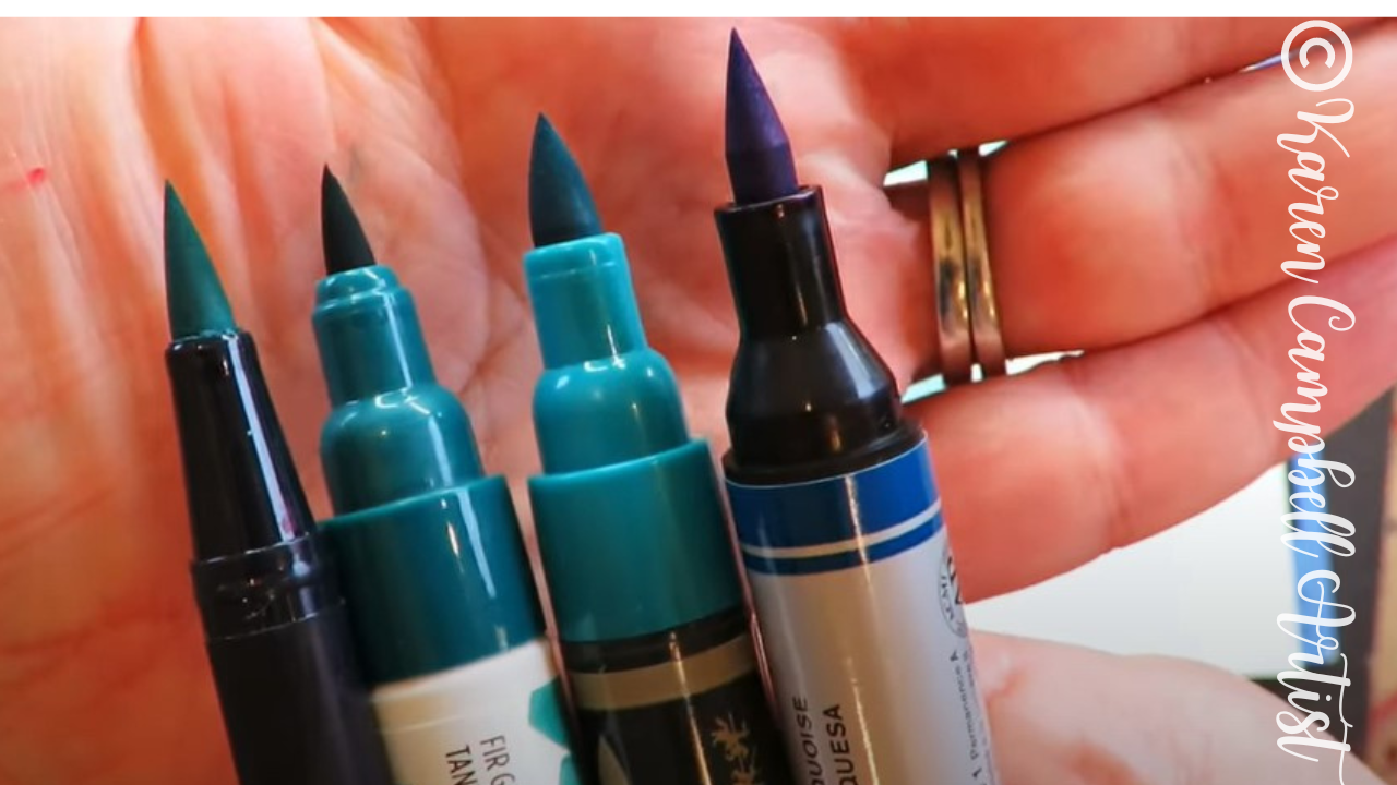
When comparing a pigment arts pens with one of my "skinny" barel (single nib) Pitt Pens side by side, they look pretty similar in terms of barrel and nib sizes (Pitt pen shown on the bottom). 
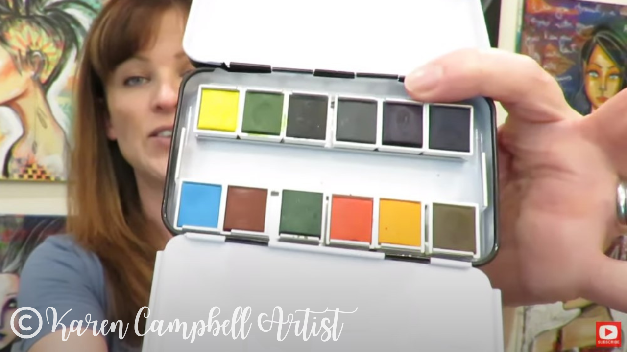
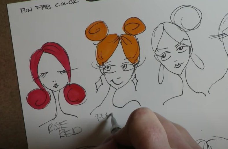
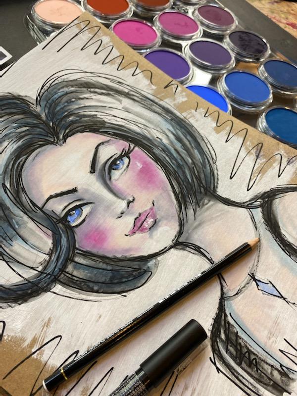
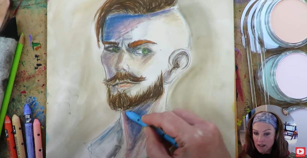
Staedtler offers a great variety of colors in their set of 36, especially in the pink family – a huge plus for me as a mixed media artist focused on whimsical girl art!
If we compare the pigment arts pens set of 36 with the dual tip Pitt Pens set of 30, you actually get MORE shades of pinks, greens, and blues (my favorite colors!) from Staedtler. BONUS!! 
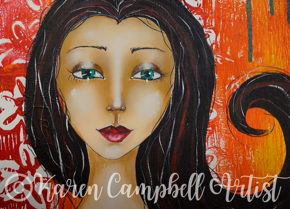
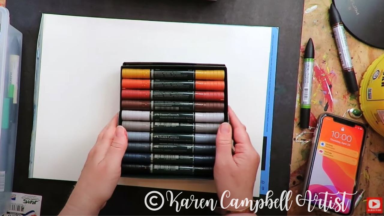
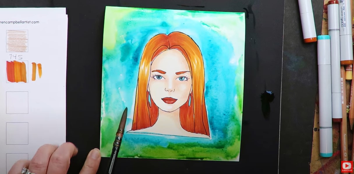
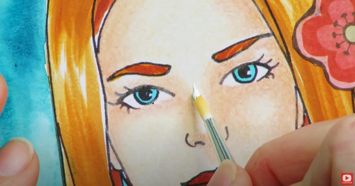
As someone who loves creating whimsical faces, I did find the variety of skin tone markers in the Staedtler pack a bit lacking:(
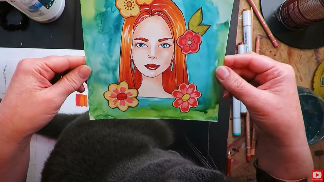
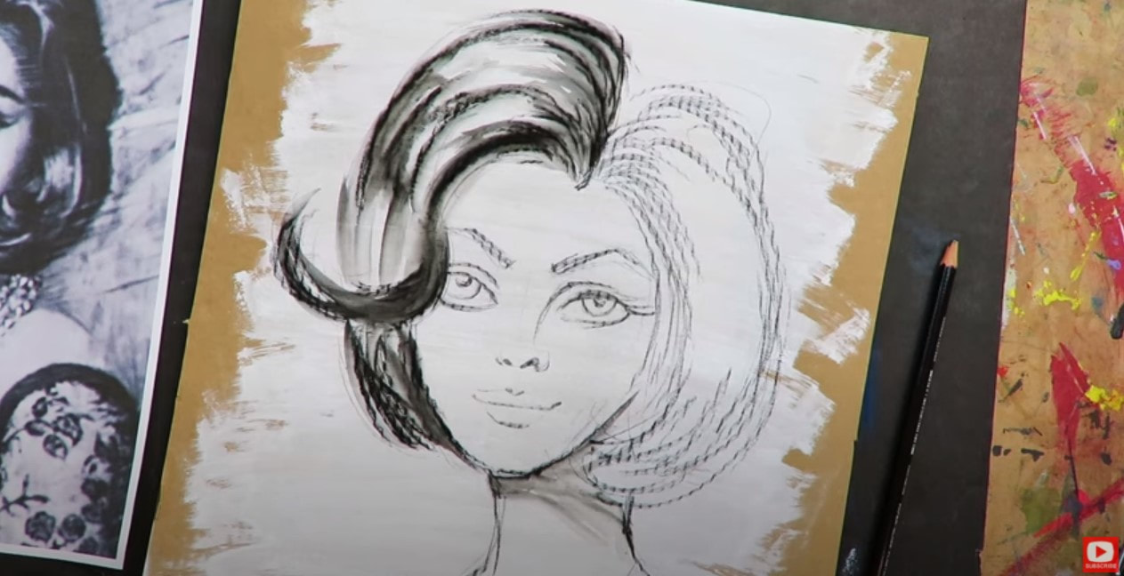
It looks like I can make about four of them work for my signature “Hamburger System” style projects. But we'll have to see how they perform and what the ink actually looks like over mod podge. 
When I first started working with the Staedtlers, the nibs felt a bit small for me because I love to work big. However, I know many of my students PREFER working on a smaller scale, so they might just love pigment arts brush pens– especially considering a price point of $53 for a set of 36 colors (compared to $180 for 30 dual tip pitt pens, or $207 for a set of 60 single nib pitt pens).

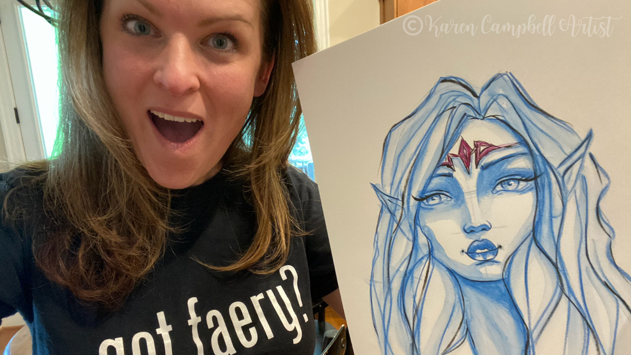
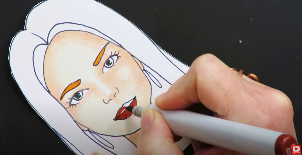
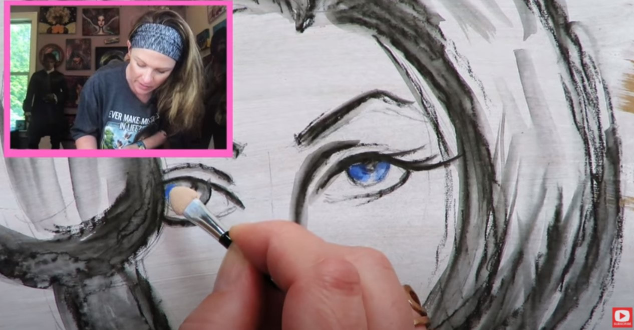
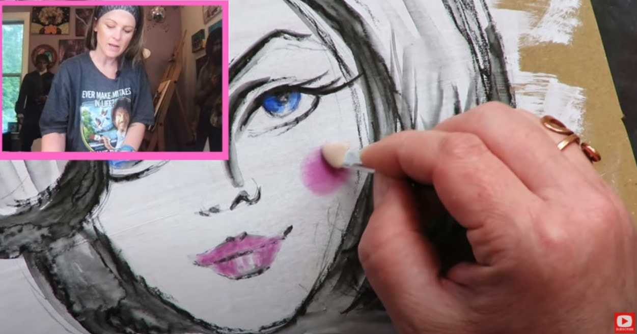
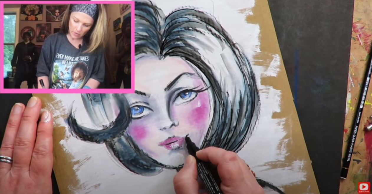
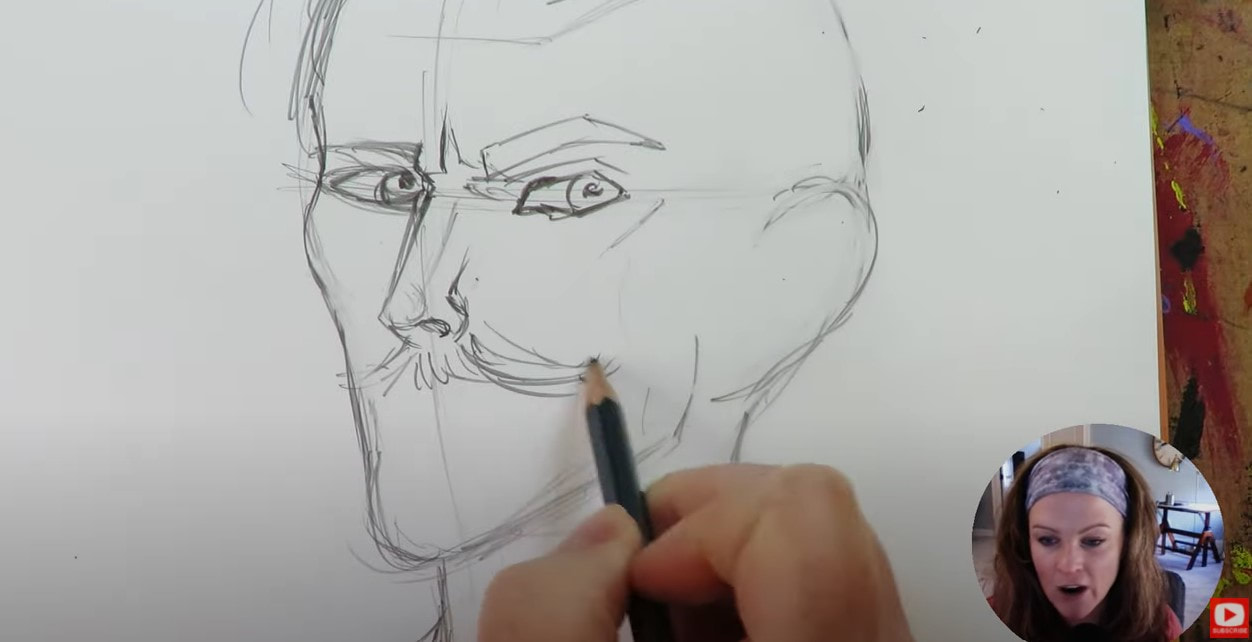
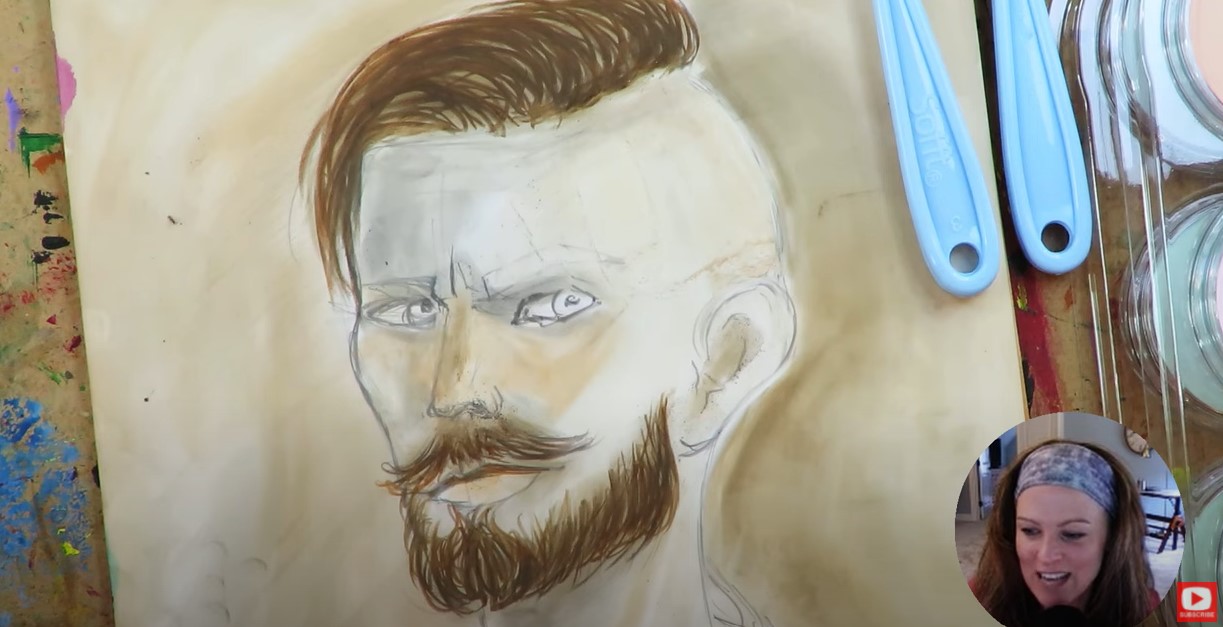
Initially, I felt there weren't enough skin tone markers in the Staedtler set, but after working with them on a light-skinned acrylic painting of a whimsical face, I LOVE how the pale tan and pink markers added subtle, yet gorgeous shading to my painting.

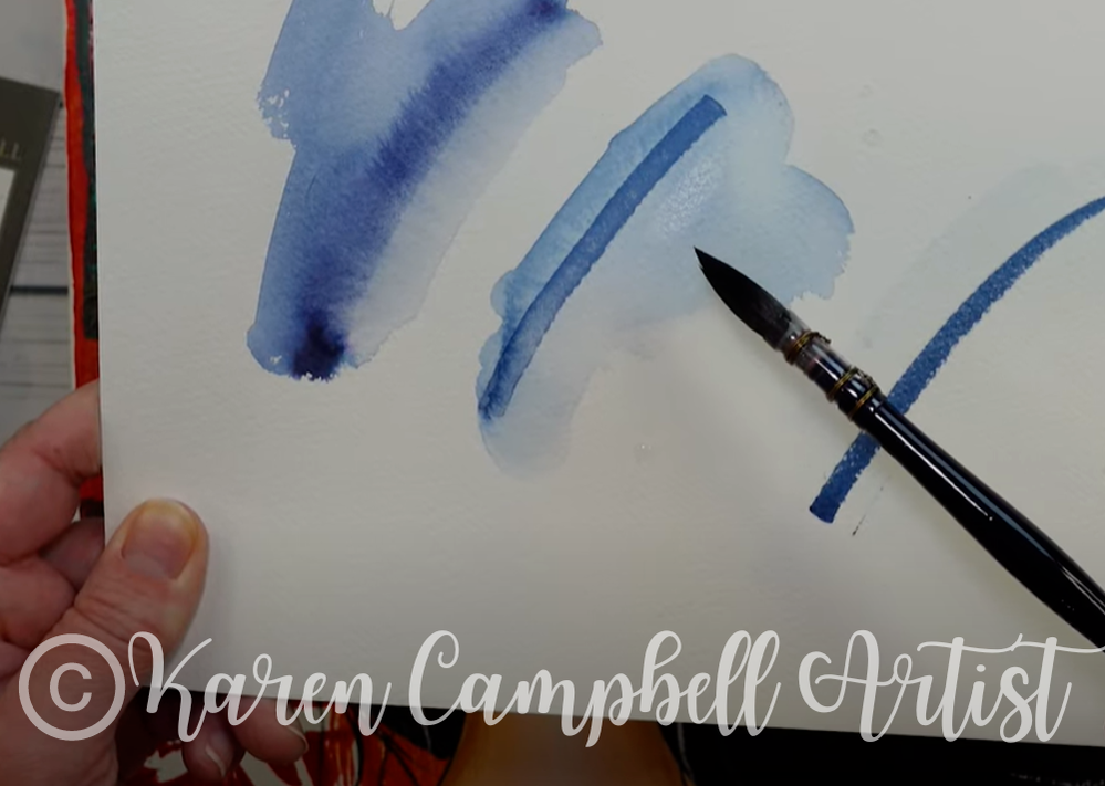
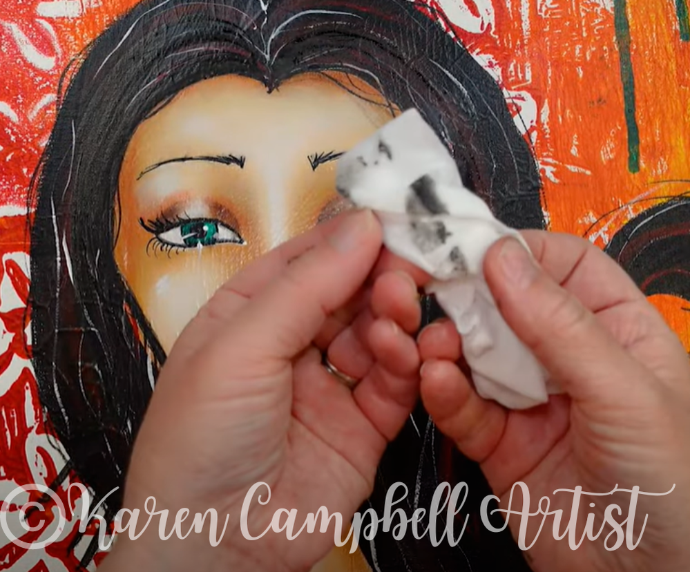
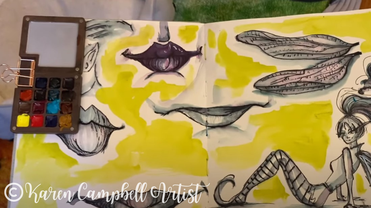
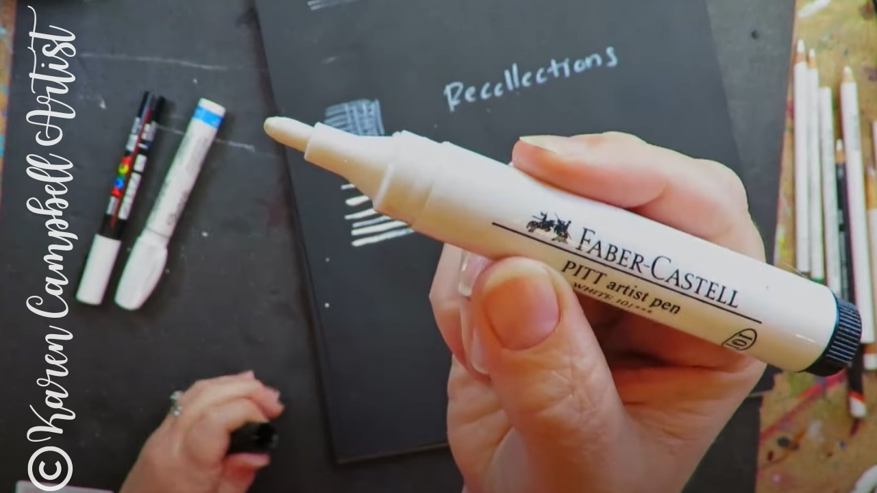
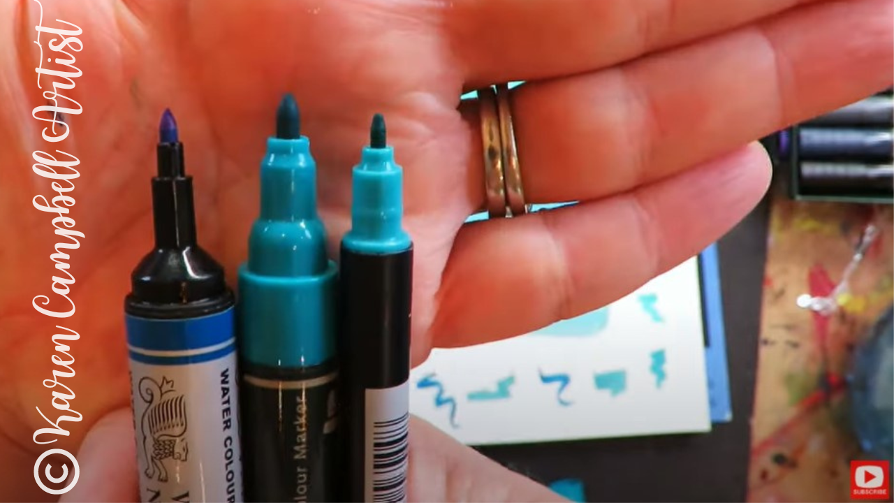
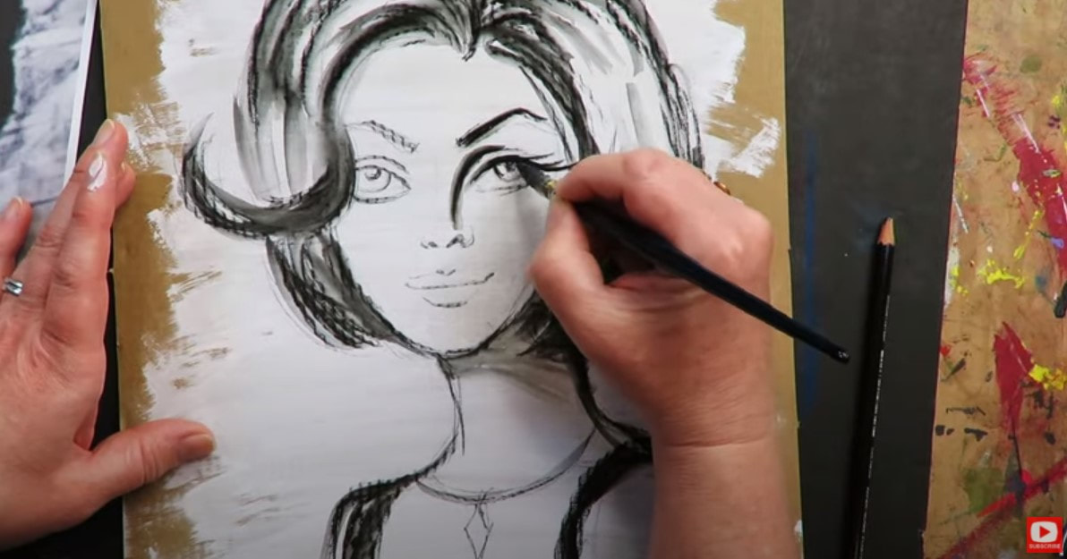
All the colors I tested ranged somewhere between transparent and opaque, which is perfect for blending and how I typically use pitt pens in Hamburger System projects. One interesting omission from the Staedtler competition is a white marker. However, I absolutely loved their black pigment arts pen! The nib was PERFECT for adding delicate outlines, eyelashes, and eyeliner to my girl's face. 
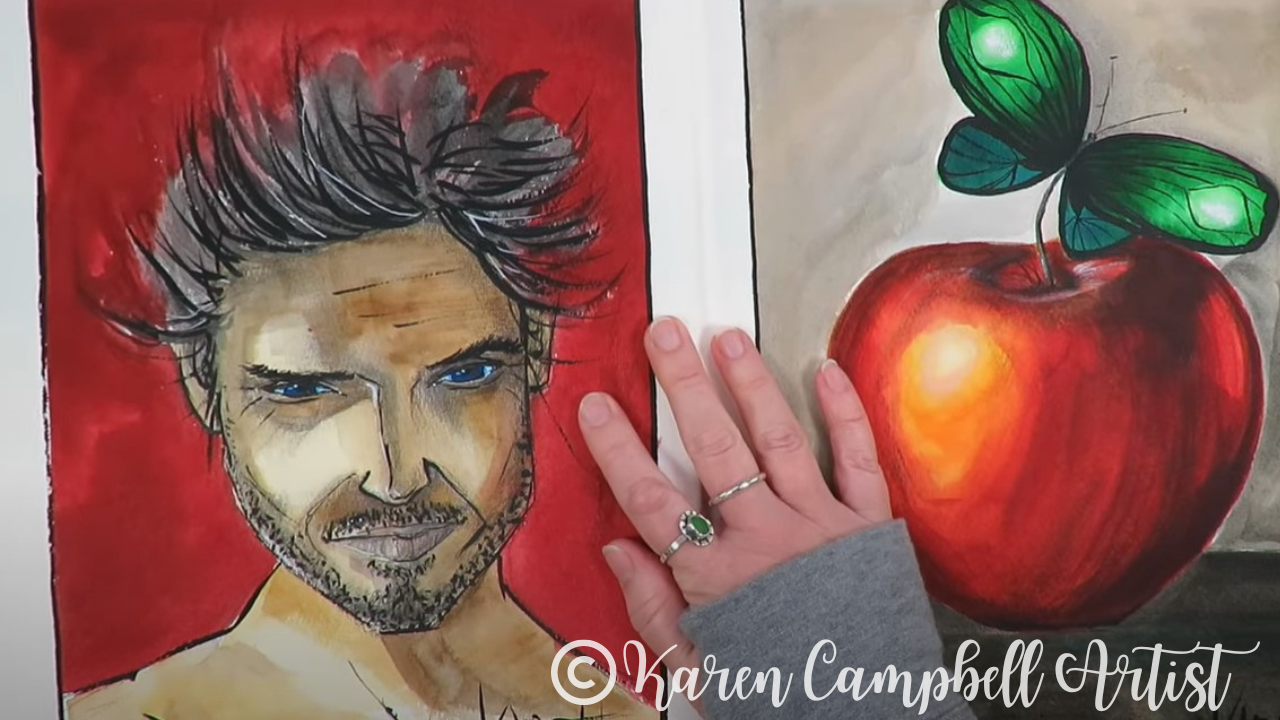
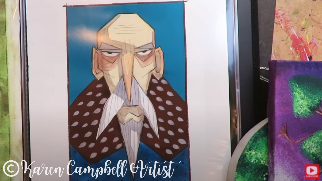
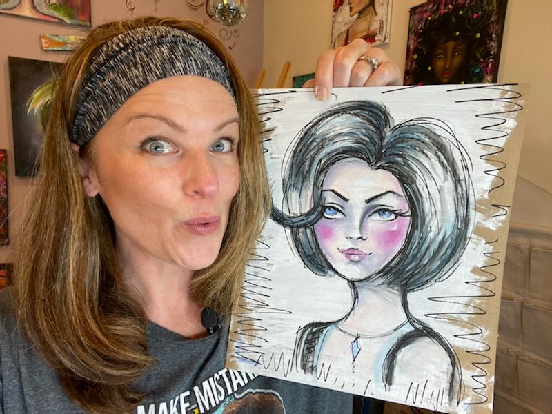
Wanna Create Whimsical Girl Art Like the Canvas
|
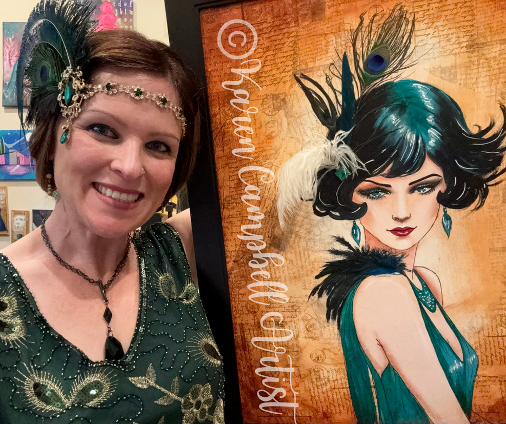
Karen CampbellFounder of Awesome Art School. Mixed Media Artist. Author of 19 Instructional Art Books! 
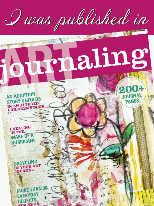
Whose work has appeared in...
 Archives
July 2024
Categories
All
|


 RSS Feed

"Karen is flipping hilarious and she's very real...I like the way she teaches in a way that really gives you confidence, whether you're a beginner or advanced there's always something new to learn!"
- Elizabeth W. |
What Fans Are SayingKaren, you are absolutely fabulous! You make me feel like I can draw anything. I have recently retired and finally have the time to do some of the art that I have loved since I was in school. I am really at the beginning of my art journey and I hope to learn as much as I can. Thank you for all you do. |
Contact ME |