FUN & EASY Mixed Media Project for Beginners with Derwent Graphitint Watercolor OVER Pencil20/9/2022
Today's mixed media project is PERFECT for mixed media beginners, watercolor beginners, and anyone curious about the Derwent Graphitint Paint Pan Pocket Set.
Adding watercolor over pencil drawings is a super FUN and EASY technique that can really make your drawings look more sophisticated. Grab your watercolors and your fairy drawing to create along with me as I lead you step-by-step through simple face shading, creating magical hair, and an easy background in watercolor!
WANT 30 FUN Mixed Media Project Ideas with SIMPLE, tried, and true art supply combos like Watercolor over Pencil? Click the button below to download my FREE Hot Dog Packet!
Each mixed media idea in The Hot Dog Packet reads like a recipe with ONLY 4 art supplies, so it's perfect for mixed media beginners! Click the button above, and I'll send it straight to your email.
Before we continue, super quick announcement: All product links are Affiliate. I may earn a small commission if you choose to order through these links but by law there is never any additional cost to the consumer for doing so. I thank you for your support.
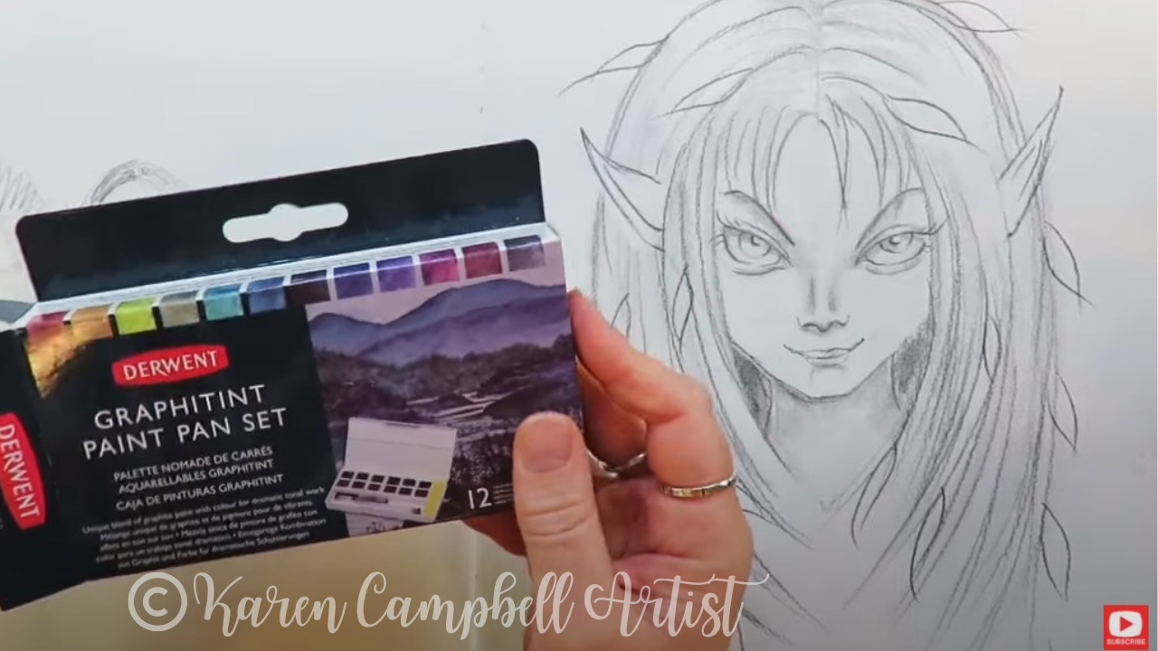
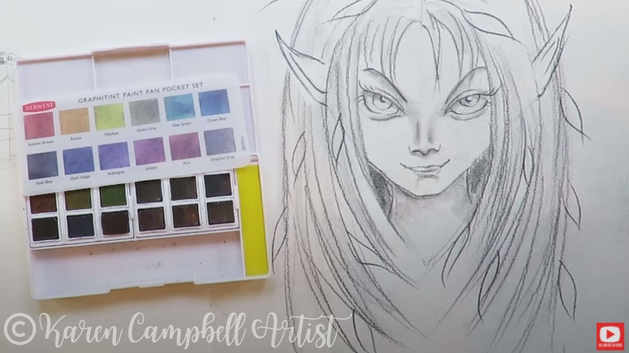
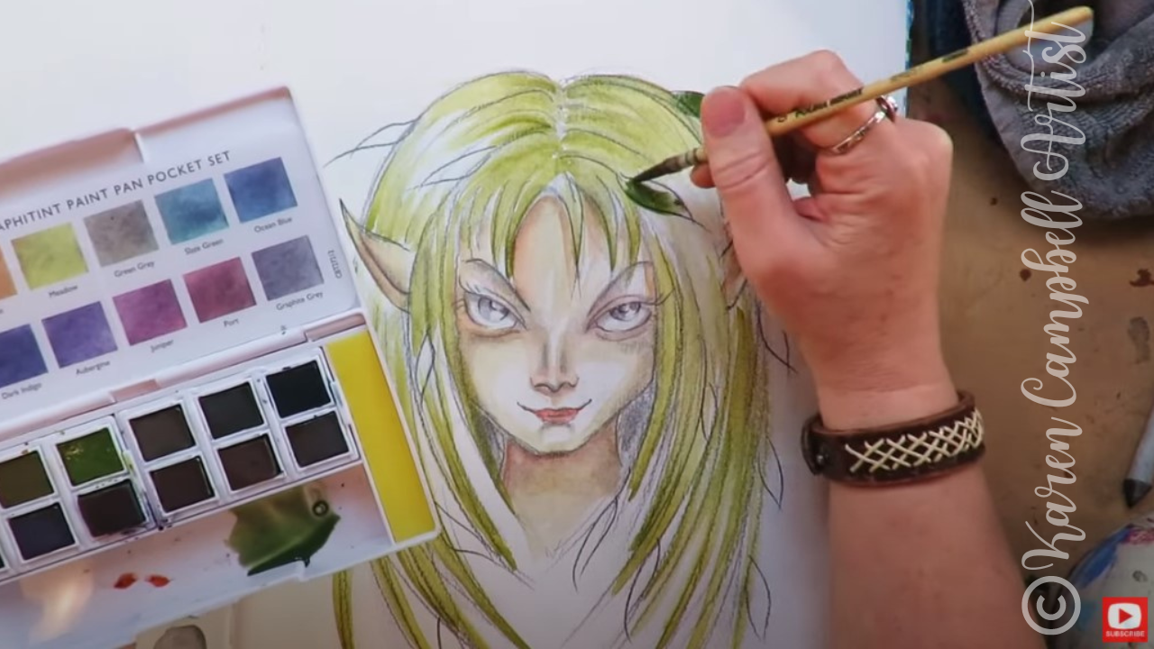
Use whatever watercolor set you have on hand to paint along with me. Today I'm trying a new set - Derwent's Graphitint Paint Pan Pocket Set.
If you've never heard of Graphitint before, it's a "unique blend of graphite paint with color for dramatic tonal work," according to the package. To me- this set feels like muted nature tones, which is perfect for today's mixed media project.
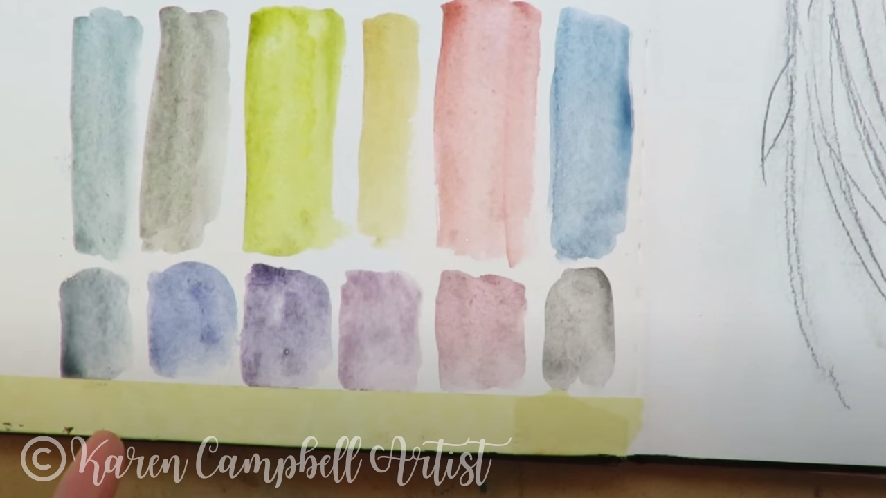
As soon as I start to swatch these watercolors, they remind me of my granulating watercolors by Daniel Smith. They also look kinda dirty, which isn't a bad thing - you can just tell they have gray graphite in there for sure.
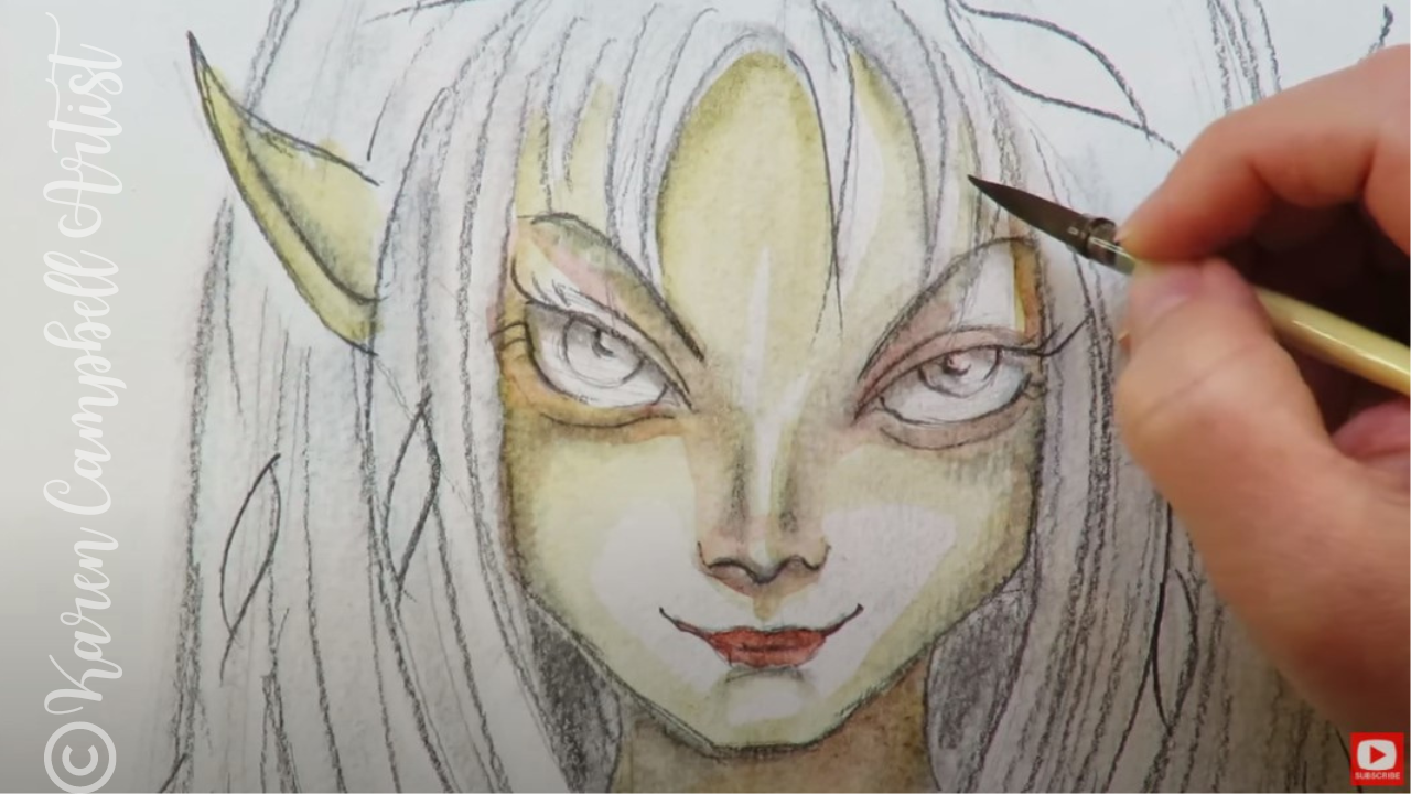
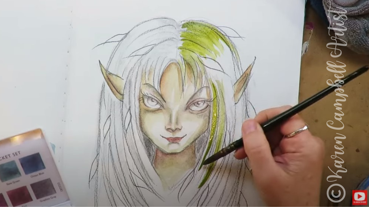
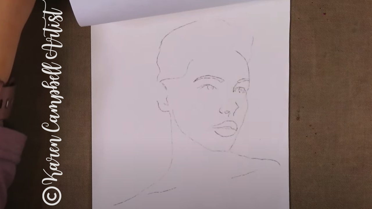
There isn't a skin tone in this set, but I feel like the shade called Russet will work. Watch as I add a light wash of this onto my fairy face drawing. (Wanna draw this fairy? Watch this first.)
I'm using my Polina Bright watercolor brushes (get 10% off Polina's watercolor brushes here) for this project. They're the only thing I use now! Find out why here.
Next I added a little Autumn Brown to accentuate the nose and creases of the eyes to add dimension. I love this technique of adding watercolor to an already shaded drawing. It's got this messy, grungey feel.
It's so freeing because you don't have to be "precious" about your work - just get in there, drop a light wash where you want some color, and call it a day.
I switched to a larger Polina Bright watercolor brush to do the hair in meadow green. If you struggle with how to paint hair (or draw it), I add color from root to tip, leave some white space, and add more color from tip to root.
Make sure you click over to the video to see this in action. It's such a cool effect, and SO easy to do - even if you're a beginner.
If you've been following me for a while, you know I HATE to mix watercolors. I know - it's ridiculous. I'm the only professional artist who won't do this. LOL.
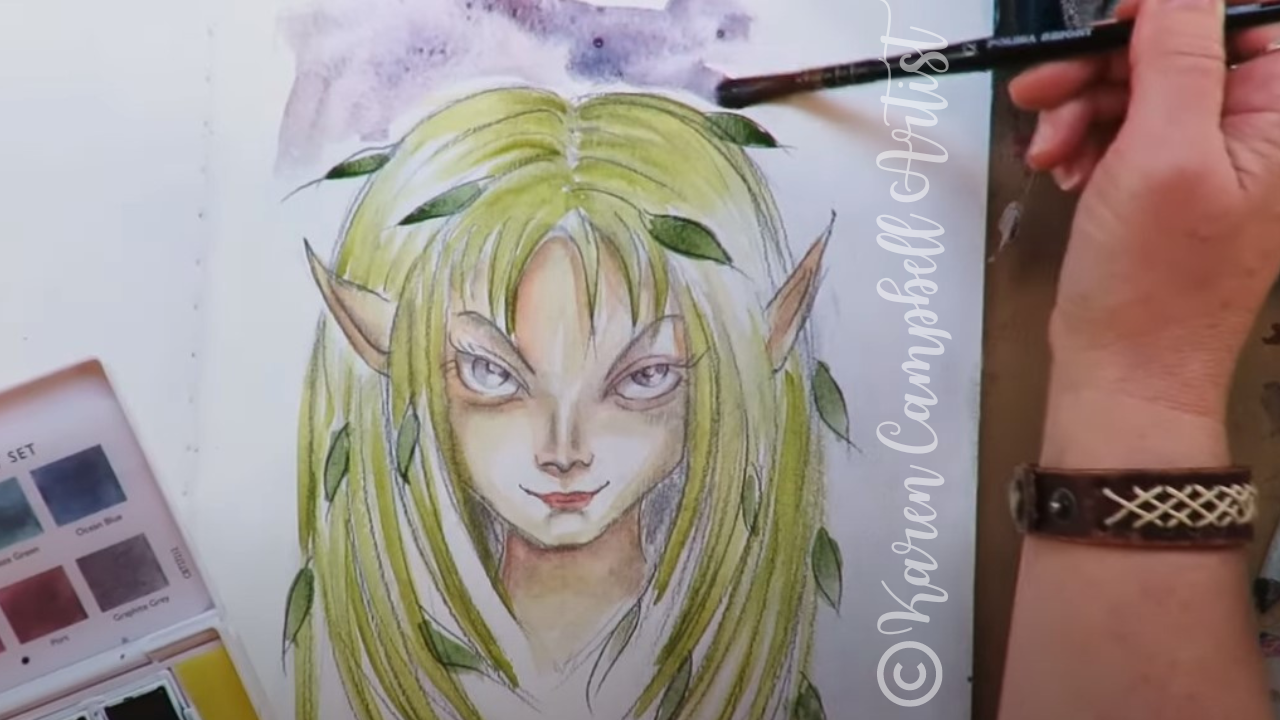
I'm just lazy like that - I love to work straight from the pan, tube or whatever. It's faster and there's no guesswork about what color I'm gonna get! I feel like this Derwent set could've used a nice dark forest green. Since it doesn't have one, I went out of my way (LOL) to mix one for the leaves in my fairy's hair.
I'm kinda loving my new Derwent Graphitint Paint Pan Set! It's perfect for doing projects like this - just adding some color to a graphite drawing.
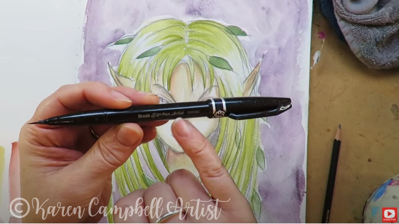
If you've been following me for a while or are a student in one of my art clubs, you know I'm obsessed with my pentel pocket brush for drawing eyelashes and outlining. I know many of my students are intimidated by it because it can be unpredictable and take some getting used to.
Recently I discovered a little sister product, the Pentel Arts Sign Pen with Micro Brush Tip. This is perfect for adding some finishing touches to today's piece.
I think it will also help those students intimidated by the Pentel Pocket Brush. This one has a much thinner bristle tip and is way easier to control to create daintier lines. I hope you enjoyed today's full-length mixed media tutorial! Remember, if you want to draw this fairy- watch this video first: When you've finished your drawing, watch this one to watercolor her: Thanks for hanging out with me today! If you enjoyed this lesson, you might just LOVE my entire #50FunFabFairies drawing challenge. Here's the playlist in case you wanna check that out. ❤️ CHECK OUT ALL my art books on AMAZON ❤️ MY FAVORITE ART SUPPLIES on AMAZON ❤️ MY BELOVED FACEBOOK GROUP ❤️ FOLLOW ME ON INSTAGRAM
1 Comment
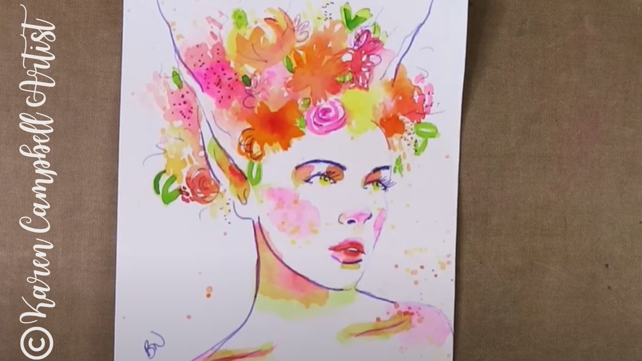
Today's REALISTIC fairy drawing tutorial with watercolor flowers is lesson six of the #50FunFabFairies drawing challenge- featuring Awesome Art School guest teacher, Bryn Nguyen.
A master of the grid drawing method, Bryn will show you step by step how to use this technique to achieve a fairy portrait that looks EXACTLY like any fairy drawing reference image you select! You'll learn how to draw fairy ears in Bryn's whimsical style and how to add colorful, loose watercolor flowers to bring your fairy to life. Enjoy!!
Want easy access to this and even MORE fairy drawing ideas? Join our FREE #50FunFabFairies drawing challenge over at Awesome Art School!
Simply click the button below to receive instant access to ALL the fairy reference images for each drawing prompt (including today's!), plus info on supplies, cheatsheets and more!
I'm excited to introduce you to today's Awesome Art School guest teacher, Bryn Nguyen. Bryn is a very accomplished artist with a distinct style (below) that my students and I have been admiring in my Facebook Group for years!
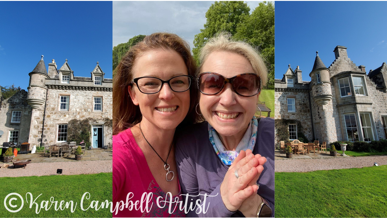
Bryn and I have known each other online for years, but finally got to meet in person for the first time this summer, on my 2022 Scotland Castle Art Retreat at Wardhill Castle with Lucy Brydon!
Before we continue, super quick announcement: All product links are Affiliate. I may earn a small commission if you choose to order through these links but by law there is never any additional cost to the consumer for doing so. I thank you for your support.
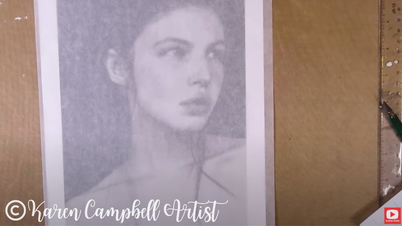
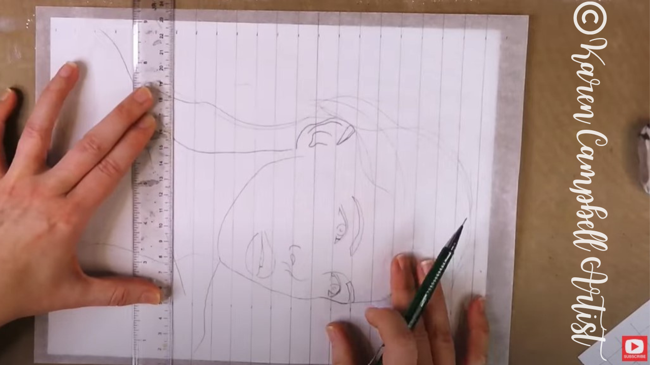
To get us started, Bryn demos how to trace the key lines of a drawing reference image using a sheet of trace paper and a lightboard. This helps her achieve greater accuracy, and she finds the process therapeutic.
You may be wondering why we're tracing today instead of freehand drawing. The freehand drawing part is coming up! As you'll see in the video, this is a great way to zero in on the key features of a drawing reference photo, and removes the distraction of all the shadows and highlights. I've been asked many times over the years if "tracing is cheating" when it comes to art. I believe tracing can be a very effective tool when it's used like it is today to create an original piece of art that's all your own. Check out this video for more of my thoughts on that subject.
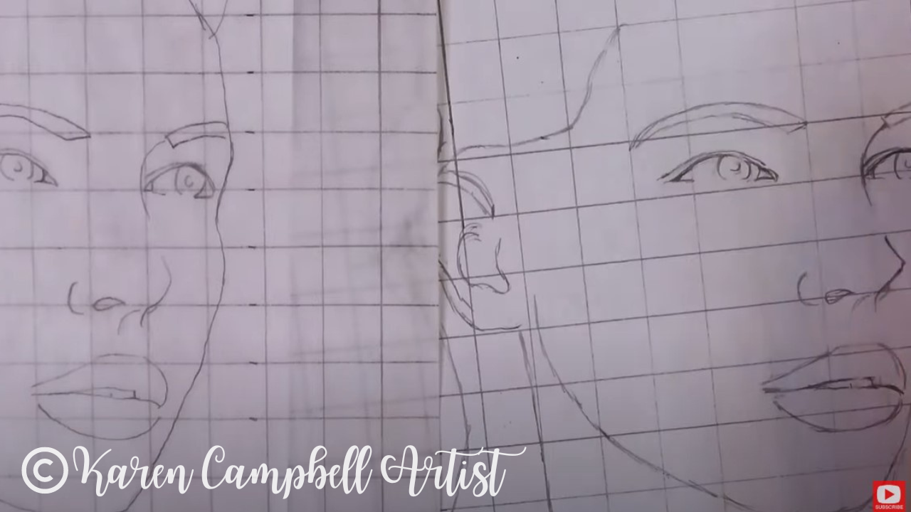
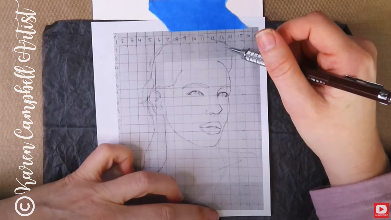
Once her face outline is complete, Bryn explains how to pencil in grid lines over a tracing. She loves to get super detailed at this point and creates 1/2" x 1/2" boxes for this process. Then she transfers what she sees (this is the freehand drawing part!), box by box onto another sheet filled with 1/2" squares.
If you'd like to learn Bryn's process in even greater detail without time-lapsed (sped up) video, Bryn is a guest teacher in The Fun Fab Drawing Club with me over at Awesome Art School in my Realistic Face Drawing classroom. Add your name to the waitlist here to get notified when the Fun Fab Drawing Club is open for enrollment.
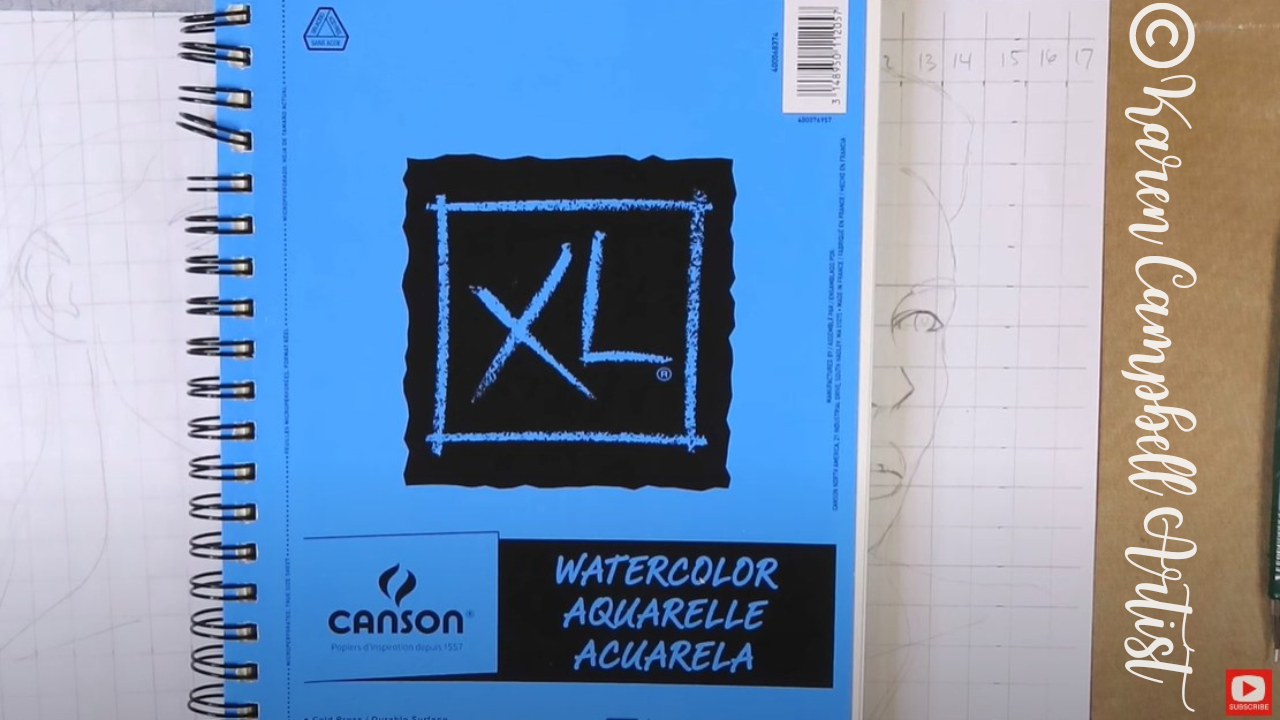
Since Bryn plans to add loose watercolor flowers to her fairy drawing, she needs watercolor paper. Today she's using a sheet of 140 lb. cold press (textured) watercolor paper by Canson. Bryn enjoys working small, so cut a sheet of this paper in half for today's project.
Make sure you watch the video to see exactly how Bryn transfers a scaled down printout of her original drawing to watercolor paper using graphite transfer paper.
I LOVE using transfer paper as well when I'm doing watercolor portraits because this process really saves my paper.
If you do a freehand drawing from scratch directly onto your watercolor paper, you risk wrecking your paper from tons of erasing. Drawing from scratch on another sheet of paper first (even plain old printer paper!) and transfering your finished drawing to watercolor paper is totally the way to go.
As you'll see in the video, Bryn uses a kneaded eraser to lift some of the bold graphite lines from her watercolor paper once her transfer is complete. This is a great tip, because if you skip this step, your watercolors can smear the graphite and turn brown.
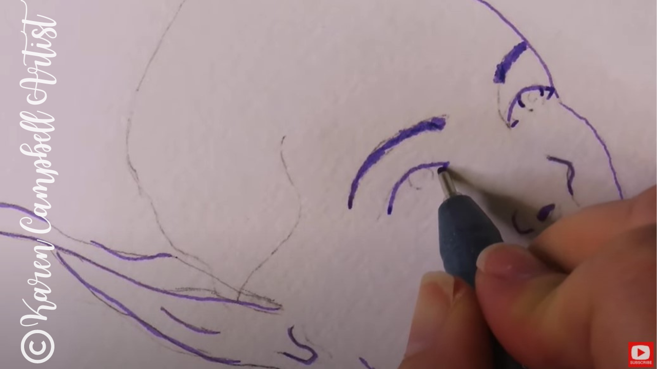
When Bryn's finished with erasing, she uses a purple Copic multiliner (in .5) to outline portions of her drawing. This fineliner is non watersoluble so it will stay put once watercolor is added. Notice how Bryn doesn't add fineliner to each and every line of her drawing, and sometimes only outlines a piece of each line. This technique really adds a sophisticated look to her artwork.
Once the ink is totally dry, you can erase any remaining pencil lines, and get ready to add watercolor! Bryn is using "The Classics" watercolor palette by Prima today for this project, but you can use any kind of watercolor you like. I typically use Daniel Smith watercolors, and have a wide variety of my favorite shades recommended for you in my Amazon shop if you need ideas.
If you need help starting a Daniel Smith watercolor collection of your own, check this video out to learn about Daniel Smith dot cards to inexpensively discover YOUR favorite shades, and this one to start your first Daniel Smith watercolor collection.
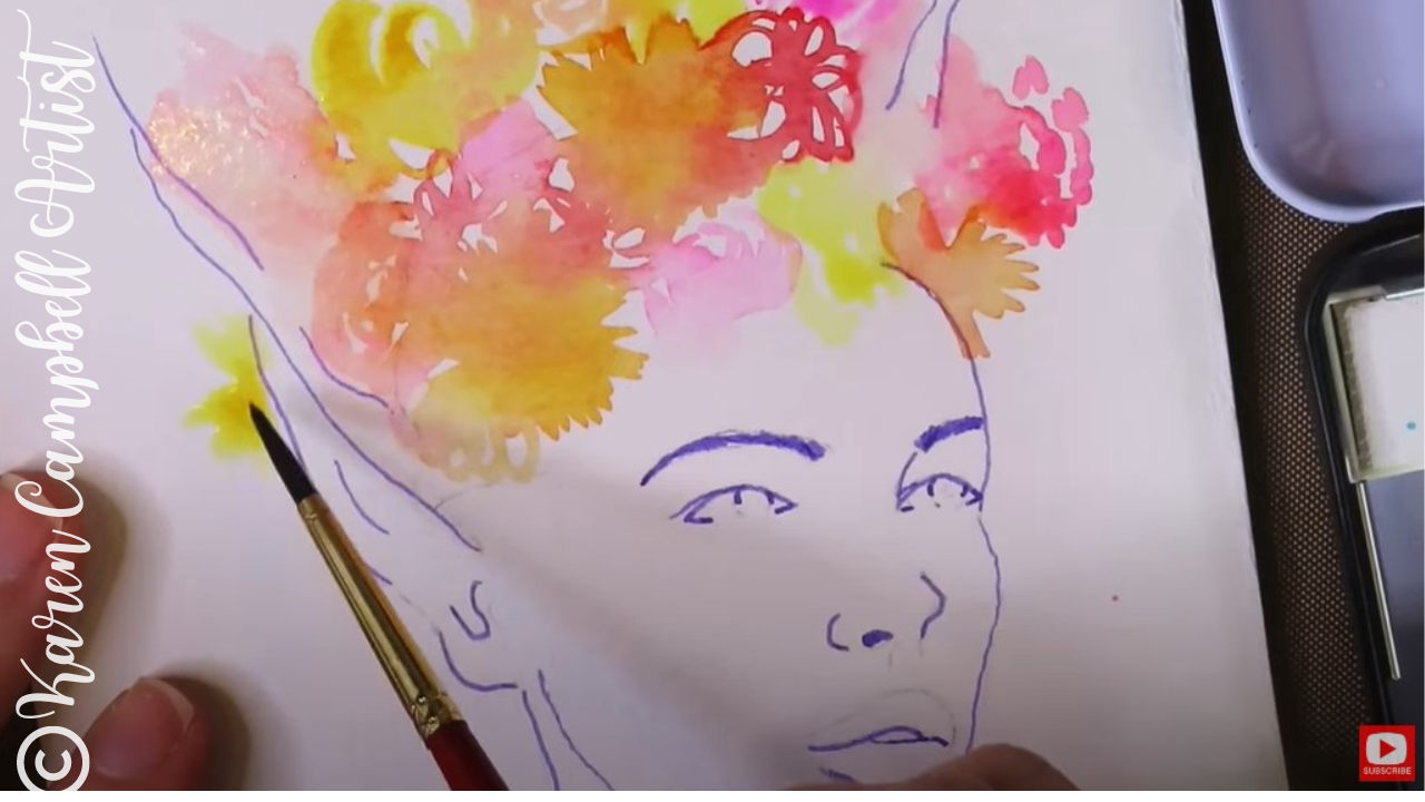
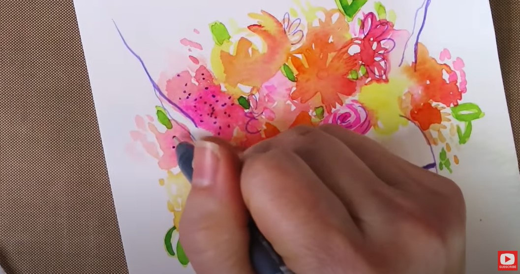
To create loose watercolor flowers on a tiny scale, Bryn uses a #3 round watercolor brush and adds abstract doodles of color in spikes and swirls to indicate flowers. Watch this process in the video because each moment has been recorderd step by step so you can paint along from home.
After the first layer of watercolor is dry, Bryn darkens portions of the flowers to add contrast, and adds bits of yellow green throughout to suggest foilage and leaves.
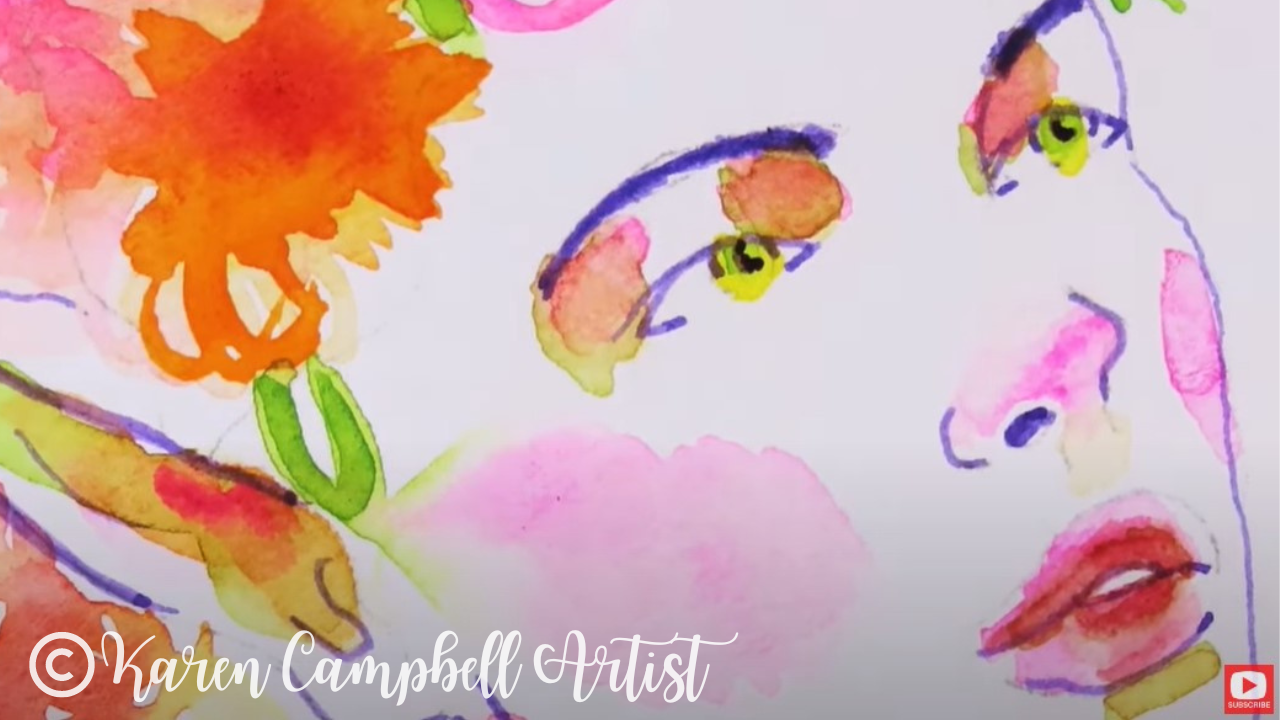
For the skin tones on her fairy's face, Bryn adds in layers of pink from her existing palette. Once these layers are dry, she adds a light layer of yellow green to indicate the darkest shadows.
I LOVE this look! Just make sure your original layers are FULLY dry before doing this at home, so your colors don't turn into brown.
Next, Bryn thickens a few of the lines from her original drawing using her copic multiliner (above), and draws in a few light embellishments throughout her watercolor flowers to tie things together.
To finish her fairy, Bryn adds a little watercolor splatter paint. I LOVE this effect too!! The key to getting this just right is having a really wet brush. Watch the video to see this technique in action, and paint along with Bryn in real time!
Thanks for hanging out with us today! We hope you have fun with lesson six of the FREE #50FunFabFairies drawing challenge!
If you're OBSESSED with fairies and fantasy art like Bryn and I are, you might just LOVE the Celtic Collective art club over at Awesome Art School.
Add your name to the waitlist to be notified next time we're open for enrollment, or when there's a club member cancellation so you can join in the fun with us! ❤️ CHECK OUT ALL my art books on AMAZON ❤️ MY FAVORITE ART SUPPLIES on AMAZON ❤️ MY BELOVED FACEBOOK GROUP ❤️ FOLLOW ME ON INSTAGRAM
We're painting whimsical watercolor trees in today's mixed media tutorial! If you've never played with watercolor before, the loose watercolor painting technique featured in today's project, is perfect for beginners!
If you're new to watercolor, or have a new palette to swatch, make sure you grab my FREE Swatch Sheet so you can swatch your watercolors out before we get to the painting portion of today's project. Simply click on the button below, and I'll send it straight to your email!
Before we continue, super quick announcement: All product links are Affiliate. I may earn a small commission if you choose to order through these links, but by law, there is never any additional cost to the consumer for doing so. I thank you for your support!
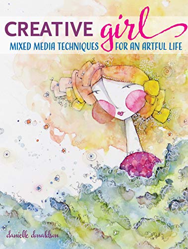
Today's mixed media art book review is of Danielle Donaldson's Creative Girl: Mixed Media Techniques for an Artful Life. (If the book isn't available on Amazon, you can also find it here). I actually love this book so much I'm doing a painting project from it for my mixed media YouTube channel, and a drawing project for my drawing channel next week!!

I think seasoned artists will also love today's watercolor painting, especially if they're in the mood for a relaxing project that isn't gonna take all day!
Let's get started with the flip-through of Danielle's book...
What I love about Danielle Donaldson's watercolor art, is her light and airy touch. It's SO whimsical. She has a very dinstinct way of leaving white space throughout her paintings and illustrations, that I just love! You'll really begin to recognize that if you start to look for it.
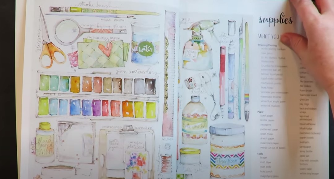
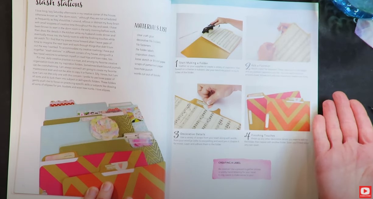
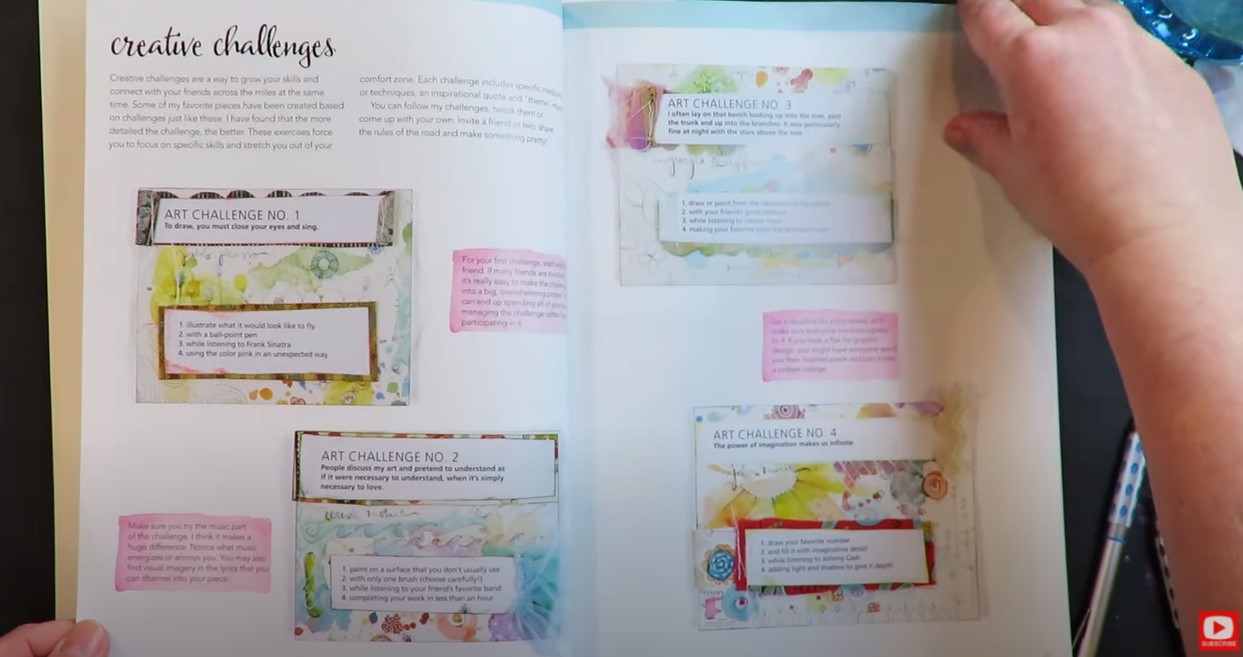
In this book, she opens with an overview on supplies, an adorable little project called "Stash Stations," and 3-4 pages of art challenges that you can use to break through creative block with a friend! Personally, I think these are just genius!
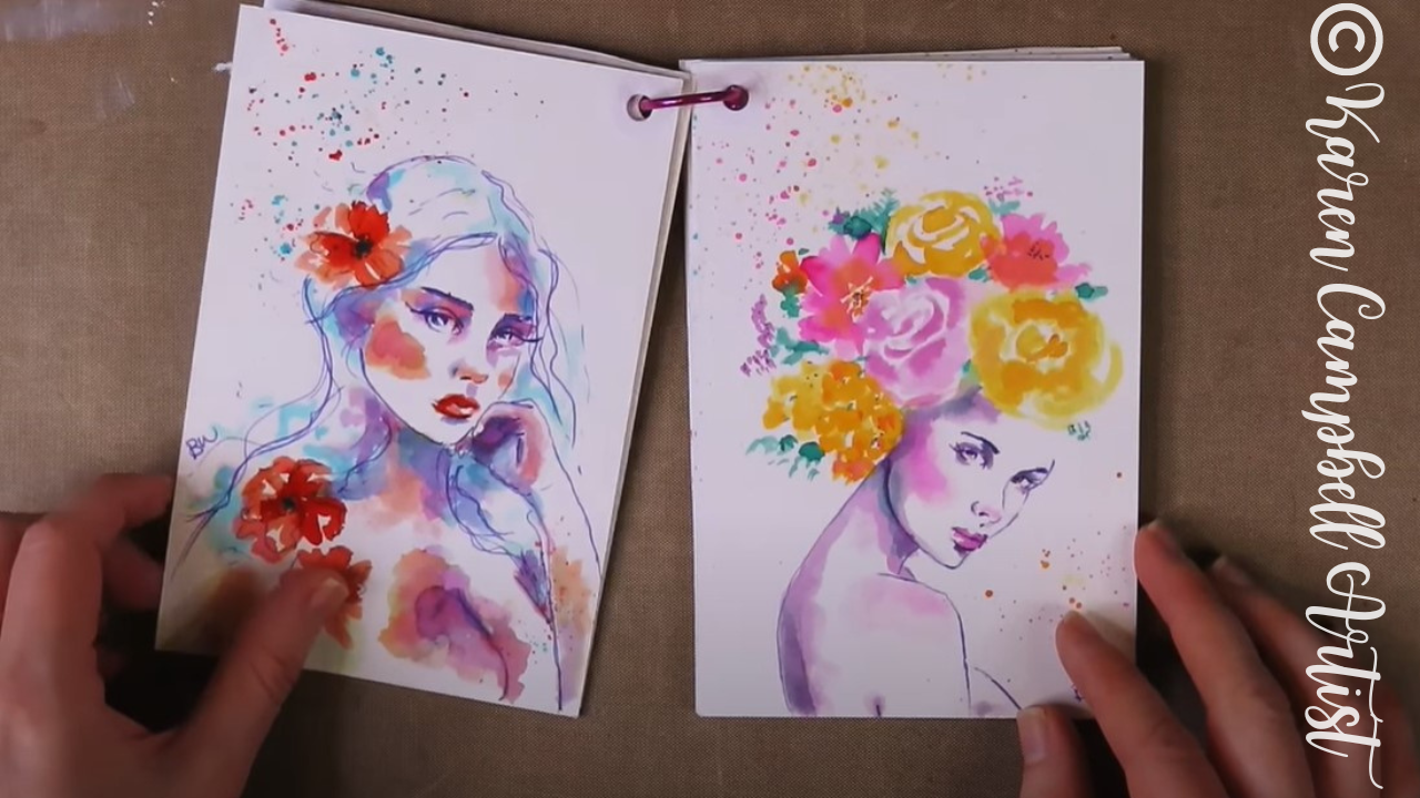
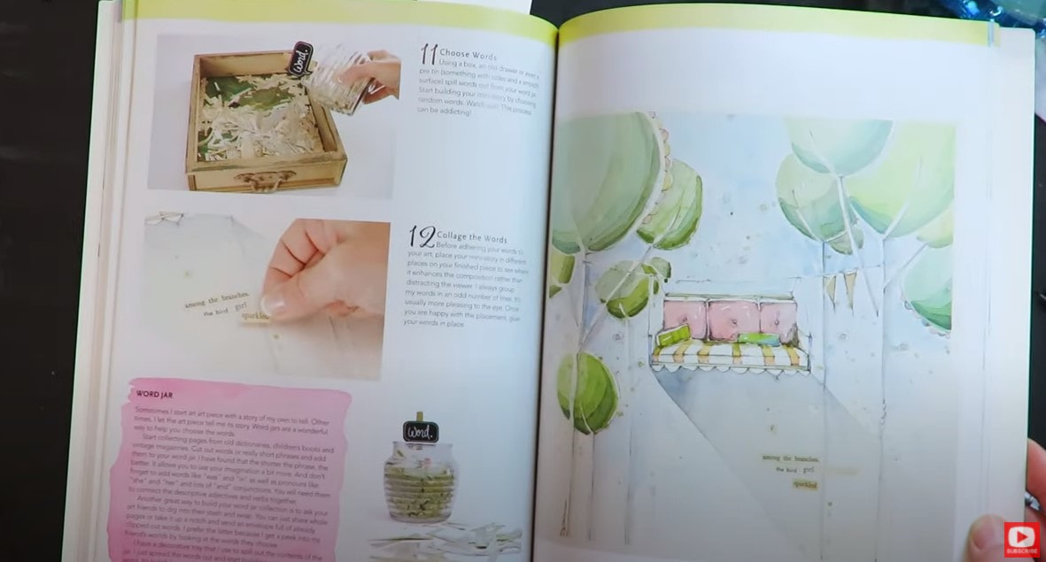
Danielle fills her book with so many unique ideas to get your creativity rolling - from saving cutouts of words from books (so they're always ready to be turned into art journal quotes!), to cute new ways to illustrate watercolor girls with tutus and so much more.
Throughout this book, Danielle also builds on projects from earlier chapters as the book progresses. I love how she helps us continue thinking about a project after we think it's "done," and turns it into a layer for a completely new project.
Today I thought I'd try to do one of Danielle's projects from this book, in her style - allowing white of the paper to peak through my watercoloring!
For me- this is WAY harder than it looks! LOL!
I'm using hot pressed paper becuase it's nice and smooth for drawing.
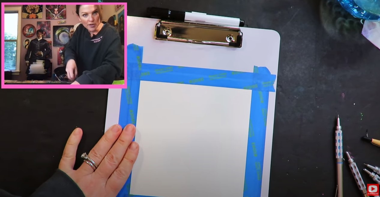
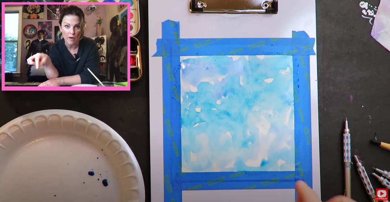
To get us started, I'm taping my watercolor paper down to a clipboard, which is actually something Danielle taught me in one of her workshops! Stick with me to the end of the video to see how beautiful the straight edged border looks around my painting after the blue tape is peeled away.
For the background, I'm trying to really do some loose watercolor painting in a "Danielle style" - keeping the shades I've selected very pastel.
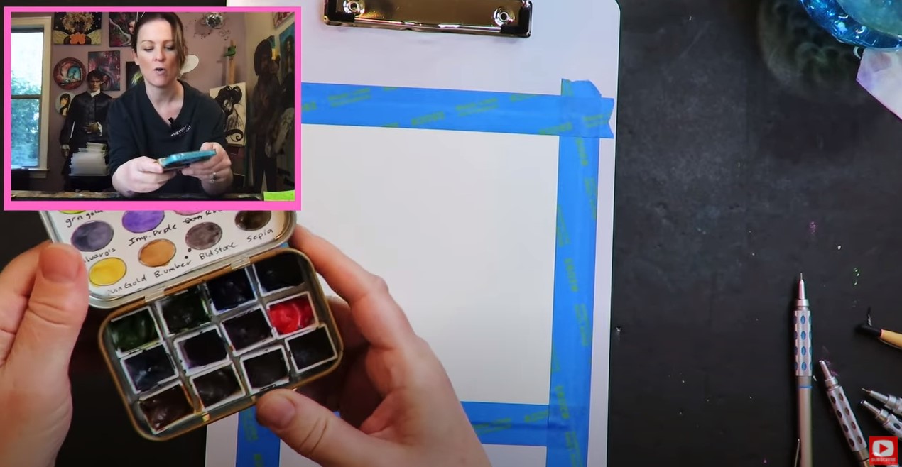
The colors I'm using are by Daniel Smith and in a cute little travel watercolor palette I made from scratch! If you want to learn how to make one too - check out that fun tutorial.
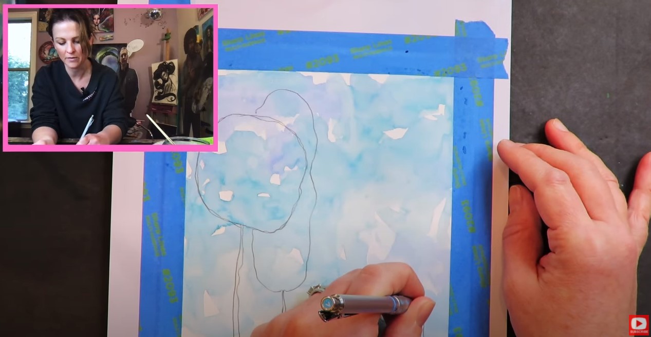
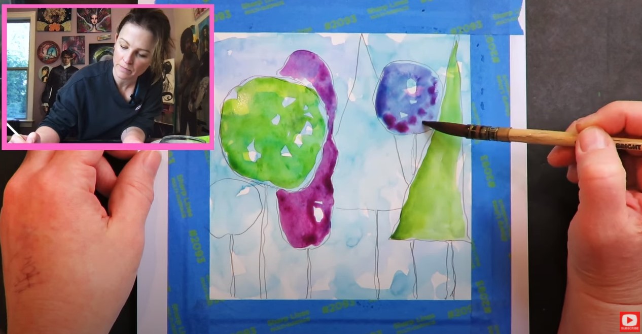
I hit the background for today's whimsical watercolor trees with my hair dryer to make sure it's fully dry, so I can starting drawing on top. I thought it might be fun to use my non-dominant hand (left!) to draw some cute little trees with wobbly lines.
Next, I did a light wash of loose watercolor for each tree, and tried to leave those little white specks of the paper showing through, but it's hard! My instinct is to cover them up!
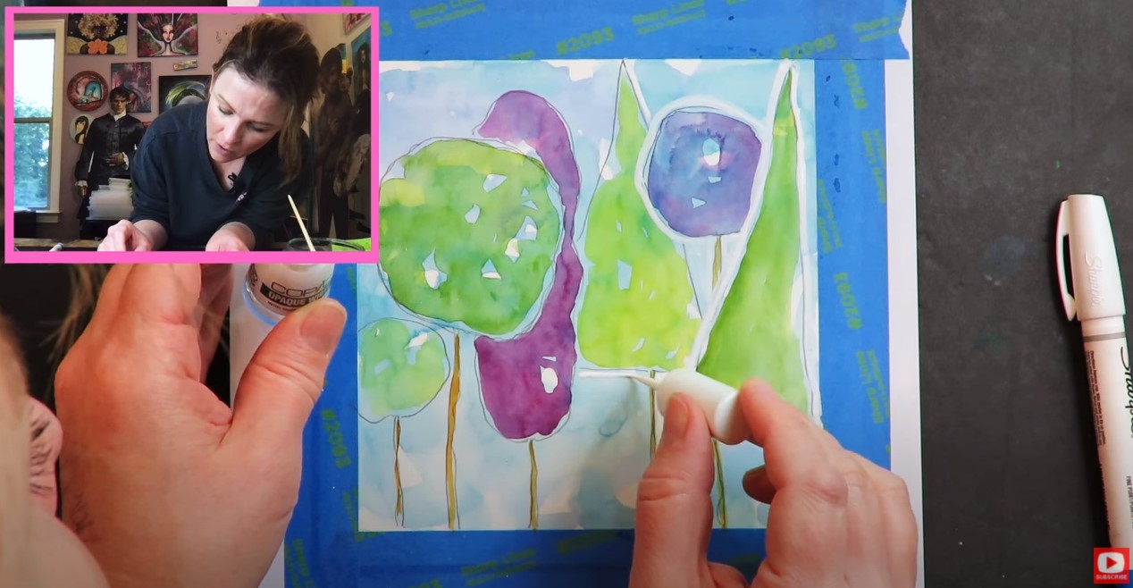
After the trees are painted and dry, I used my white sharpie paint pens to add outlines in a variety of thicknesses. I'm struggling to find one that works well or isn't dried out, so I decided to pull out this really cool gift my husband got me for Christmas from Copic. It's an opaque white and like a nail polish applicator. It does the trick perfectly and looks adorable.
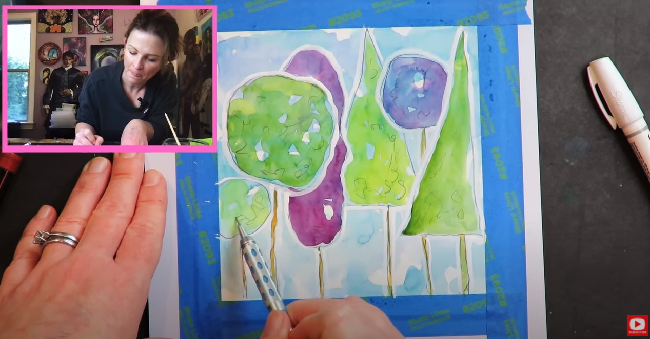
I totally felt the urge to do some pencil squiggles on top for a little more interest, followed by a few splatters of watercolor on top for a fun, artsy effect. Whenever you've got the urge to try something - you've gotta go with it!
Make sure you WATCH today's video to see everything in action. I hope you learn something and have SO much FUN trying this at home! If you'd like to learn a little more about drawing, I've got the PERFECT event coming up and would LOVE for you to attend! SIGN UP FOR MY ART RETRO RENDEZVOUS with this special link for just $15. Beginners welcome (even if you've NEVER drawn a thing before). It's 5 days, filled with 10 beginner drawing lessons for you to enjoy! Here's a sneak preview of the projects... I hope to see you there!! ❤️ CHECK OUT ALL MY ONLINE ART CLASSES & Art Clubs ❤️ CHECK OUT ALL my art books ❤️ MY FAVORITE ART SUPPLIES on AMAZON ❤️ MY BELOVED FACEBOOK GROUP
Today I'm trying 5 watercolor moon painting techniques out to see which ones create THE BEST lunar effects! Check out what happens when I test naturally granulating watercolor by Daniel Smith vs adding granulating medium. Plus- how does regular table salt compare with kosher salt watercolor painting? And- how does the texture of my favorite Fabriano watercolor paper change the effects when I paint on hot press vs cold press paper? Click over to today's video to find out!
Before we continue, super quick announcement: All product links are Affiliate. I may earn a small commission if you choose to order through these links but by law there is never any additional cost to the consumer for doing so. I thank you for your support.
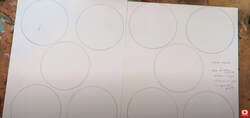
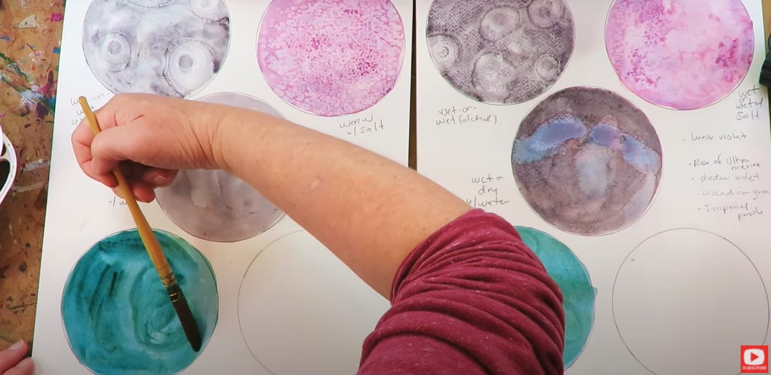
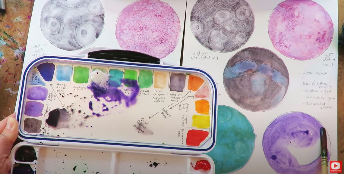
I've drawn 5 moon circles on each page of Fabriano watercolor paper. On the left, I've got 140# hot press (smooth) watercolor paper, and on the right- I have a sheet of 140# cold press (textured) watercolor paper.
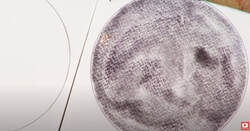
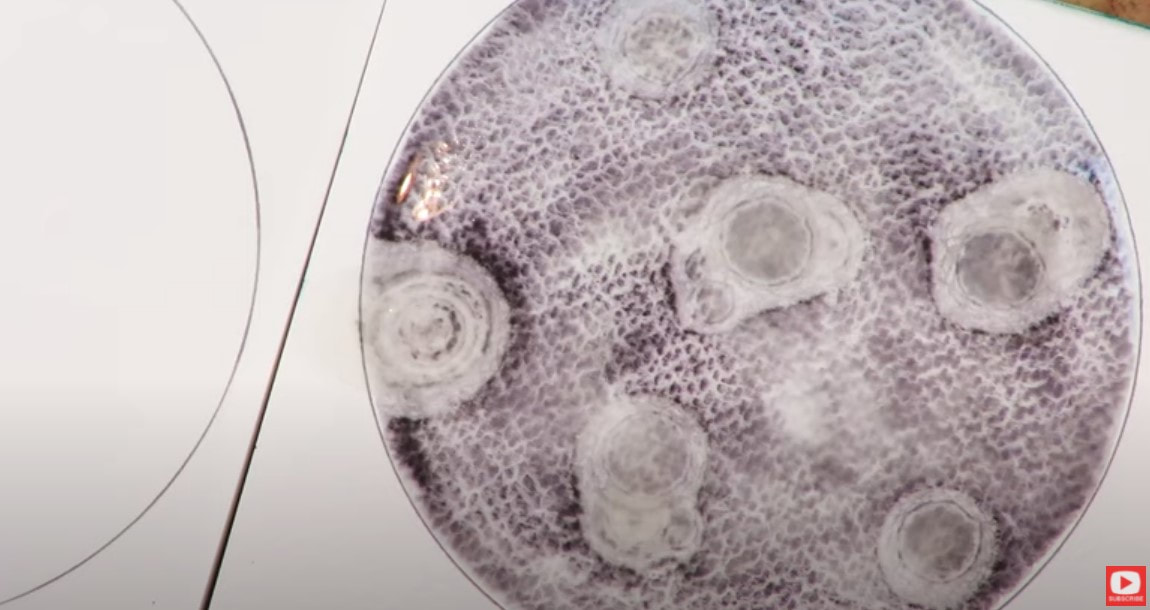
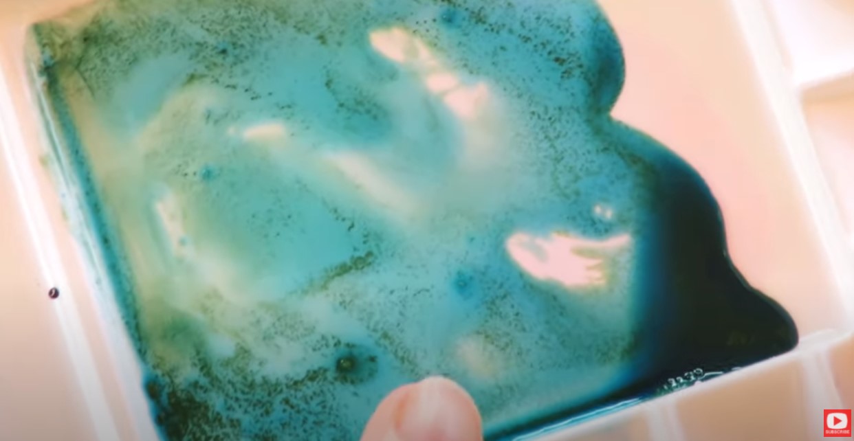
I love granulating watercolor (this means the color separates a bit and you can see tiny particles in it, like in the pic above). The first granulating shade I chose to work with is lunar violet by Daniel Smith.
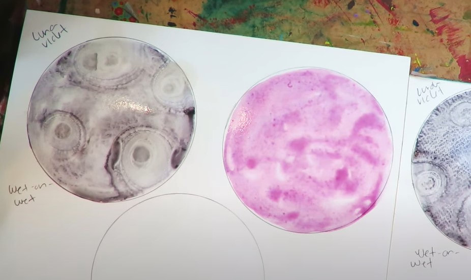
I coated this entire circle with plain water first, then applied the color.This technique is called wet on wet watercolor.
For fun I decided to add a few droplets of rubbing alcohol using a pipette to see if this would give me the look of moon craters. Above is how it looked on the textured, cold press watercolor paper.
As you can see, wherever the alcohol droplets were added, the watercolor dispersed. Click over to the video to see how the wet on wet watercolor technique looks on the hot press watercolor paper.
I tried the same alcohol watercolor technique to see how this looked on the hot press watercolor paper, and so far I'm loving how this looks.
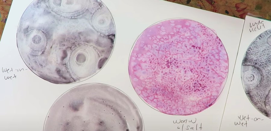
For the next "moon," I used the same wet on wet technique with rose of ultramarine by daniel smith. While it was still wet, I sprinkled some table salt over this one because salt watercolor painting can give you some gorgeous effects!
Isn't that beautiful?!
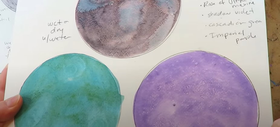
The next color I'm testing out is shadow violet. This time I used the wet on dry watercolor technique, and tried adding a few extra droplets of plain water to see what happened. At first I kinda hated how this looked- but after it dried, it started to look a bit more "planetary." For my fourth watercolor moon, I decided to use cascade green (also by Daniel Smith). I mixed this off to the side with about 50% granulating medium because I really want to see how this separates the colors of this gorgeous blue green.
I just love the way the colors immediately separate in my palette, but it doesn't transfer to the paper in the same way like I expected it to, so that's a little disappointing.
The final color I wanted to test out today is imperial purple (another granulating watercolor by Daniel Smith). It separates into pinks and purples and reminds me a lot of the effects I love getting from activating my elegant writer! It's so pretty (bottom right corner, below)!
For this one, I tried adding one more medium - an irridescent medium, and just becuase I love salt watercolor painting effects, tried sprinkling kosher salt on top.
Once dry, the irridescent medium doesn't do very much to create that shimmery look I was hoping for, so again - I'm feeling a little disappointed in this medium.
Today's test has definitely shown me that the mediums I tried aren't really worth it, and we're better off just getting a set of irridescent, metallic or granulating watercolors if these are effects we enjoy. Thanks for hanging out with me today! Make sure you click over to the video to see each technique in action and decide which one YOU like best!
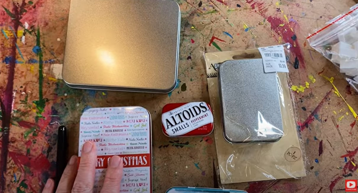
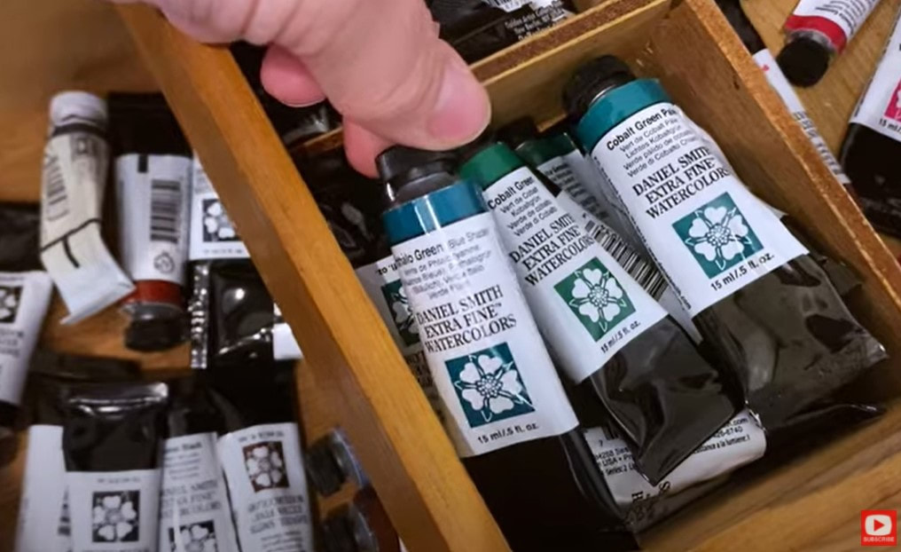
Today I'm showing you how EASY it is to set up a travel watercolor palette from scratch! All you need is a small metal tin (an empty altoids or mints tin works great!), some watercolor tubes, watercolor half pans, an adhesive magnet roll or glue gun, a sheet of watercolor paper ... and you're good to go!
Before we continue - super quick announcement! All product links below are Affiliate. I may earn a small commission if you choose to order through these links but by law there is never any additional cost to the consumer for doing so. I thank you for your support!
Watercolors are one of the easiest art supplies to travel with because they don't take up much room. If you make your own diy watercolor paint palette - YOU get to choose how many colors to include and how big the palette is.
Today I'm choosing my tin first. I've got a number of random ones in my stash on hand that I've purchased at my local craft stores or other shops when I've been out and about. You can often find cute, empty tins for $1, sometimes less! I also found this little set of tins on Amazon in case you're interested.
One of my favorite ways to travel with only a few watercolors is to create an altoids watercolor palette! It's so compact - you can pop it into any bag and bring along 3-4 of your favorite colors. These make the cutest little gifts!!
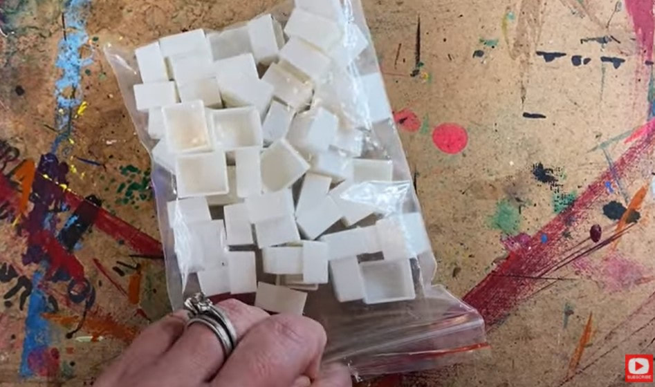
All you need to do this is an empty Altoids tin and a few empty watercolor half pans (shown below).
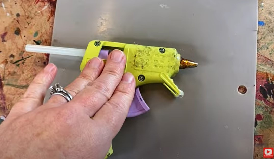
Next you need to decide how you want to affix your half pans into your tin! My two favorite ways to do this are to either cut off a snippet of adhesive magnet tape, or to hot glue each half pan into the tin.
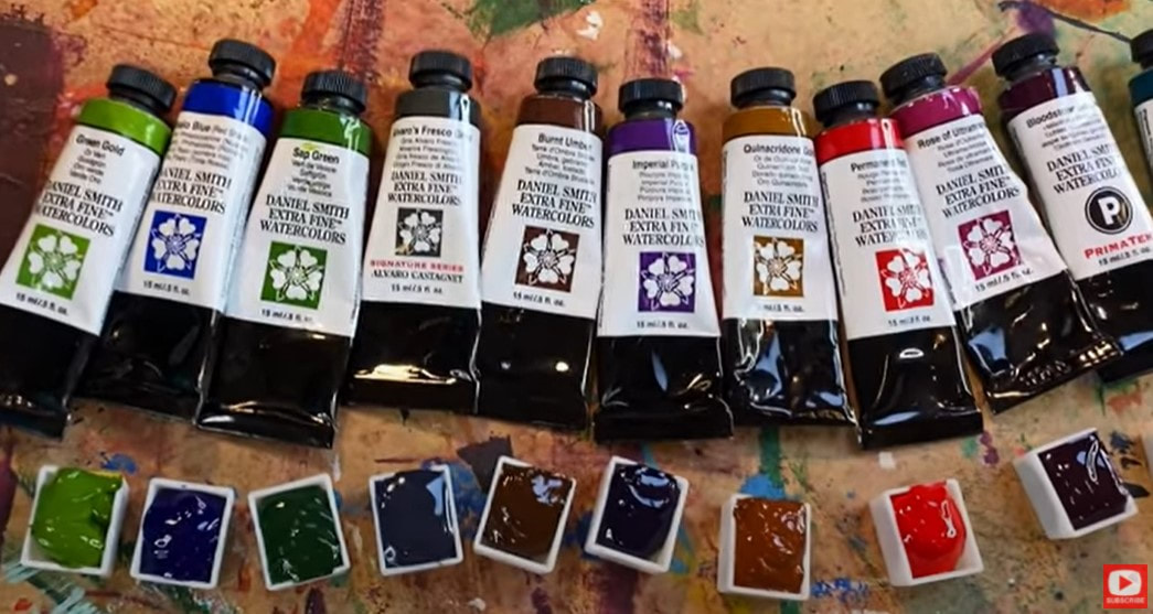
Be sure to click over to the video to SEE how I'm doing this! I've found using magnets is a great way to give yourself some flexibility in case you want to change your colors out from one trip to another. For example- if I'm headed to Scotland I know I'll want a variety of greens, grays, purples, light blues and golden shades to paint fairies, florals, landscapes and castles! If I were headed to the beach- I might trade out a lot of my greens for a wider variety of blues, and I may add in more colors to paint sunrises or sunsets - depending on what I'm in the mood to capture! If trading out the colors of your travel paint palette sounds like something you want to do - definitely use the adhesive magnetic tape. I actually found 50 half pans on Amazon with magnetic strips already attached for only $6! Next, we need to select which watercolors to include in your palette. Honestly- this is probably the hardest part! The struggle is REAL as I start pulling out my watercolor tubes and comparing them.
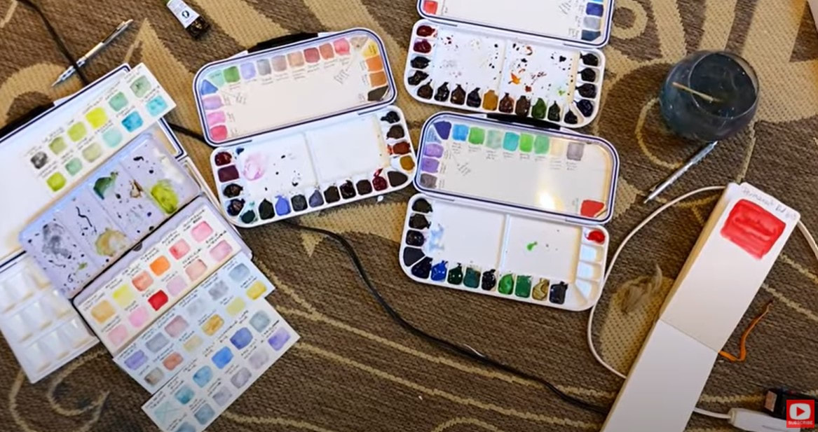
If you're having a tough time choosing from the tubes and only have room to include a few - do a little swatching to compare the shades and help you narrow things down.
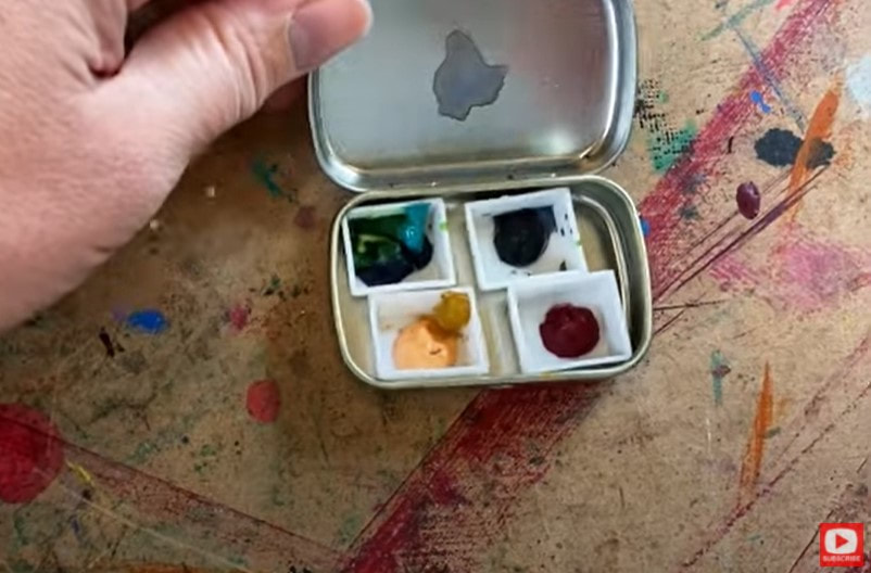
Once you decide which colors you want to include (I only have space for 12 today), simply squirt a little paint from each watercolor tube into your half pans and let them dry overnight.
If you want to know exactly which colors I selected, scroll down to the bottom of this post or click over to the video and check out the description box.
Since the watercolor half pans I'm using actually had some raised writing on the bottom, my adhesive magnet wouldn't stick so I needed to use hot glue to get them to stay in my tin.
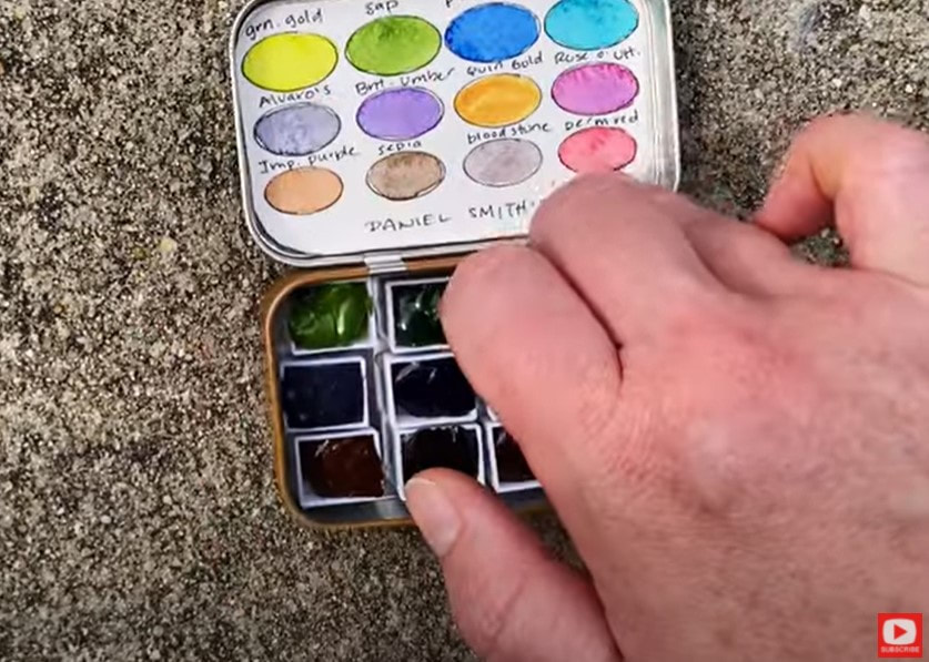
After all of my half pans were in position in my tin, I cut out a piece of watercolor paper to fit inside my tin, and traced some ovals on the sheet with this template. Then I added a touch of watercolor to each half pan and labeled what color each oval was (so future me knows which watercolor tube to pull out later when it's time to refill my half pans). Easy!!
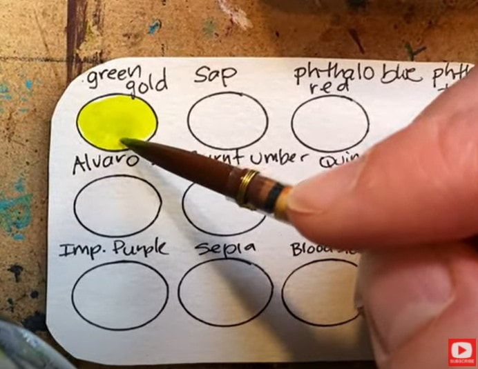
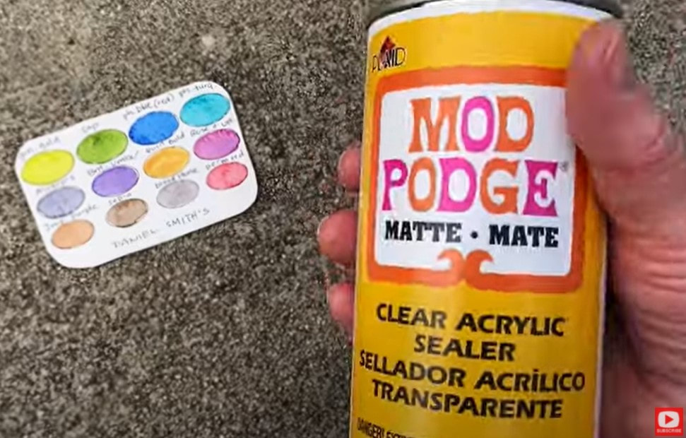
When my swatches were finished, I brought my swatch card outside and sprayed it with a touch of Mod Podge Clear Acrylic Sealer (in matte).
I've found this stuff to be amazing because it doesn't re-activate the watercolor I've already put down, and it's fantastic for when I'm actually watercoloring later because that little card is protected. If I spill water or a drop of paint on top - it TOTALLY wipes off!
Click over to the video to see how EASY this is!! If you have a laminator- that would be a great choice too, and you can totally skip the mod podge spray.
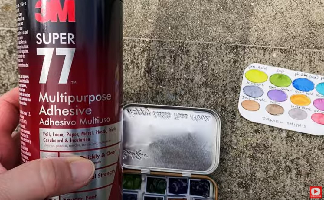
Once my mod podge sealer was dry, (or your swatch card has been laminated), I flipped my card over to spray some multipurpose adhesive on the back. This way I can pop that card into the lid of my tin, glue it in place, and not worry about it falling out! (Trust me - this step is SO helpful becuase those little cards ALWAYS fall out!!)
SO EASY, right?! These cute travel watercolor palettes make excellent gifts and are also a good way to split the cost on more expensive watercolor tubes (like Daniel Smith!), if you have a creative friend who wants to share a few tubes together!
If you're interested in building your own Daniel Smith watercolor collection - I've got a video on that to help you. I know these are super expensive and it can be so hard to decide which colors to get. They're all gorgeous and there's no wrong answer, but check this video out for a few pro tips before ya buy!! Need a list of the colors I added to my travel watercolor palette today? Here ya go!!
Thanks for hanging out with me today! See ya back here next week!
❤️MY ARTIST BESTIE, LUCY BRYDON & I created a NEW ART MEMBERSHIP together called The Celtic Collective! It's now open for enrollment! Join us before the price increases on August 7. |
Karen CampbellFounder of Awesome Art School. Mixed Media Artist. Author of 19 Instructional Art Books! Whose work has appeared in...Archives
July 2024
Categories
All
|
|
"Karen is flipping hilarious and she's very real...I like the way she teaches in a way that really gives you confidence, whether you're a beginner or advanced there's always something new to learn!"
- Elizabeth W. |
What Fans Are SayingKaren, you are absolutely fabulous! You make me feel like I can draw anything. I have recently retired and finally have the time to do some of the art that I have loved since I was in school. I am really at the beginning of my art journey and I hope to learn as much as I can. Thank you for all you do. |
Contact ME |









 RSS Feed
