
|
Hey art friend!! As you know, I'm obsessed with art. But did you also know I'm ALSO obsessed with historical art and history in general? I recently discovered a graphic artist on YouTube who enjoys bringing historical figures "to life" with facial reconstruction by studying whatever art is available to her- including paintings, death masks, sculptures, and more. I think her channel is FASCINATING, and her work is gorgeous.
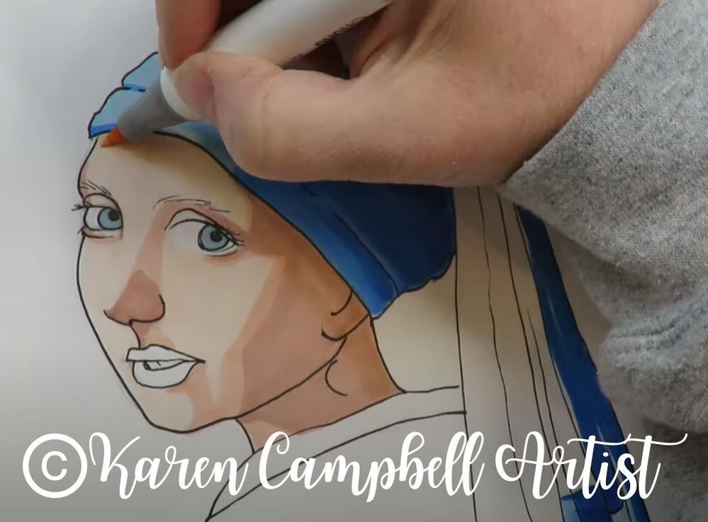
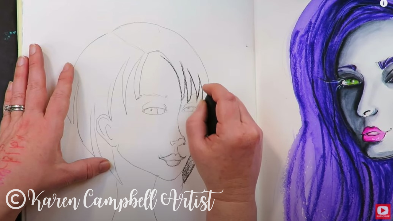
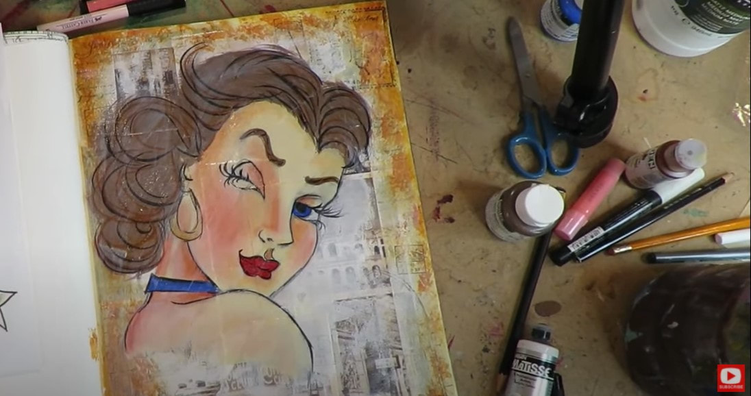
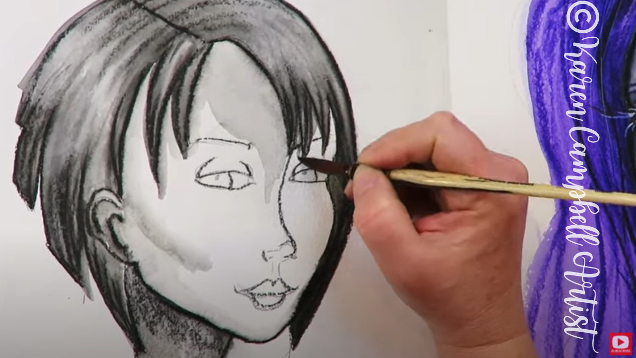
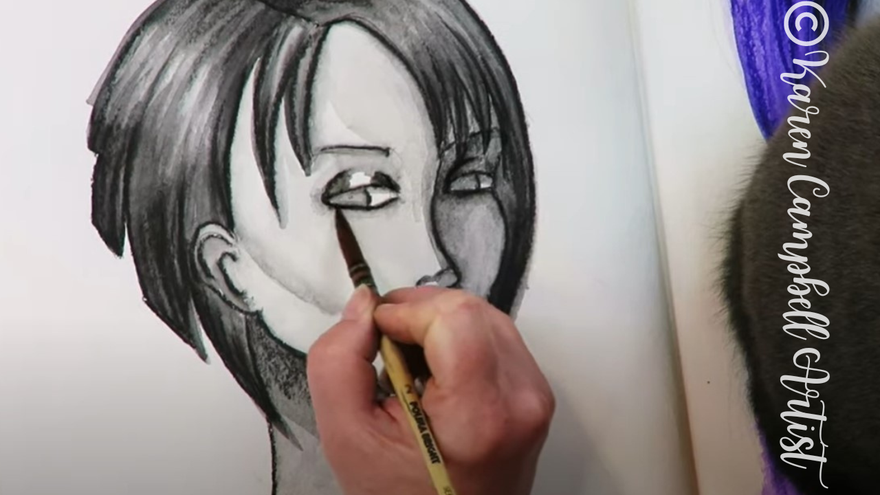
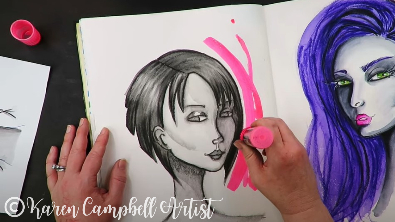
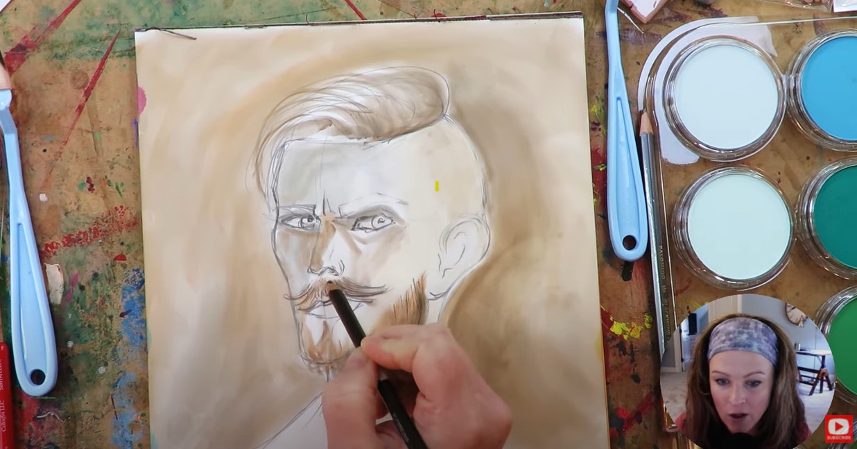
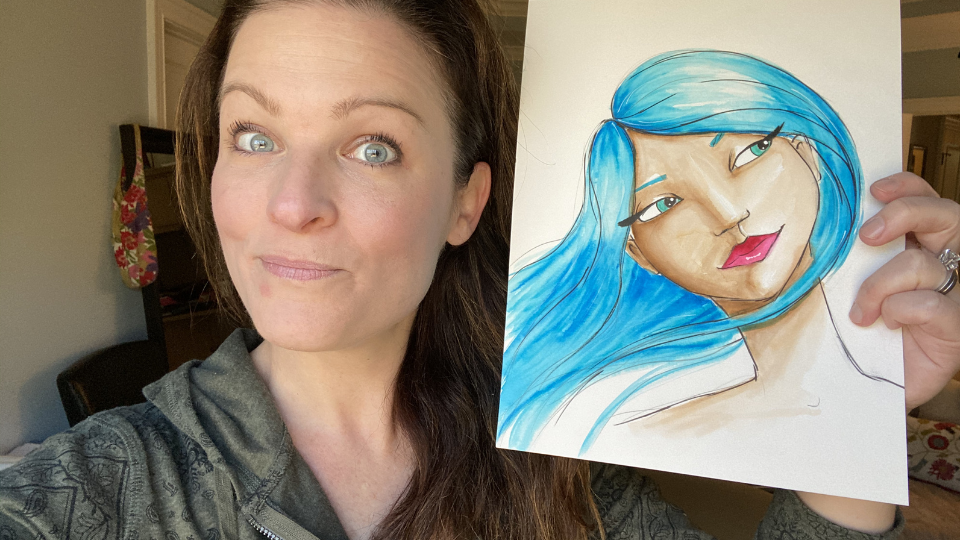
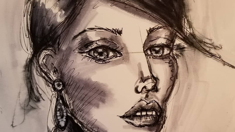
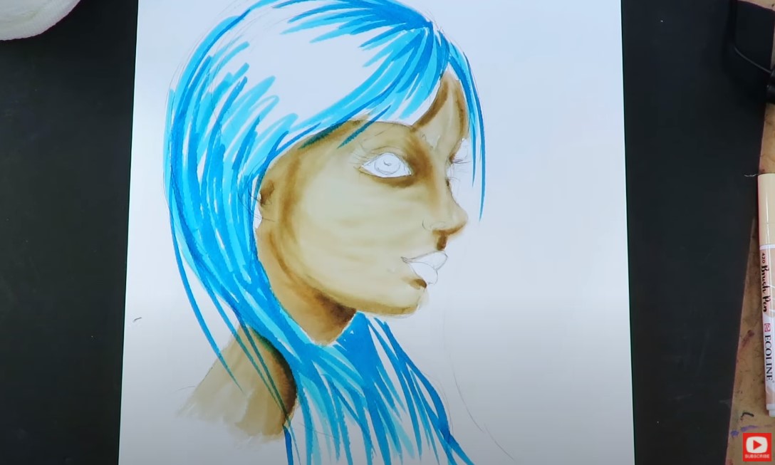
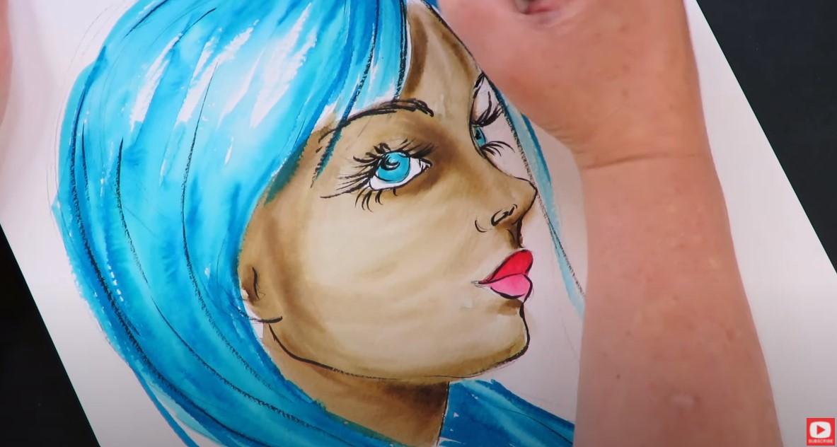
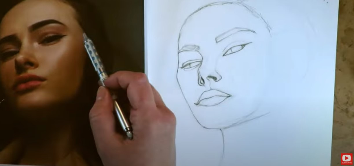
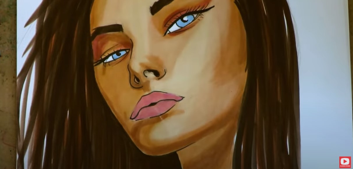
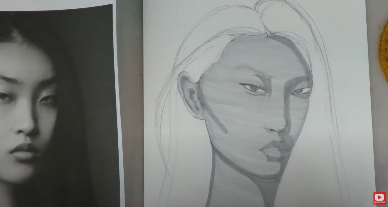
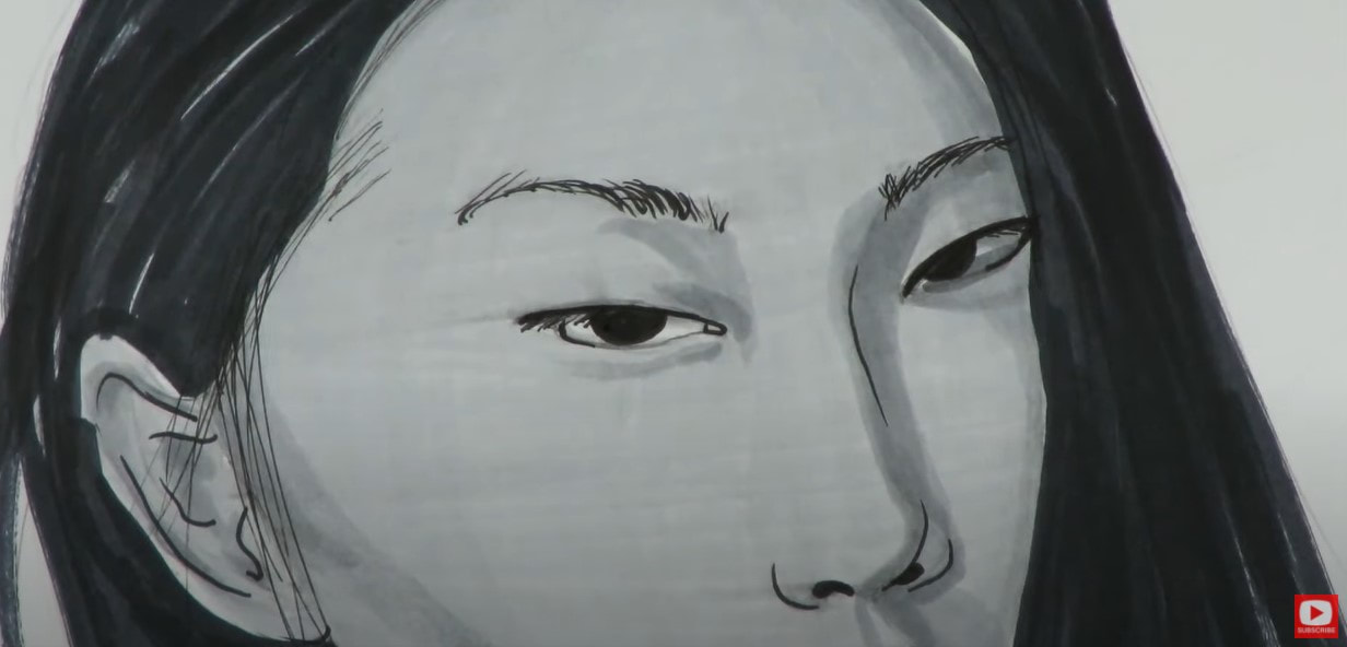
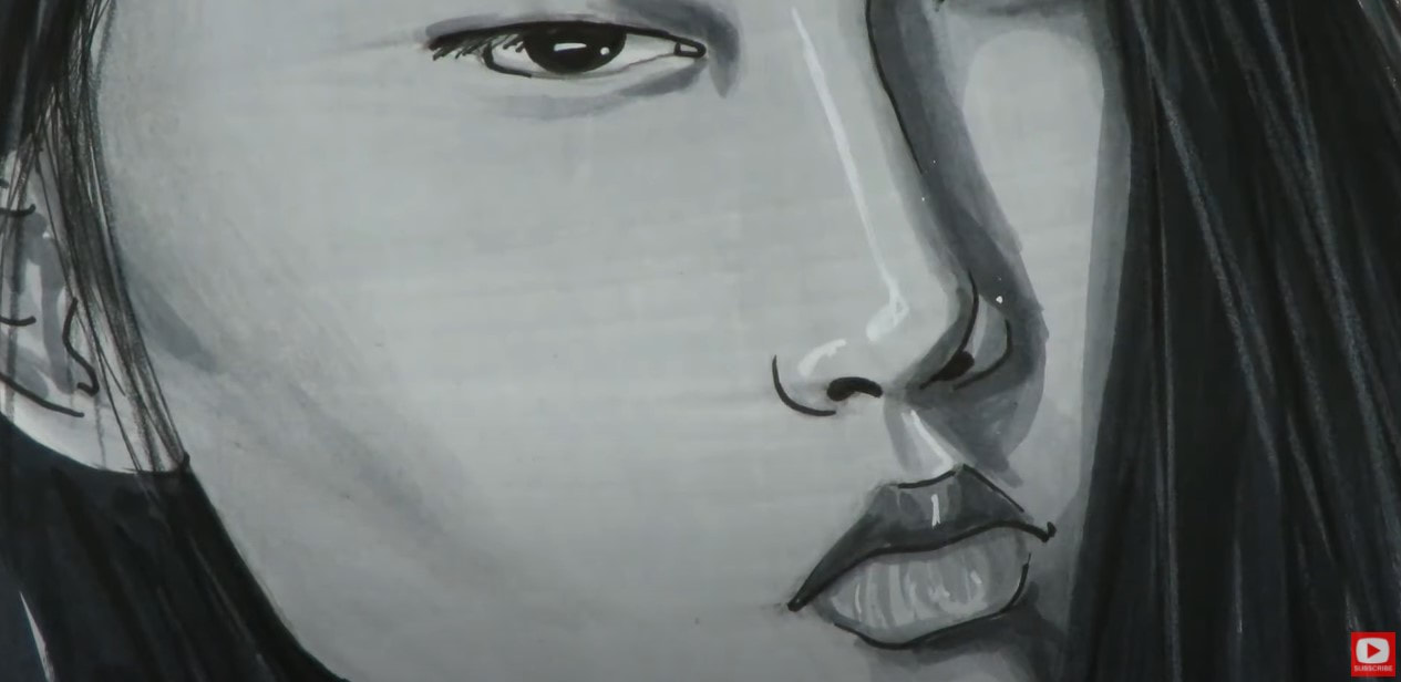
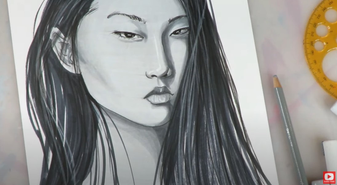
She inspired me, so I reached out to ask if I could share her YouTube channel with my audience, as well as use Becca's work as drawing references. She graciously accepted! Today is the first in a series of videos presenting famous historical figures and paintings in my signature Fun Fab style! I hope you enjoy my Fun Fab version of Vermeer's Girl with a Pearl Earring in alcohol markers. 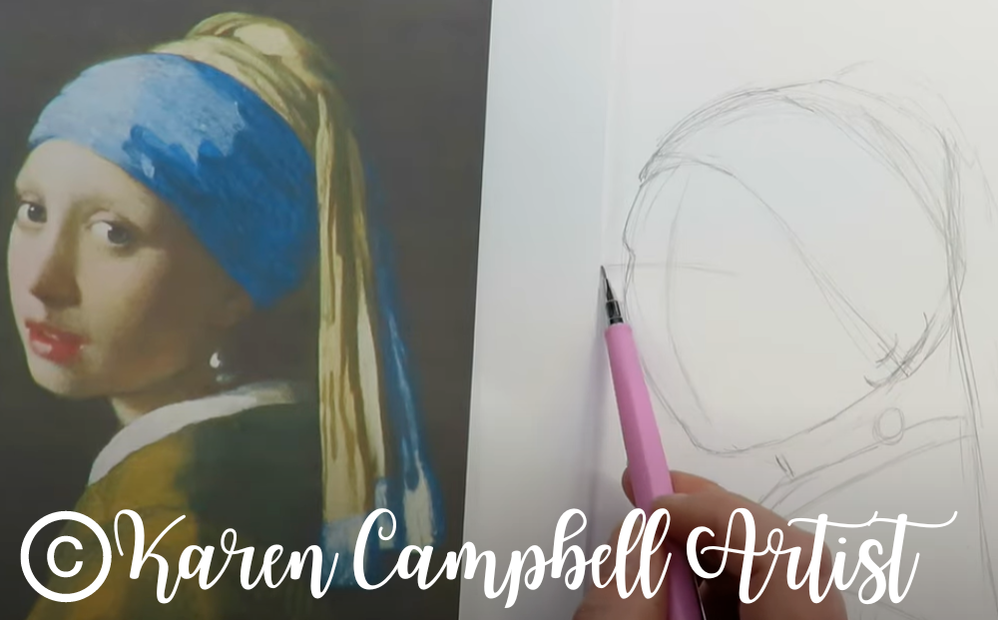
*All product links are affiliate & for U.S. residents only.*
Not Familiar with my Fun Fab Style?
In case you're not familiar with my Fun, Fab Style, it's my signature semi-realistic or whimsical look I give to the characters I draw. It all began back in 2015 with my very first book, How to Draw Fun Fab Faces.
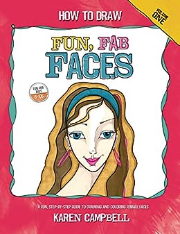
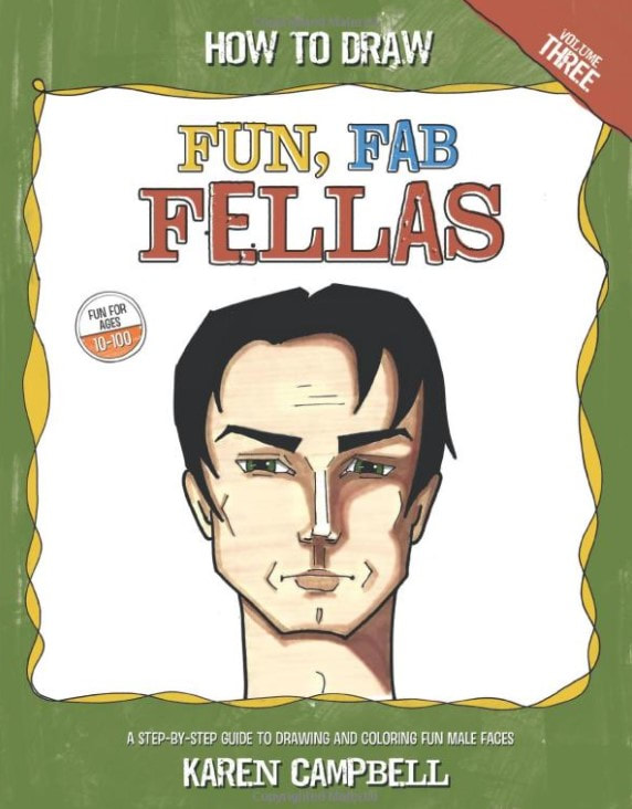
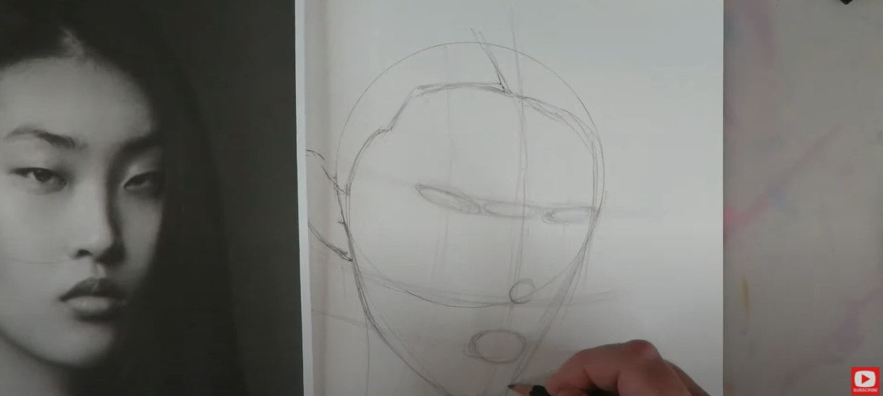
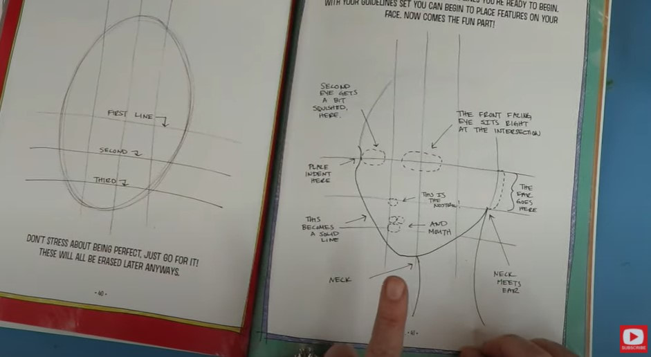
I discovered I LOVED teaching how to draw faces for beginners, and quickly followed this book up with a sequel that will TOTALLY come in handy for you if you're thinking about drawing along with me in today's video, but aren't sure how to draw a three-quarter portrait.
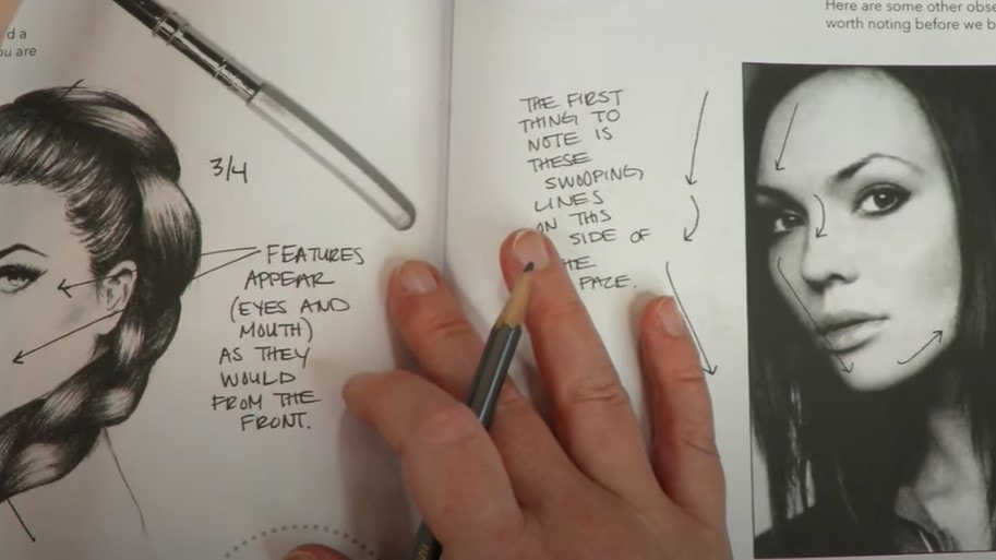
In How to Draw MORE Fun Fab Faces, I broke down the steps of how to draw a profile and 3/4 portrait to make these views more approachable and accessible to those just learning how to draw, and those interested in expanding their range to drawing profiles from the side and/or at an angle. 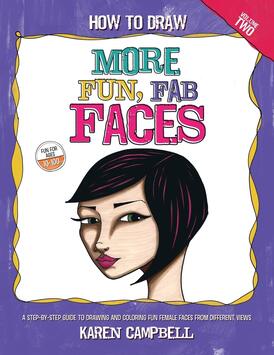
Draw Along with Me!
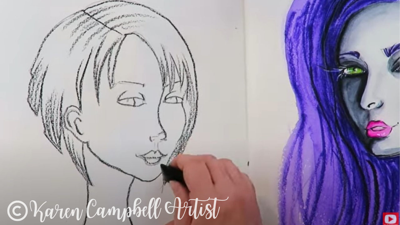
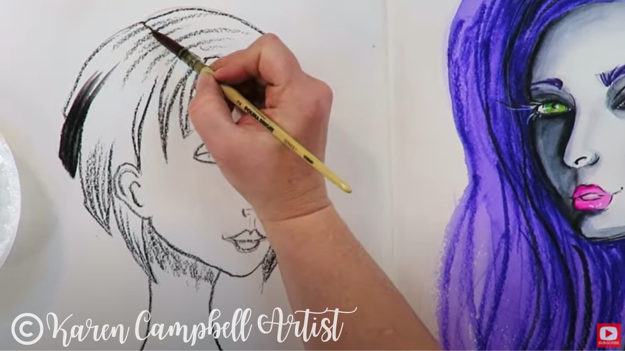
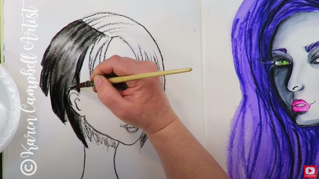
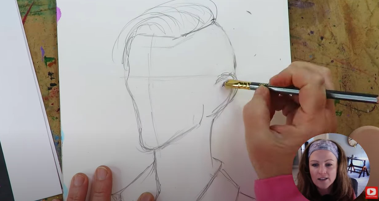
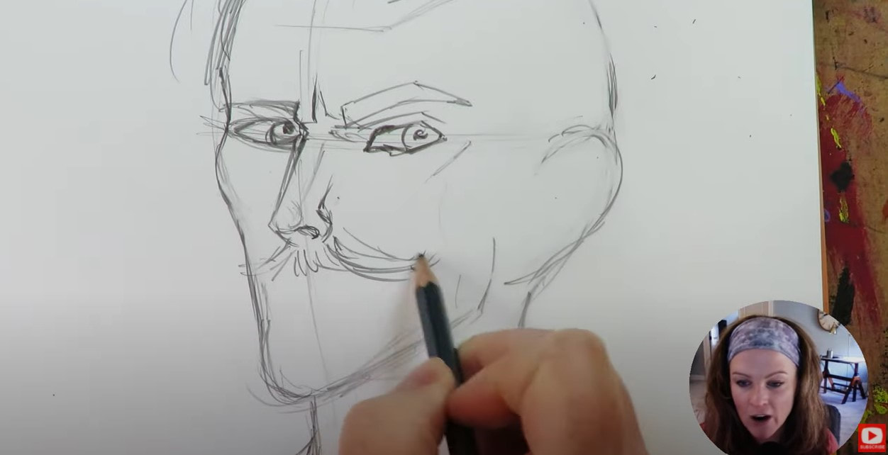
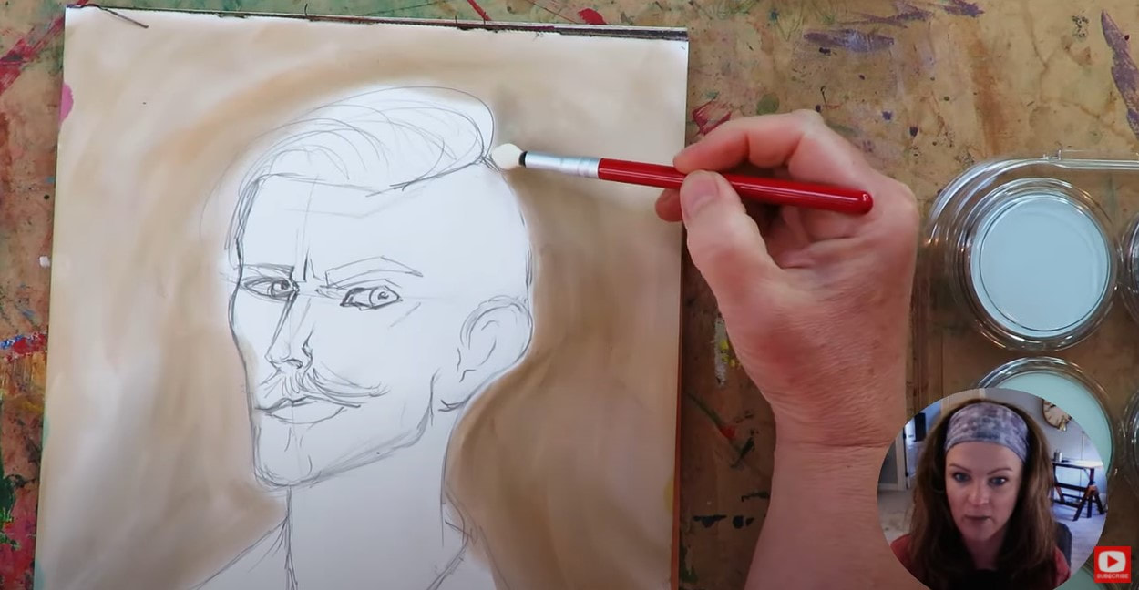
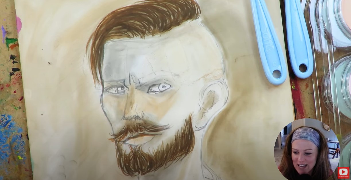
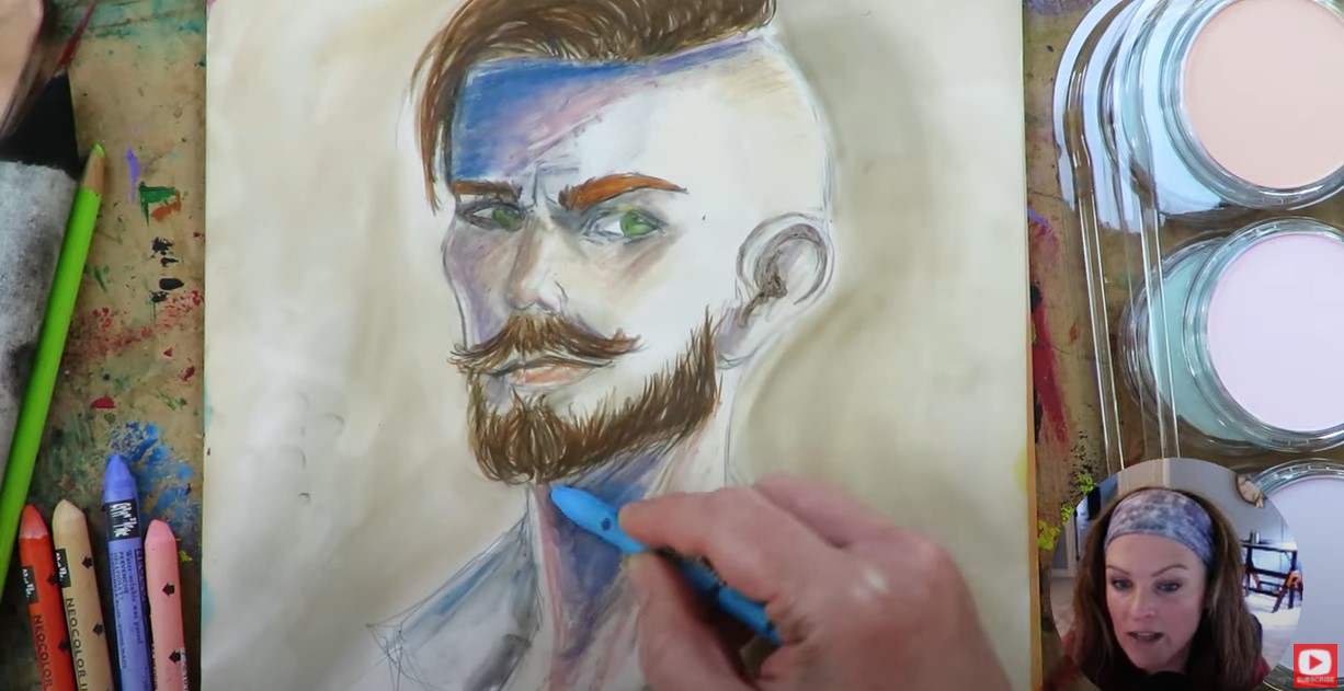
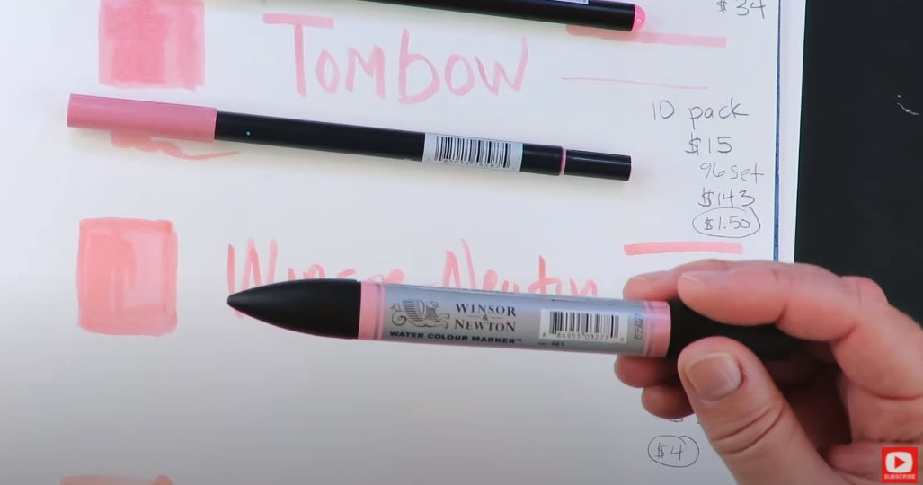
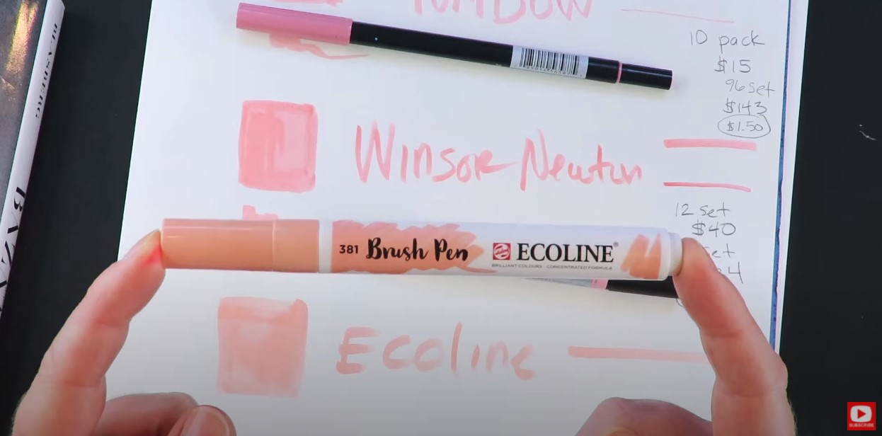
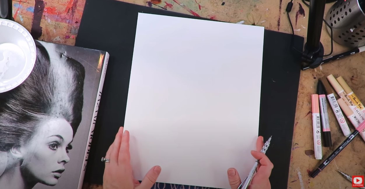
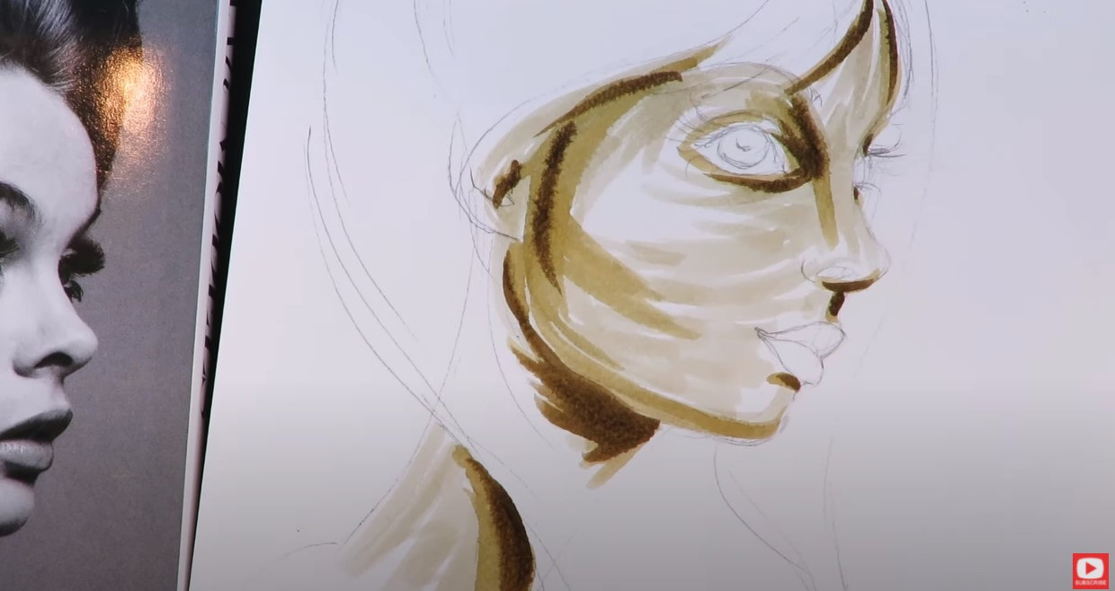
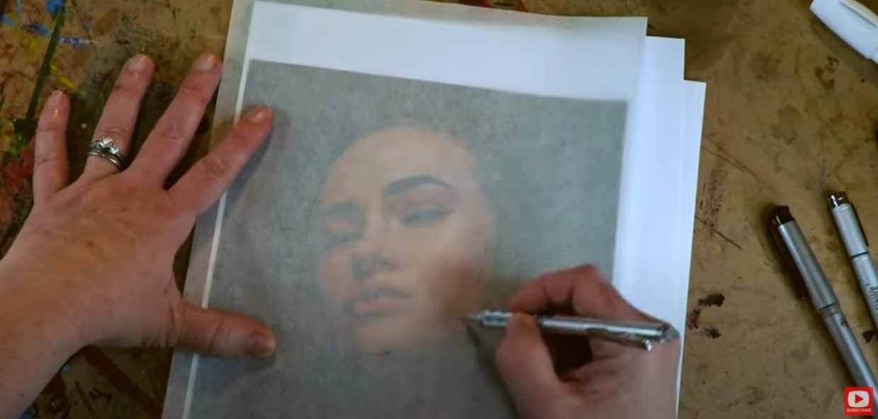
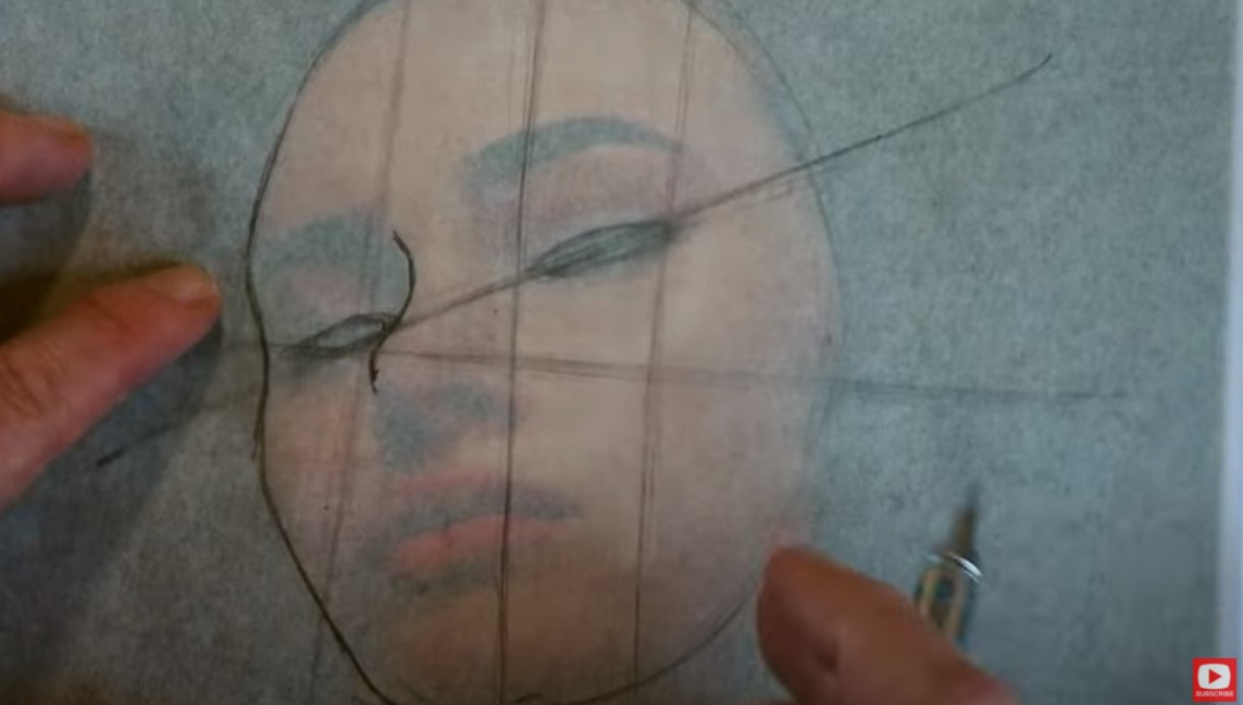
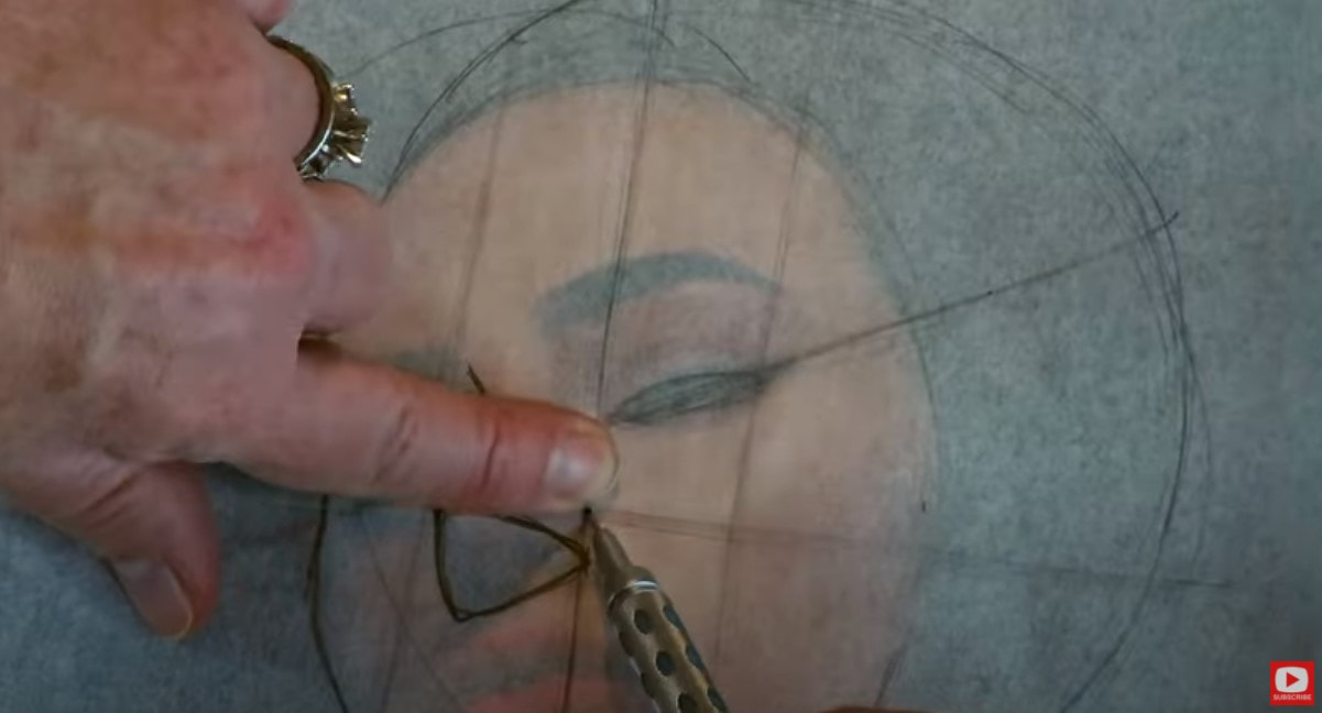
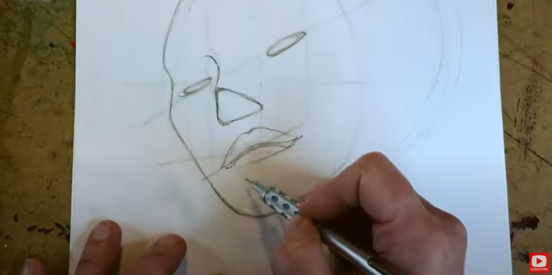
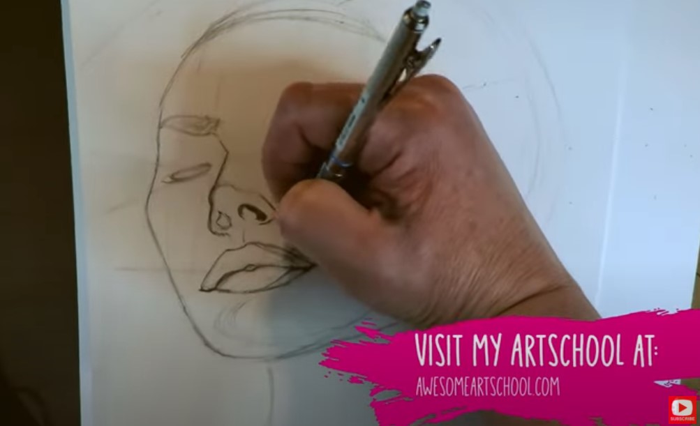
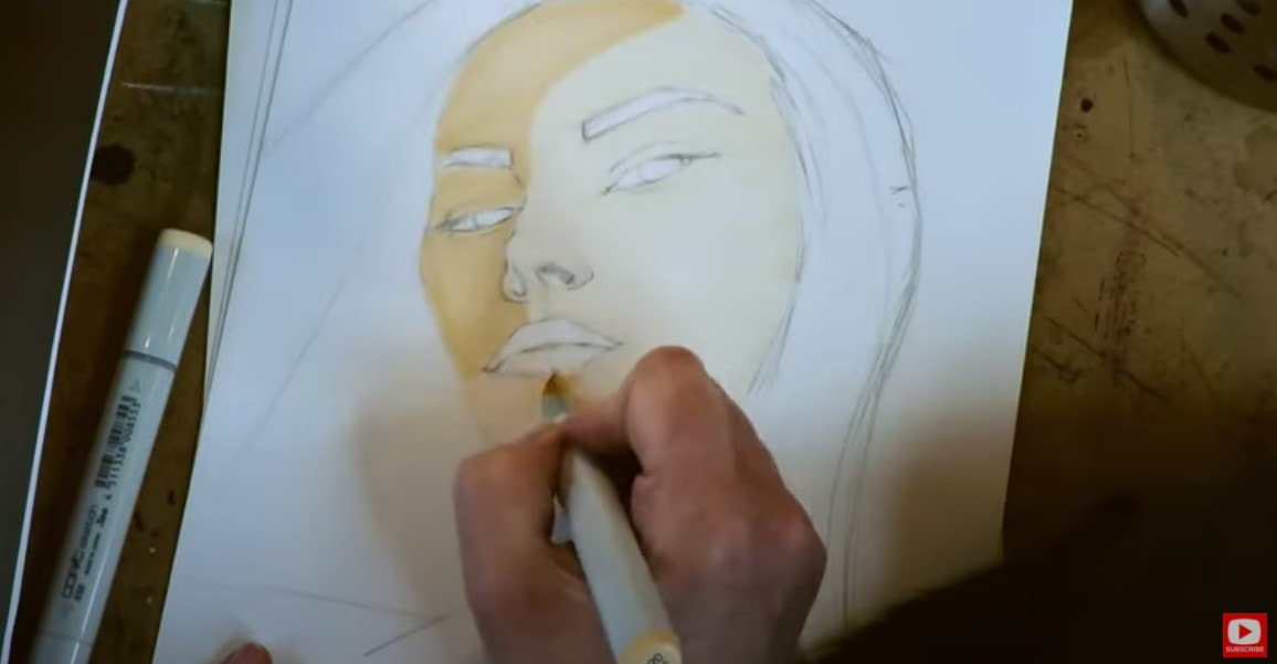
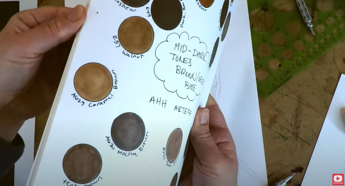
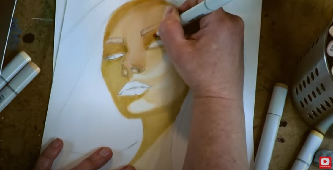
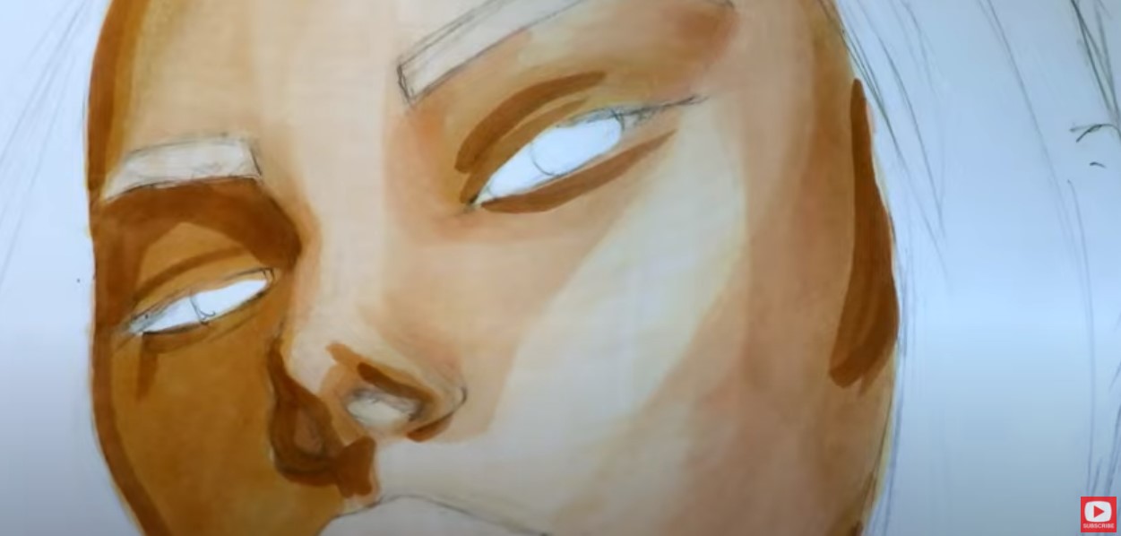
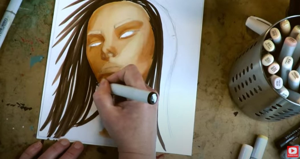
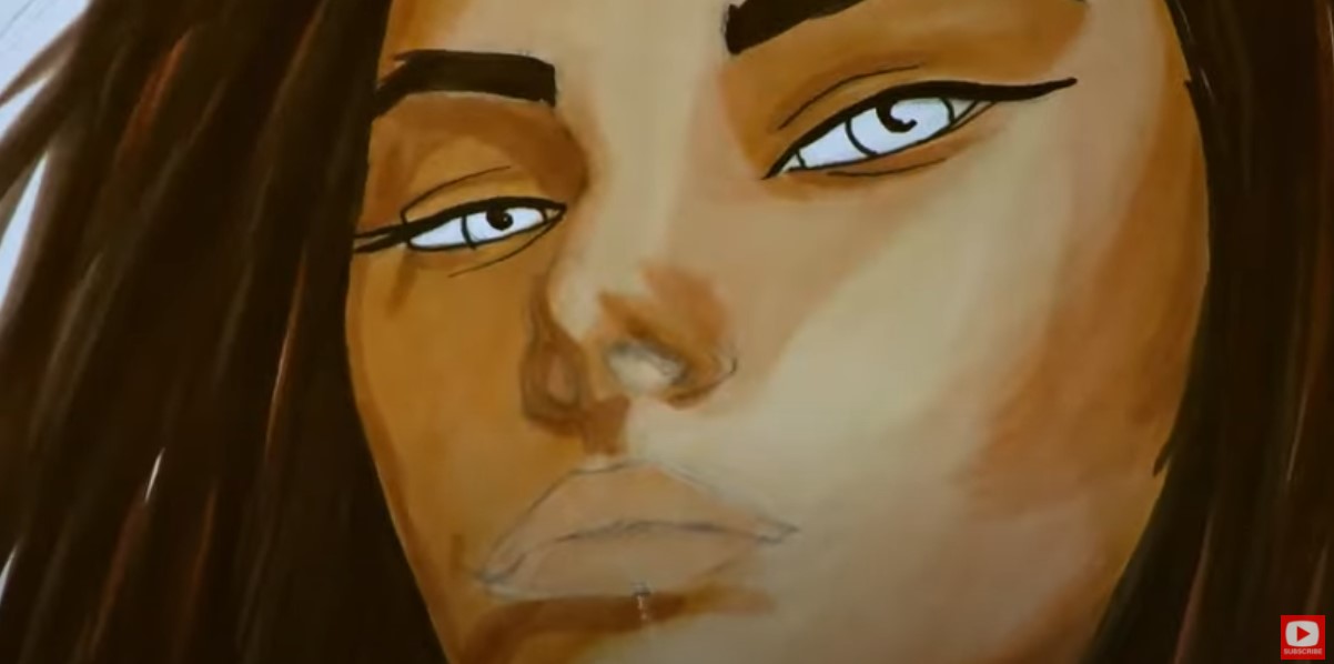
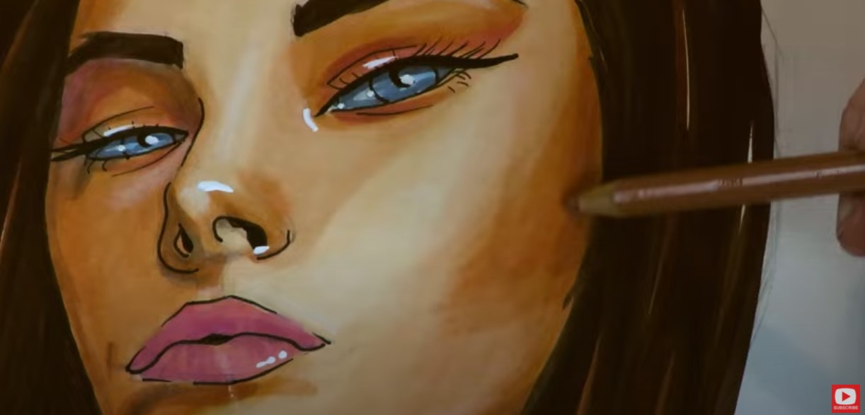
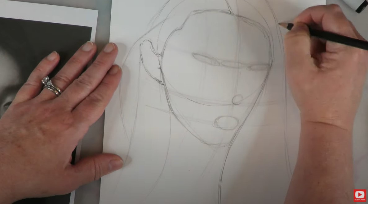
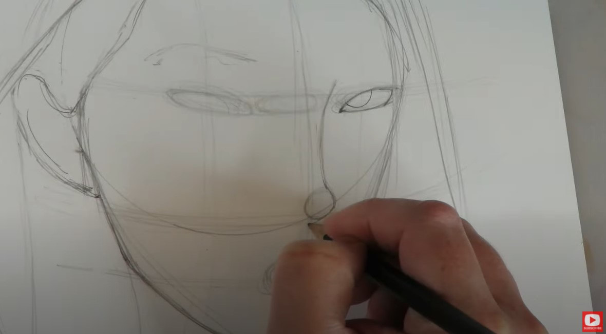
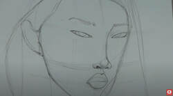
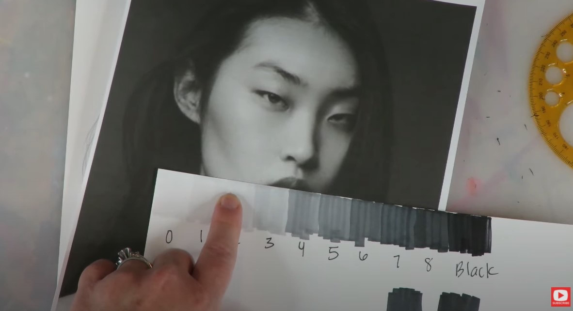
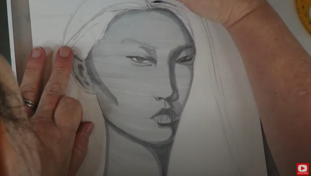
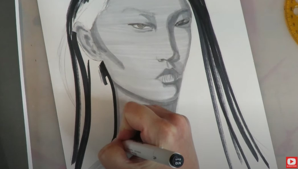
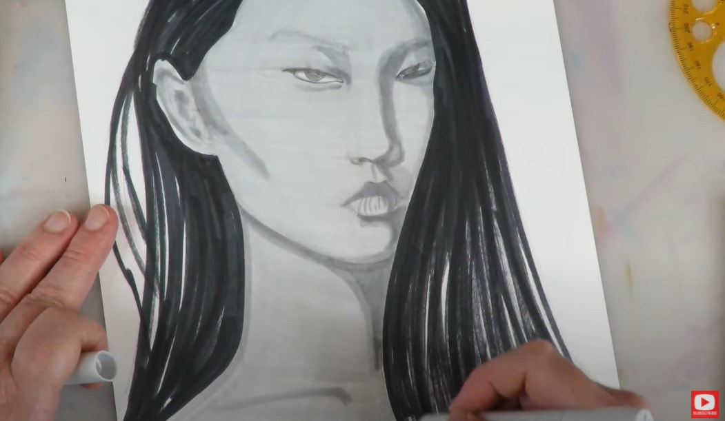
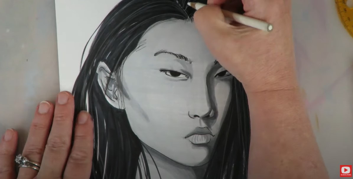
If you'd like to draw along with me in today's video, grab a pencil and sheet of drawing paper. I'll be coloring my drawing in with alcohol markers. If you plan to do the same, be sure to create your drawing on Bristol or a smooth cardstock alternative like this.
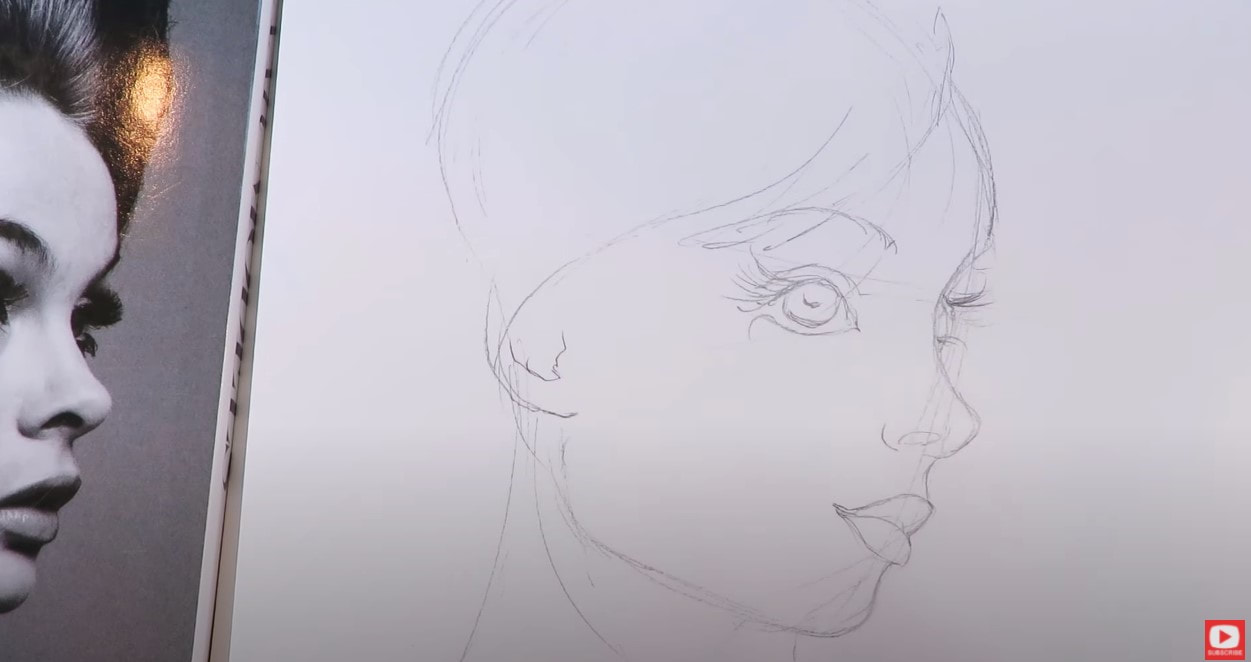
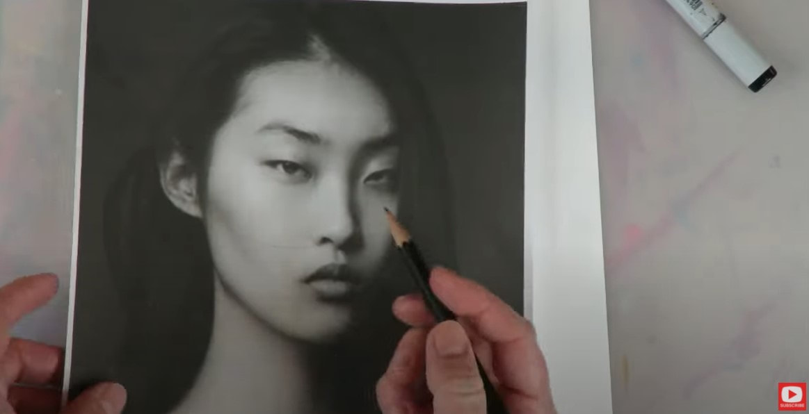
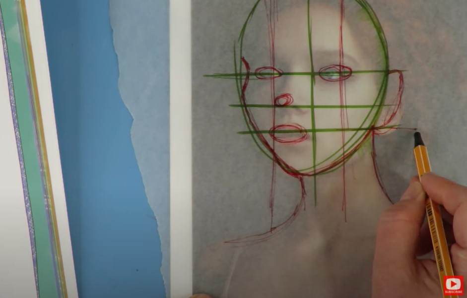
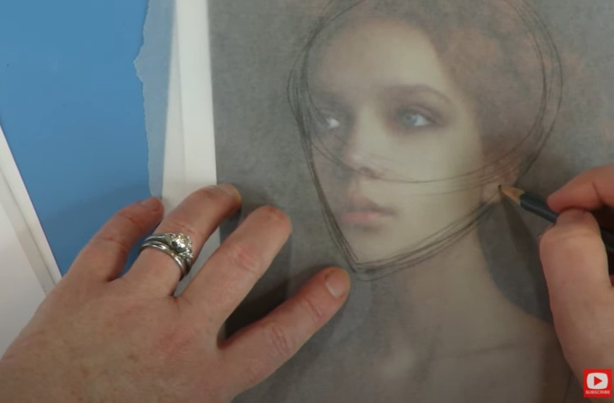
I started this drawing off with a copy of my reference (Girl With a Pearl Earring painting), and used my 3/4 face drawing guidelines. These come straight outta my book - How to Draw MORE Fun Fab Faces, but I also offer them as a FREE DOWNLOAD in case you're interested! Simply CLICK HERE or press the button below to grab my cheatsheet, then meet me right back here for the rest of the video. 
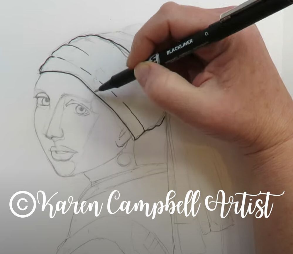
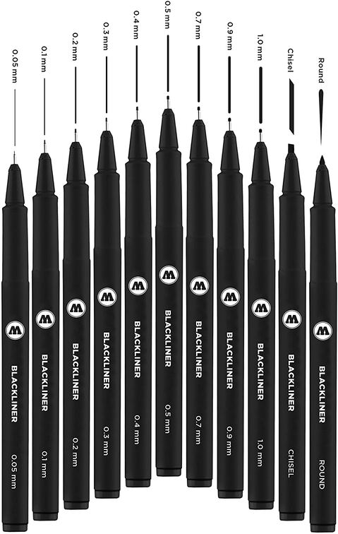
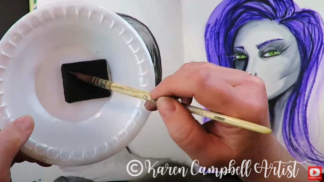
How to Use Fineliners with Alcohol Markers
|
Karen CampbellFounder of Awesome Art School. Mixed Media Artist. Author of 19 Instructional Art Books! 
Whose work has appeared in...
 Archives
July 2024
Categories
All
|


 RSS Feed

"Karen is flipping hilarious and she's very real...I like the way she teaches in a way that really gives you confidence, whether you're a beginner or advanced there's always something new to learn!"
- Elizabeth W. |
What Fans Are SayingKaren, you are absolutely fabulous! You make me feel like I can draw anything. I have recently retired and finally have the time to do some of the art that I have loved since I was in school. I am really at the beginning of my art journey and I hope to learn as much as I can. Thank you for all you do. |
Contact ME |