|
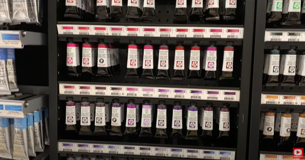
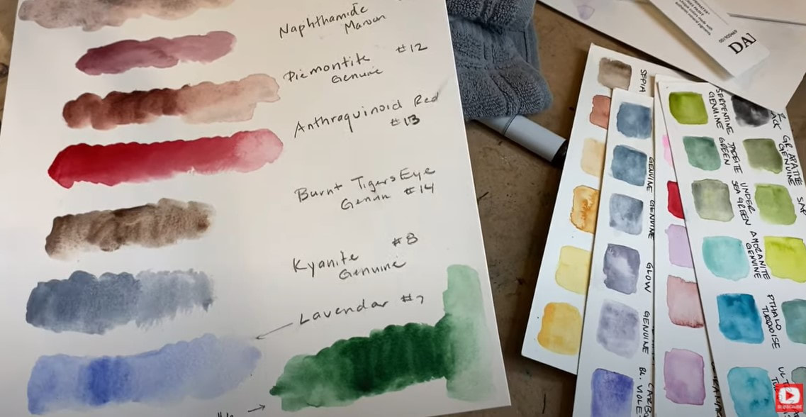
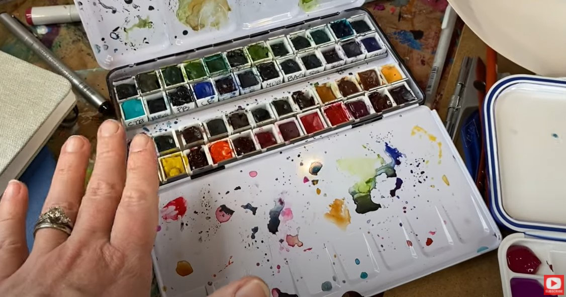
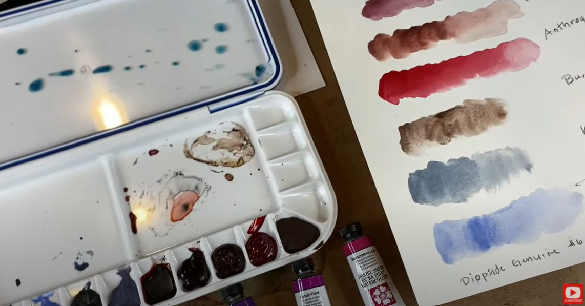
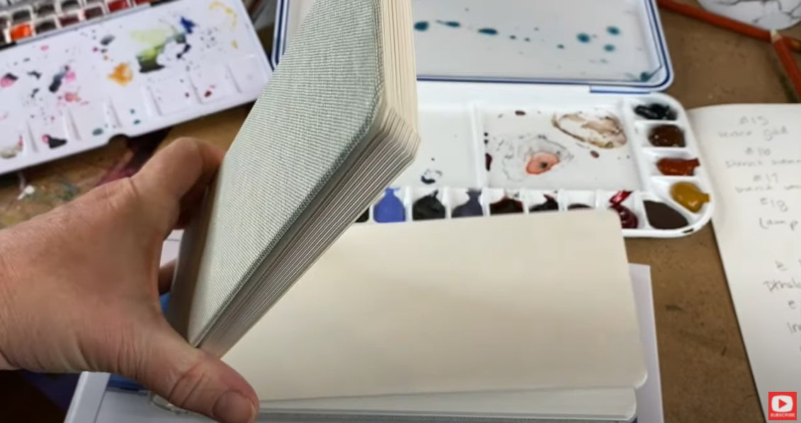
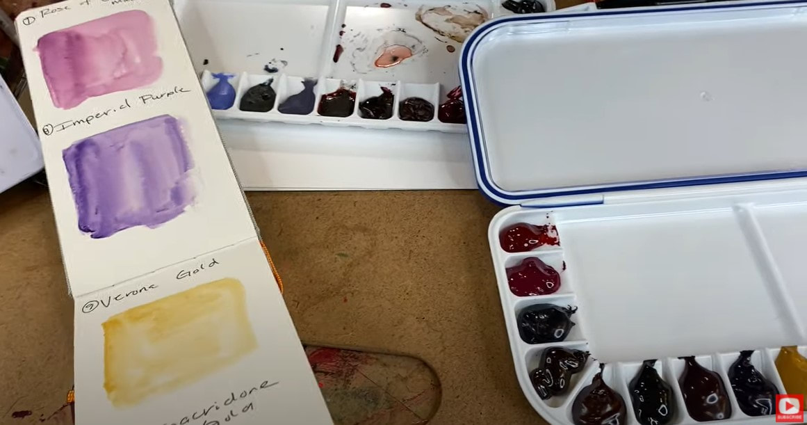
There are SO many watercolor supplies on the market today! It can feel totally overwhelming if you're a beginner thinking about trying watercolors for the first time, or someone who wants to invest in a special watercolor palette, and no idea where to start! Which watercolor brand should you buy? If you have a limited budget - which colors should you start with? Today's YouTube video on my mixed media channel is all about what I WISH someone had shared with me before I started building my first watercolor collection! I'm in LOVE with a watercolor brand called Daniel Smith. If you're new to Daniel Smith watercolors, these tubes are pricey, but if you want to try watercolor, I recommend cutting through the cluter on the shelves at your craft store and choosing something that will give you a quality experience from the very beginning. You can absolutely try something cheaper that gives you more colors for less money, but I guarantee you'll go back to the store looking for something better in time, and you'll spend MORE on trial and error with your supplies than if you had selected one or two shades of Daniel Smith watercolors to play with from the start. To me, there is just something magical about how Daniel Smith watercolors look when you put them on paper. They have some GORGEOUS granulation properties in them that make me feel like I'm working with raw elements directly from the earth when I paint!! In today's YouTube video I'm showing you EXACTLY how to build your first Daniel Smith watercolor palette! A watercolor palette is simply a case to hold a collection of colors. Many brands carry sets of prefilled palettes, but typically I prefer to create my own. Before we continue, super quick announcement: All product links are Affiliate. I may earn a small commission if you choose to order through these links, but by law there is never any additional cost to the consumer for doing so. I thank you for your support!! There are multiple ways to go about making your own palette. The one above contains tiny, removeable squares called half pans. I buy them empty so I can squeeze my favorite colors into them and create an entire palette of beautiful options to paint with. Alternatively, you can select a watercolor palette that has indentations or little wells in it - like the one shown below- to hold your colors. You choose whichever style you like best to work with! As you'll see- when you squeeze watercolor tubes onto your own palette- the paints look much darker here than they do when you add water to them and put them on paper! Because of this- it's SUPER EASY to wet your brush and think you're dipping into black, when it's actually indigo, green or purple!! To help yourself remember which colors live where in your palette, you'll want to create a little "key" for yourself. This is called color swatching. You can cut out a piece of watercolor paper to fit inside your palette, or you can swatch in your watercolor sketchbook, etc. I bought this adorable, long watercolor sketchbook and have decided to use this to swatch the colors I'm dropping into a new palette with only my absolute FAVORITE Daniel Smith watercolor shades! Be sure you watch the video to see just how I do this so you can replicate it at home for yourself whenever you're ready! In the video I also give you my recommendations about which colors you might want to start with if you have a limited budget or just need some ideas on where to begin!! I also love using Silver Black Velvet watercolor brushes, but if you need help selecting a watercolor brush - I've got an entire VIDEO on this subject ready and waiting FOR YOU!! I hope you find this helpful and I can't wait to see what you create!!! I think you're going to LOVE the world of watercolor - especially if you're using Daniel Smith!! See ya back here next week!!
0 Comments
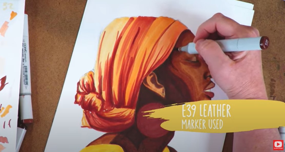
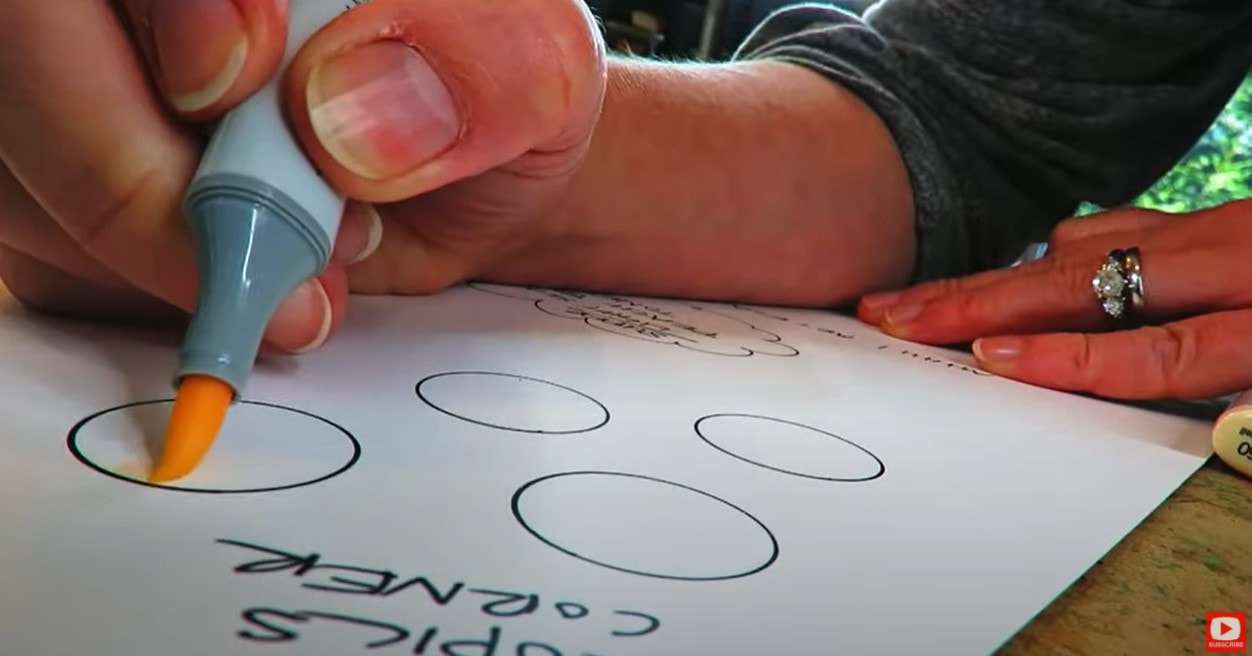
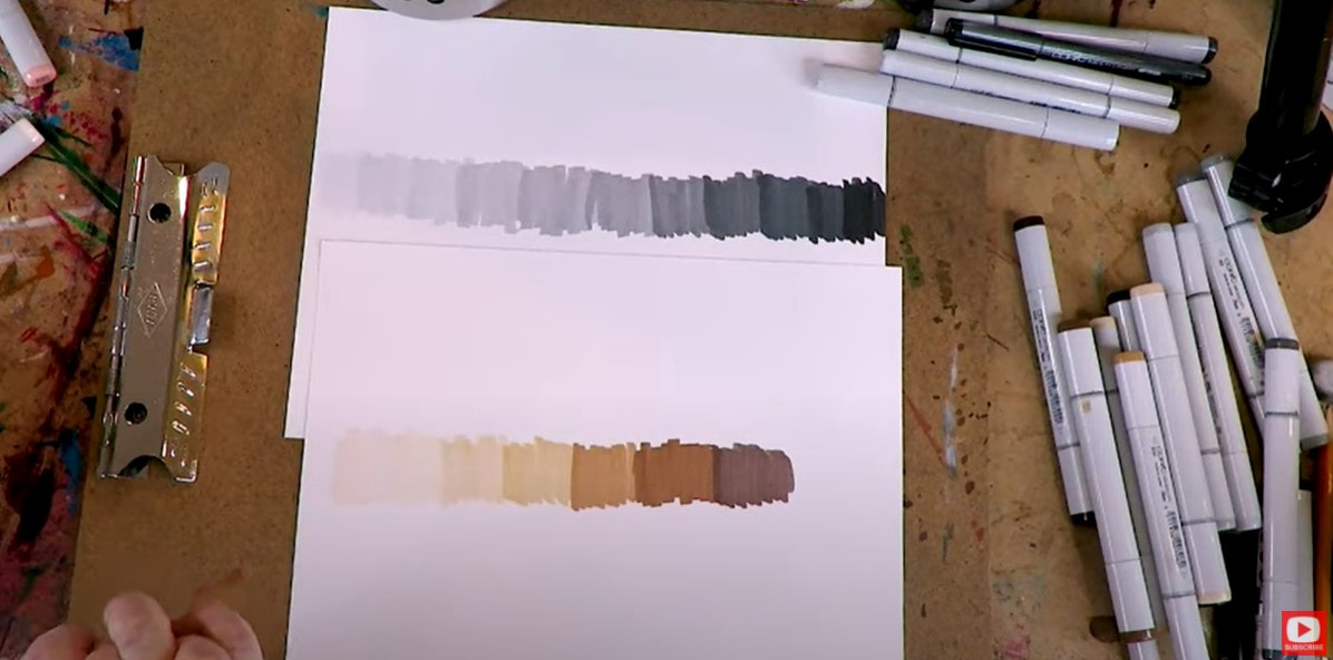
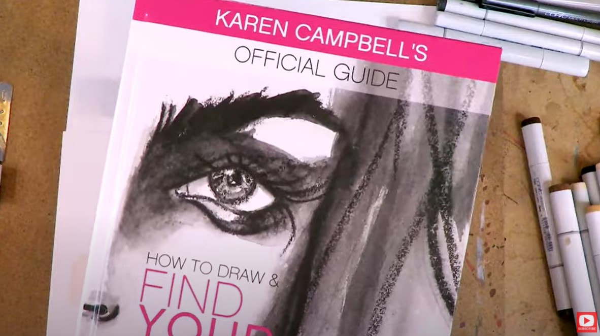
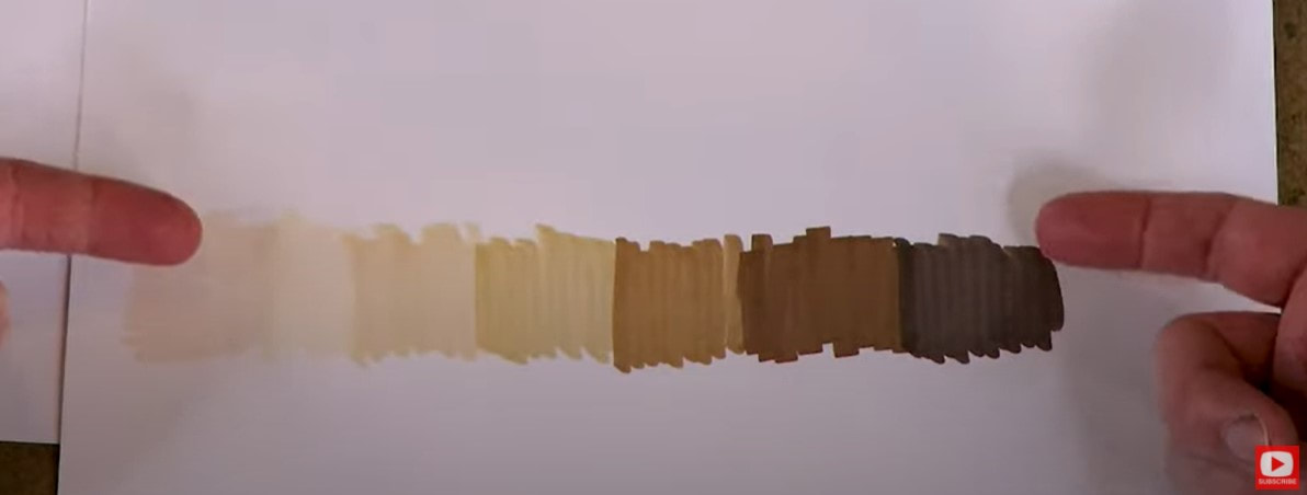
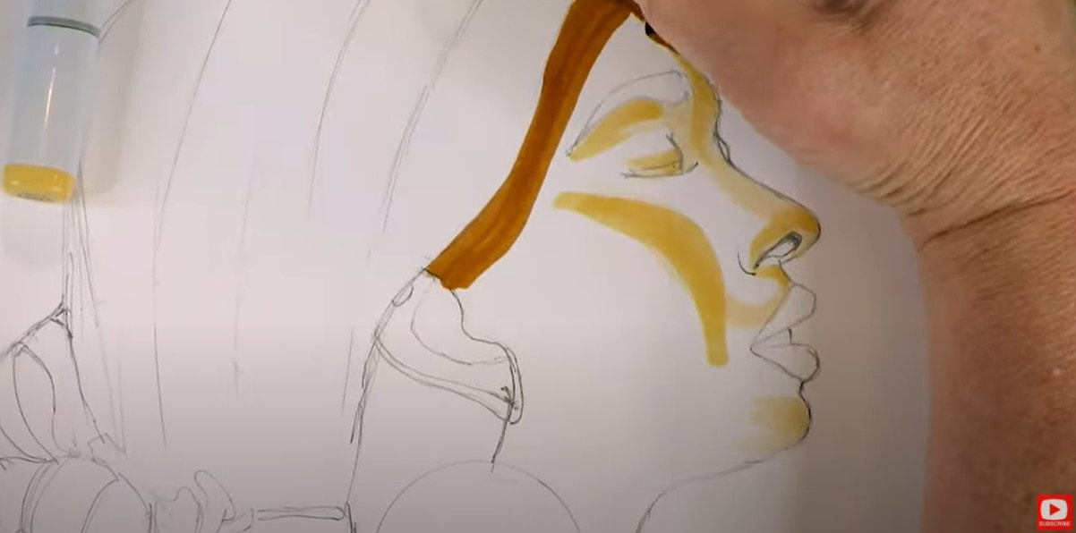
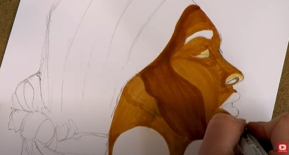
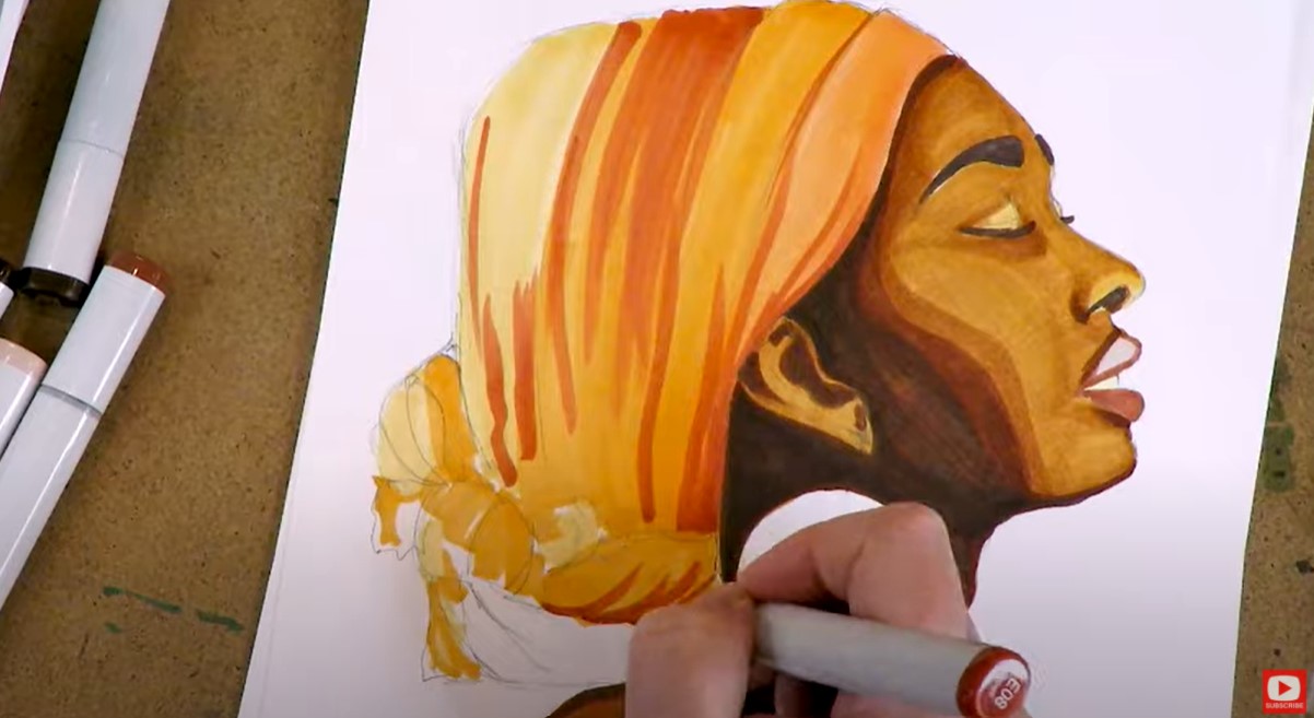
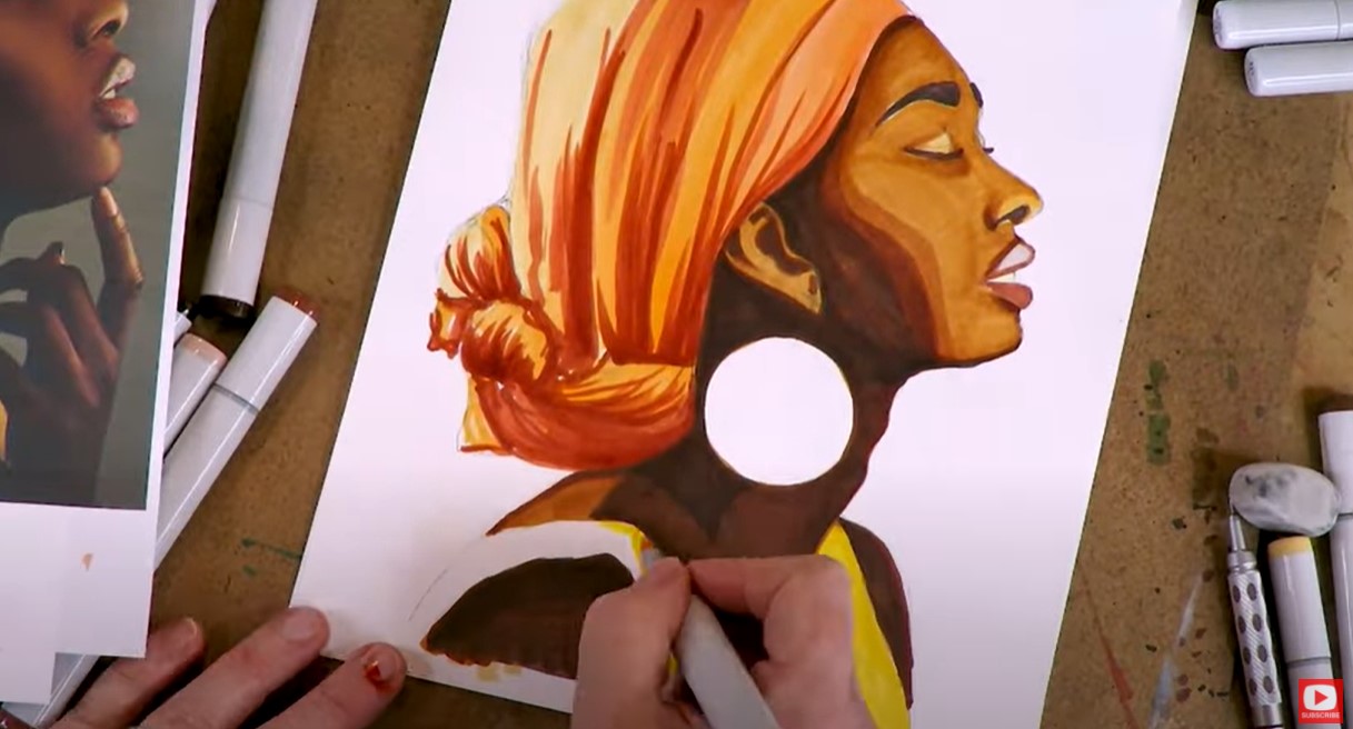
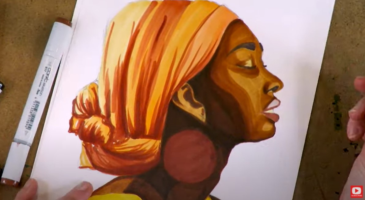
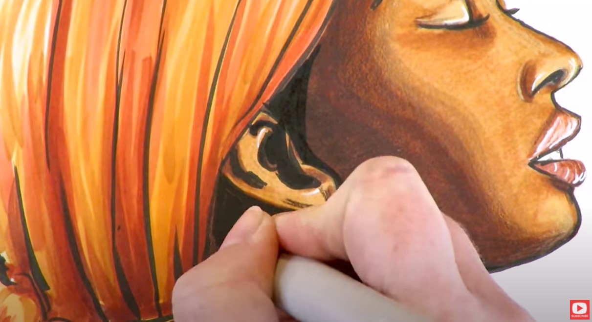
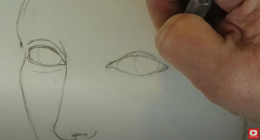
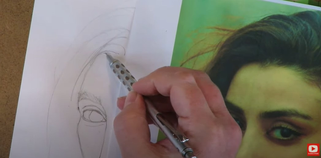
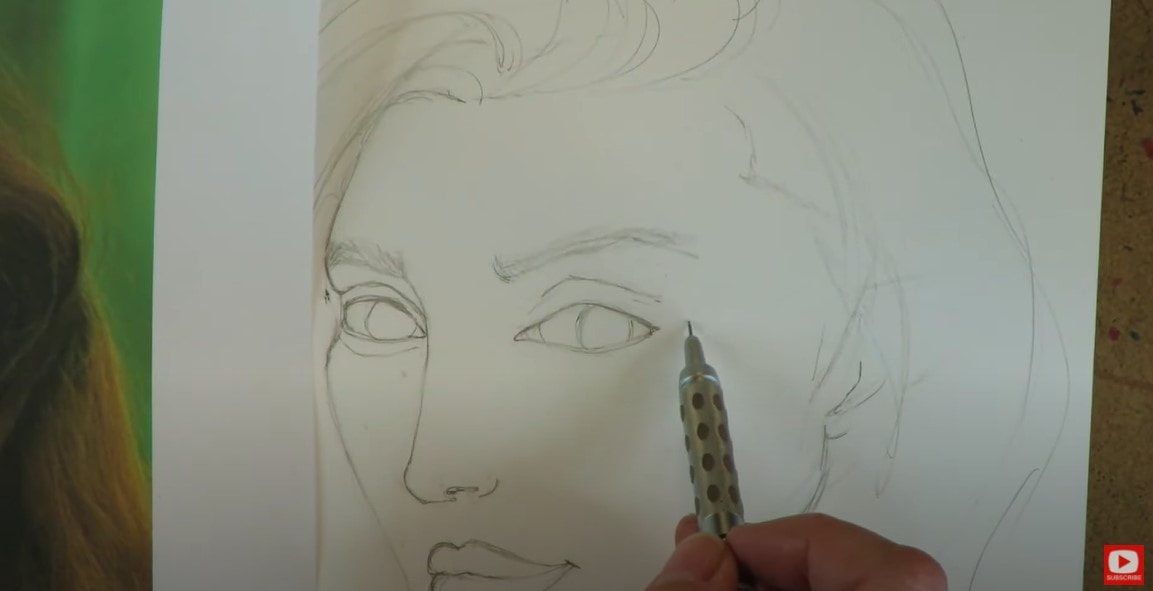
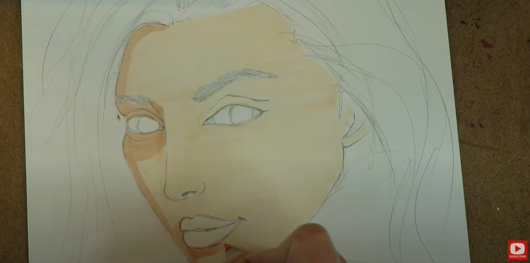
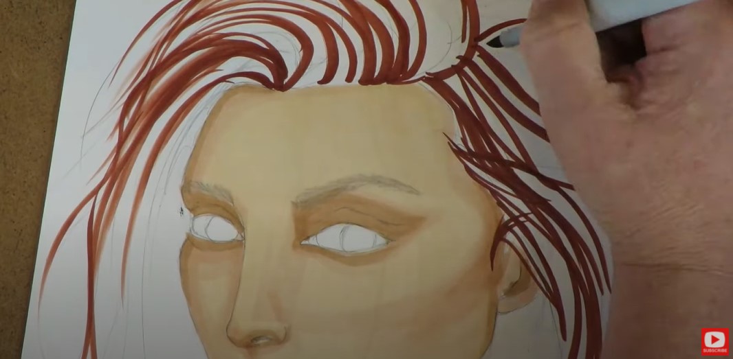
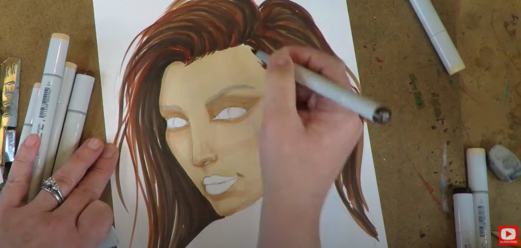
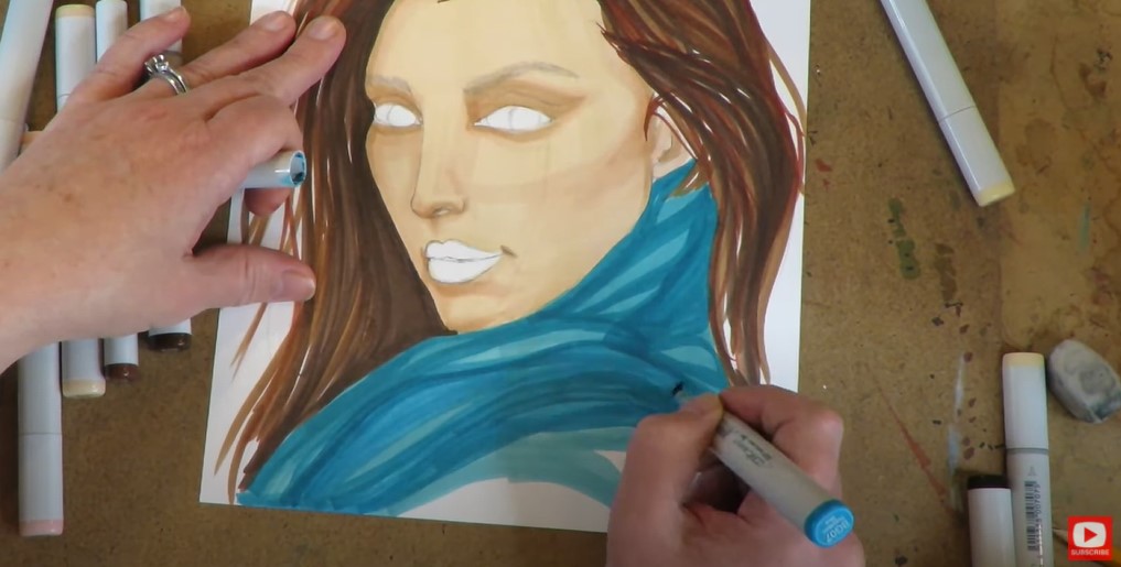
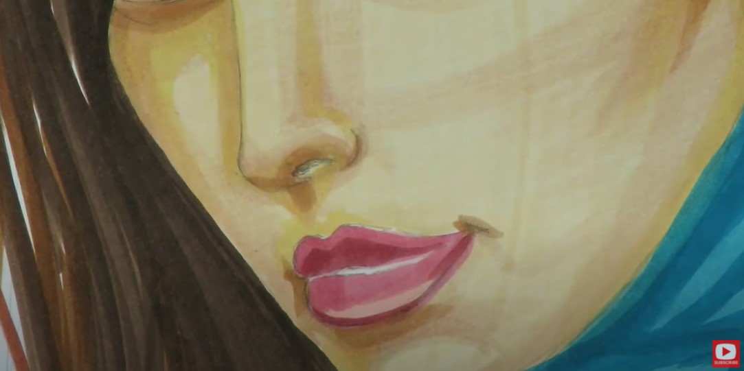
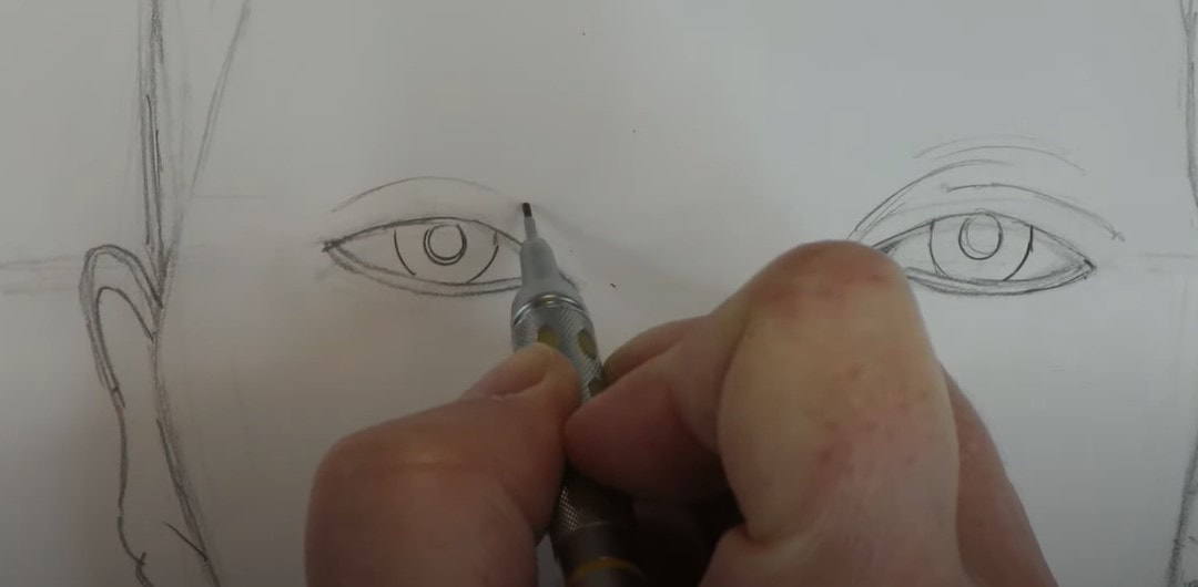
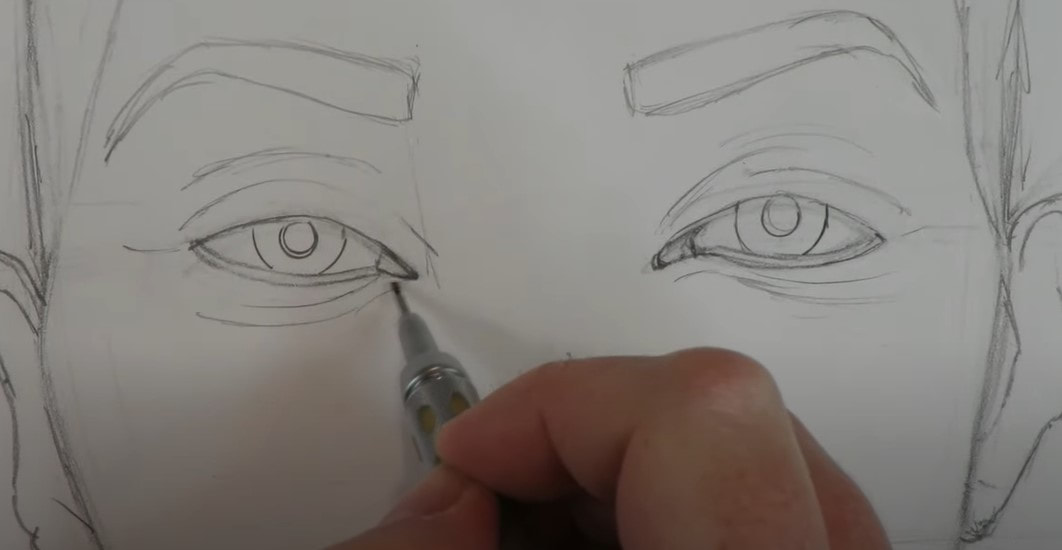
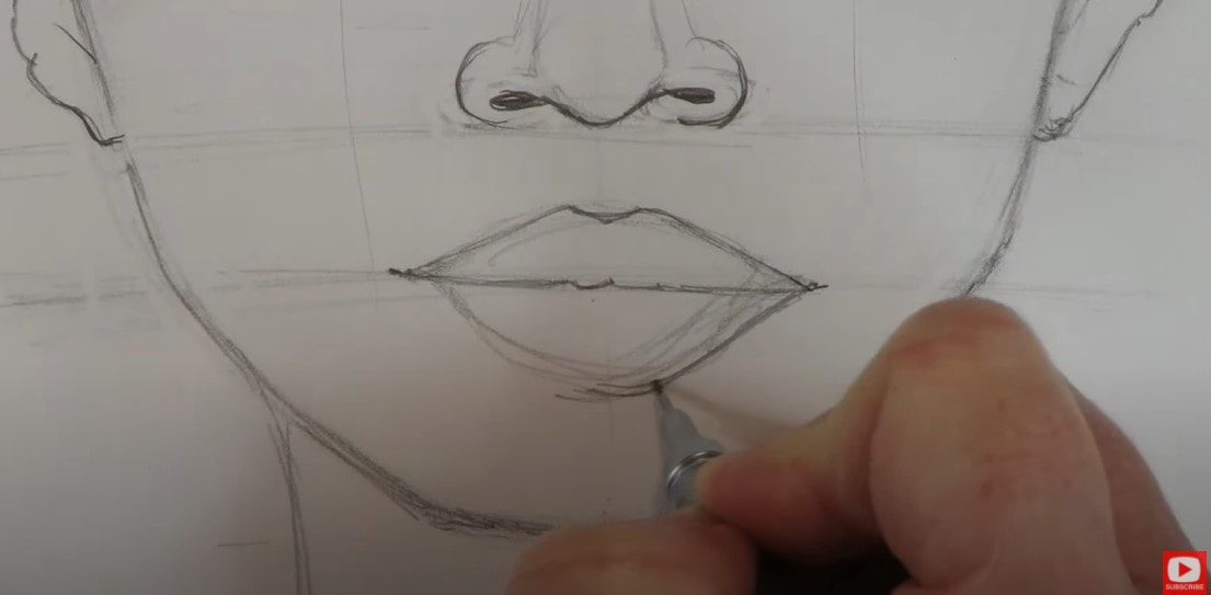
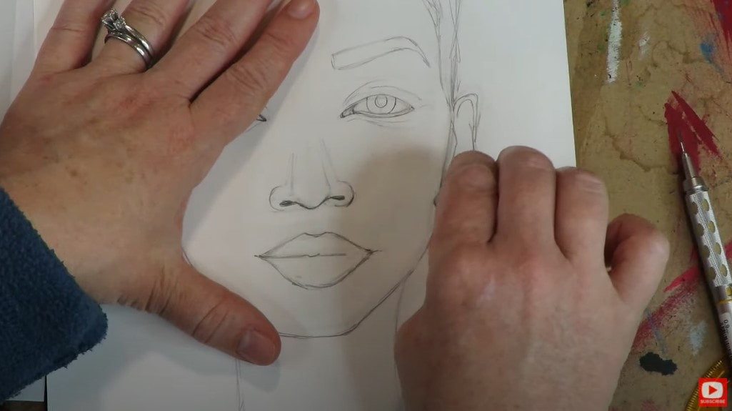
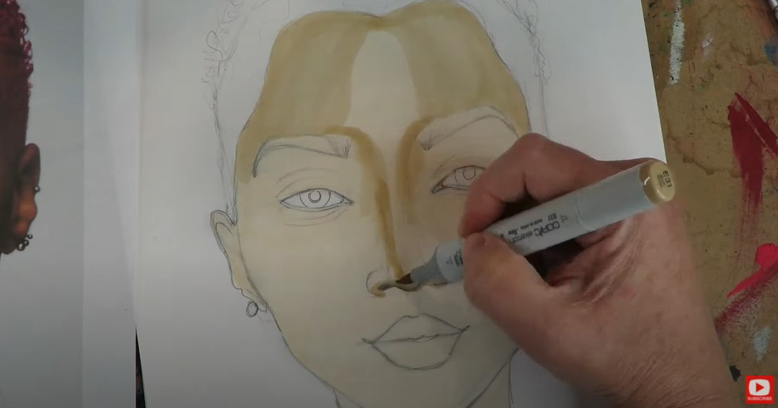
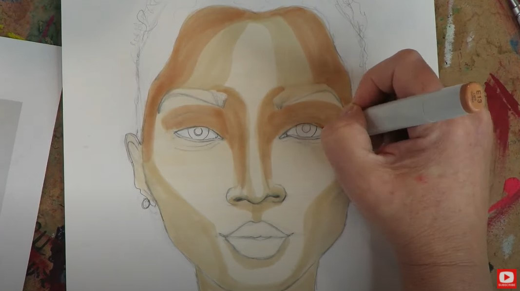
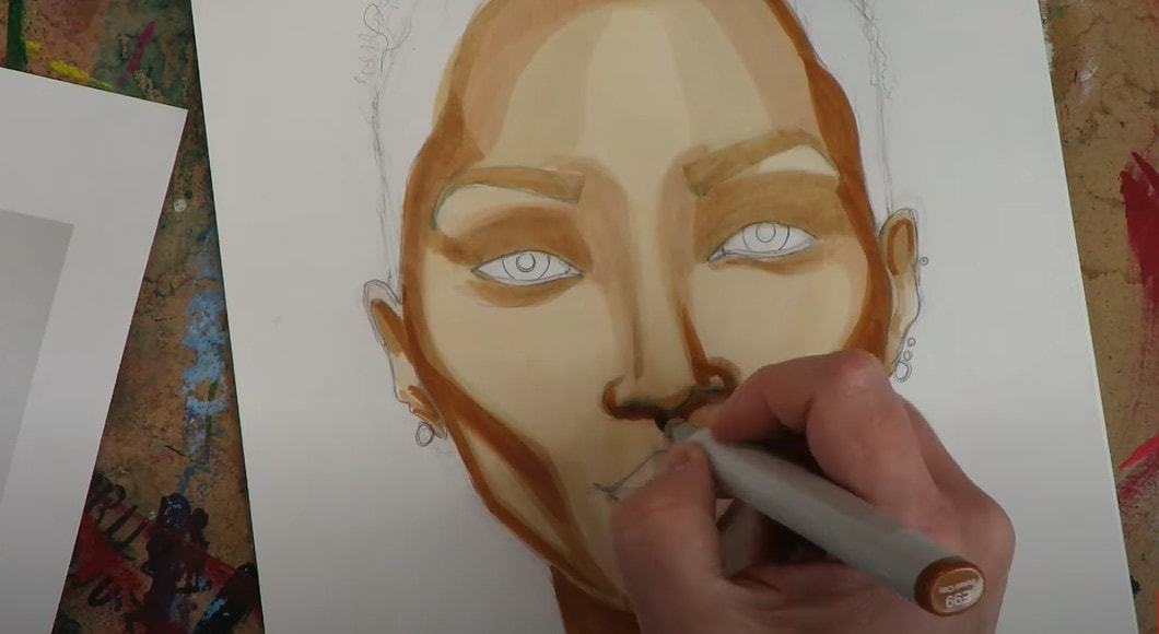
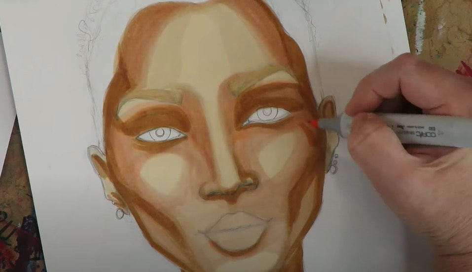
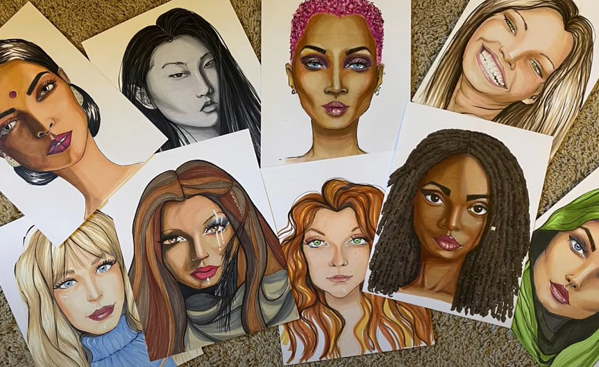
I've been collecting copic markers (especially copic skin tones!) for some time now, but they don't come cheap!!! Tons of students have reached out asking if there is a copic marker alternative I can recommend that is more affordable to do their Whimsical Women of the World face drawing projects with. I bought ALL the ohuhu skin tone markers and artezas I could get my hands on so I could give YOU some answers in today's YouTube video on my drawing channel!!! The questions I've been hearing the most from students, are not only how do the various alcohol marker brands compare to one another, but more specifically - are there equivalent marker shades from brand to brand of alcohol based markers? For example - if you've got the ohuhu skin tone markers set - which number should YOU use if I'm using copic E39? I WISH it was that simple!! Since it's not- I created a cheatsheet to help you out - with my own skin tone marker swatch comparisons!! If you'd like to get your hands on this 12 page PDF for FREE, and save yourself TONS of money and hours in swatch time (it literally took me THREE hours to do this), LOL! Click the button below, and I'll send the Color Swatching Guide/ Cheatsheet straight to your inbox!! Make sure you click over to today's video, so you can see how I decided to swatch colors out across the three alcohol marker brands I'm comparing (Copic vs Ohuhu vs Arteza) - while keeping things as SIMPLE as possile for YOU!! Before we continue, super quick announcement: All product links are Affiliate. I may earn a small commission if you choose to order through these links, but by law there is never any additional cost to the consumer for doing so. I thank you for your support! Personally, I love the copic markers brush tip to do most of my coloring with, because it feels so much like a paintbrush to me when it glides across the page. I can also achieve some really unique effects by changing the pressure I use when pressing down with my marker. However, I DID find ohuhu brush markers have a very similar feel to them and actually found them to be just as juicy as my copics, but for SO much less money!! Ohuhu markers come in a 24 piece skin tone set, for about $32 on Amazon vs the Copic skin tone pack of 6 for around $33. I know- WAY cheaper, right?! Arteza also has a nice set of alcohol markers for beginners available on Amazon. You can get an Arteza Everblend set of 36 skin tone markers for around $36. That's a pretty insane value if you're on a budget and just want to have a little fun!! Did you click over to get the color swatching guide yet? TRUST ME. You NEED this in your life if you are just starting to build an alcohol marker collection, and are looking for a copic marker alternative!  I hope you find the video and cheatsheet helpful!! Thanks for hanging out with me today!! See ya back here next week! HOW to DRAW & SHADE a WHIMSICAL African Face & Head Wrap in Copic Markers (Whimsical Women #11)21/12/2020 Teaching you how to draw a whimsical face is one of my FAVORITE things to do! I'm having SO much fun with the whimsical face drawing tutorials in the Whimsical Women of the World series! Not only does today's STUNNING model help us study profile drawing, we'll cover how to draw an African head wrap (including how to draw the fabric folds within it), how to draw a closed eye, and how to draw a face looking up! As always, the whimsical drawing portion of today's video is in real time so you can see exactly how I get it done!! To get us started off on the right track, I'm doing a mini review of the value scale to help you understand how important this is whenever you're drawing and hoping to take your artwork to the next level. If you incorporate the lightest light ALLLLLL the way to the darkest dark, and everything inbetween... your art will be so much more sophisticated!! Real quick, before we go any further: All product links are Affiliate. I may earn a small commission if you choose to order through these links, but by law, there is never any additional cost to the consumer for doing so. I thank you for your support! I talked about how to shade skin tones in graphite (or black and white variations of the value scale), a lot in my How to Draw & Find Your Style book because it's easiest for beginners to learn about value scale drawing in black and white first. Graduating from shading in graphite / black and white to color can be tough and trip some artists up, but it's exactly the SAME concept as grayscale- you're just essentially working in browns! HOT TIP! Be sure to create a value scale of skin tones for yourself that looks something like this before you start shading. I recommend you also write the name of the marker color next to the shade so you know exactly which one to pick up when the time comes! One of the reasons I have loved doing this Whimsical Women of the World portrait drawing series is because I could push myself to explore all the variations of skin tones represented in countries around the world. If you've watched me before, you know I LOVE dramatic highlights and shadows, which today's reference photo is FULL of!! If you'd like a copy of my reference photo, hop over to AwesomeArtSchool.com and click into either my YouTube & Cheatsheet Library, or the Whimsical Women of the World classroom to download the reference image from today's lesson, or any lesson from this series! If you are a member of the Fun Fab Drawing Club over at Awesome Art School, the Whimsical Women of the World classroom has already been made available to you within the club!! If you're not a member of the club, but are interested, please sign up for the waitlist, and you'll receive an email from me when the membership is open for enrollment again in the spring! Today's portrait drawing tutorial is a profile. Instead of teaching you my "Fun Fab" approach for side profile drawing- I'm showing you a little more advanced method from my book. It's a bit more realistic. If you start watching today's tutorial and begin feeling like this is a little too advanced for you- don't worry!! The drawing projects in the Whimsical Women series ARE more advanced. But I work hard to break them down for you to keep things simple, so when you do feel ready, you can dive right in!!! If this looks fun for you but feels a little out of reach at the moment, I've got an awesome 6-part video profile drawing series on YouTube that teaches you my Fun Fab method for drawing whimsical profiles (it's more directed at beginners)!! If you'd rather start with a front facing face (most do!!) - here is the 5-part series for absolute beginners! Profiles can feel extremely tricky to draw because of all the angle variations that make us who we are as individuals. For example, in the photo above - I've highlighted the angle of the nose to the chin to show you just how much this changes from face to face. Some faces have a pronounced angle here, some have a more subtle one, and others have barely any angle presentat all - as in the case of today's beautiful model. I find using a sheet of trace paper helps me to understand the spatial relationships on a face before I draw it. You might find this to be a helpful trick as well! It's kinda like a practice round to warm up my hand. If you're not sure how to draw a closed eye, how to draw open lips, or how to draw fabric folds on a headscarf /african head wrap- be sure to click over and actually watch the portrait drawing tutorial so you can follow me in real time. For drawing fabric folds on our model's head scarf, I try to break the overall head scarf down into chunks / shapes that I can clearly see, then replicate on my paper. Since I'm doing a whimsical drawing, instead of a realistic drawing, I'm able to give myself a little grace here if things aren't perfect. Doesn't THAT feel good?! No need for perfection when you pull out your "whimsy" card!! When everything is sketched in, go ahead and start erasing all your guidelines. My favorite eraser is the vanish eraser - which you can pick up for about $2 at Jerry's Artarama, or on Amazon for a bit more. If you're not using alcohol markers to color in your drawing like I am, just be sure you have a nice gradation of skin tone shades swatched out before you begin so you know what to reach for when you're ready to start incorporating each shade! We want the WHOLE value scale represented in your work, because this adds dimension and sophistication!! You have two choices when you're shading- either shading from light to dark or from dark to light. I've chosen to shade light to dark today- hitting the highlighted areas of her nose and chin first. As you'll see in my work, and in your own (if you're using copic markers or another brand of alcohol markers), these can be very streaky. To reduce the streaks, it helps to lay your color down quickly so the shades blend into one another a bit when the ink is wet. You can also choose one color to shade over transitional lines to attempt to soften these lines, or add colored pencil shading over the top of your marker layers. When you're blending copic markers, you can also try shading one solid color in strokes running the opposite direction from how you originally laid down color. I often use the lightest or a medium skin tone marker when doing this to my face drawings. Be sure to watch the tutorial because I demo this today and in many of the videos from this series. When I selected marker shades for the headscarf, I used the exact same strategy as I did for choosing skin tone markers to work with for this project. You want to choose 3-5 shades that transition nicely and can blend into one another to represent various stages of the value scale from lightest to darkest. If you're intimidated by the head wrap or not sure how to draw folds in fabric- this really is easier than it looks! I find it to be similar to drawing hair. Follow me, and I'll break it down for you. The farther I get into my project, the more layers I continue to build up on her face to eliminate some of the streakiness in my transitions. But I also discover, the model in my reference image really is much darker than I have portrayed, and I need to continue darkening the shadows and blending skin tones to do a better job replicating what I see. Be sure to take your time here. Start slowly, and gradually build up those values. Honestly, the more layers you have, the more realistsic the skin will look- because we're all made up of many colors!! So just keep working and blending until you feel like you're at a good place and happy with what you've got. I used my pentel pocket brush for my outlining - including the detail work on her eyelashes, just as I have used it in the previous lessons. I actually had to recently change the ink cartridge on this pen and sadly, it hasn't been working the same for me as it used to!! As I was working the finishing touches on today's drawing, I decided to add just a bit more shading in and around the ear, because something about it was just bothering me! I ended up adding some black and it made all the difference in the world!! Now there is really some deep, gorgeous contrast! If there is anything I've learned during this series it's you can't have too many layers!! This amazing Hammermill paper I work on can seriously take a beating with my alcohol markers and I love it!!! The paper you work on is EQUALLY important as any other art supply you invest in. I hope you enjoyed this portrait drawing lesson in copics!!! I learned a ton, and hope you did too!!!
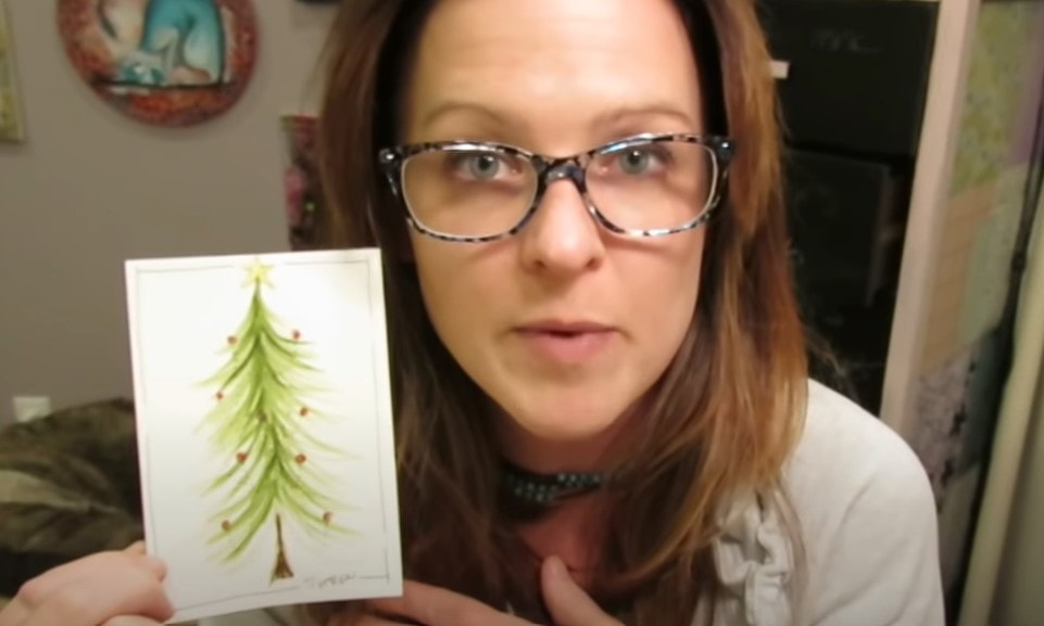
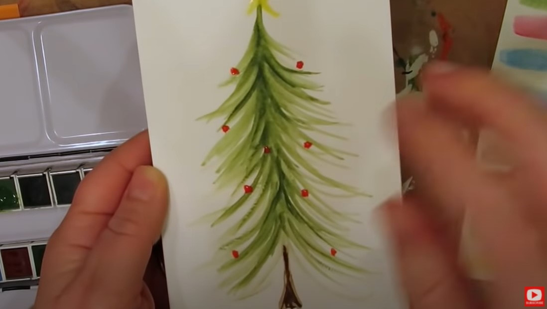
Who doesn't LOVE a whimsical christmas tree?! And let's be honest... who doesn't love a FUN project that's both QUICK and EASY?!
One of my friends over in the Awesome Artist Facebook community didn't believe me when I told her she could create this watercolor Christmas card in just 5 minutes, so I had to do a video to prove her wrong :)
Even if you've never even tried watercolor before, you absolutely CAN do this whimsical tree. It's perfect for beginners!!
If you don't celebrate Christmas, stop the lesson @ 6:25 and you'll have a cute pine tree watercolor painting!
If you're just learning how to watercolor for beginners - I have a super fun FREE DOWNLOAD for you! Simply click the button below and you can download my free Swatch Sheet!
Once you grab your swatch sheet and print it out, you'll likely enjoy this video teaching you how to use it! I print my swatch sheet over and over to swatch watercolors, markers, you name it! It's a life saver to help you keep track of what your colors look like on paper vs. what the tube or cap color LOOKS like the color should look like on paper ;)
Before we continue, super quick announcement: All product links are Affiliate. I may earn a small commission if you choose to order through these links, but by law there is never any additional cost to the consumer for doing so. I thank you for your support.
Now let's get back to today's cute watercolor project!
For this SUPER EASY watercolor Christmas tree project, I decided to try out a new little travel set of watercolors by Field Artist. This set comes with THE CUTEST, space saving travel watercolor brush that screws together.
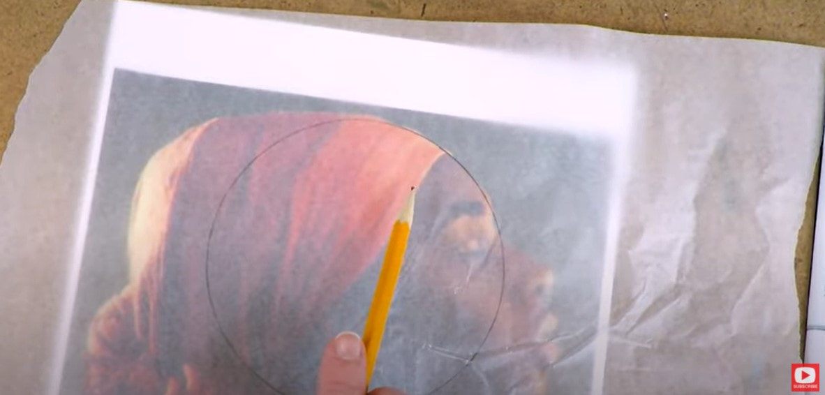
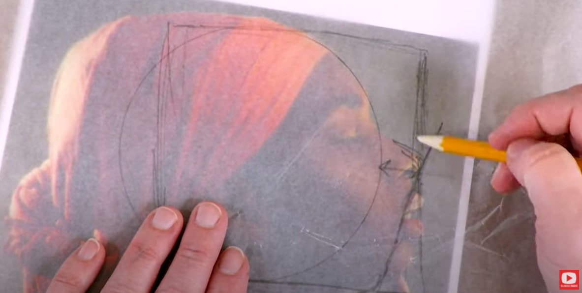
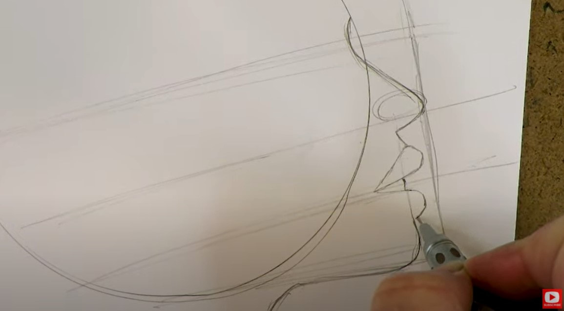
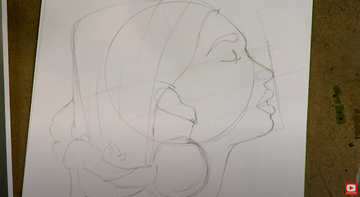
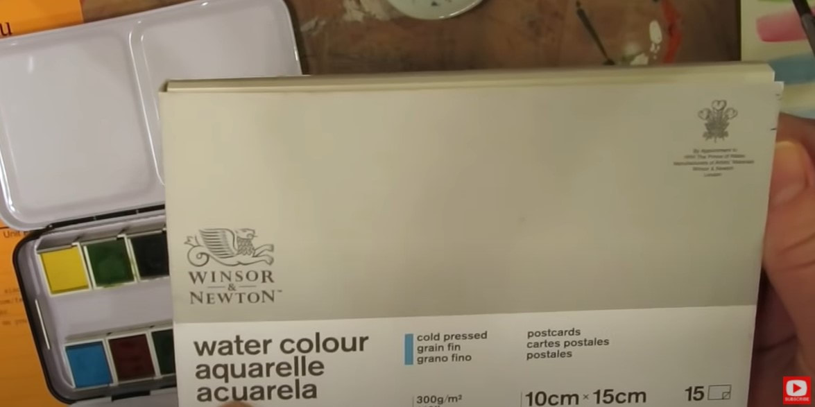
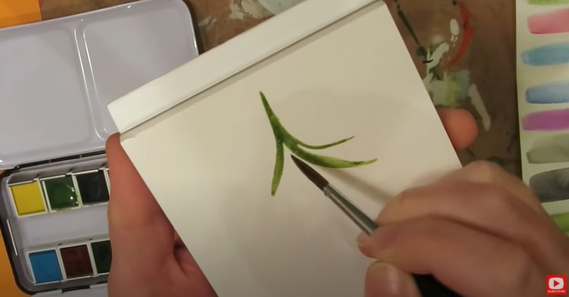
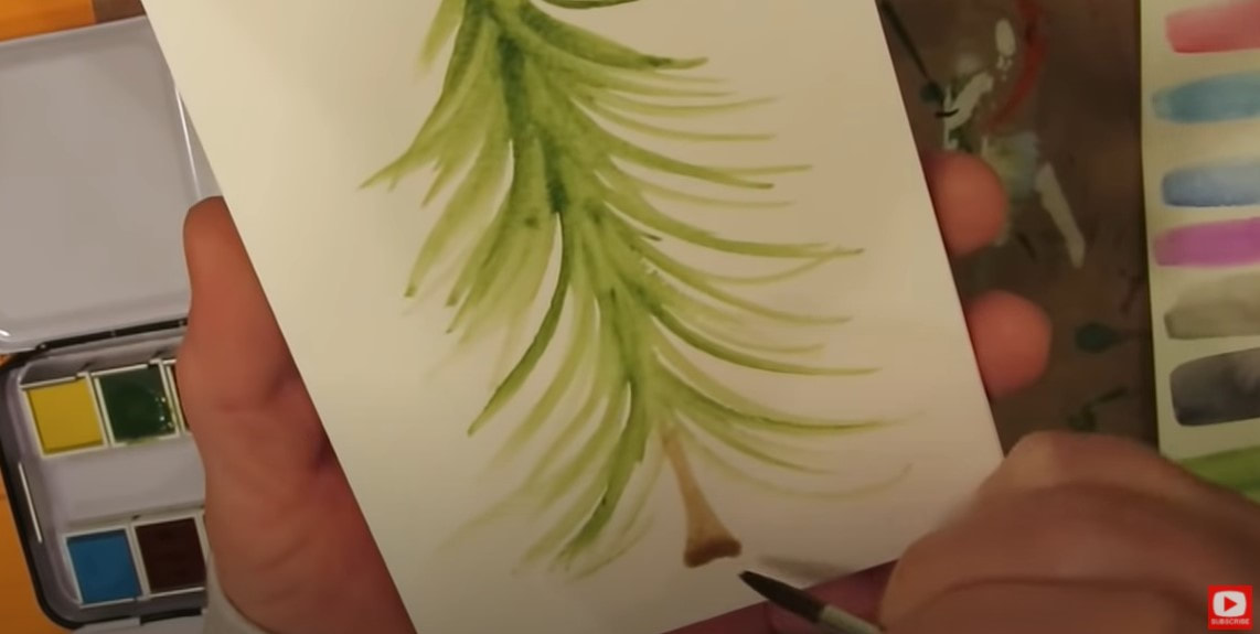
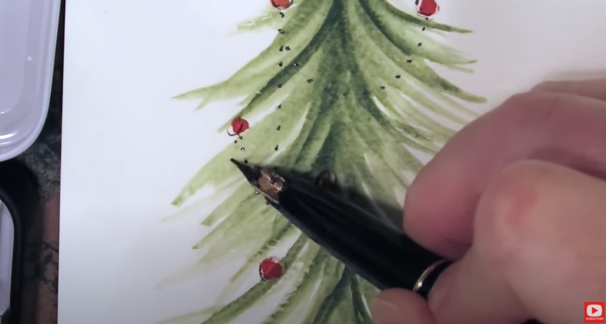
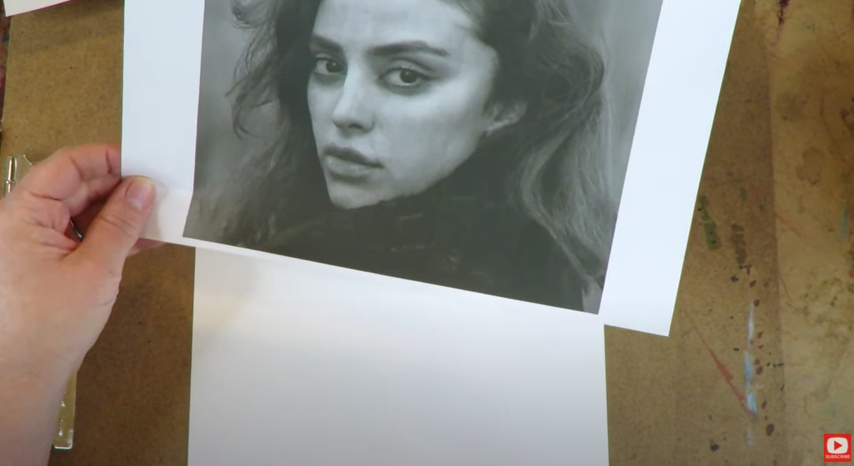
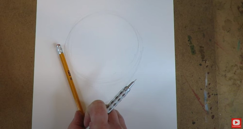
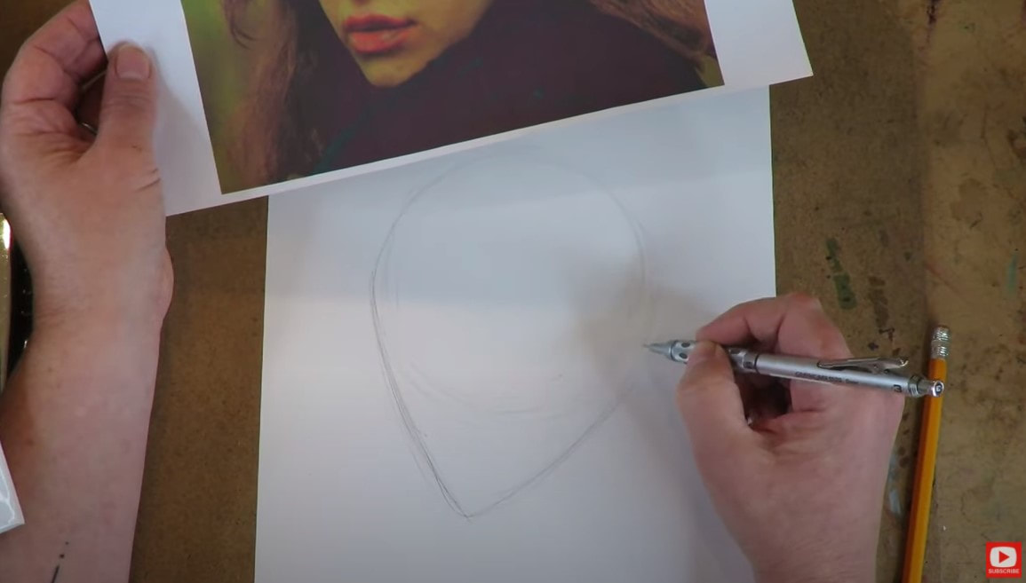
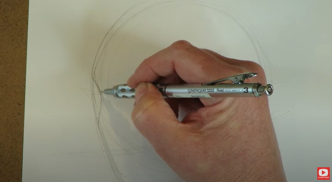
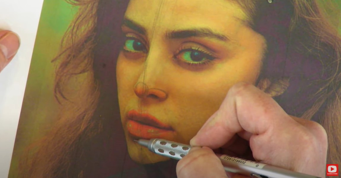
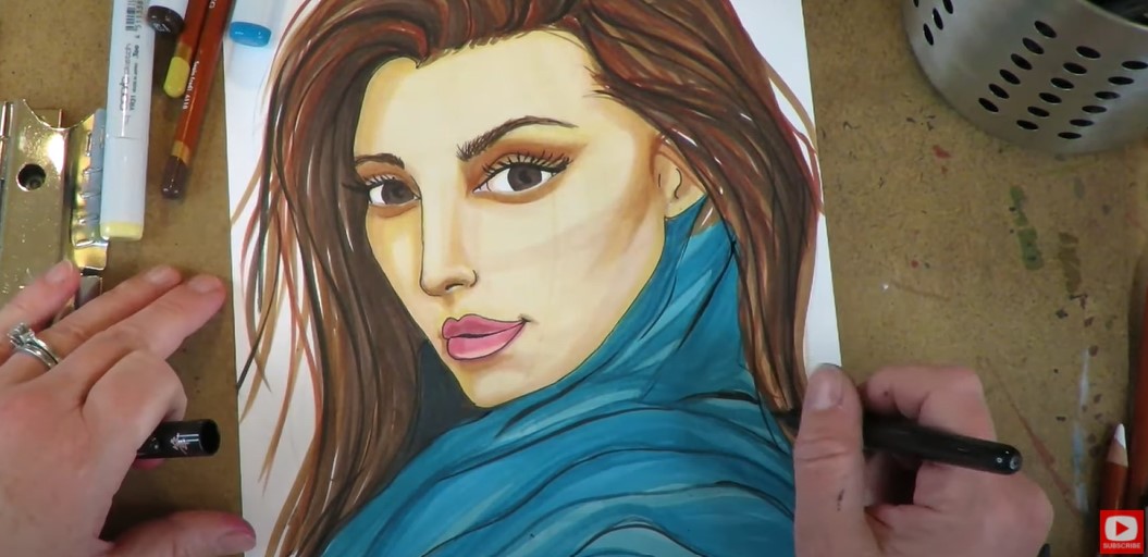
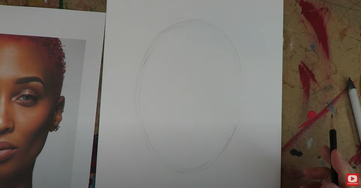
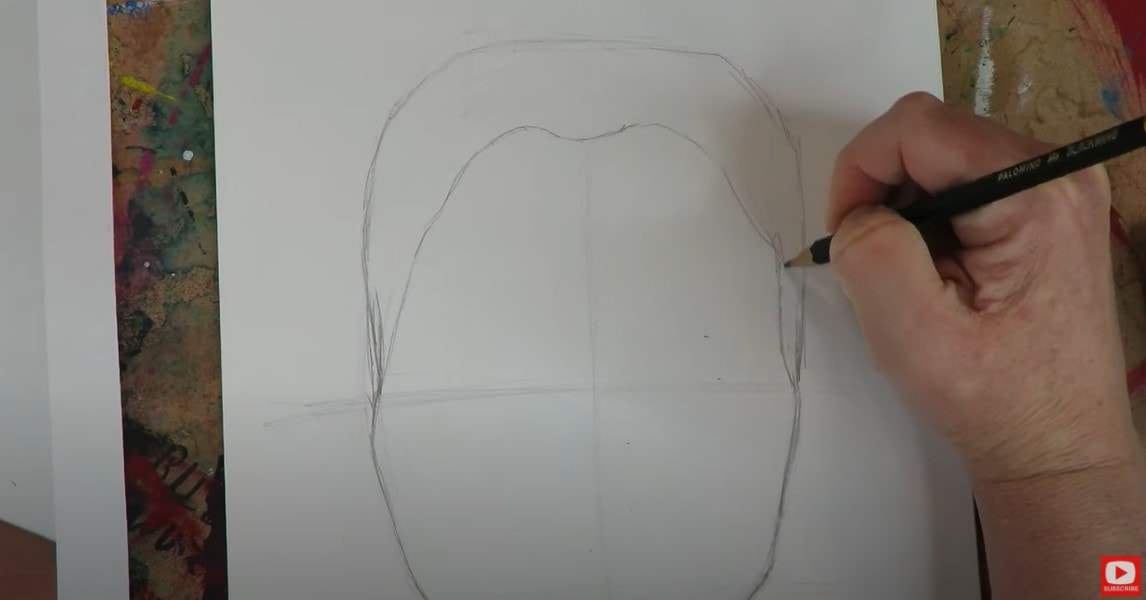
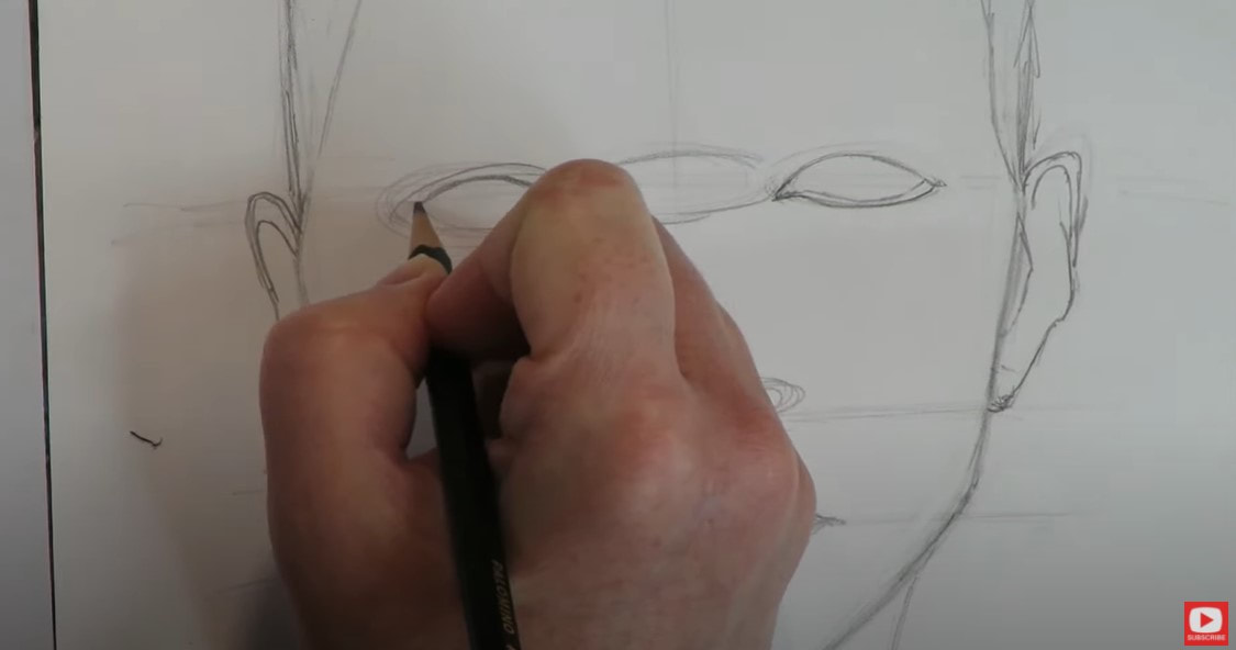
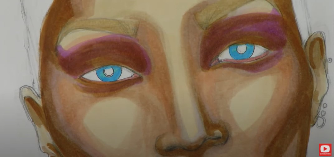
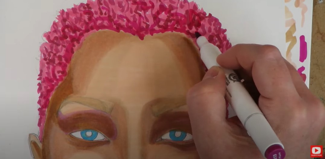
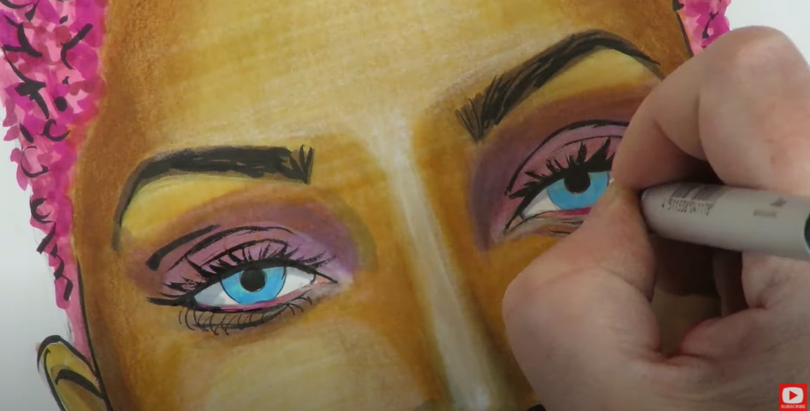
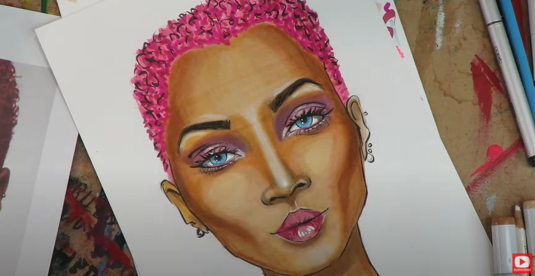
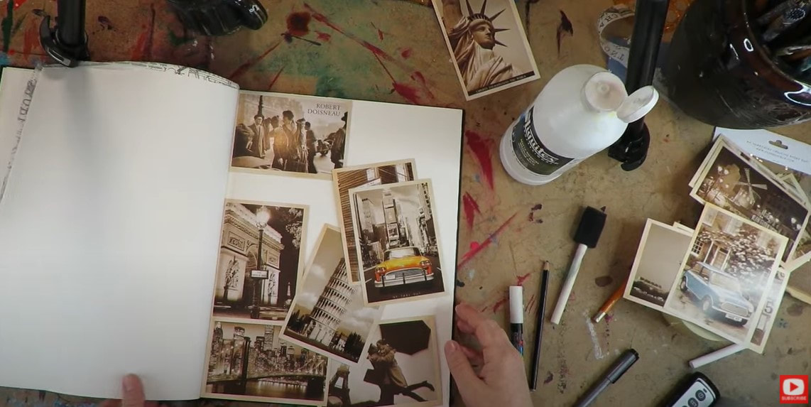
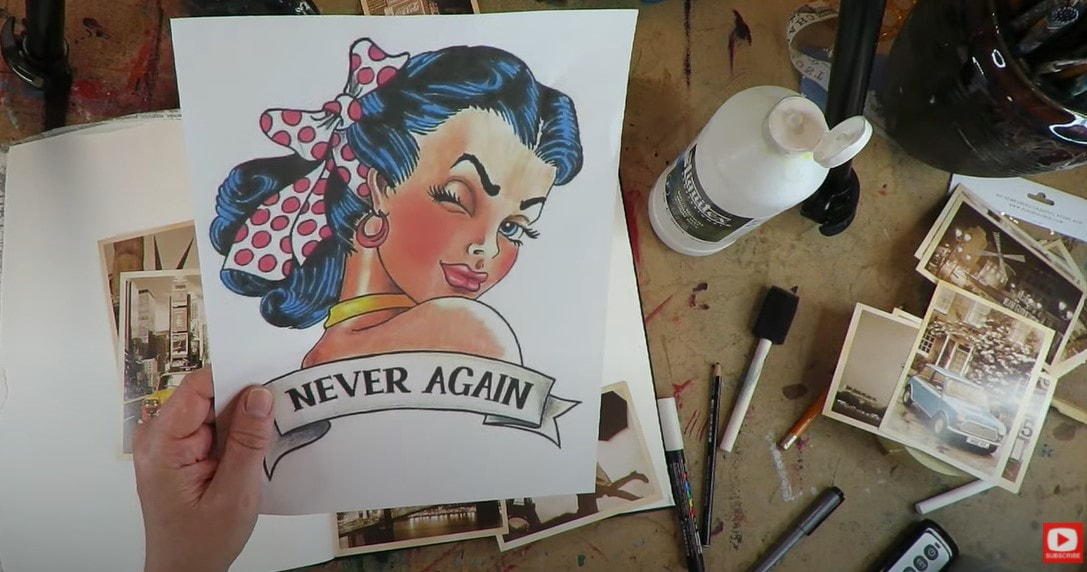
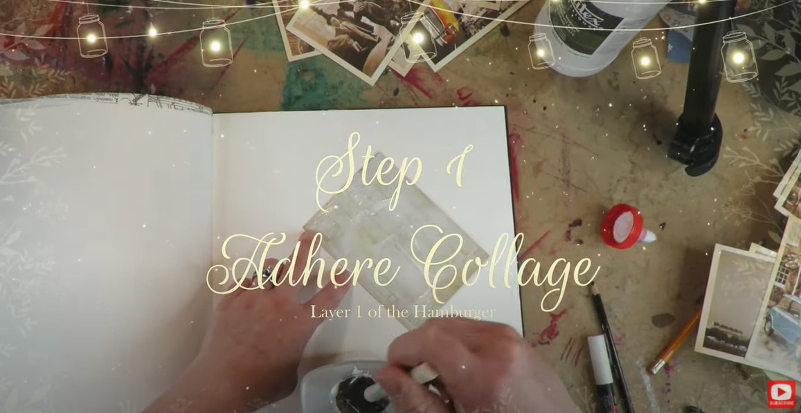
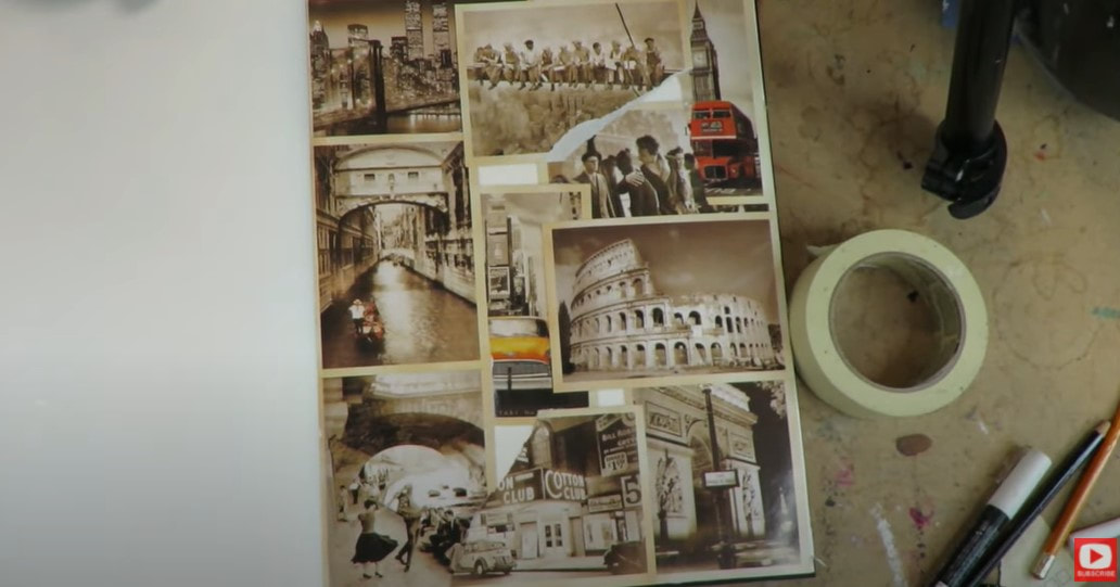
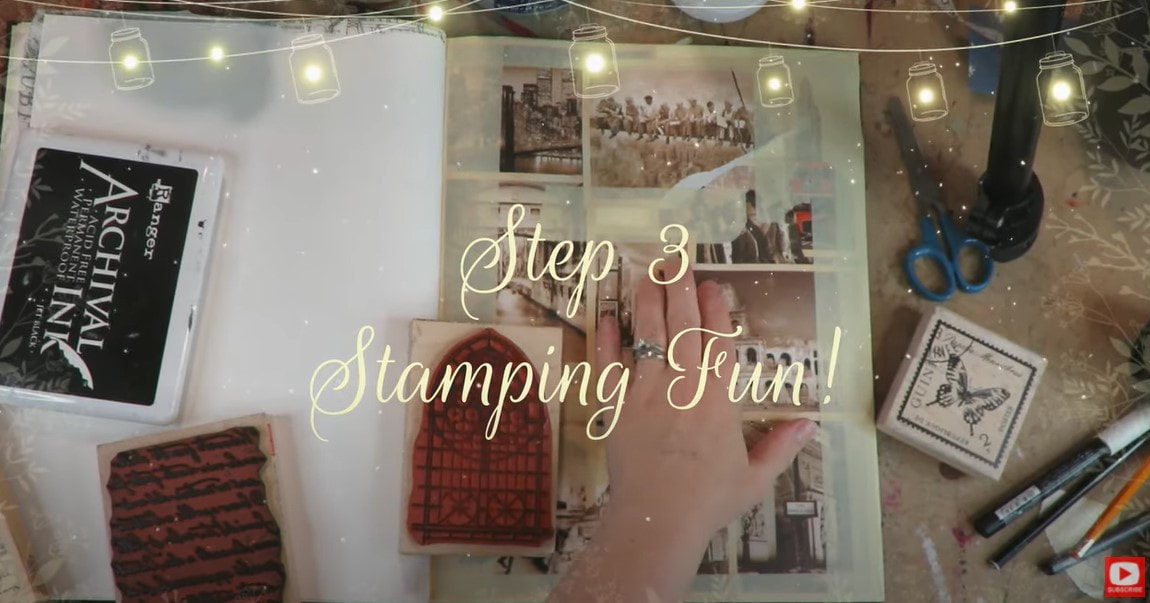
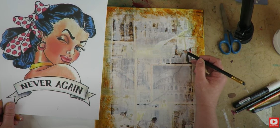
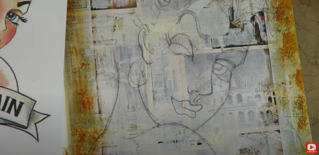
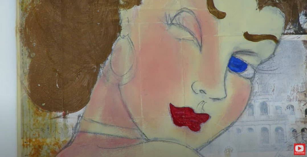
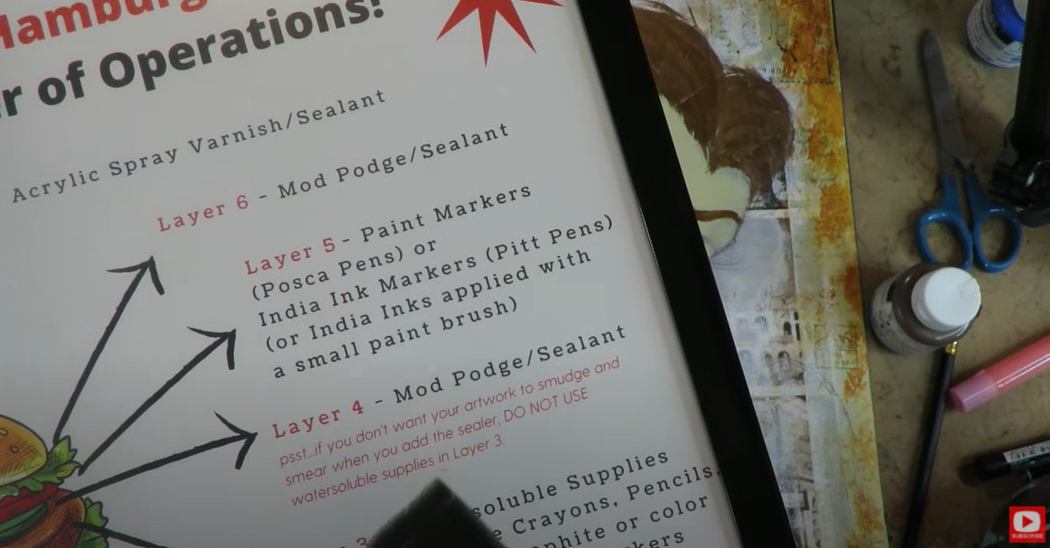
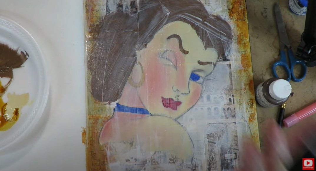
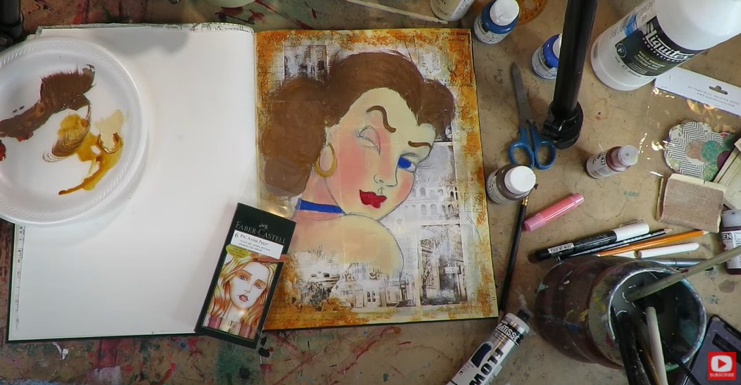
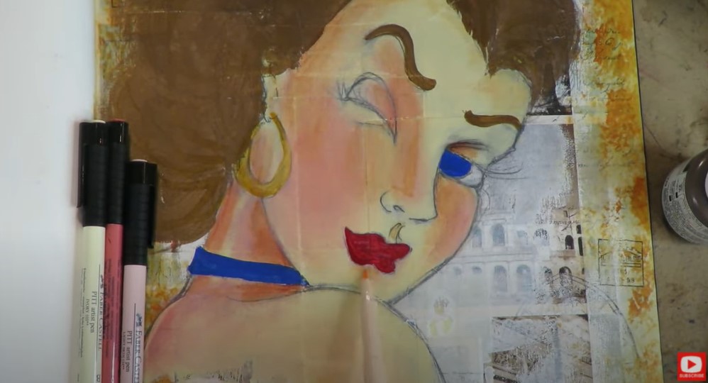
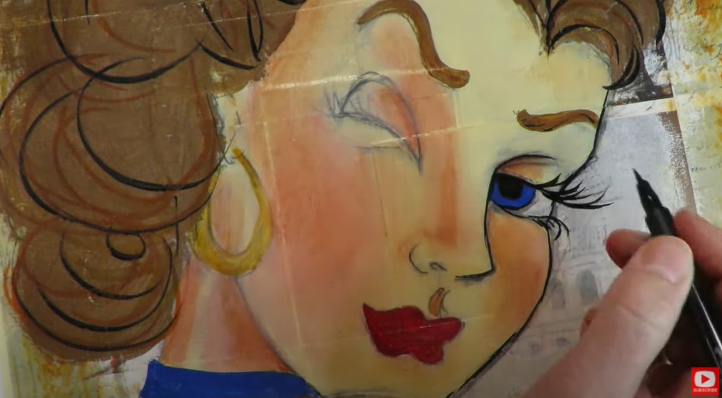
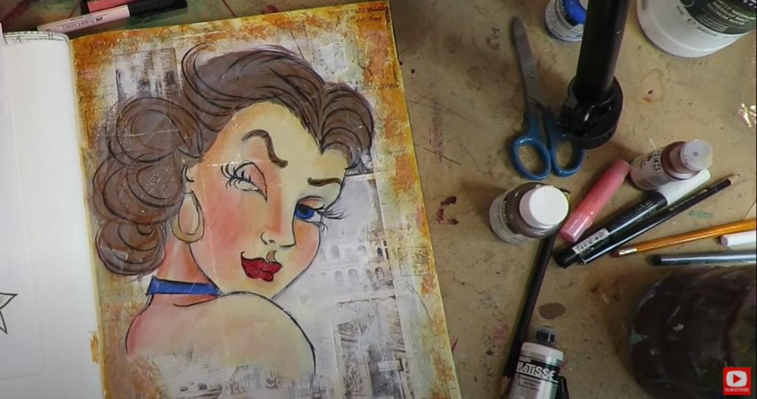
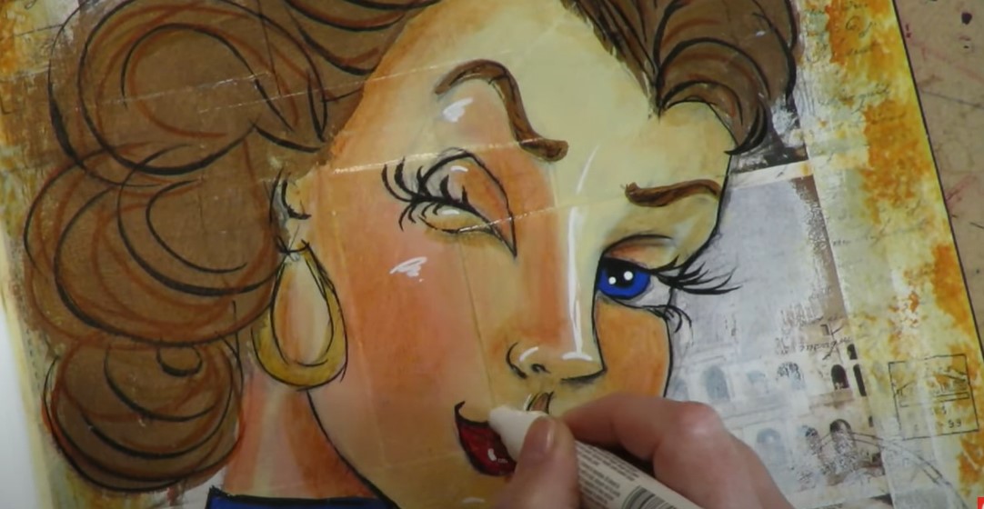
I chose to paint our little tree on one of my adorable 4x6 watercolor postcards by Winsor Newton. If you've never played with watercolors before (as an adult!), this is THE EASIEST watercolor project for beginners that you can probably find! I'm keeping things very simple and using a green straight from my palette. Watch the video as I demonstrate an easy watercolor technique you can try at home with a flick of your brush to make the tree branches. Before I move on to the next step- I take a minute to pause and dry my painting with a hair dryer. I find this works SO much better than a heat gun, because I can control the temperature of the heat (believe it or not- some supplies can melt under the heat gun!). Also- the air flow I get from my hair dryer generates a lot of power- which means my paper is dry SUPER FAST! If you know me - FAST is something I need in my life;) If you want, you can choose to add a secondary layer of green branches on top of what's already been done for a little added dimension, or just leave it as is! If you choose to do a second layer of green- take care if you're a watercolor newbie, becuase even a little water will reactive your first layer of watercolor, so things could move around on you. If you don't want this to happen, try to use less water on your brush when you wet it before tapping into your second shade of green. When this second, optional layer is totally dry as well, I add in a few cute spots of color as ornaments, along with a teensy, yellow star on top. Then it's time to hit it with the hair dryer one more time! After the ornaments are fully dry, I pulled out one of my fountain pens to doodle around on my tree for added decoration. I'm using a fountain pen filled with ink for the next part, but you can use a pen, a pencil - anything you're in the mood for and already have lying around at home! And that's it!! I know! Can you believe it? Told ya it was a quickie, 5 minute watercolor project! So easy if you love to send a little something handmade in the mail at Christmas time for cards or presents. Have fun painting!! I wish you a MERRY EVERYTHING & a Happy New Year!! ❤️ CHECK OUT ALL my art books on AMAZON ❤️ CHECK OUT ALL my online art classes @ Awesome Art School ❤️ MY FAVORITE ART SUPPLIES on AMAZON ❤️ MY BELOVED FACEBOOK GROUP HOW to DRAW & SHADE a WHIMSICAL 3/4 View Latina Face in Copic Markers (Whimsical Women #10)13/12/2020 Teaching how to draw a whimsical face is one of my FAVORITE things to share on YouTube, and I'm having SO much fun with the whimsical face drawing tutorials in this series! Today's reference image features a three quarter view - one of the trickiest to draw! As always, the whimsical drawing portion of today's video is in real time so you can see exactly how I get it done!! HOT TIP! Because the color version of my reference image is highly saturated, the lighting can make it tricky to see where my shading should go naturally. Whenever you have difficulties with images like this, and color is throwing you off - I HIGHLY recommend you simply print yourself a black and white copy of the image so you can clearly see what is in shadow and where the highlights are. As a matter of fact, this is the WHOLE REASON I printed my book How to Draw and Find Your Style in black and white instead of color! It's so much easier on artists to replicate the values they see on paper, when working in grayscale - especially when they are just learning to draw faces. Once you master this skill- moving over to color is SO much easier!! Trust me!! Before we go any further, super quick announcement: All links are Affiliate. I may earn a small commission if you choose to order through these links, but by law there is never any additional cost to the consuner for doing so. I thank you for your support! People ask me all the time about how to draw faces from different angles. The three quarter view is definitely one of the hardest to conquer! If you were watched episode 4 in this series, our Asian reference was also a three quarter face drawing prompt, and we used my 3/4 Face Drawing Guidelines Cheatsheet (click the link below to download yours for FREE if you haven't grabbed this yet). Today, I'm using my other favorite method for drawing a 3/4 face. It's slightly different, and from my How to Draw and Find Your Style book. I sketch a rough triangle at the bottom of a circle and add some curved lines across the face to help me position facial features. Make sure you click over to see me do this in the video because watching it in motion REALLY helps!! In case you feel like you need them, the art reference photos for this whimsical face drawing tutorial, and ALL of the Whimsical Women of the World tutorials can be found in my YouTube & Cheatsheet Library over at Awesome Art School, as well as in my new Whimsical Women of the World classroom over at Awesome Art School. Once you have the face shape sketched in, take some time to really study the angle of your reference image. Sometimes I actually draw right on top of my printouts (shown below), because it helps me understand the angles on the model's face. This can sometimes make me feel a little more comfortable when I put my pencil to paper and try to replicate what I see. Don't worry if you get into your sketch and feel things need to move around or be adjusted - just make alterations as needed. That's what erasers are for!! I LOVE the eyes on this model. They are SO huge and are going to look awesome when they are all colored in! When I'm ready to move on to the hair, I sketch in the main shapes that I see, in sections. When you're drawing hair, it extends UP and OVER the the oval of your face shape drawing because it has so much volume. Hair also has TONS to do with directionality - so look to your reference to copy what direction it's flowing from. Be sure to watch the video so you can see how this is done. Remember to always take a step back from your drawing to pause and really look at it from a distance to reassess the spatial relationships in your drawing vs the art reference photo. It makes a huge difference! When you're ready to begin shading with your alcohol markers, erase all of your face drawing guidelines and extraneous marks. I often "pounce" the graphite a bit with my vanish eraser as well, to life some of it off the page without fully erasing my lines because I don't want my lightest copic markers to smear the graphite, or pick that up as I'm dragging them across the page. If you're new to coloring with copic markers, you need to move fairly quickly with them as you lay your color down because they can definitely get streaky. You only have a small window of time while the alcohol is wet, and the pigment from the color is suspended in the alcohol. This is the time when it's easiest to blend shades from multiple markers. I love drawing hair with the copic markers brush tip because I feel like I can almost paint with it! A cheaper copic marker alternative that I've recently discovered and enjoy working with are my Ohuhu markers. They also have a brush nib, which makes them very easy to work with in a painterly way. I use the chisel nib on my copics when I want to cover large areas on my paper, and find this can get the job done a little bit faster than the brush nib. Another thing I LOVE about using my copic markers, is I feel like I can really achieve a lot of personality and variety with them - just by switching nibs or changing the amount of pressure I use when I press the marker to paper. As you alreayd know if you've been watching this series - copic markers and colored pencils work amazingly together!! Colored pencils are awesome for adding detail, easing transitions between colors, and they create a pretty texture. As you'll see in today's face drawing tutorial, adding colored pencil on top of the coat (or blanket- or whatever she's wearing!!) helped to create the look of cloth that I couldn't achieve by using copics alone. SUPER HOT TIP! The ingredients in your art supplies matter greatly. If you're experiencing smearing/bleeding where you've added some black outlines - make sure you're using a WATER BASED black marker/fineliner here, because the alcohol and water IGNORE one another! There is currently a 40% off coupon running - so be sure to check that out if you are interested in purchasing or gifting the Whimsical Women of the World classroom for the holidays!! Each lesson is about 90 minutes long, contains all the drawing reference photos, and the lessons are in real time (even the shading parts)! I hope you have fun with this lesson! See ya back here next week!! HOW to DRAW & SHADE a WHIMSICAL UK Face with Short Curly Hair in Copic Markers (Whimsical Women #9)7/12/2020 How to draw a whimsical face is one of my FAVORITE things to teach, and I'm having an absolute blast with the whimsical face drawing tutorials in this series! Since I don't know where the GORGEOUS model in today's art reference photo is from - I've decided to call her "UK Cool chic" because of her funky, pink hair! We begin this whimsical drawing like we have each one in the Whimsical Women of the World portrait drawing series - by sketching in our guidelines! The bone structure is super important on this girl because her hair isn't covering anything up! Speaking of hairstyle - I have no idea yet how I'm gonna pull this one off, but I'll get there... just gonna have to think on that a bit!! Then it's time to sketch in our whimsical face drawing guidelines. If you're not sure what I'm talking about, I'm guessing you might need my cheatsheet to help you out! I printed and laminated this because drawing proportions of the face are SO important. They also really are the same no matter what ethnicity you are drawing. We all start out with a human oval for the face, so this is a reference I've ALWAYS got on my art table. Click the button below and I'll send it straight to your email. The model for today's whimsical face drawing tutorial has got SUCH COOL EYES!! And her eye makeup is really awesome. There is some kind of hot pink going on in the wet line under her eyes that I already CAN'T WAIT to get in there with my markers and add!! Faces are kind of like vases, you know? If you draw one side, it's really hard to finish that and then hop over to the other side and get them to match! Am I right?! Over time, I've really learned to build both sides up at the same time - especially when it comes to the EYES. This way they are much more likely to end up symmetrical than if I completed the whole right half of a face, and then tried to replicate it symmetrically on the left! It just doesn't work that way for me, so this is my trick. I see some lines under our model's eyes, so I'm just drawing them in. I always draw what I see. This is how you capture someone's likeness. And honestly, what makes lines on peoples' faces such a big deal anyway?! It just adds to their beauty! Be sure to watch the video because the drawing portion is all in REAL TIME so you don't have to keep pausing the video to keep up with me ;) Just copy what I do, and draw right along with me. The eyebrows on this woman are just gorgeous - super sculpted and glamorous!! I'm loving her gorgeous full lips too, and can't wait to start adding some color! Before we go any further, super quick announcement: All product links are Affiliate. I may earn a small commission if you choose to order through these links, but by law there is never any additional cost to the consumer for doing so. I thank you for your support! Students ALWAYS ask me about my eraser, and I'm in love with it. It does such an amazing job lifting the graphite off my page without ripping the paper. It's called the Vanish Eraser. You can grab them on Amazon. If you live near a Jerry's Artarama, they're only like $2 if you can get over there in person! Let's wrap her up and erase all those guidelines. The first step with whatever art supplies you choose for coloring, is to lay down a foundational color. I either work light to dark, or dark to light with my copics - either way is totally fine. Be sure to pause the video as you're going along to catch where the shading is getting put in. I love the way the light is hitting our model's face today. It's one of my absolute favorite shading patterns to replicate - in any medium! It's super symmetrical. Whatever you do on the right side- just replicate on the left. This is also one of the EASIEST lighting patterns to shade onto a face! So even if you're a beginner- YOU CAN DO THIS! If you've seen my videos in the past, you know we all hit a point about half way into a project when the face we're working on is in what I LOVINGLY refer to as ....the ugly phase. When you're shading with copic markers (or any brand of alcohol markers), you tend to hang out in "the ugly phase" for quite a while because there is a lot of layering to get the shading right, etc. You've gotta just embrace it! Acknowledge the ugly phase when you arrive, and KEEP GOING. Typically whenever I've hit the ugly phase, I help my girl start working her way out of it by sweeping a light to medium shaded skin tone marker over the the entire face. The alcohol in that marker RE-WETS all the previous alcohol marker layers and it helps to blend them all together. COOL TRICK, right?! As you're laying down darker shades of color throughout the coloring process, don't freak out if they feel like they're too dark. Alcohol markers go down kinda like watercolors and appear much darker when they first hit the page. They dry much lighter - so don't worry!! While I'm adding some pink around her eyes, I decide to just go for it with her hair- even though I still have no idea how to do it! I study my reference and just start adding color. For me- I really feel like when you're shading in color, you really need at least three colors to produce a 3-dimensional look - a light, medium and dark. I select my three colors and go for it with some "kindergarten" squiggles! If you've been watching the Whimsical Women of the World series, you'll know I've been using colored pencils to add some shading on top of my markers to add texture, fix my mistakes, or help blend the transitions between marker shades. In this video, I really relied on my colored pencils to help me achieve the look I'm seeing in the reference image in terms of makeup. For continuity among the other Whimsical Women in this series AND because I'm obsessed - I turn to my pentel pocket brush for detailing in the eyelashes, eyebrows, hair, and outlining throughout. I finish the project with while highlights in posca pens - which I totally love, because they add SO much more dimension and sophistication to my pieces with pops of light in the eyes, lips, nose, and wherever I see sparkles throughout the features in my art reference photo. I hope you DO NOT HOLD BACK when you're doing your own highlights in your own projects! I know this can be scary for some of my students, but they pack the biggest punch and can make such a difference in your work. My wishes for you ... be DARING with your shadows and BRAVE with your highlights! And above all, HAVE FUN!! Enjoy today's Whimsical Women of the World face drawing tutorial! Thanks for joining me! See ya back here next week! Who doesn't love SASSY Pinup Girl Art?! Seriously!! Why have I not shown you how to draw a pinup girl before?! I had such a blast with this art journal page and can't wait for you to try it! Today’s video is a FULL LENGTH mixed media art project, so if you love vintage collage, pinup girl drawings, art journaling, my hamburger system OR mixed media tutorials - this is for YOU! Not sure what I'm talking about when I say "Hamburger System?" NO PROBLEM!! I've got you!! My Hamburger System is a simple mixed media layering system I've developed over time after TONS of trial and error from playing with ALL the art supplies I could get my hands on!! I used to get asked all the time (and still do!) about my mixed media process, and what order I layer my mixed media art supplies in. I've broken it down for you layer by layer and created a fun step by step video series on YouTube, created a FREE cheatsheet you can download, and EVEN ending up pouring it all into a book because I think it's that helpful to have as a reference on your art table. I love collaging art journal backgrounds with new materials and trying out new art journal ideas, so was thrilled to try doing a postcard collage! I was not sure how this was gonna work because I've never done much with postcard art, or collaging materials with a glossy sheen, but I was in the mood to BREAK a FEW RULES!! Grab your art journal, some vintage postcards, your acrylics, gelatos, pitt pens and ALL your mixed media hamburger supplies because it's TIME TO PLAY!!! How ADORABLE is this retro pinup girl I found to use as our reference image for todays' project??!! I'm SO excited to paint her into the foreground!! Before we go any further, super quick announcement: All product links are Affiliate. I may earn a small commission if you choose to order through these links, but by law there is never any additional cost to the consumer for doing so. I thank you for your support!! If you follow me, you know I'm a super fan of liquitex matte medium for my collage layer, but since I've already started this project in a rebel mood- I'm gonna go ahead and continue that streak! These postcards are pretty substantial, so I grabbed my good old fashioned Weldbond adhesive because I don't want them buckling or separating. I want them to be locked down and rock solid. Initially I hadn't planned to use masking tape for this project, but it was sitting next to my art journal, and I've used masking tape tons in the past on my collage layer, so decided to frame my page around the edges. Not only will this add some additional texture to my collage background, it will help to strengthen the edges of my page. Before we get TOO FAR into the project- we need to talk about background vs. foreground. While I totally love each and every one of these postcards individually AND the composition they've magically created together in my background - I'm not gonna let myself get attached. I KNOW it's hard, but you need to do this to if you intend to paint or draw something into the foreground of your piece. A background is simply that- a background. Of course we want it to be awesome, but we can't be precious about it. To help me with that, I've added a few scrappy pieces of masking tape in the center of my page, and my stamps! Next, I added some gesso with my brayer to kick the background back even more, so I have some space to draw. Don't let this hurt, ok? Background is background! We're prepping the space for someone fun to appear in the foreground, so we need this to head backstage. The rough application with my brayer helps the background take on a bit of a grungy look - which I LOVE. To bring that out a bit more- I added some brown acrylics around the edges. I know some mixed media art fans kinda hate drawing, but I love it, so a lot of my work ends up as mixed media portraits (because I LOVE drawing faces and teaching people how to draw a whimsical face!). If you love drawing faces, you HAVE to join me over on my YouTube Drawing channel for my Whimsical Women of the Women of the World series. We're having a blast and you can do this on your own time, any time you want! If you're totally new to drawing faces, check this series out on my YouTube Drawing Channel to get you started!! You'll learn how to draw a whimsical face in pencil. It's super easy and relaxed. Then I show you how to add a little bit of shading, and we build on those skills when you're ready for more! I get a ton of questions about how to draw so many random things, and I really encourage using a reference photo because everything you need to know to create a beautiful drawing is already in the photo. All you do have to do is draw what you see! A reference makes things SO much easier. And if you choose to draw in a whimsical style like I typically do - it's way more forgiving than realism. AND more fun (I think!!). After your pinup girl drawing is all sketched in - it's time to kick things up a notch and add some color!!! Have FUN layering in your acrylics and gelatos. Just keep on moving up the hamburger layering system from the bottom up! If you have questions about your supplies and where or when they go, just use your cheatsheet! If you didn't grab that yet, click the button below to have it sent straight to your email! When I'm happy with my gelatos and acrylic layers, I'm ready to seal it - which is layer number 4. At this point, nothing should move when I add mod podge except for my gelatos. They will melt a little bit, so be prepared for that. If you don't want anything to move (this totally freaks some people out, and that's ok!) - you can just choose to work only with materials that are nonwatersoluble, and permanent - like acrylics! Tons of students ask me if watercolors are ok to use in the Hamburger System and where to put them. I honestly don't use them AT ALL in the Hamburger system because they are SO reactive, and just their own animal! I save up my watercolor love for other projects. Watercolors play nicely with colored pencils, paint pens, fountain pen ink, pens, etc. - and I totally love them, just not for my "Hamburger" projects. Remember - my Hamburger System is not the only way to go with mixed media- it's just a fun pattern I've developed for layering over time that I love and find to be pretty fail safe. It always gives me gorgeous results, and because I want YOUR art to be AWESOME - I've shared this with you so you have NO questions about what supplies play nicely together and you can just have FUN, which is the most important part of art-ing, am I right?! Once my mod podge layer dries, it's time to have some fun with my pitt pens! They're made by Faber Castell and filled with India Ink, and I LOVE using them to "paint" more details on the mixed media faces and mixed media animals I love creating. They actually make an awesome skin tone pack that you might want to check out if you don't have any pitt pens and are interested in trying them out. So fun!! Make sure you do a test swatch of these before you put them on your project because the caps can totally can trick you here and there! At this point, I just have a blast shading and doodling all over the place with my pitt pens to add detail and depth on my slippery mod podge surface. I use my finger to blend for shading in the face. The amazing thing about this layer and playing with pitt pens, is they can be erased with a baby wipe if something happens that you don't like!! If you're following along with my cheatsheet for the Hamburger System, you can feel free to seal this layer with mod podge, and then go back to add even MORE doodles! If you do get any smears with your mod podge here - like I did (because my black pitt pen marks weren't quite dry in one spot before I added my mod podge), that's ok! Everything is fixable- we can figure it out. Just take a breath and redirect the smear! I always finish up with a white sharpie pen or posca pen / paint marker to add some highlights that pop - they make SUCH a huge difference in your art! Watch the video to see exactly where I love to jazz my girls up, and make them glow!! Once I'm good to go with my highlights and have finished adding some distress marks to the edges of my art journal page, it's time to seal her up so she doesn't move and so my art journal pages will not stick together. This is one the HUGEST questions I get from students- "How to keep art journal pages from sticking together?!" So here ya go - my answer is at the end of today's video. Be sure to stay with me till the end for that tidbit!! Thank you so much for hanging out with me today! I hope you LOVED this project and will see ya back here next Friday!! Have a fab weekend!! |
Karen CampbellFounder of Awesome Art School. Mixed Media Artist. Author of 19 Instructional Art Books! Whose work has appeared in...Archives
July 2024
Categories
All
|
|
"Karen is flipping hilarious and she's very real...I like the way she teaches in a way that really gives you confidence, whether you're a beginner or advanced there's always something new to learn!"
- Elizabeth W. |
What Fans Are SayingKaren, you are absolutely fabulous! You make me feel like I can draw anything. I have recently retired and finally have the time to do some of the art that I have loved since I was in school. I am really at the beginning of my art journey and I hope to learn as much as I can. Thank you for all you do. |
Contact ME |





 RSS Feed
