
|
Let's kick this week off with another fun FREE art lesson!! In today's video, I'm going to teach you how to draw dreadlocks on a whimsical African American face, using copic markers and colored pencil. If drawing dreads or copic marker blending have been tricky for you in the past, today's face drawing tutorial is for YOU! As you can see, today's beauty has lots of exciting challenges in store for our face drawing practice from how to draw dreads to shading with a variety of skin tone markers. If you're not sure how to blend copic markers - you're in luck, because I demo 3 different ideas to help you conquer the streaks that are SUPER common with copics / alcohol markers! If you've struggled with how to draw curly hair, or if you're feeling intimidated by drawing dreads, don't worry- I was too at first, but it didn't take me long to come up with an EASY drawing / shading technique I liked. I can't wait to show it to you!! Ok!! Go grab some art supplies and meet me back here for the tutorial. Before we continue, super quick announcement: All product links are Affiliate. I may earn a small commission if you choose to order through these links but by law there is never any additional cost to the consumer for doing so. I thank you for your support! 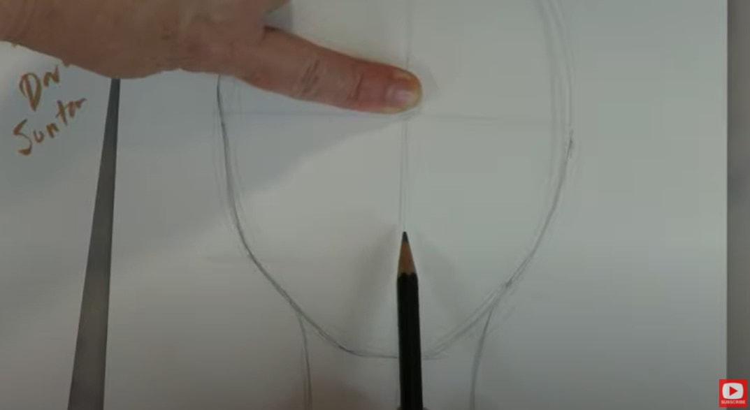 I'm working on hammermill cover cardstock because I've found it to be the best value at 4-8 cents per sheet when I get a box of 250 sheets on Amazon. The paper is perfect for working with alcohol markers! To get this project going, I'm sketching in my whimsical face drawing guidelines, just like I always do. Remember to NEVER skip this part because it makes such a difference when you're trying to get drawing proportions of the face right! While I sketch in some placeholders for the facial features, I also block in the main shapes I'm seeing in my art reference photo for this model's hair. Hair is a HUGE part of our lesson today ;) 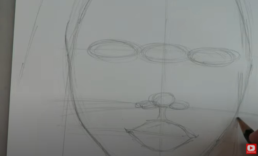 The model in our reference photo today has gorgeous, HUGE eyes. If you're just learning how to draw faces, and struggle with getting your eyes to match - especially after you've got one you like and then don't know how to draw the other eye... I've got you!! Here's my trick: If you "build" your eyes up at the same time while you're drawing, this can really help to make them even. I start with the tear duct lines and for whatever reason pencil that in on the right side, then do the same on the left. Then I go back to the right to draw in another line and do the same to the left side, until I've got two eyes staring back at me ready for more detail! Not bad right? They're not a perfect match, but they're close enough for me because I'm just having fun, keeping things light and into teaching you how to draw and shade a WHIMSICAL face! 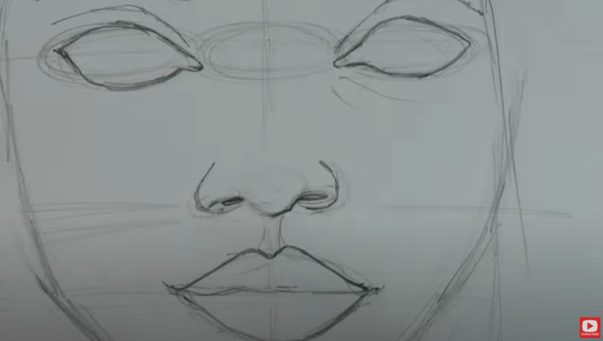 Once you've got your features all sketched in, go ahead and start erasing all of the guidelines. If you need a new eraser, or have been looking for one that does a super job but doesn't kill your paper, I LOVE my vanish eraser. I have NO SHAME in using a circle template to draw in the irises and pupils, and neither should you!! Make something a little easier on yourself. We're just having fun :) 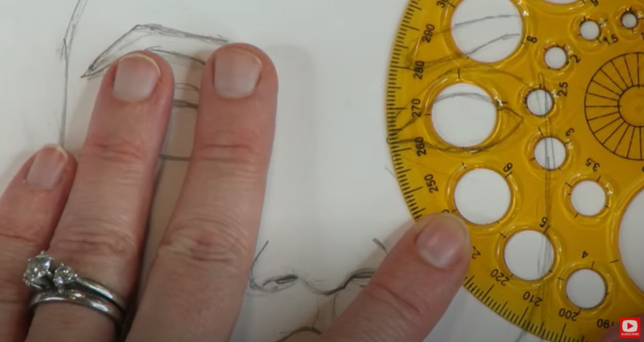 Isn't she looking pretty already?! 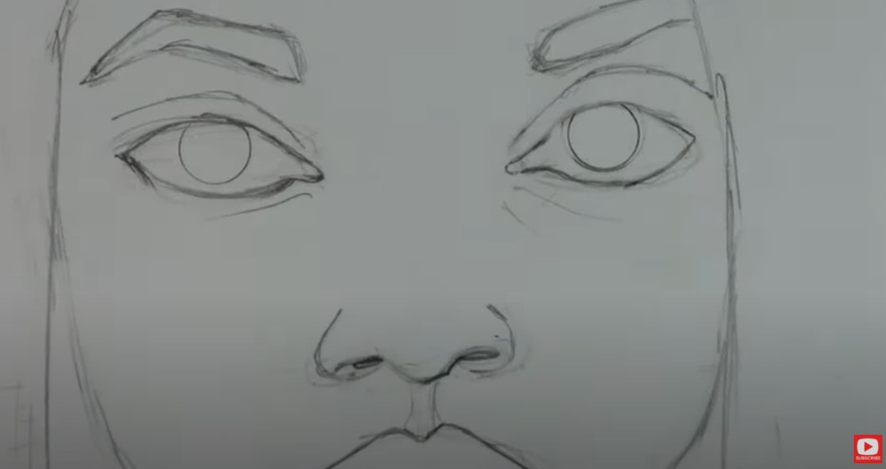 I LOVE her cat eye makeup and feel like it just needs to be penciled in asap! I usually do this near the end, but I just can't wait :) 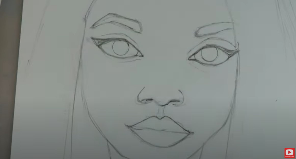 Once all your guidelines are erased, it's time to swatch your skin tone colors and start shading. I know you may feel tempted to skip this step, but don't! It's super important and will save you! I don't know how many times I've reached for a marker or paint tube based on the cap / packaging - only to find out it looks COMPLETELY different on paper! So do yourself a favor and take the time to make yourself a little cheatsheet of the colors you have on hand for whatever supply you're using! Mine totally isn't fancy and was super quick to do, as you can see in the bottom left. 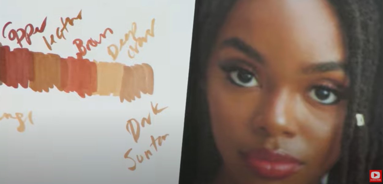 I'm purposefully NOT calling out the exact names for the marker shades I'm using because I have a MILLION alcohol markers and I don't expect you to and want you to just create with what you have. Don't get caught up in matching your colors to mine. Just work on the PROCESS I'm teaching you ;) Today we're really focusing on the LAYERING PROCESS with our alcohol markers. More layers help to blend your streaks. I know it can feel like this takes quite a while, but just be patient and your shading will totally come together! 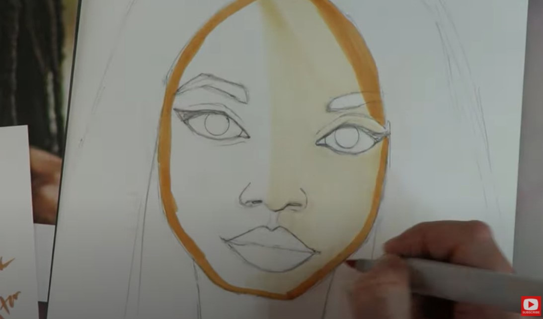 I started with my lightest skin tone today and used that almost everywhere, then slowly started building up my layers going through a variety of colors to catch the medium and eventually darkest of darks that I was seeing in my art reference photo. 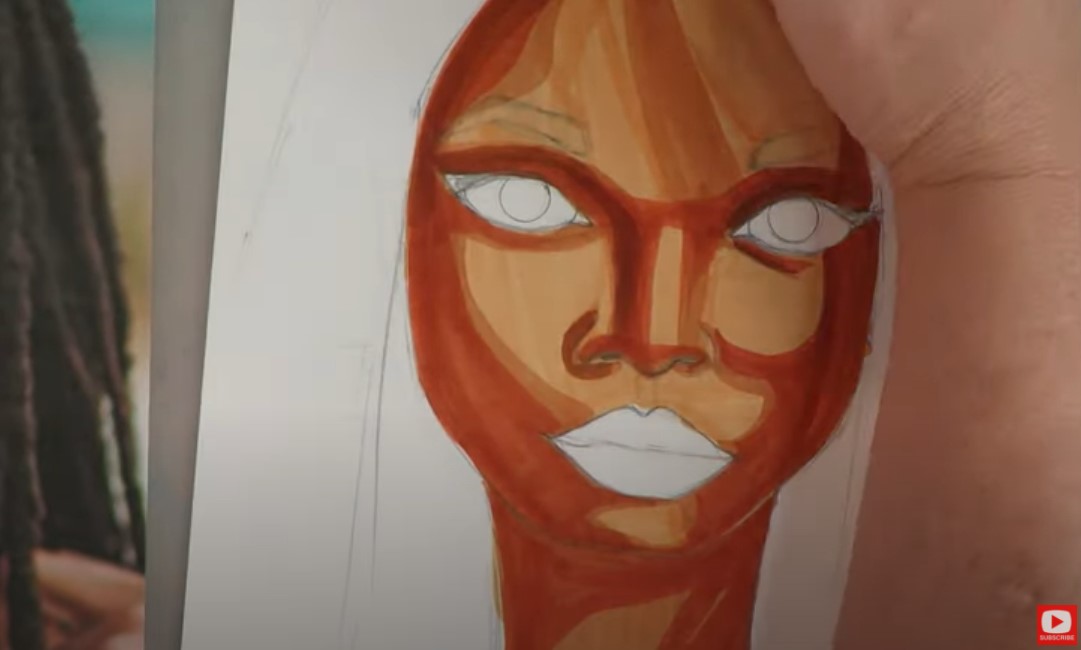 Now!! If you have been following this series at all- you know I've been specifically calling out "the ugly phase" every single time it kicks in for me because you HAVE to know how common this is!! If you look at the pic above- my girl IS IN IT big time!! The ugly phase starts to kick in when you are about HALF way done. And while it can feel frustrating because she looks SO unfinished and it may feel like you're never gonna pull it all together, you have to be patient. KEEP GOING. If you give up on your art when you hit this phase, the ugly phase will "win." Just IGNORE it and keep chuggin' full steam ahead!! 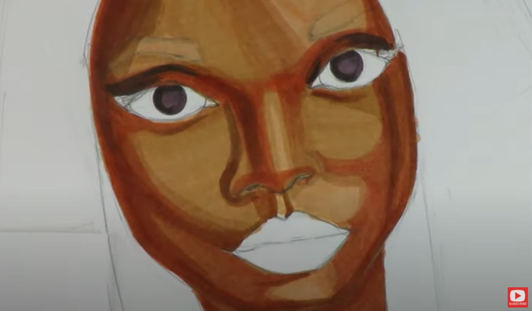 If blending your marker streaks is bugging you at this point in your project - remember you can totally use colored pencils on top at the end to help you out. This is going to get better as well - just keep layering. Watch the video and do what I do. Pause as much as you like! 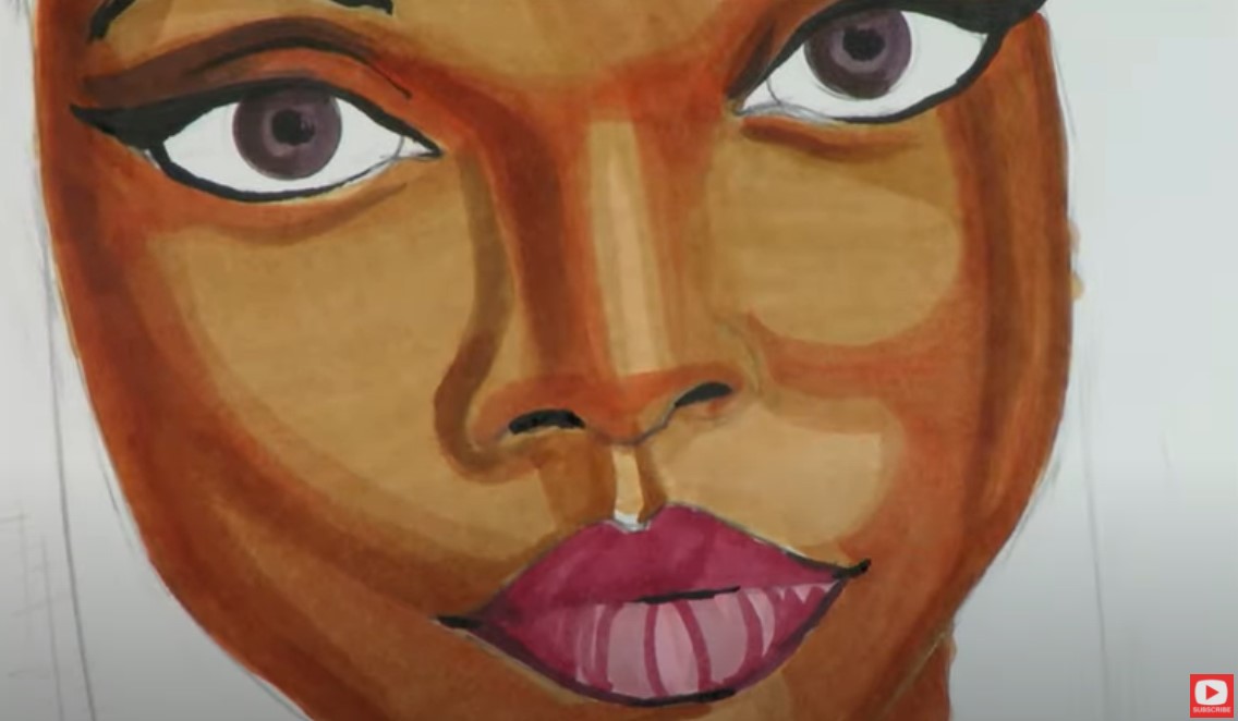 Not sure how to blend copic markers? When it's time to blend, I choose to work with one shade lighter than the lightest color I've used. Using this lighter marker, I'll lay down both a horizontal and vertical layer to "erase" the streaky marks in the transitional areas. If it's still not blending the way I want it to, I'll take the lightest shade marker I used, or go a shade up to a medium color to cover the entire face, both horizontally and vertically. For this particular project, I decided to try something new and incorporated one of my favorite products I love for my mixed media portraits when I'm blending the shading and skin tones- my faber castell gelatos! Even thought these are considered a "craft" product, I LOVE what they do in terms of blending. They're SUPER buttery and honestly did the job quicker and better than my colored pencils for larger face areas. They're super simple to blend with your finger and leave a smooth effect. Check out the upper right corner of the pic below... 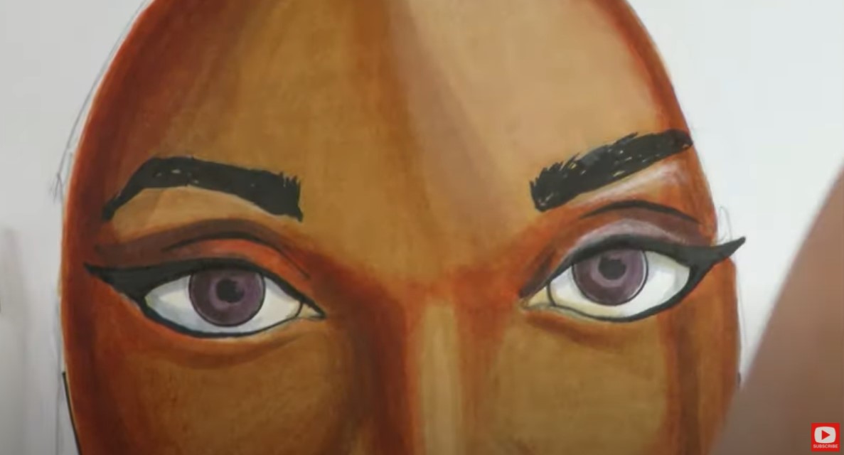 You'll notice I also worked some light gray (alcohol marker) into the whites of my girl's eyes, and used a pale peach colored pencil on top of her eyelids to drop in some highlights. 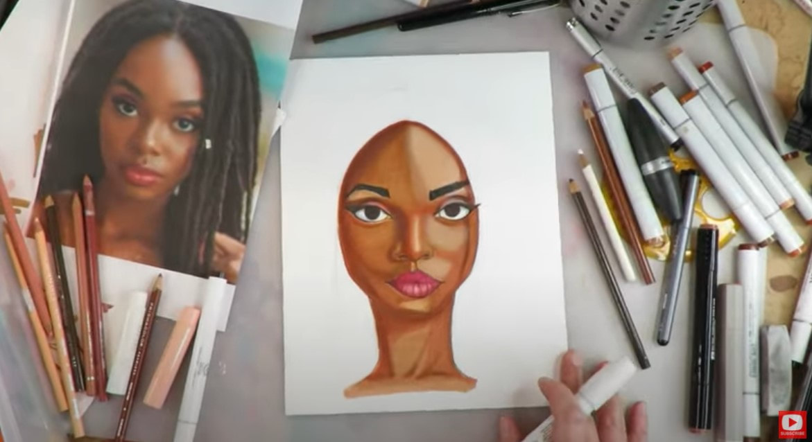 Looking good!!! Remember to always take a step back to hold your drawing from a distance. Your eye will typically see something you want to adjust, and you'll probably also be more than a little amazed at what YOU have just accomplished!! I feel like my girl's left eyebrow needs a little love, so I quick take care of that, then move on to some white highlights - like the eyeshine (which I think TOTALLY makes my girls "come alive!"). I also add a few taps to her lips and the white highlight down the center of her nose. 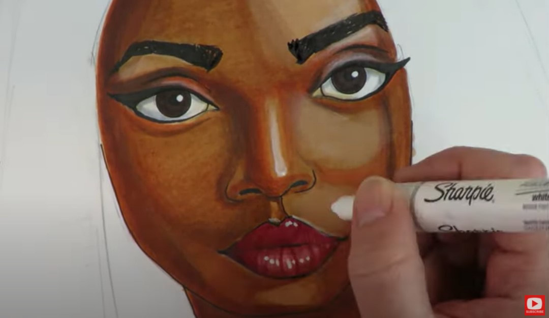 Now it's time for HAIR, but I have no idea how to draw dreadlocks!! LOL. Not a problem! We've got this!! I decided to get my pencil back out to sketch in the shapes I'm seeing in my reference photo. While I was sketching, I decided to try diving in with my marker using a circular movement, and I ended up LOVING the effect! It gave me just what I was hoping for. Be sure you watch the video to see how this goes! 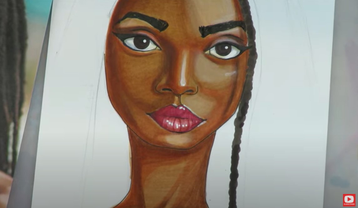 To give the appearance of texture, I experimenting with using a lighter colored pencil and did squiggly circles on top. This is what it looks like up close... 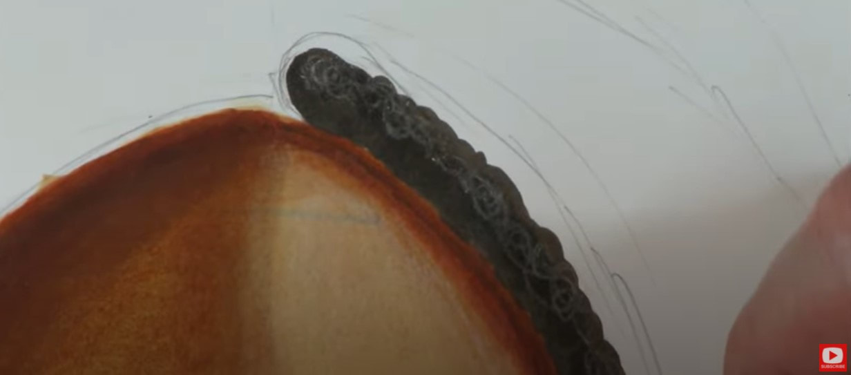 When I pull the camera back, I kinda love the effect and feel like this technique for drawing dreads really helps to indicate the texture I see in the model's hair from my reference photo. Not bad, right?! 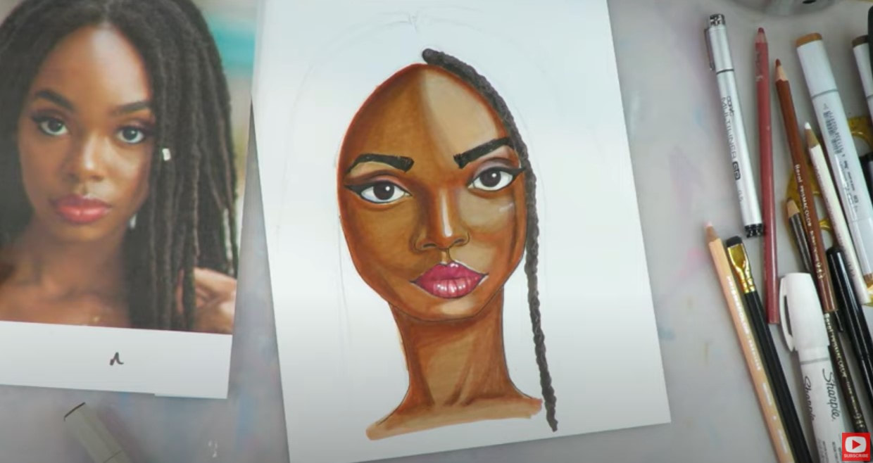 If you're not sure how to draw dreads, be sure to watch the video because I'm really happy with the simple technique I made up. I switched up my markers a bit as well and incorporated some black to indicate depth, as you can see below... 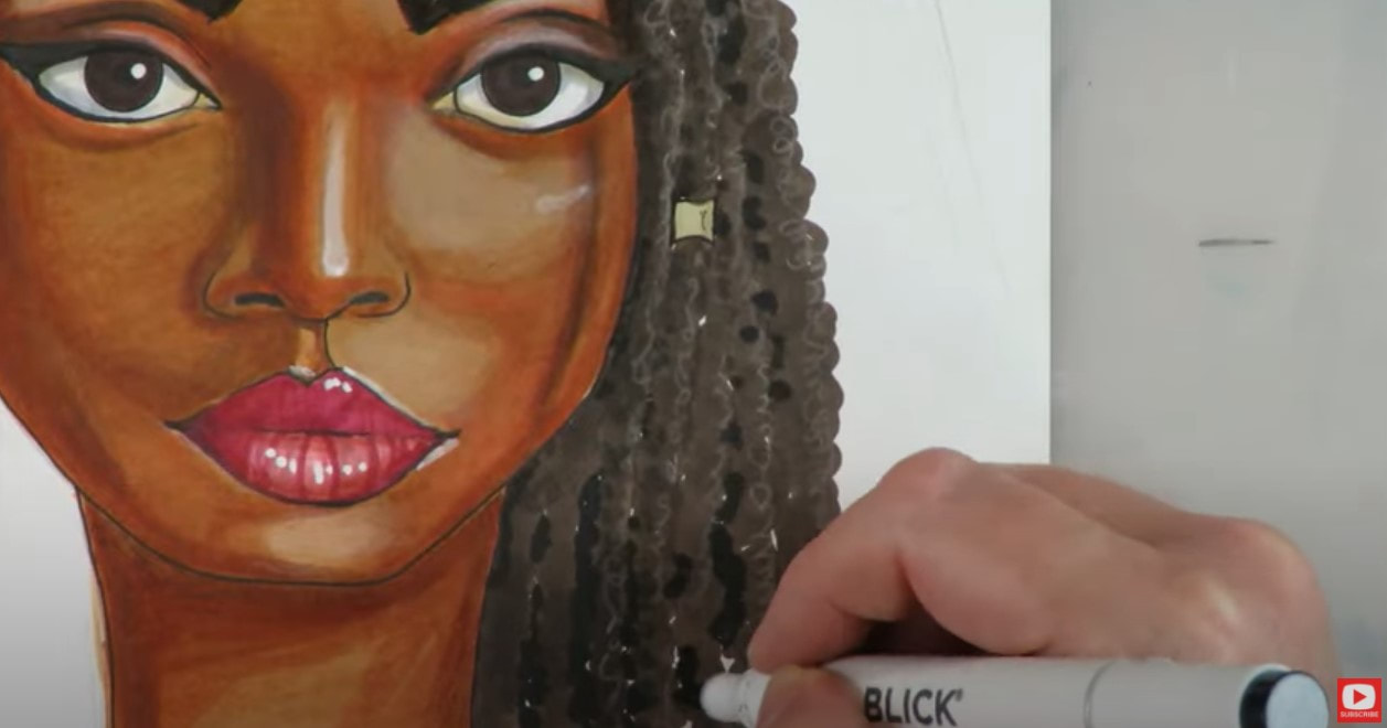 I can't wait to see how you do with this week's project!! Please share your work with us in the Facebook Group or over on Instagram and use the tag #whimsicalwomen! Remember I'd LOVE to include your interpretation of this project, or any of girls from my Whimsical Women of the World portraits in my upcoming book! Simply head over to GET PUBLISHED, read the submission requirements (they're easy, promise!!), and submit your artwork. Thanks for hanging out with me! I hope you enjoyed this project as much as I did!!
3 Comments
The idea of drawing freckles may SOUND scary, but it's really not!! Trust me! In today's "Whimsical Women of the World" portrait drawing tutorial, I'll teach you how to draw freckles and wavy red hair on an adorable Scottish lass, using copic markers!! Grab a sheet of card stock or a paper you love using for copic marker art, a pencil, & let's sketch in our face drawing guidelines. By the way, if you haven't heard yet - I'm going to be publishing a book featuring all 12 of the face drawing projects in this series when I'm all done, and I want YOU to join me!!!  All you have to do to participate is jump over to GET PUBLISHED, read through the easy submission requirements, and enter your work. I'll be featuring four student variations of each lesson in the book and hope YOURS is one of them!! This week...since I can't GO to Scotland except in my mind right now, we're drawing a fiery redhead!! 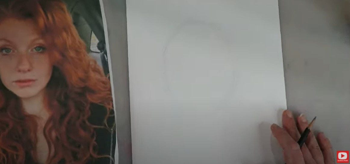 I'm working on my favorite Hammermill cardstock for copic marker coloring, since that is what I'll be shading with once I'm done sketching in her face. Typically when I'm drawing a face from scratch, I'll add a guideline that's smack in the middle of my oval to represent an eyeline. Since I'm using a reference with BIG HAIR, I've raised that eyeline a bit to account for this, because that's what I'm seeing in my portrait drawing reference. The model in this photo has her face tilted to the side a little as well, so my vertical drawing guideline also needs to shift slightly to replicate what I see in the photo. I also check the her face shape carefully as I sketch, because I want to capture the unique contours of this model's bone structure. 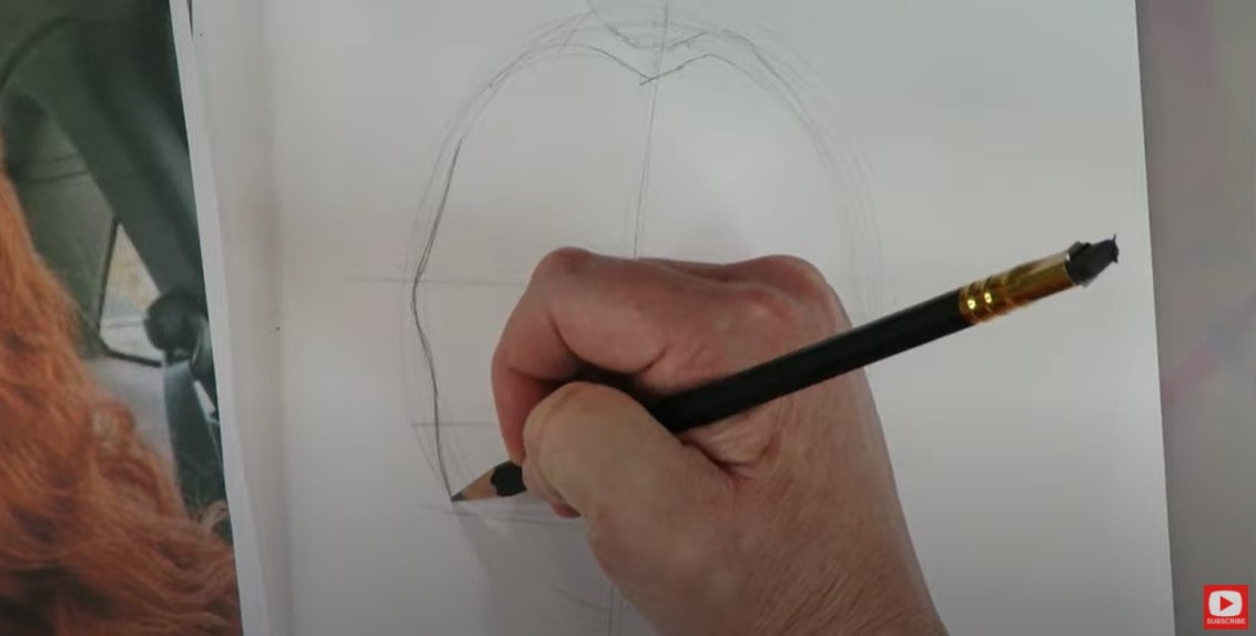 Her chin line is bit tricky, so pay attention to this if you're drawing along with me. The right side of her face is really covered by a wave of hair, so I simply penciled a wave in, and recommend you do the same before sketching in the facial features. 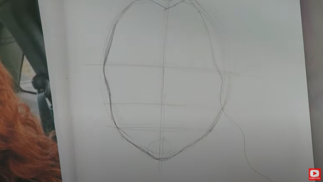 Next I rough in those face drawing guidelines to map out where her eyes, nose and mouth will sit. I also sketch in any other shapes I see that are unique to this art reference photo while I'm working. For example, her "lip dip" feels a bit longer to me and her nose is a bit wider at the base. 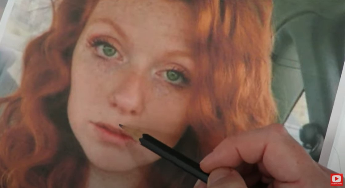 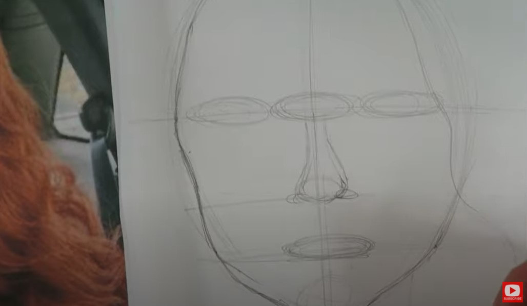 Next I sketch in a bit more hair - including her widow's peak and the curly waves around her face. Then I dig right into drawing her eyes. I always "build" both eyes up at the same time. If you struggle with drawing eyes and eyebrows, this is one of my BIGGEST tricks. Draw one line on the right, replicate it on the left. Go back to the right, add a line, and repeat it on the left, until both eyes are done. Drawing eyes step by step at the same time makes a BIG difference and will totally help if you aren't sure how to draw the other eye so it matches!! After that - I erase a bunch of my guidelines with my vanish eraser - only to discover her eyes look like they are set way too far apart. Not a problem! Instead of starting over - I just extend her eyes to make them a little wider. This is a perfect solution because it's a whimsical drawing anyway, and who doesn't love BIG EYES?! 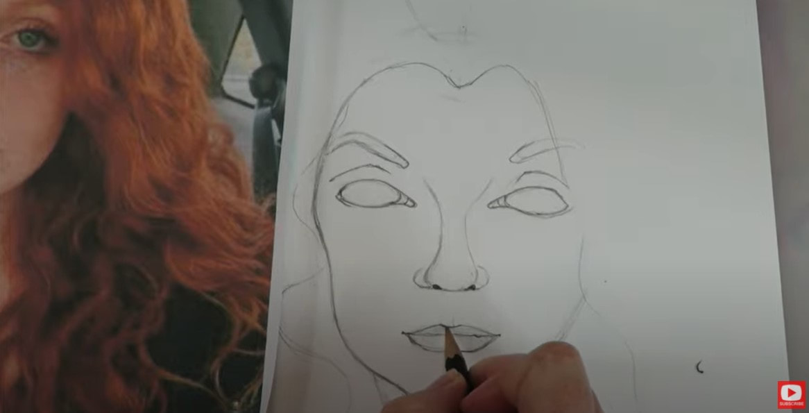 If you follow me for drawing, you know I never actually sketch in the bridge of the nose or a full outline of the nose - this comes forward naturally once shading is added. All I ever do is typically draw in the nostrils. But this particular model has a distinct nose shape and HIGHLIGHT I want to replicate when shading. She also has fairly thin lips, so pay close attention to the shapes you see here as you're copying them. I'm really glad I picked this art reference photo, because she actually presented me with a few challenges when it came to drawing her facial features!! These are the kinds of things I LOVE about drawing faces, because each of us are SO unique. Shifting our lines slightly creates a totally new person every time we draw! 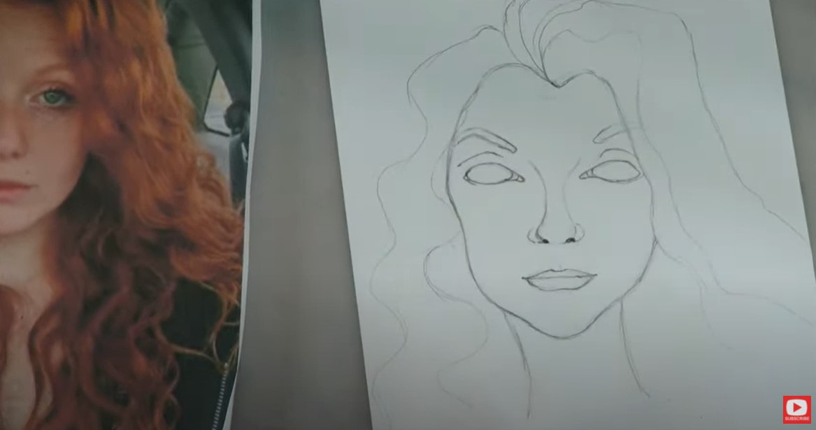 When it comes to drawing hair - I never draw each individual strand because I seriously don't have time for that!! LOL! Instead, I sketch out the big, main volume lines I see for the hair, then add in little sub-sections. Take whatever artistic license you want to because this is a whimsical drawing! For the irises and pupils, I feel no shame in grabbing my circle stencils and NEITHER SHOULD YOU!! Why stress about stuff if there is something that can help us with a teeny shortcut so we can move on and start shading?! 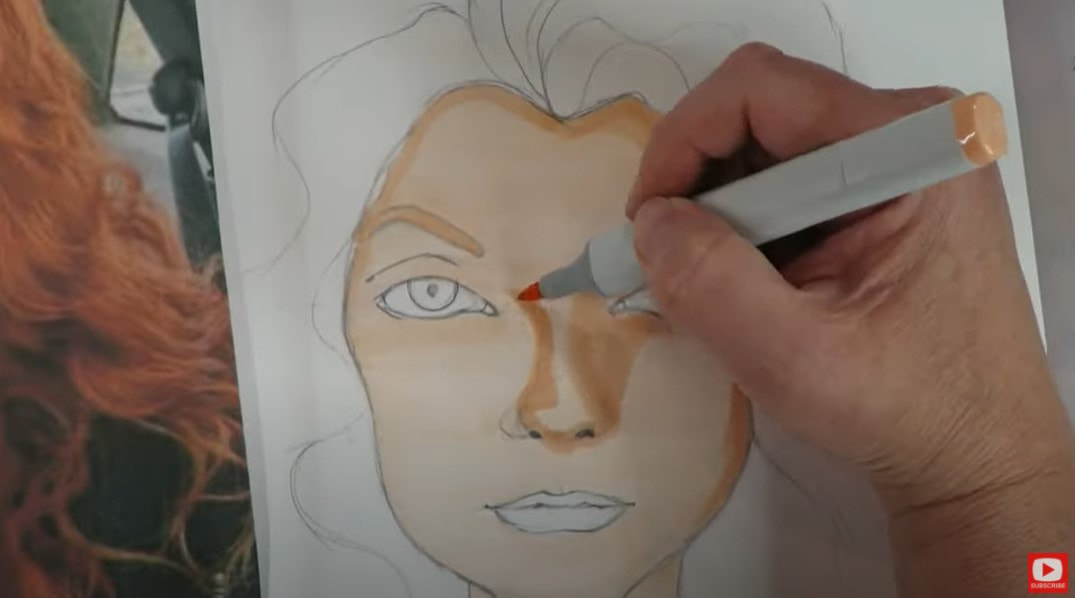 When you're ready to shade, pick 3 -5 skin tones in a row and swatch them off to the side. You always want to have a game plan BEFORE you begin laying down your color so there are no surprises! I see a lot of peach in this particular image, so those are the shades I reach for today. 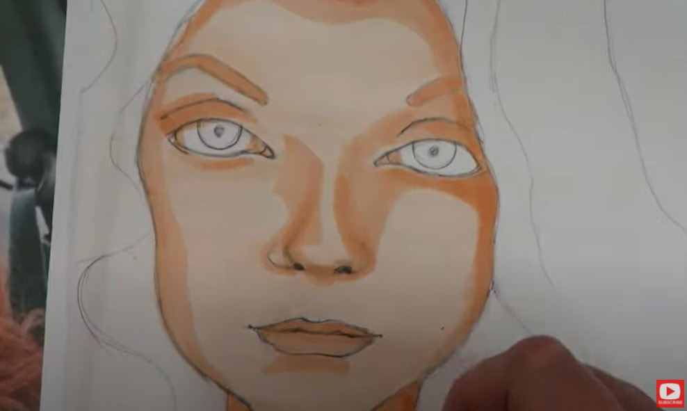 I see a lot of cool tones in the reference photo as well, so I worked some light gray into the face shading. You'll also see a bit of gray in the whites of her eyes because if you look closely- there are shadows here too! They're not perfectly white. I love adding multiple greens for her eyes too! 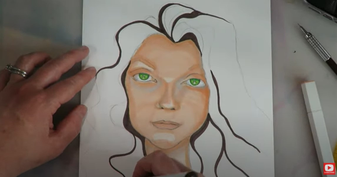 I choose 3-5 markers for her fiery red hair, and started with the darkest shade first. I actually got a little more detailed in this piece than I typically do with hair strands, but was in the mood to go there! Plus the brush nibs of my markers were fairly thick, so it didn't take long. One of my other big tricks - especially if you're not sure how to draw wavy hair, is to start your marker (or whatever you're drawing with!) where the ROOT of the hair is, and extend your lines from there to the tip. Just keep repeating this until you're happy, root to tip. 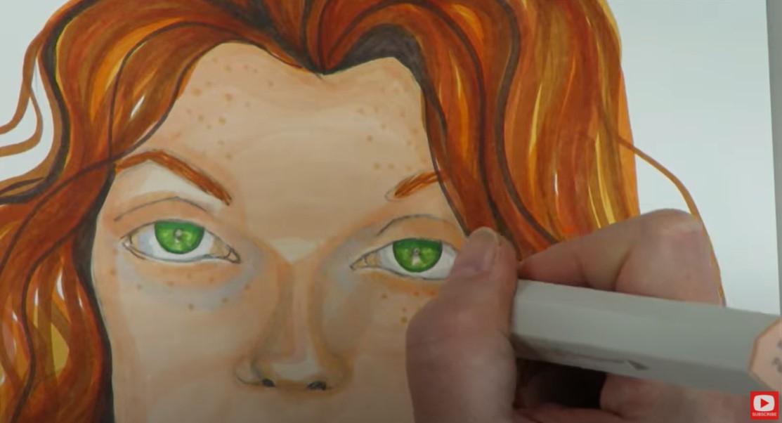 Now I know freckles can feel a little scary, but don't let these freak you out. They are actually REALLY easy!! All you need to do is hop in there with the tip of your marker, using one skin tone shade slightly darker than your lightest shade, and you'll be fine. If you're still feeling nervous- go ahead and try drawing freckles on paper you don't care about, off to the side on a scrap piece of paper. When my freckles were done, I felt like my shading needed a little more drama. Here is another hot tip for how to shade faces - when I'm adding additional layers of shading, I always go back to continue working the shaded areas I already created. Don't go in and start shading in a new place. 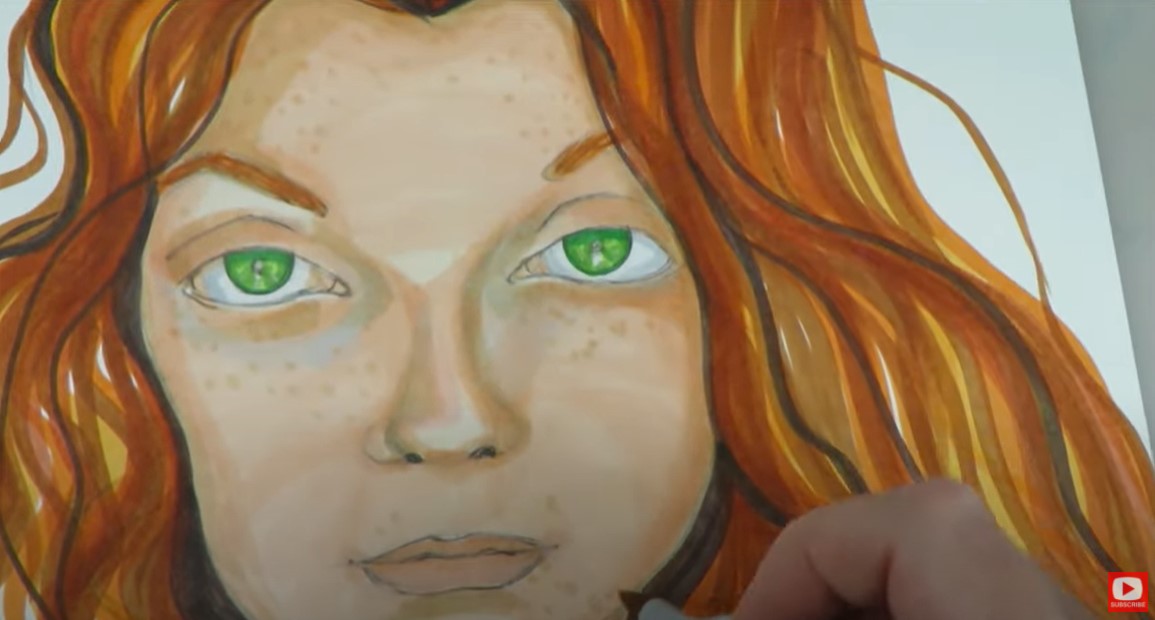 The wonderful thing about coloring with alcohol markers is you can slowly add more detail with colored pencil, fix problem areas, blend etc. Just make sure you're NOT using oil based colored pencils for this kind of work. Check out what your colored pencils are made of before you begin. (I *think* polychromos are a no-no here - please confirm that if you plan to use them). Next, I tackle one of my favorite areas, eyelashes with my pentel pocket brush pen! If you're not sure how to draw eyelashes - I recently did a video ALL about this to help you, and even have a cheatsheet you can download if you want! Be sure to check that out. 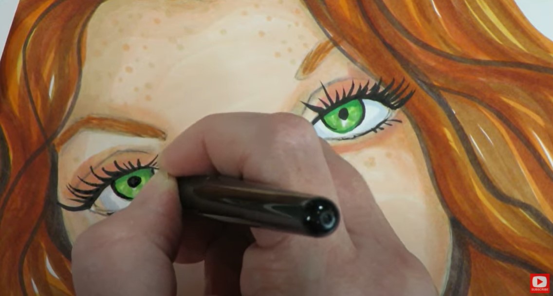 When the eyelashes and eye makeup are finished, I added the teensiest bit of black to her nostrils and the crease of her lips. I also added a few black strands of hair just for artistic effect. I wasn't trying to replicate anything I saw in the reference photo here - I just felt I needed to carry the black through a little more to unify the piece. Less is more here though, so if you're doing the same, go slow! 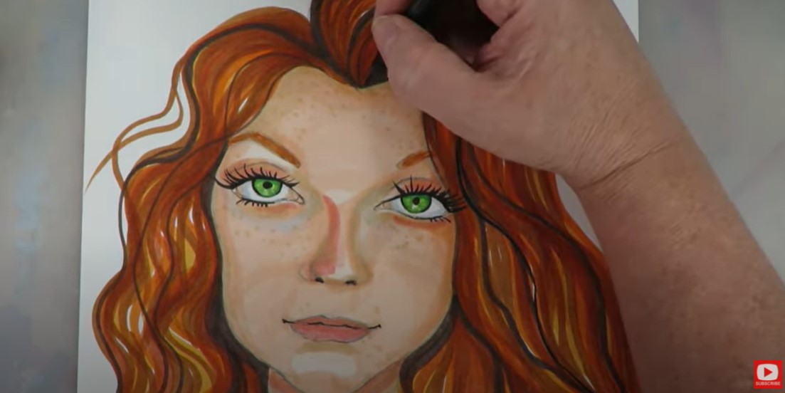 Remember, if you do have any streaky areas remaining from your marker strokes- you can continue blending those out by going over your streaks in the opposite stroke direction with the LIGHTEST shade of marker you were using in that area. Use your colored pencils to knock things up or down a shade, wherever you need it. 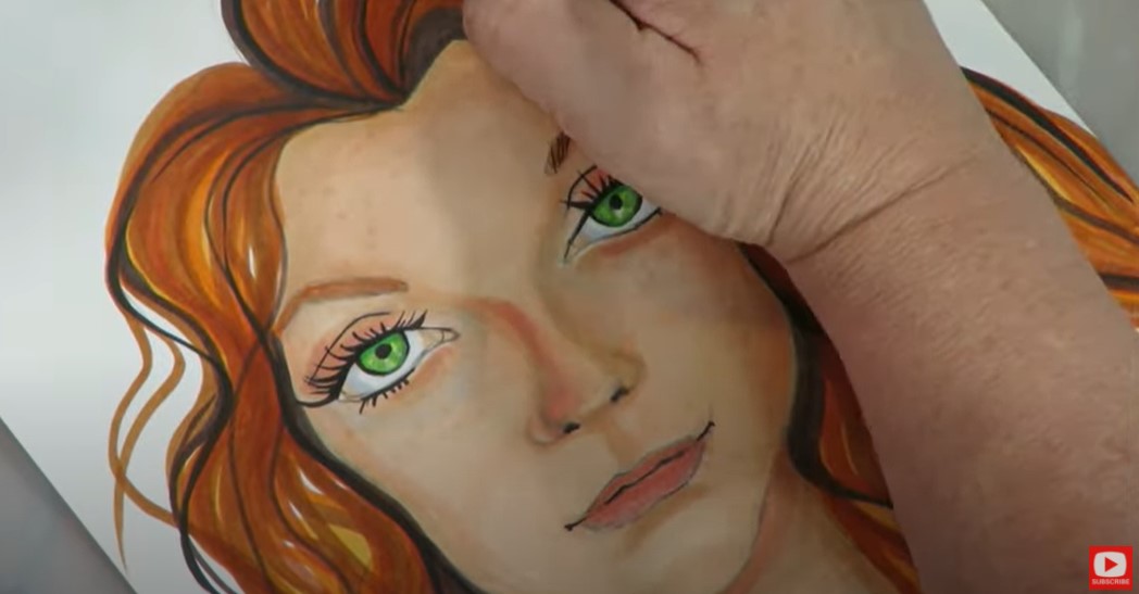 When you're happy with how things look, it's time for highlights!! DON'T SHY AWAY from this part!! Even if you're scared... these can make the BIGGEST impact in your piece. I love using my white poscas or sharpies for these. I also took some artistic license here again, because I love drama! I added them on the outer corners of the tear ducts, the tip of the nose, and a teensy bit on and around her lips and chin. This really "turns up the volume" on the dimension and can totally bring your character to life. 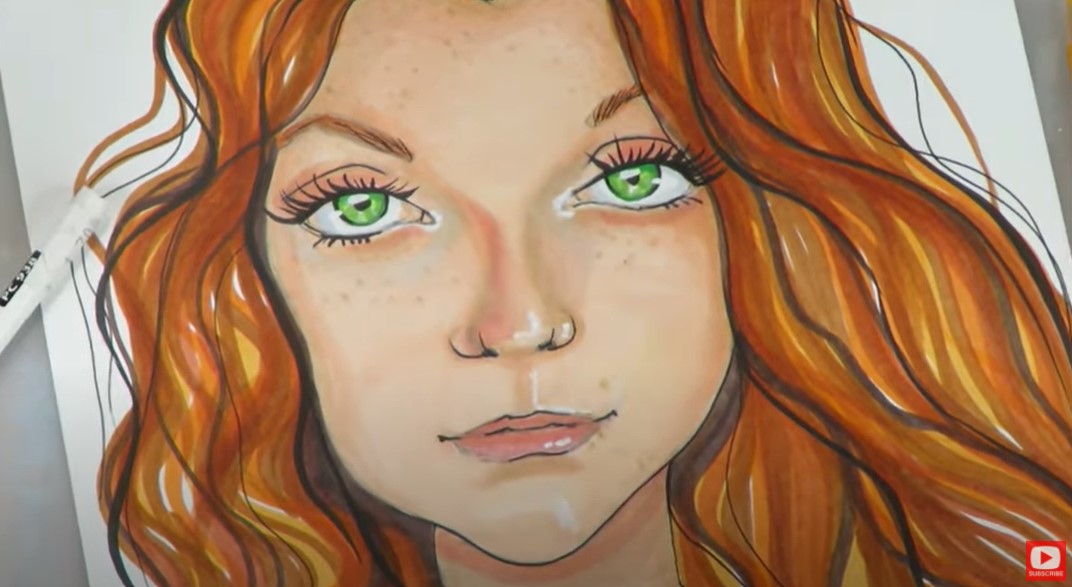 In the end, I decided to punch up the freckles as well by peppering in a few more, again one shade darker than I had been working in earlier. Come do the lesson with me, and PLEASE submit your version for publication in my upcoming book!! Thanks for hanging out with me!! I'll see ya back here on Friday with the latest on my Mixed Media channel, followed by another Whimsical Woman of the World next Monday!! I'm super excited to share week 2 of my 12-part portrait drawing series, "Whimsical Women of the World!" I got so into this series, I've decided it's BOOK WORTHY!!! Even better - I'm inviting YOU to join me in this process!! Simply draw along with me in any video from the Whimsical Women of the World series, and submit a digital version of your artwork here. This week we are drawing a woman from India, and I've found another gorgeous art reference photo for us to use! I've found drawing in a series is fun because it gets me out of my comfort zone! I think it's so easy to fall into a habit of drawing the same whimsical types of faces- but if we take a moment to look at all the different human facial features across our ethnicities around the world, it is just gorgeous! Not to mention all the variations of color in our skin tones... it's beautiful to work with as an artist! 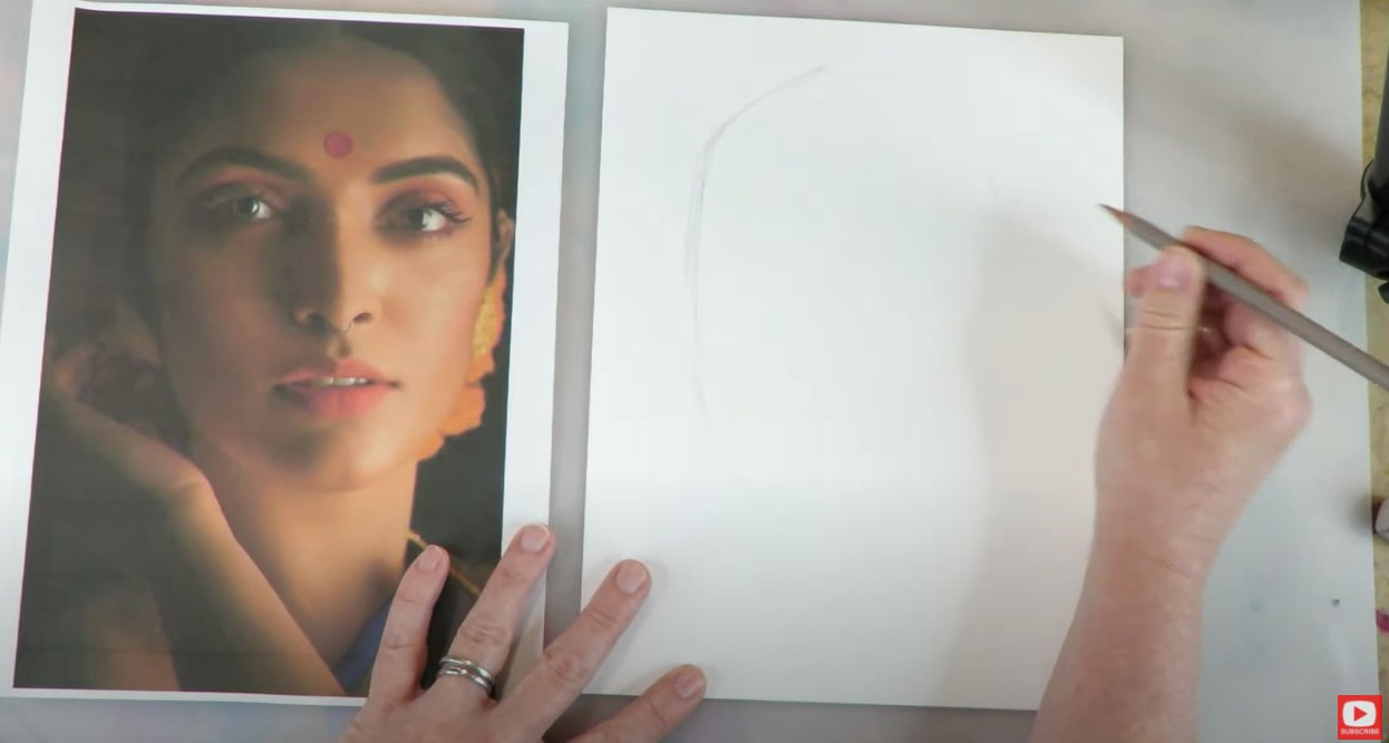 I think you'll love our reference photo today as much as I do! There are a few things I found really unique about this image. I love the lighting on her face. It's rare to find a photo where a highlight goes exactly down the the center bridge of the nose! That calls for some dramatic shading - which I'm a huge fan of, so this photo really called to me. I also love how huge her eyelids are. They happen to be basically the same shape I love to draw for my Fun, Fab Faces, so I was thrilled to find this in a photo from real life ;) As I started to draw, I did find this particular face to be a bit tricky because the top of her head actually extends off the page. This makes sketching in her eyeline a bit more difficult. Watch how I do it in the video, and you'll be fine to do it on your own!! 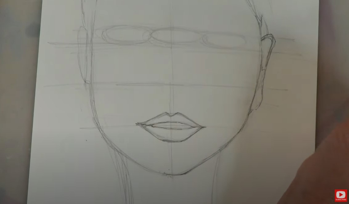 Don't beat yourself up if it doesn't look like mine, if it doesn't look like the reference photo - it's fine! We're working on learning to draw faces that are well proportioned. That is our main goal!! And, if you already know me, you know I find drawing realistic faces to be super stressful! I prefer to do whimsical drawings so I can just have fun!! I think whenever you add the word "WHIMSICAL" in front of what you're drawing - it gives you some grace if things don't come out exactly right! 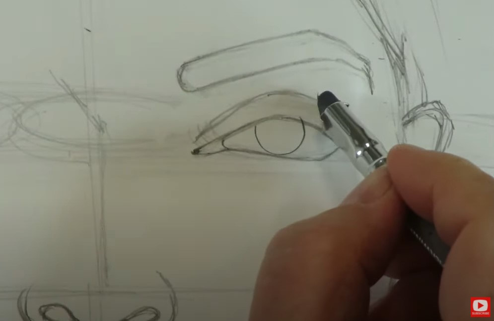 As you'll see, I'm drawing with my blackwing pencils again today because I just LOVE how soft and smooth they are. They also have this great, rectangular eraser that makes it SO easy to erase in tiny areas. If you need an excellent eraser for bigger areas of your paper, the vanish eraser if phenomenal!! Links for both of these are in the description box of today's video if you need any new drawing supplies. 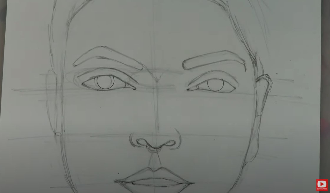 I traced a circle for my irises today. Sometimes this is just easier, so if drawing circles stress you out- use a stencil!! Our model has some simple earrings, but feel free to look around on Pinterest for more intricate jewelry or hairstyles for your drawing. There are so many gorgeous variations you can do for Indian women. I kept it simple because I didn't want to overwhelm anybody with too much detail. I tried to replicate the model's beautiful bone structure- which is super subtle, but I felt was a really important aspect of capturing her look. Because both the hair and background on my reference photo are so dark, I had to imagine a bit what her hair looks like, so drew in some little bumps to indicate a low bun. 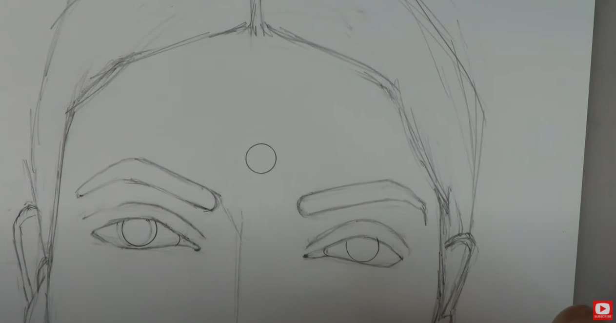 You'll see I pulled my circle template out again to draw the bindi (this is the small dot on her forehead that indicates she's married in Hindu culture). I wanted that circle to be exact, because this is an actual sticker applied to the face and there is depth to it. I love how this model has other beautiful facial features that are different from what I typically draw. She has very large, dilated pupils (which I used my circle template for again!). Her nose shape is subtly different as well. It dips down dramatically and even has a nose ring! Her lips are parted slightly as well -showing some teeth - which I normally avoid!! She definitely pushed me out of my comfort zone a bit, but I loved it!! It forced me to really study the image. I believe 50% of being a good artist is having amazing observational skills! Working with the reference photos in this series will help you develop those skills even more! 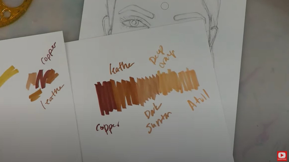 Skin tone swatching is KEY if you're shading your drawing in color. If you're doing this in colored pencils, copic markers, etc. - swatch them ahead of time so you're not surprised by anything, and know the colors blend into each other seamlessly. Whenever I'm shading a dark skinned face- I start with my darkest shade first, and work my way through shades until I reach the lightest color. I know it can be scary to START with the darkest shade - especially if you're working dark to light!! Just take your time and continually check in with your reference photo. I'm always asking myself, where are the darkest shadows? Where are the lightest highlights? Then I do my best to replicate this on my own drawing. Now onto the "ugly phase!!!" LOL... I believe there is ALWAYS an ugly phase. That's what stage my drawing is in right here... 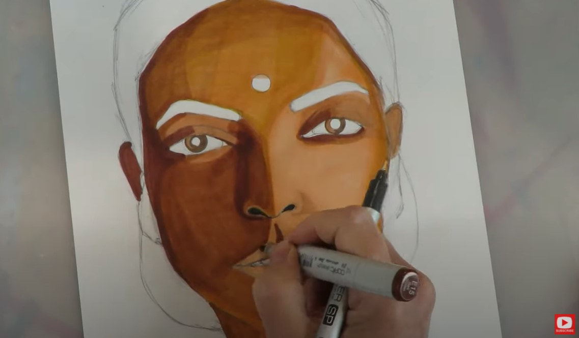 If I stop working on my drawing right here and come back to it later- it could make me want to cry because she is unfinished- looks like a weird puzzle of colors, nothing is defined, etc. THIS is the ugly phase!! It's guaranteed. We all have it in our work. PUSH THROUGH IT!!!! It happens in every medium, and if you STOP working at this stage because you think your piece is ugly- you're letting the ugly phase win. KEEP GOING. TRUST ME on this!!!! 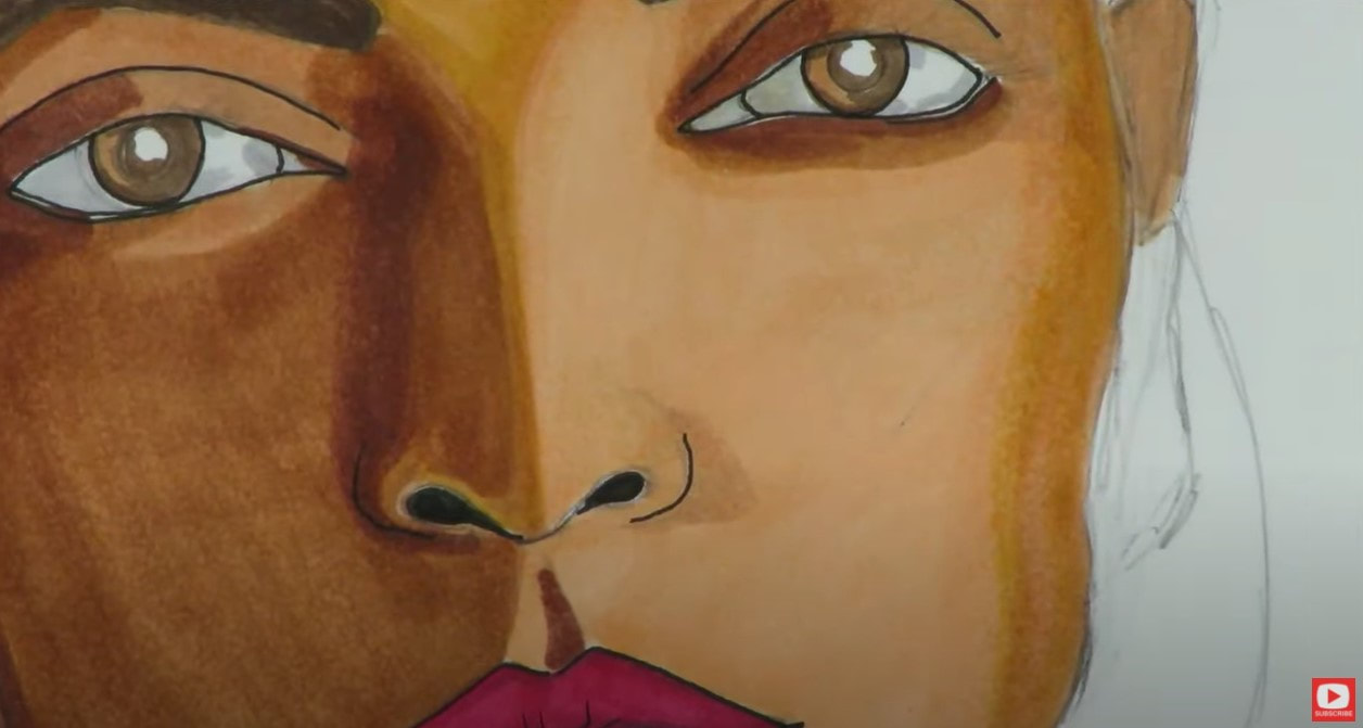 You'll notice as I'm working color into the shading of the eyes, there is barely any white left by the time I'm done, because this is what I see in the reference photo. When you're doing a portrait - If you're shading in color, make sure you've got your GRAYS out because nothing is usually stark white, even the teeth! Look for the shadows here to make your coloring realistic by knocking back that white. 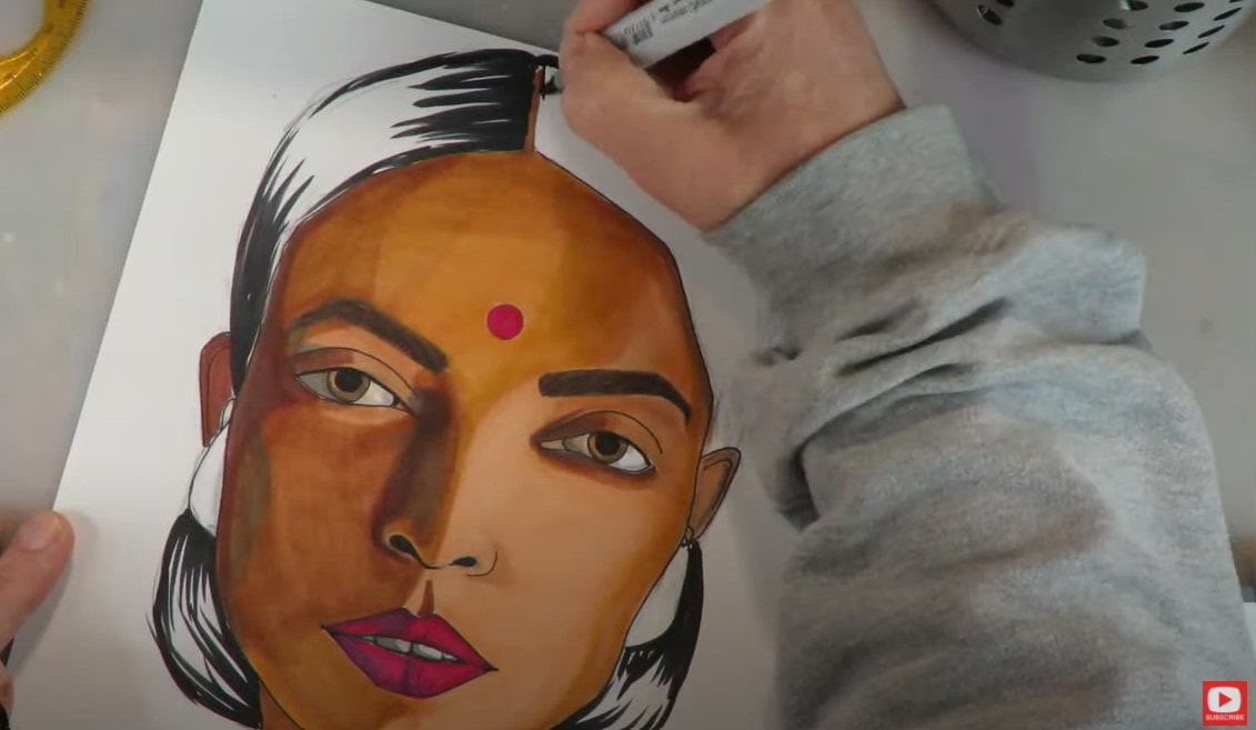 When I'm done with my markers, I layer in colored pencil to help ease the transitions between shades. Sometimes I like seeing the marker lines, and sometimes I don't. If I don't want that look showing up - I take my colored pencil and shade in the opposite direction to try and wipe out those lines. So if my marker lines were horizontal, I do vertical lines for my colored pencil. I know a lot of people get discouraged if they outline a face FIRST, and then shade with copics. It can be easy to run into your outlines and end up having the outline bleed. You'll notice today I outlined LAST with my microliner to prevent the bleed from happening. You might want to try the same if you're working with alcohol markers! 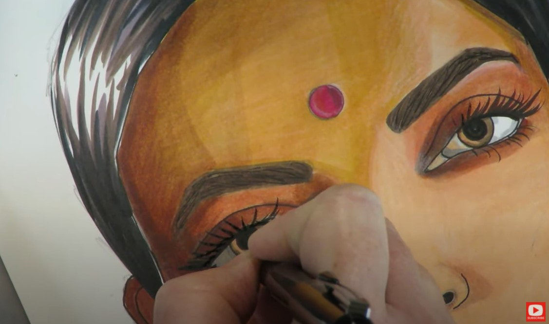 When it was time to add in eyelashes, I used my pentel pocket brush, or my "secret weapon!" If you struggle with drawing eyelashes, make sure to check out the recent video from my Mixed Media channel, I give you ALL my secrets for how to draw eyelashes !! I added twinkle in the eyes with my white paint pen. I typically do a different look with those, but love how this one turned out and will totally do it again! See what happens when you step outside your comfort zone?! 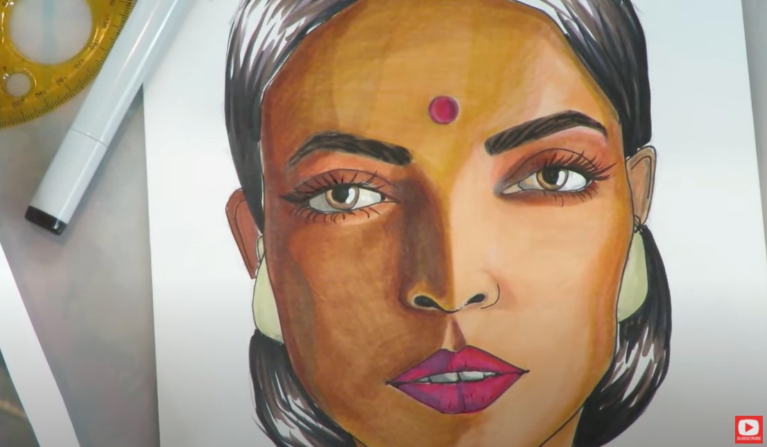 For the nose ring, I just used my pencil because the reference photo showed it as being shiny metal. 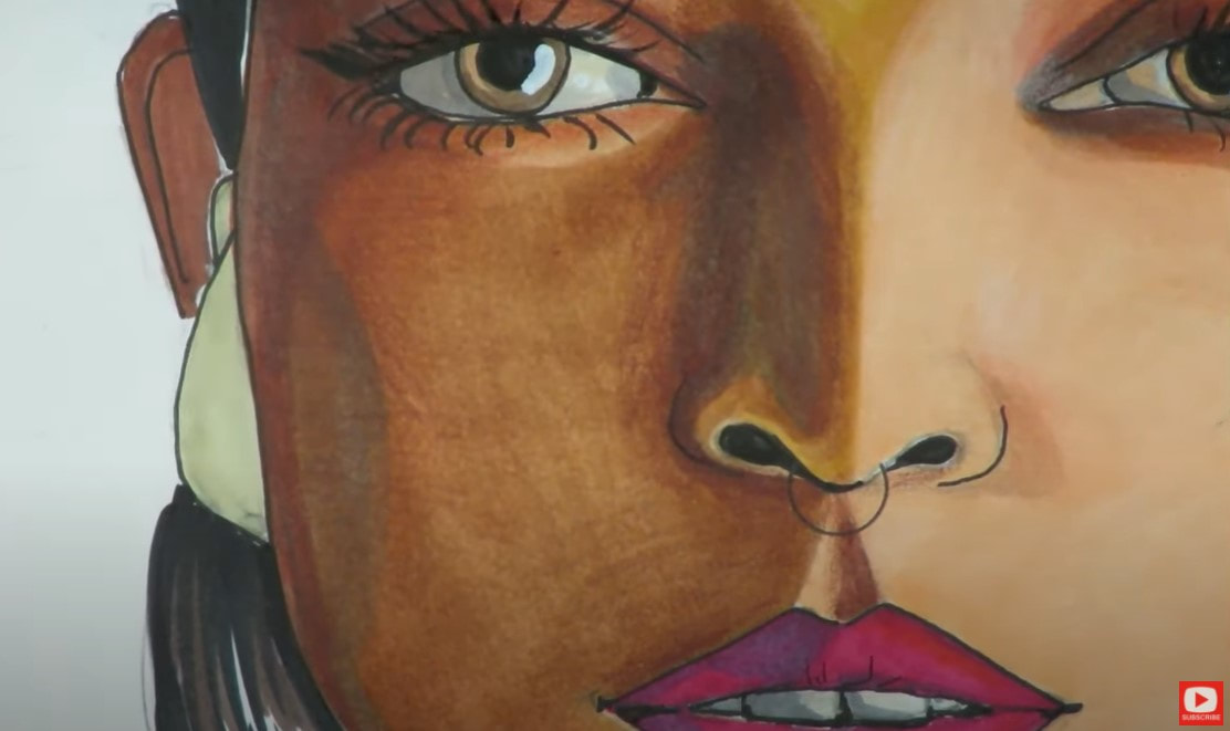 I added white colored pencil on top of the markers wherever I noticed highlights occurring in my reference photo. To punch those highlights up a bit more - I used my white gel pen or bright white posca pen. This adds more drama and dimension for me! If you're nervous to add in highlights -start with your white colored pencil to make sure you like where the highlight is going. The colored pencil is soft, and creates a gentle first layer. 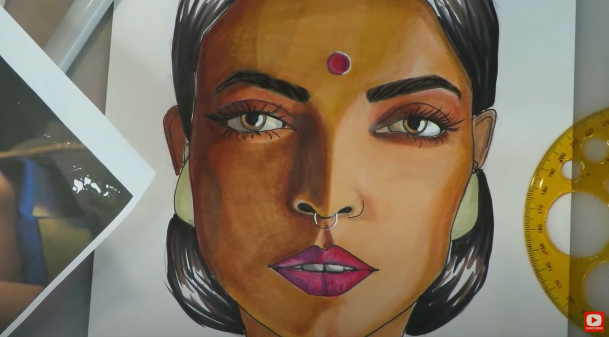 Remember, acrylic paint pen markers are awesome to add on top of anything. So if you're using watercolor or another medium- feel free to STILL use the posca on top of your work for additional highlights drama! I was excited to discover the eyelashes in this photo have "undersided" highlights, and they look SO cool!! Those marks aren't me just being "creative," that's me reading the reference and adding the detail I see in the photo to my drawing. If you feel like you want or need the reference photo for this drawing project, or the entire series - just go to AwesomeArtSchool.com. You can get all 12 of the reference photos (+ all my cheatsheets!!!!) in the YouTube Library Collection. 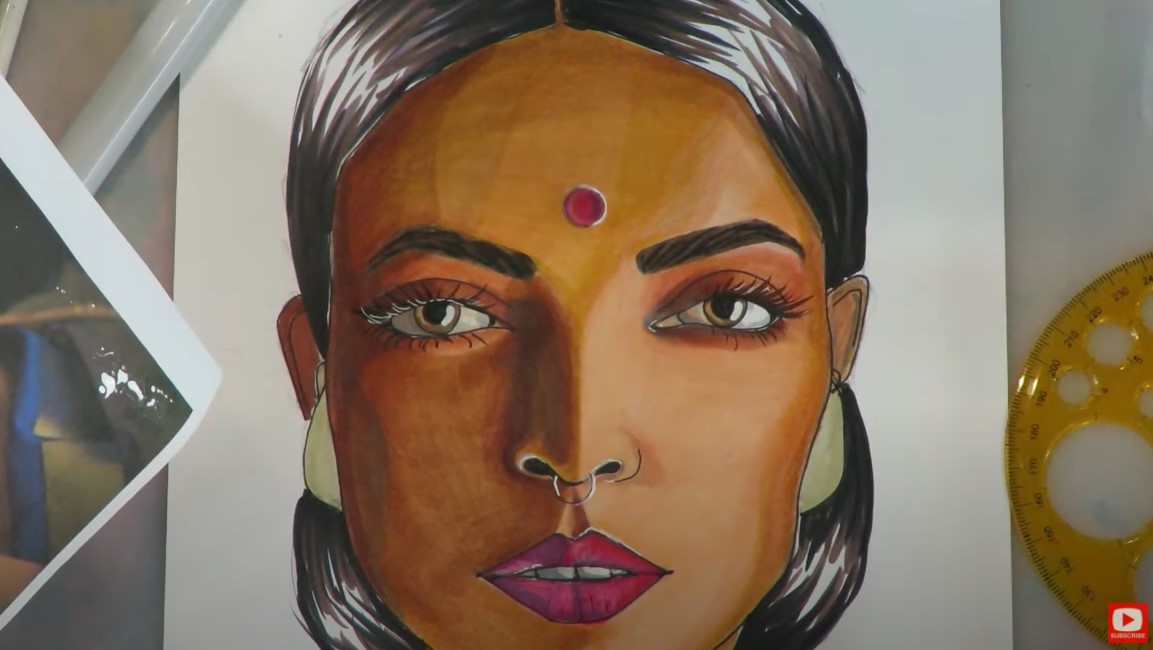 Remember to enter a photo of your beautiful drawing when you're done by clicking on this link to GET PUBLISHED! Come join me in the studio for the 40 minute tutorial! See ya there!!! |
Karen CampbellFounder of Awesome Art School. Mixed Media Artist. Author of 18 Instructional Art Books! 
 Archives
April 2024
Categories
All
|
 RSS Feed

"Karen is flipping hilarious and she's very real...I like the way she teaches in a way that really gives you confidence, whether you're a beginner or advanced there's always something new to learn!"
- Elizabeth W. |
What Fans Are SayingKaren, you are absolutely fabulous! You make me feel like I can draw anything. I have recently retired and finally have the time to do some of the art that I have loved since I was in school. I am really at the beginning of my art journey and I hope to learn as much as I can. Thank you for all you do. |
Contact ME |